Build a Card that flips on ‘click’ with HTML, CSS, and Vanilla Javascript (Part 1)

There is a feature that I see a lot that I think is a great learning tool for HTML, CSS, and Vanilla Javascript. A three card in-line feature is very useful. It shows information or images on the front and can be clicked to flip around and show additional information on the back.
During this written tutorial I will go over HTML, CSS, and the Javascript. This write-up is intended for beginners, and throughout I will review why each line exists. At the end of tutorial you should, hopefully, have an understanding of the logic behind approaching this type of feature.
Let’s start by using Codepen. Codepen is a great tool to build out fun things, practice, and learn by checking out other people’s work as well.
You can open a free account with Codepen, but if you prefer not to do so, you can also use any code editor you like. I recommend VS Code or Atom for your editor. I personally use VS Code in my day to day coding expeditions. All of my screenshots will be views of my Codepen from here forward. Feel free to follow along!
Ok, so let’s start with a clean slate. If you are using Codepen you will see 3 sections: HTML, CSS, and Javascript. If you are using a code editor, create 3 new files all in the same folder index.html style.css and index.js .
If you are using code editor, set up your blank index.html page with this starter markup:
If you are using Codepen, your new pen should start out as below. I personally prefer to have my code to the left of my preview browsers as shown below. You can change this by clicking the “Change View” button and selecting your preferred display.
Let’s start by building out the HTML foundation. This will give us a structure to work with.
First, we need a container that will hold the three cards. For this container, I will use the element called <section> . The section tag does exactly what the name implies. It is defining a section of the page.
You’ll notice that the first tag looks like this: <section> and then there is a second tag like this: </section> . These are opening and closing tags. There are some tags that are “self-closing” and we’ll get to at least one of those later on, but typically, most tags need an opening and a closing tag.
Ok, now within this container, lets place in cards within the section container using the <div> tag. div tags are division tags. They are very commonly used in HTML.
Let’s take a look at what we’ve got so far. We have 3 <div> elements sitting inside of the opening and closing <section> tags.
This is called nesting. Now, the <section> tag is the Parent to the div tags, and the <div> tags are the Children of the section tag, and each of the div tags are Siblings to one another.
Although we have a container and 3 card elements, you’ll notice that our page is still blank. This is because we have no content and have not added any styles yet. Let’s go ahead and start working on that.
First, I am going to add some placeholder text. This text will go away later, but will help us to style the cards to start.
Within each opening and closing <div> add placeholder text
This gives us a visual to work with.
Let’s begin styling.
At this point, we are going to start moving back and forth from the HTML to the CSS. If you are using a code editor, it will be a good idea to keep both the index.html and style.css files open.
Some basics with CSS are IDs and Classes. IDs are initiated within the CSS file using a hashtag # and Classes are initiated with a period . or dot.
Id’s should not be used more than one time per page. If there is a possibility that a style being written could be utilized more than one time, we should use classes.
First thing I am going to do is get the three placeholders to align horizontally. We will do this using Flexbox. Flexbox is a built in part of CSS. It is compatible with all current browsers with partial support for IE 11. I do not typically strive to accommodate outdated browsers like IE 10and older, unless specifically requested by clients.
Every html element is treated like a box. Every. Single. Element. So, right now you have a section element that is a box and 3 div elements that are all each their own boxes. With CSS we can determine how they are displayed with the display property.
In CSS, let’s write an ID called container and assign a property called display with a value of flex . There are quite a few display options, but for our purposes today, the flex value will work perfectly.
Every CSS selector has to have opening and closing curly braces < >, and, at the end of each line in those braces you need a semicolon ; . So our container id should look like this:
Now that we have part of CSS written, let’s add that ID to our HTML by assigning it to the section element.
Great! Now we can see that our placeholders are all displaying on the same line.
By default, display: flex sets its children into a row. What we can do now, is set those 3 placeholders to be centered in the middle of the page by using more flexbox options. Before we add more flexbox though, lets start by adding a height of 100vh to the container. Using vh stands for view height which means that the element with the id of container will take the the full height of the view port.
What’s the viewport? Good question!
The viewport the visible area of your web page.
Now, let’s add in our CSS to the container specifying centering our content horizontally and vertically.
Note: /* */ in CSS will comment multiple lines. Comments help you to make notes as your coding so that when you go back later, you can know why lines are written.
So far, your CSS should look like this:
Are your placeholders all aligned horizontally now?
Side note: If you’d like to learn more flexbox, check out this great zombie game by geddski.
It’s time to start styling your cards. Since all 3 cards will have similar styles, we will use a class so that we can apply it multiple times to different elements in our html. We will call this class .card .
I am going to start with the background color of the cards. I like the color orange, so let’s use the color #F76014 .
Wait, that’s orange?
This is called a hex color. You can find your favorite hex color at this HTML Color Codes website.
Let’s add this class to our div elements now by adding class="card" to each one.
You can see now that each placeholder has an orange background. Next, lets separate these cards from each other. Right now they are touching and we cannot tell where one ends and the next begins.
As I mentioned before, each element is treated like a box. Each box comes with its own packaging.
The very outer portion is the margin. The margin acts like a force field that will determine how close the surrounding boxes can get. Directly inside the margin is the border. This border is not required to be visible, but every element has one available. The next layer is the padding. This will stretch out the inner portion of the box, pushing away the border and the margin. Finally inside all of that stuff is your content.
Since we don’t want these cards to touch, let’s build our force field (margin).
We can determine if we only want top, bottom, left, right, or some combination of these. For these purposes, we are going to set the same number for all sides. By setting margin: 15px we are telling that class to apply that number to all 4 sides.
I think we are in a good place to add in a picture. For demo purposes I really like the website Unsplash. You can use their images for free. I highly recommend giving credit to the photographers where you can.
My go-to is using dog images. Click on the image you like. You can download for free, or you can copy the image address, which is what I do most of the time when using sample images.
You’ll just need to right click on that image and click Copy image address .
Now, back in your HTML, let’s add a new element.
In the first card div, remove the placeholder text, and in its place, add in an image tag <img /> . Image tags are self-closing, however, they need a bit of information inside of the tag to specify the image your are adding.
You need the source of the image and an alt tag. Although alt tags are not required, I really recommend using them because they are very helpful with accessibility for impaired users as well as things like SEO (search engine optimization).
This is the start of our image tag. Now we just need to add in our puppy image link to the source and we can name it in the alt tag.
This image tag should go in our first card div, which will replace the placeholder text.
Let’s do this for the other 2 placeholders as well. Feel free to pick any image from unsplash that you like.
We now have 3 cards with 3 different images. Excellent!
The problem that we have now, is that images are HUGE! We could reduce those sizes down in the card class, but let’s think about this for a minute.
We are building cards that are going to flip to the back on click. That means we have a front part of the card AND a back.
Let’s add those to our card div and then we can resize our images.
I’m going to start by adding 2 new divs. I’ll also add in the class of front to the first of the divs and back to the other. Then, let’s move the image tags into the divs with the class of front . Now your HTML should look like this:
Side note: when building out features, it is very common to have to adjust, add, move, replace elements and css as you go. It’s important to be fluid while building things.
It’s time resize the width and height so that we can see our images better.
In our CSS file, lets set the class .card to have a height of 200px and width of 300px. This will give us a landscape image for any card that is built.
Our pictures are still HUGE! This is because we need to tell our pictures that they are only allowed to be a certain size. Lets take another quick look at part of our HTML:
You can see we have the div with a class of .card as the parent of .front and .back and we have image tags inside of the front tag. We will eventually add images to the .back class as well. We can now specify our CSS to only target the image tags that are nested within those classes.
By using the character > we can select all <img> elements where the parent has the .front class. BUT WAIT THERE’S MORE! We want to do the same thing with the class of .back , so let’s add that to this same css rule. We do this by just separating the selectors with a comma:
You could write each of those individually, however, the fewer lines you write, the less likely you are to make a mistake.
Hover effect
It seems like a good time to give the front of the cards an effect when you hover over it.
When you want to target a piece of your HTML on hover, you can add on to the selector with :hover . For example, every time a user “hovers” over the card, it will be clickable, so we should change the cursor to pointer. Let’s start there.
Below our card class, let’s add a new rule called .card:hover and inside of that rule, we’ll add a declaration of cursor: pointer .
There are many different cursor options you can use for different situations, but we specifically want the pointer in this instance.
Now let’s work on the color changing on hover next.
Currently our card has a background color set to #F76014 , but we can’t see it because we have an image sitting on top of that color. With this in mind, let’s change the opacity of our picture on hover and allow some of that color to come through.
We are going to target the images that are nested in the .front class to change on hover. To do this we will add:
Opacity is on a scale of 0 -1 in CSS. By setting opacity to 0.5 we are telling the image to reduce to 50% on hover. You can play with that number to a setting that you prefer. In our example, the half-way point works great.
Your images should now have color overlay on hover, something like this:
Как случайным образом выбрать карту из колоды карт и не выбирать ее снова?
Я пытаюсь построить игру на основе случайного выбора карт. Игрок тянет карту, после того, как карта была взята, карта больше не будет вытягиваться.
Я пытался заставить его работать, но на моем веб-сайте появляется сообщение об ошибке «Uncaught TypeError: currentCard.filter не является функцией».
Я новичок в JS, и код, вероятно, можно было бы написать более аккуратно и более эффективно, поэтому, пожалуйста, извините за длинный и беспорядочный код.
Что я делаю не так?
3 ответа
Конкретно отвечает на:
Я новичок в JS, и код, вероятно, можно было бы написать более аккуратно и более эффективно, поэтому, пожалуйста, извините за длинный и беспорядочный код.
Как правило, вы хотите попытаться разделить данные и логику, но ваш код смешивает и то, и другое.
Вместо этого рассмотрим что-то вроде:
Таким образом, у вас будут данные ( cardsById ) только с уникальными частями данных (имена и идентификаторы изображений), а логика будет отдельной.
Что касается того, чтобы не выбирать одну и ту же карту дважды, можно было бы удалить каждую карту по мере ее выбора, используя slice , как @Crayon Violent предложил в комментариях (хотя я бы рекомендовал splice с » p «вместо этого).
Другой вариант — добавить идентификатор каждой карты во второй массив alreadyPicked , а затем проверить этот массив при генерации случайного идентификатора; если он уже выбран, выберите его заново. Какой стиль лучше, зависит от вашего конкретного кода.
Я считаю, что это должно сработать.
Возможно, вы захотите сделать что-то вроде этого . Держите под рукой два списка, в которых хранятся карточки. В первом списке хранятся все карты, а во втором — список currentCards . Таким образом, каждый раз, когда вы берете карту из основного списка cards , она добавляется в currentCards и удаляется из основного cards , поэтому вы никогда не будете повторять одну и ту же карту. randomNumber будет обновляться по мере того, как список cards также становится меньше.
Создаём простую игру на Vanilla JS
В этой статье мы создадим простую игру с помощью HTML5, CSS3 и чистого JavaScript. Вам не понадобятся глубокие знания программирования. Если вы знаете, для чего нужны HTML, CSS и JS, то этого более чем достаточно. На работу игры вы можете посмотреть здесь.
Структура файлов
Начнём с создания нужных папок и файлов:
Начальный шаблон, соединяющий CSS- и JS-файлы:
В игре будет 12 карточек. Каждая карта состоит из контейнера div с классом .memory-card , внутри которого находится два элемента img . Первая отвечает за лицо ( front-face ) карточки, а вторая — за рубашку ( back-face ).

Необходимые изображения можно скачать из репозитория проекта.
Обернём набор карточек в контейнер section . В итоге получаем:
Мы используем простой, но очень полезный сброс стилей, который будет применён ко всем элементам:
Свойство box-sizing: border-box учитывает значения внутренних отступов и границ элемента при подсчёте общей высоты и ширины, поэтому нам не нужно заниматься математикой.
Если применить к body свойство display: flex и margin: auto к контейнеру .memory-game , то он будет выровнен вертикально и горизонтально.
.memory-game также будет flex-контейнером. По умолчанию ширина элементов уменьшается, чтобы они помещались в контейнер. Если присвоить свойству flex-wrap значение wrap , элементы будут располагаться на нескольких строках в соответствии с их размерами:
Ширина и высота каждой карточки подсчитывается с помощью CSS-функции calc() . Создадим три ряда по четыре карточки, установив значения ширины и высоты равными 25% и 33.333% соответственно минус 10px от внешнего отступа.
Чтобы разместить наследников .memory-card , добавим position: relative . Так мы сможем абсолютно расположить наследников относительно родительского элемента.
Свойство position: absolute , установленное для .front-face и .back-face , уберёт элементы с их исходных позиций и разместит поверх друг друга:
Поле из карточек должно выглядеть примерно так:
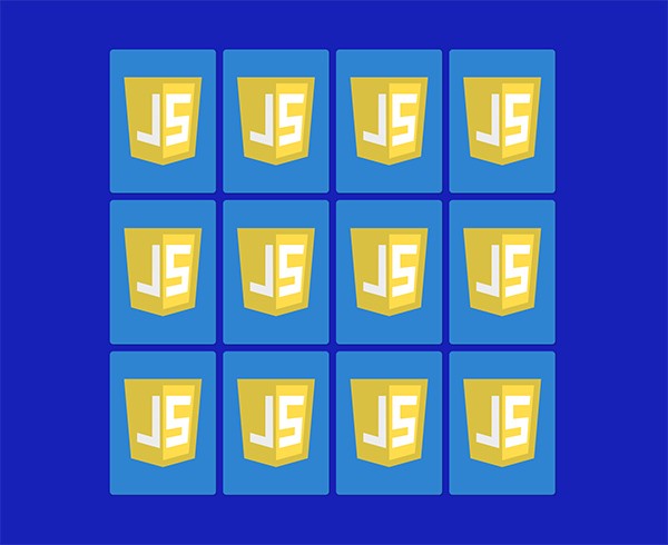
Добавим ещё эффект при клике. Псевдокласс :active будет срабатывать при каждом нажатии на элемент. Он устанавливает длительность анимации равной 0.2 с:
Переворачиваем карточки
Чтобы перевернуть карточку после нажатия, добавим класс flip . Для этого давайте выберем все элементы memory-card с помощью document.querySelectorAll() . Затем пройдёмся по ним в forEach -цикле и добавим обработчики событий. При каждом нажатии на карточку будет вызываться функция flipCard() . this отвечает за нажатую карточку. Функция получает доступ к списку классов элемента и активирует класс flip :
CSS класс flip переворачивает карточку на 180 градусов:
Чтобы создать 3D-эффект переворота, добавим свойство perspective в .memory-game . Это свойство отвечает за расстояние между объектом и пользователем в z-плоскости. Чем ниже значение, тем сильнее эффект. Установим значение 1000px для едва уловимого эффекта:
Добавим к элементам .memory-card свойство transform-style: preserve-3d , чтобы поместить их в 3D-пространство, созданное в родителе, вместо того, чтобы ограничивать их плоскостью z = 0 (transform-style):
Теперь мы можем применить transition к свойству transform , чтобы создать эффект движения:
Отлично, теперь карточки переворачиваются в 3D! Но почему мы не видим лицо карточки? На данный момент .front-face и .back-face наложены друг на друга из-за абсолютного позиционирования. Рубашкой каждого элемента является зеркальное отражение его лица. По умолчанию значение свойства backface-visibility равно visible , поэтому вот что мы видим при перевороте карточки:
Чтобы исправить это, применим свойство backface-visibility: hidden для .front-face и .back-face :
Если перезагрузить страницу и снова перевернуть карточку, она пропадёт!
Так как мы скрыли заднюю сторону обеих картинок, на обратной стороне ничего нет. Поэтому сейчас нам нужно перевернуть .front-face на 180 градусов:
Наконец, мы получили желаемый эффект переворота!
Ищем пару
Мы научились переворачивать карточки, теперь нужно разобраться с проверкой на совпадение.
После нажатия на первую карточку она ожидает переворота другой. Переменные hasFlippedCard и flippedCard будут отвечать за состояние переворота. Если ни одна карточка не перевёрнута, значение hasFlippedCard устанавливается равным true , а нажатой карточке присваивается flippedCard . Ещё давайте сменим метод toggle() на add() :
Теперь при нажатии на вторую карточку мы попадаем в else-блок нашего условия. Чтобы проверить, совпадают ли карточки, нужно их всех идентифицировать.
Всякий раз, когда нам нужно добавить дополнительную информацию к HTML-элементам, мы можем использовать data-* атрибуты, где вместо «*» может быть любое слово. Добавим каждой карточке атрибут data-framework :
Теперь мы можем проверить, совпадают ли карточки, с помощью свойства dataset . Поместим логику сравнения в метод checkForMatch() и снова присвоим переменной hasFlippedCard значение false . В случае совпадения будет вызван метод disableCards() и обработчики событий будут откреплены от обеих карточек, чтобы предотвратить их переворот. В противном случае метод unflipCards() перевернёт обе карточки с помощью 1500 мс тайм-аута, который удалит класс .flip :
Складываем всё воедино:
Более элегантный способ написать условие совпадения — тернарный оператор. Он состоит из трёх частей. Первая часть — это условие, вторая часть выполняется, если условие возвращает true , в противном случае выполняется третья часть:
Блокируем поле
Мы научились проверять, совпадают ли карточки, а теперь нужно заблокировать поле. Это нужно для того, чтобы два набора карточек не могли быть перевёрнуты одновременно, в противном карточки не будут переворачиваться обратно.
Объявим переменную lockBoard . Когда игрок нажмёт на вторую карточку, lockBoard будет присвоено значение true , а условие if (lockBoard) return; предотвратит переворот других карточек до того, как эти две будут спрятаны или совпадут:
Нажатие на ту же карточку
У нас всё ещё есть сценарий, при котором после нажатия на одну карточку дважды условие совпадения будет выполнено и обработчик событий будет удалён.
Чтобы избежать этого, добавим проверку на то, равняется ли нажатая карточка переменной firstCard , и вёрнемся из функции, если это так:
Переменные firstCard и secondCard нужно обнулять после каждого раунда. Реализуем эту логику в новом методе resetBoard() . Поместим в него hasFlippedCard = false и lockBoard = false . Деструктурирующее присваивание [var1, var2] = [‘value1’, ‘value2’] из ES6 позволяет писать код меньших размеров:
Новый метод будет вызываться из disableCards() и unflipCards() :
Перемешивание
Наша игра выглядит довольно неплохо, но играть в неё не очень весело, если карточки всегда на одном месте. Пора это исправить.
Когда у контейнера есть свойство display: flex , его элементы упорядочиваются сначала по номеру группы, а потом по порядку в исходном коде. Каждая группа определяется свойством order , которое содержит положительное или отрицательное целое число. По умолчанию свойство order каждого flex-элемента имеет значение 0 . Если групп больше одной, элементы сначала упорядочиваются по возрастанию порядка группы.
В игре есть 12 карточек, поэтому мы пройдёмся по ним в цикле, сгенерируем случайное число и присвоим его свойству order . Например пусть будут сгенерированы числа в диапазоне от 0 до 12:
Чтобы вызвать функцию shuffle() , сделаем её IIFE (Immediately Invoked Function Expression). Это значит, что она будет выполнена сразу после объявления. Скрипт должен иметь примерно такой вид:
JavaScript Display Random Images
At the risk of people not being happy with me again, I will post the code that I already have. Please look at the comments and let me know where I am going wrong.
Yes this is homework, yes I have watched videos and looked at our book (JavaScript by Example) which is a horrible book by the way. I have tried to e-mail my teacher but I get nothing back. This is a 5 week intro to JavaScript class and I am obviously not understanding any of it.