CSS Animations
In the early days of the web, pages were very static. Browsers did a great job rendering fonts, colors, and pictures, but the content typically didn’t move or change after the page was loaded. When JavaScript and the Document Object Model (DOM) was added in the late-1990s, developers started experimenting with more interactive user interfaces and content, which made the web feel more alive, but the relatively slow execution speed of JavaScript resulted in fairly jerky and unpredictable animations on slower machines. JavaScript also couldn’t take advantage of the specialized hardware-based animation accelerations being added to graphics cards at this time.
In the late 2000s, browser vendors began adding new CSS properties to create smooth hardware-based animations and transitions. These properties are now part of the core CSS specification, and are supported by all the major browsers. You can use them to create both 2D and 3D animations.
WARNING: animations are cool, but they are also quite distracting. Like fine chocolate, a little goes a long way! Use them to add some motion and excitement, but keep it subtle so that people interacting with your page don’t get annoyed or distracted.
Defining an Animation
To define a new animation, you declare a @keyframes rule in your CSS, like so:
The keyword @keyframes starts a new animation definition, and is followed by a name you want to give this animation. Inside the curly braces, you define style rules that are applied at various stages of the animation. The selector for each of these rules is a percentage of the animation duration, like 0% or 25% . The keywords from and to are synonyms for 0% and 100% respectively.
In the example above, I named the animation fadeIn because it animates the opacity property from 0 to 1 . Recall that opacity controls how opaque an element is: a value of 0 makes the element entirely transparent (i.e., invisible), and a value of 1 makes the element entirely opaque (i.e., fully-visible).
The from selector is synonymous with 0% , so the formatting properties in that rule are applied at the start of the animation. The to selector is synonymous with 100% , so the formatting properties in that rule are the ending target for the animation. The browser then handles creating a smooth transition between the starting values and the ending values. In this case, the browser will smoothly increase the opacity from 0 to 1 , making the element fade-in.
Note that you don’t specify the animation timing in the definition: we will specify that when we apply this animation to an element. That allows us to define the animation once using relative stages, but apply it at different speeds on different elements.
You can define as many stages in the animation as you want. If multiple stages in the animation share the same properties, you can use a group selector syntax to specify those properties only once. For example, if we wanted an animation that fades-in and then fades-out again, we could specify it like this:
Here we say that opacity should be 0 at both the start and end of the animation, but should be 1 at the mid-point of the animation. Thus the element will fade-in and then fade-out again.
Which Properties Can Be Animated?
In general, any continuous property can be animated. Discrete properties like display , font-family , or background-image can’t be animated because there is no way to transition smoothly from one value to another.
That said, not all continuous properties will result in really smooth animations. Browsers have to do a lot of work to layout a page, so any property that changes the overall page layout will naturally be tough to animate at 60 frames-per-second. These properties include:
- width, max-width, min-width
- height, max-height, min-height
- margin, padding
- flex, flex-basis
- font-size
- text-indent
- line-height, letter-spacing, word-spacing
Properties that only affect the element being animated will work much better. Those include:
- color
- background-color
- border and border-radius
- box-shadow
And those that affect only the final compositing of elements on screen will work the best. Those include:
- opacity
- transform
Animating Multiple Properties
Although the examples above animated only one property, you can specify as many properties as you want in the stage rules. For example, you can animate both the opacity and the transform at the same time:
Applying an Animation
After we define an animation, we can apply it to one or more elements. This is typically done in response to an event, like the user clicking on something or pressing a key on the keyboard, but that requires JavaScript. Since we haven’t learned JavaScript yet, we will use the :hover pseudo-selector to trigger the animation when a user hovers the mouse over an element.
Assume that the element we want to do this on is a <div > element. We can use the .animate-me class selector to refer to this element specifically, and the :hover pseudo-selector to create a rule that should be applied only when the mouse is hovering over that element.
Here’s what it looks like in action. Hover your mouse over the orange square (if you’re on a touchscreen, touch the white part and then drag over the orange square instead):
See the Pen CSS Animations by Dave Stearns (@drstearns) on CodePen.
The animation property should be set to a value containing at least the animation name (defined in the @keyframes rule) and a duration. Here we use 1s to specify one second. You can use s for seconds, or ms for milliseconds ( 1000ms is the same as 1s ).
Timing Function
By default the animation uses a timing function that is not linear. Instead, it has a slow start, gets faster in the middle, and then slows down again at the end. This is a commonly-used timing function that approximates how physical objects move in the world: they start slow as they build momentum, then slow down again as they lose that momentum. But you can change that to make it linear if you’d like. Just add the keyword linear to the end of the value:
CSS offers several pre-defined timing functions, but you can also use the cubic-bezier() function to define your own.
Iterations
By default the animation goes through only one cycle, but you can change that by specifying an iteration count. You can use the keyword infinite to make the animation continue indefinitely.
3D Animations
The value of the transform property can utilize several different transformation functions, some of which work in three dimensions. This allows you to create 3D animations that appear leap off the page.
For example, the rotate3d() function allows you to rotate an object on its x, y, and z axes in 3D space. You can rotate on just one axis or all three, as this example demonstrates:
Here’s what it looks like in action. Hover your mouse over the box (on touchscreens, touch the white area and then drag over the box):
For 3D animations, you can adjust the perspective using the perspective() function, or you can set the perspective property on the parent element of the element you are animating. The value is a distance you want the viewer to be away from the element on the Z axis in 3D space, expressed in any distance unit (pixels, inches, centimeters, or even rems). A larger number makes the 3D effect more subtle, as the viewer is farther away from the animated element, while a smaller number makes it more pronounced.
For a fun example of how you can combine multiple elements into a 3D cube with animated rotations, see David DeSandro’s 3D cube.
Triggering Animations from JavaScript
Triggering an animation on mouse hover allows us to play around with animations, but more commonly you will want to trigger an animation in response to some event, such as a click/tap, scroll, or during an HTTP request. Catching these events requires a JavaScript event listener. That listener function can then alter the element’s animation style property directly, or add/remove a particular style class that applies a particular animation property value.
After we learn JavaScript and the DOM, we will come back to CSS animations, showing you how to trigger them in response to events, or during asynchronous HTTP requests.
CSS Animation Libraries
Basic animations are easy to define yourself, but more complex ones can get tricky. Thankfully there are several CSS Animation libraries available that define a bunch of these tricky ones for you. The most popular is Animate.css. This project defines a stylesheet that currently offers 75 different animations. To apply one of these animations to your element, simply include their stylesheet in your page and add the appropriate style class to your element. You can add this class in the HTML to make the animation happen on page load, or you can dynamically add the class via JavaScript at the appropriate moment.
Since this is an open-source library, you can also simply find the @keyframes definition for the particular animation you want, and copy/paste it into your own stylesheet. That will eliminate the extra network round trip to download their stylesheet, and reduce the number of style rules your browser must parse before styling the page.
How do you add GIFs to html?
How do i add GIFs to html? I’m currently learning html, and i want to know how to add a GIF to my websites. Does anyone know how to do that?
3 Answers 3
GIF is an outdated format, terribly wasteful and resource hungry for the animations we know as “GIFs“. The term GIF is also used for the content pattern of short, autoplaying, silent videos that run in a loop.
If you checkout big websites with GIFs like Giphy, 9Gag or Twitter, they are actually using video formats like VP8, VP9, H.265 or AV1, which are way more efficient than the old Graphics Interchange Format.
Whatever you do, please do not forget to provide an alternative text for visitors who either have visual impairments or simply cannot load videos. This is called accessibility, hashtag a11y.
Using the embed option to include a GIF from a platform
So, if you simply want to add a GIF from one of the GIF sharing platforms, you would choose the GIF you want to put on your website, use their “embed” sharing option and copy the resulting code into your website.

The default <iframe> element from Giphy does not include an alternative description, and you should add an attribute like title="Animation, a man moving his hands away from his forehead sideways, in a mind-explosion gesture. An overlaid animation enforces the explosion character."
Include self-hosted GIF-animations as videos
If you plan to serve the animation file from your website, this is the recommended way to go if you want to systematically put GIFs on your website.
Since the GIF format is not suited for animations nowadays, you would like to embed your animations as actual videos in a <video> element
Include a self-hosted GIF-animations as actual GIF images
One reason to actually use the GIF format in HTML would be for Emails, since most Email clients do not play videos.
You would use the <img> element and point the src attribute to your .gif file.
To provide an alternative text for images, you would use the alt attribute:
How To Insert Animated GIF in HTML
Feel a regular image is too general? Want to make your site looks more cool? Let’s try to add some animated GIF images on your site.
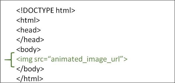
To insert animated GIF in the web page. We use the html <img> tag to achieve this. If you didn’t have an idea how to use the <img> tag, we have another tutorial to teach you how to add an image on your website. At here, we use the same method, but we will place the image URL to the animated GIF URL.
To insert the GIF on your HTML web page, just add this link of code in your body element.
At the code above, I set the width as 100% to fit my blog post width. By using the <img> tag to display the animated GIF on your HTML web page, the URL of the image should be correct.
It might look like this.
Looks fun right? These GIF image are originated from giphy.com. There are many some others funny GIF on giphy.com.
If you are a completely beginning of HTML, but want to test it out with this code. You can simply run the code on the top-right side of the code snippet. If you want to create your own, HTML page from scratch. Check out How To Create an HTML Page. The code might looks like this.
Make it More fun and Attractive
There are a few ways to make the GIF image more attractive:
- Add a Caption: You can add a caption to the GIF image to make it more interesting and engaging. For example, you can add a funny caption that relates to the image.
- Add a Border: Adding a border to the image can help it stand out and make it more visually appealing. You can experiment with different border styles and colors to find one that complements the GIF.
- Adjust the Size: Depending on where you plan to use the GIF, you may want to adjust its size to fit the space. A smaller size may work better for social media, while a larger size may be better for a website.
- Change the Background: You can experiment with different background colors or patterns to make the GIF image stand out. A contrasting background can help the image pop.
Here’s an example of how you can modify the code to make the GIF image more attractive:
Add Animation To The GIF Image
In this example, I’ve added a CSS animation that slides the caption in from the left when the page loads.
I’ve also added a CSS animation to the GIF image that rotates it continuously in a clockwise direction. You can adjust the animation duration, timing function, and other properties to customize the effect. Let me know if you have any other questions!
How to use an animated image in HTML page?
Animated images in HTML are an image on a web page that moves. It is in GIF format i.e. Graphics Interchange Format file.
We need to use the <image> tag with the src attribute to add an animated image in HTML. The src attribute adds the URL of the image (file destination).
Also, we can set the height and width of the image using the height and width attribute.
Syntax
Example 1
Following is an example to show how to use an animated image in HTML page −
Example 2
You can try to run the following to work with the animated image in HTML −
Example 3
We can change the height and the width of the animated image using the style sheet.