Как сделать — адаптивную форму входа, авторизации
Узнайте, как создать адаптивную форму входа в систему с помощью CSS.
Нажмите на кнопку, чтобы открыть форму входа:
Как создать форму для входа
Шаг 1) добавить HTML:
Добавьте изображение внутри контейнера и добавьте входные данные (с соответствующей меткой) для каждого поля. Оберните элемент <form> вокруг них, чтобы обработать входные данные. Вы можете узнать больше о том, как обрабатывать входные данные в нашем учебнике PHP.
Пример
Шаг 2) добавить CSS:
Пример
/* Bordered form */
form <
border: 3px solid #f1f1f1;
>
/* Full-width inputs */
input[type=text], input[type=password] <
width: 100%;
padding: 12px 20px;
margin: 8px 0;
display: inline-block;
border: 1px solid #ccc;
box-sizing: border-box;
>
/* Set a style for all buttons */
button <
background-color: #4CAF50;
color: white;
padding: 14px 20px;
margin: 8px 0;
border: none;
cursor: pointer;
width: 100%;
>
/* Add a hover effect for buttons */
button:hover <
opacity: 0.8;
>
/* Extra style for the cancel button (red) */
.cancelbtn <
width: auto;
padding: 10px 18px;
background-color: #f44336;
>
/* Center the avatar image inside this container */
.imgcontainer <
text-align: center;
margin: 24px 0 12px 0;
>
/* Avatar image */
img.avatar <
width: 40%;
border-radius: 50%;
>
/* Add padding to containers */
.container <
padding: 16px;
>
/* The "Forgot password" text */
span.psw <
float: right;
padding-top: 16px;
>
/* Change styles for span and cancel button on extra small screens */
@media screen and (max-width: 300px) <
span.psw <
display: block;
float: none;
>
.cancelbtn <
width: 100%;
>
>
Создание модальной формы входа
Шаг 1) добавить HTML:
Пример
<!— Button to open the modal login form —>
<button onclick="document.getElementById(‘id01’).style.display=’block’">Login</button>
<!— The Modal —>
<div > <span onclick="document.getElementById(‘id01’).style.display=’none’"
class="close" title="Close Modal">×</span>
Шаг 2) добавить CSS:
Пример
/* The Modal (background) */
.modal <
display: none; /* Hidden by default */
position: fixed; /* Stay in place */
z-index: 1; /* Sit on top */
left: 0;
top: 0;
width: 100%; /* Full width */
height: 100%; /* Full height */
overflow: auto; /* Enable scroll if needed */
background-color: rgb(0,0,0); /* Fallback color */
background-color: rgba(0,0,0,0.4); /* Black w/ opacity */
padding-top: 60px;
>
/* Modal Content/Box */
.modal-content <
background-color: #fefefe;
margin: 5px auto; /* 15% from the top and centered */
border: 1px solid #888;
width: 80%; /* Could be more or less, depending on screen size */
>
/* The Close Button */
.close <
/* Position it in the top right corner outside of the modal */
position: absolute;
right: 25px;
top: 0;
color: #000;
font-size: 35px;
font-weight: bold;
>
/* Close button on hover */
.close:hover,
.close:focus <
color: red;
cursor: pointer;
>
/* Add Zoom Animation */
.animate <
-webkit-animation: animatezoom 0.6s;
animation: animatezoom 0.6s
>
Совет: Можно также использовать следующий код JavaScript для закрытия модального, щелкнув за пределами модального содержимого (а не только с помощью кнопки «x» или «Cancel», чтобы закрыть его):
Пример
<script>
// Get the modal
var modal = document.getElementById(‘id01’);
// When the user clicks anywhere outside of the modal, close it
window.onclick = function(event) <
if (event.target == modal) <
modal.style.display = "none";
>
>
</script>
Совет: Пойдите к нашему учебнику формы HTML для того чтобы выучить больше о формах HTML.
Совет: Перейдите в наш CSS Form учебник, чтобы узнать больше о том, как стиль элементов формы.
Форма авторизации на простом HTML с пояснениями
Добрый день. Конечно всем эта тема знакома уже много лет, но она будет кому то полезна особенно новичкам, которые ищут форму авторизации. Формы бывают разные и я буду добавлять новые, чтобы кто то не тратил много времени на поиски готовых решений. Это будут формы авторизации из двух полей, форма авторизации по номеру телефона, форма авторизации с «галочкой» запомнить, а так же формы авторизации с капчей от гугл. Еще добавлю, что все формы будут иметь уникальные классы блоков, что позволит их использовать на любых проектах, чтобы не ломать действующие возможные стили и пересечения классов блоков.
Базовая разметка простой формы авторизации:
Базовая разметка HTML для простой формы авторизации:
В данной разметке мы создали простой блок родитель в котором будут храниться все остальные блоки, как видно их не так много. Блоки названы одноименными классами, так легче понять о чем идет суть и какие стили к чему относятся в структуре. Обратите внимание на type для двух input, поскольку первый является полем для ввода имейл адреса его тип выбран как email это позволит пользователю в простой проверке браузера избежать ошибки к примеру в отсутствии @ или попросту точки перед доменной зоной.
Второй input имеет тип password это скрывает пароль от глаз в виде точек. Это не так критично, многие предпочитают тип text, но правильнее все же будет использовать тип password, о других нюансах выбора типа поля input будет рассказано в другой статье.
Placeholder — простым словом «тег подсказка», он дает возможность указать для пользователя что ему требуется сделать, что разрешено, а что нет. Можно указать любое значение. Обратите внимание что тег placeholder можно изменить с помощью стилей CSS.
Обратите внимание что в input так же задано свойство name, оно необходимо для последующей работы с формой, когда дело доходит до ее обработки на сервере. Это значение нужно делать уникальным и желательно схожим по названию отражающем его сущность. Если это форма авторизации, то логичнее всего задать name=»auth_email», таким образом мы будем понимать что это свойство отвечает за передачу email адреса из формы авторизации. Многие новички в последующем делают частую ошибку работая с обработкой этих данных на сервере, особенно работая по паттерну MVC, когда в контроллере срабатывает событие к примеру submit а данные свойства name остаются везде одинаковые к примеру name=»email».
Простые стили к форме авторизации без адаптации под мобильные устройства:
И вот что у нас получилось в итоге:

Простая форма авторизации из двух полей и небольшим количеством стилей. Давайте усложним задачу и сделаем эту форму более отзывчивой и добавим ей немного мобильной адаптации.
Формы в HTML
В наше время сложно представить сайт без форм — мы сталкиваемся с ними каждый раз при оформлении заказа пиццы и при регистрации на сайтах. Они позволяют нам отправлять запросы с введенными нами данными на удаленные сервера. И именно о формах мы поговорим в этом уроке.
Кстати, на большинстве сайтов обработка форм на стороне бэкенда происходит с помощью PHP, который вы можете изучить у нас бесплатно.
Чтобы создать форму используется тег <form> с двумя атрибутами:
- Атрибут action. С его помощью указывается адрес, на который отправятся введенные на форме данные
- Атрибут method. С его помощью указывается HTTP-метод отправки формы (get, post, put, и т.д.). Подробнее о разных методах читайте тут и тут.
Внутри тега form размещаются непосредственно поля для заполнения данных и кнопка для отправки формы.
Чтобы создать текстовое поле для ввода нужно воспользоваться тегом <input> со следующими атрибутами:
type — говорит о том, что это просто текстовое поле;
name — это имя поля, которое отправится в запросе на сервер, а его значением будет то, что мы введем в нем на форме.
А чтобы создать кнопку для отправки формы используется опять тег <input>, но уже с другими атрибутами:
Давайте создадим свою простейшую форму, которая будет формировать поисковый запрос в Яндекс. У Яндекса для формирования поискового запроса используется query-параметр в адресной строке с именем text, поэтому имя нашего текстового поля такое же. Чтобы отправить поисковый запрос нужно отправить get-запрос на адрес:
https://yandex.ru/search/?text=PHP
Давайте сформируем форму для поиска в Яндексе:
Форма будет выглядеть так: 
Теперь, когда мы нажмём на кнопку, мы попадём на страницу поиска в Яндексе: 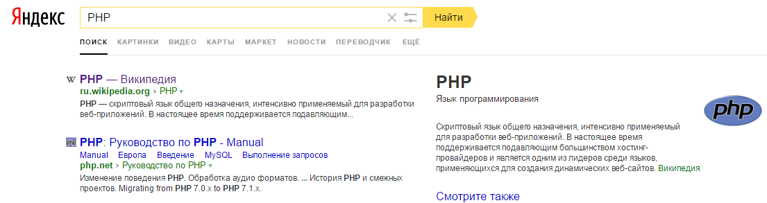
Таким образом, мы передали содержимое поля с именем text в параметр text на странице поиска в Яндексе.
Подписи к полям ввода
Чтобы привязать к полю ввода подпись используется тег <label> с атрибутом for, в котором указывается id инпута. Этот id, разумеется, нужно заранее добавить.
Вот как это будет выглядеть на примере.
Результат в браузере: 
Теперь если нажать на текст рядом с полем ввода, то курсор для ввода данных переключится на соответствующее поле
Создаём форму авторизации на HTML
Давайте создадим самую простую форму для авторизации на сайте. Для этого нам необходимы два поля. Первое поле – для логина, второе – для пароля.
Результат в браузере: 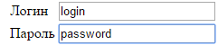
Со вторым полем не все в порядке. Поскольку на текущий момент оно представляет собой просто поле для ввода текста, вводимый пароль отображается на экране монитора. Не секьюрно! К счастью, специально для паролей для инпута есть тип password.
В итоге код нашей формы получится следующим:
Результат в браузере: 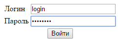
Вот и получилась наша формочка авторизации на HTML. Изи!
Тег textarea — многострочное поле ввода:
Для создания многострочного поля используется тег <textarea>. Этот тег является парным, в отличие от <input>. А ещё для управления его шириной и высотой можно управлять с помощью атрибутов cols и rows соответственно.
На примере выглядит вот так:
Результат в браузере: 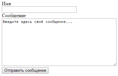
Чекбокс
Чекбокс создается тегом <input> с атрибутом type="checkbox". Если чекбокс на форме отмечен, то на бэкенд уйдет переменная с именем инпута, а иначе — нет. Чтобы чекбокс на форме был отмечен по умолчанию, то нужно добавить атрибут checked. Выглядеть это будет вот так:

Радиобаттон
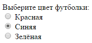
Радиобаттон создается тегом <input> с атрибутом type="radio". Он служит для выбора одного варианта из нескольких. Все варианты должны иметь одинаковый атрибут name и разные атрибуты value. Значение атрибута value отмеченного радиобаттона будет отправлено на бэкенд.
Форма для загрузки файлов
Чтобы создать форму для загрузки файлов, использутеся тег <input> с типом file. При этом самой форме нужно прописать атрибут enctype="multipart/form-data":
А вот так будет выглядеть наше получившееся поле: 
How to create your first login page with HTML, CSS and JavaScript

The beginning of the journey in (front-end) web development can be daunting. The markup is really weird at first. CSS some times makes your page beautiful, other times you have no idea why a single property turned your page into a mess. And in case this is your first time working with a programming language, JavaScript might be the most daunting of the three.
But, when you finally have a grasp of HTML, CSS and JavaScript, what do you do with them? Practice. Think of something you want to do with your newfound knowledge, it doesn’t matter if it’s “useful”, it doesn’t matter how complex it is. Just do something that helps you get better at HTML, CSS and JavaScript. And please, never forget the value of building dumb sh*t 🙂
Today, as you have already found out from the title, I will be walking you through the creation of a login page using HTML, CSS and JavaScript. But don’t worry. Again, as the title says, this is your first login page, which means the code is as simple as possible and there will be an explanation to accompany each piece of code.
Before jumping to the code though, let me show you what we will be creating:
As you can see, the page contains a title, a login form (for username and password) and a login button that “submits” the input data. Note that I used quotation marks around the submission because there’s no actual submission. Neither the username nor the password are sent to a server to be validated. Instead, when the user clicks the login button we validate that the username is “user” and the password is “web_dev” using JavaScript. If they match, then an alert dialog is shown and the page is reloaded (for the sake of simplicity); otherwise, we display an error message.
Now that you’re more familiar with the end result, let’s move on to the code.
HTML
We’ll start with the HTML, as it is the one responsible for the information displayed in the page. In other words, first we will write and structure all the information contained in the page without worrying for style (CSS) or interactivity (JavaScript). Analyse the complete HTML file for as long as you want and when you’re ready move on to the explanation.
As usual in HTML files, we have two parts: the <head> and the <body> . The former includes metainformation about our web page, like the character encoding used, the title of the page (the name you see in the tab of your browser) and references to the CSS and JavaScript files which this HTML file will make use of. Due note that there’s a defer attribute in the <script> tag so that the JavaScript script is only executed after the HTML is fully loaded.
In the <body> , we include all the information that will be visible in our page. We use a <main> element to wrap all the content of the page instead of a simple <div> . While <main> and the other semantic elements are functionally the same as <div> s in the sense that they wrap other elements, the former provide the browser more information about the contents of web pages and facilitate the work of tools like screen readers, which are essential to make the web more accessible.
Inside the <main> element, that is, the white rectangle, we have all the information seen on the screen: the “Login” title as an <h1> element, a <div> that’s just setting the space needed for the error message ( <p> ) and lastly, the login form, <form> . This form is made up of three <input> elements: a text field for the username, a password field for the password and the respective form submission button. Using a password as the type of the second field is important so that when the user types its password it shows dots instead of the actual password. Also, note the placeholder attribute. The value you give that attribute is then shown as, you guessed it, the placeholder text of your form fields.
By the way, if you’re wondering why the <input> elements are not closed, it’s because they don’t need closing tags ( </input> or something among those lines). It’s what we call self-closing tags.
Of course, we make plenty use of ids and classes to facilitate our work with CSS. The ids allow us to select HTML elements unambiguously, that is, each id represents a single element of our file. On the other hand, classes are used when we have a set of CSS styles that we want to repeat for multiple elements. We’ll see the practical use of these ids and classes next.
Now we have the CSS, in other words, the style of our page. To modify each element in our HTML file, we can select them using ids, classes or the tag names themselves, though the last option is discouraged. You see, the styles of more specific CSS selectors overwrite the styles of less specific ones. For example, the styles of an id selector overwrite those of a class selector, and class selector styles overwrite those of a tag name selector. In other words, always make your CSS selectors as specific as possible to affect only the elements you want to be affected.
And don’t forget, while tag name selectors just need the name of the tags, id selectors start with the pound sign ( # ) and class selectors start with a dot ( . ). If an element has an id “test-id”, then it can be selected in the CSS by its id using #test-id . If an element has a class “test-class”, then it can be identified as .test-class .
With that said, you can still use tag name selectors. For instance, look at the beginning of the code gist. The <html> and the <body> tag names were used as selectors. Though, don’t forget that there’s only one of each of these two elements in a HTML file… In this case, we’ve used those first two rulesets (selector plus everything inside the brackets) to make page-wide modifications. Setting the <html> and <body> height to 100% makes the page use all of the screen and setting the <body> margin to 0 removes any vertical scroll that might appear because of default styles of this element.
Still on the <body> , we make it use a grid display to center its contents vertically and horizontally (with align-items and justify-items , respectively). In other words, it takes the contents of the <body> , which are just the <main> element, and positions <main> and its contents in the dead center of the screen. This is called CSS grid layout and if you’re not familiar with it, I’ve written a quick introductory article about it here in case you want to learn more.
We’ll use only the most simple grid layout use cases, that is, to make an element use grid display and then position its contents accordingly, but I do recommend looking into the Grid Layout when you can. It’s a simple but powerful tool to position elements in your pages.
For <main> , known by its id main-holder (line 15 of the above code gist), we adjust its size and play around with its style to make it stand out from the dark background. We also turn <main> into a grid to facilitate the positioning of its contents which are just three elements: a <h1> , a <div> and a <form> . Thus, by default the CSS makes this a three-row grid, one for each of the elements. In other words, think of the white rectangle as a three-row grid.
The first row of the grid, the title, stays as is. The only modification it gets is being centered, as a consequence of the contents of main-holder being centered.
The second row on the other hand does get some modifications (lines 26 through 49), as we need to modify both the row itself which contains the error message and then the error message itself. We use the grid layout once again to center the message inside the second row and make the <div> take up all of the available space in its row (remember, by default a <div> is the same size as the elements it contains, so to make it bigger you need to specify its height and/or width).
For the error message, we just play around with its size and styles. Due note that initially its opacity is set to 0, that is, it is not visible. This value will be changed using JavaScript when the user enters invalid credentials.
We also change the display of half of the text in the error message. If you look back at the message element in the HTML, we have:
Notice that <span> element that wraps half of the text. <span> is quite useful when you want to style only part of the text in an element. Because we want the error message to be split in two lines of text, “Invalid username” and “and/or password”, we make the second half show as a new line of text by setting that <span> ‘s display to block ( #error-msg-second-line
Now we only need to go through the <form> ’s rulesets, the third row of the <main> grid, to wrap up the CSS (line 71 until the end). We start by using the grid layout one last time to turn the <form> into a grid. Though, we also make use of another grid property in its ruleset, #login-form . Since the <form> is a grid item of the <main> element grid container, we can tell it how that grid item should be positioned inside of its own row. Thus, we tell it to be vertically-aligned to the top of its row with align-self: flex-start . Nothing more, nothing less.
Then we style the form fields. Since we want both fields (username and password) to look the same, we create a single ruleset which selects the class given to both elements, login-form-field . Instead of selecting each individual element by its id only to repeat the CSS, we write the CSS once in a single class and then give that class to both elements.
For the style modifications, those were some slight changes to make these two <input> elements look better. To keep the placeholder text style in line with the <input> s’ style, we also change the colors of those placeholders with the ::placeholder pseudo-element. But, instead of making it general and writing ::placeholder <. >, we specify that we only want to change the placeholders of elements that have the class .login-form-field as such: .login-form-field::placeholder <. >. Again, try to make your CSS selectors as specific as possible.
Lastly, we change the style of the login button to make it look better. Nothing new here, except for cursor: pointer which changes the cursor into a pointer when hovering over the button.
Okay, we got through the HTML and we just finished the CSS. Now we are in the home stretch with JavaScript.
JavaScript
For starters, we get all the elements that we’ll need to work with using JavaScript: the login form, the login button and the login error message. We do it by calling the method document.getElementById , passing it the id of the element we are looking for. Also, since the values of those three variables will not change, that is, the variables will always refer to the exact same elements, then we declare all three as const .
After that we create an event listener for the login button, of type click . In other words, every time the login button is clicked, the function defined after "click", will be executed. The function receives a parameter that we call e , which is a mouse event that represents the click of the button (naming it e is just a convention of sorts, call it whatever you prefer).
Inside the function, we start by preventing the default behavior of clicking the login button (which is to submit the form data). In this demonstration we don’t want to submit the data, we only want to validate it using JavaScript, hence the e.preventDefault() to prevent the submission.
Then, we grab the values input by the user in the username and password form fields, respectively. We can take advantage of the JavaScript syntax to select a field of the loginForm form as formElement.nameOfField , where formElement is your HTML <form> and nameOfField is the value given to the name attribute of the <input> element you’re looking for. To get the value of the selected field, just add .value . For example, if the user typed “user01” in the username field, then we’ll get that value with loginForm.username.value . Pretty neat, right?
Now the finishing touches. Whenever the user clicks the login button we retrieve whatever values have been typed in the form fields. But we need to do something with those credentials. Then, we’ll write an if/else block to execute a chunk of code if the login credentials are valid or another chunk if they are invalid. We also need a condition, right? Let’s make that condition the actual validation of the credentials. For the sake of simplicity, that validation will check if the typed username is “user” and the password is “web_dev”. In JavaScript syntax, this translates to
where && is the AND operator that specifies we need both the username to be equal to “user” and the password to be equal to “web_dev”.
If the credentials are indeed valid, then we display an alert dialog with the message that the user has logged in with sucess and next reload the page (again, just for the sake of simplicity). But if either the username or the password are not valid, then we change the opacity property of the login error message ( loginErrorMsg ) to make it visible and let the user know their credentials are invalid. We can make this CSS change within JavaScript by accessing the styles of loginErrorMsg ( loginErroMsg.styles ) and then the opacity property ( loginErrorMsg.styles.opacity ) to set it to the value we want. Setting it to 1 means the error message will be fully opaque.
And… that’s it. We’ve reached the end of this explanation and now you have a fully functional login page created with HTML, CSS and JavaScript. I think this is a great idea for the early stages of learning front-end web development as it can be easily improved upon by adding animations, changing the design of the page or making the validation server-side when you learn a back-end language like Node.js, Java, PHP, etc.
I hope this article has been helpful for you and by all means let me know your feedback 🙂