Шапка сайта и навигационное меню с помощью CSS
Просматривал видеокурс по блочной верстке сайта от Андрей Морковина.
Начал смотреть с чувством, что вот — сейчас научусь чему-то новому. Но терпения хватило досмотреть до девятой части. Устал наблюдать мучения автора по верстке шаблона, и в частности, то, как создавалась шапка.
Автор зачем-то вырезал только часть фона с навигацией, вставлял изображение логотипа в html-каркас и обертывал его ссылкой, пытался угадать местоположение навигации с помощью абсолютного или относительного позиционирования. Я решил сам попробовать сделать шапку сайта так, как мне кажется более правильным.
В основу создания шапки я положил свойство вложенных слоев на ‘ах. Кстати, с этим методом я только недавно познакомился в другом видеоуроке от Дмитрия Семенова. Далее, предполагается, что размеры всех фоновых изображений известны (на практике так и происходит, при вырезании их из psd-макета).
Для чистоты эксперимента приведу эти размеры: , , . В CSS-свойствах сделал для них подстановку с помощью фоновой заливки цветом, для подстраховки.
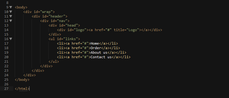
Итак, что я буду делать. Первый шаг стандартный. Создается обертка с помощью слоя , которой прописываются свойства центрирования страницы и задания ей ширины:
Затем создается слой , в котором будет располагаться шапка будущего сайта. Для нее прописываю совсем короткие свойства, с помощью которых гарантированно растягиваю шапку на всю ширину блока-родителя и задаю ее высоту:
Затем создаю слой , задача которого будет содержать в себе фоновое изображение для навигационного списка шапки. Высоту этого слоя устанавливаю равной высоте шапки, а сам фоновый рисунок позиционирую в правом углу блока. Высота его равна высоте шапки, поэтому достаточно сметить его по-горизонтали вправо, а по-вертикали оставляю как есть.
Рисунок короткий и будет занимать не всю ширину шапки, а только некоторую ее правую часть, как раз ровно настолько, чтобы вместить в себя навигационный список. CSS-код для этого слоя представлен ниже:
Теперь создаю еще один слой , в котором будет размещено еще одно фоновое изображение. По высоте оно меньше, чем фоновое изображение слоя и будет располагаться поверх этого слоя, перекрывая его.
Поэтому фон слоя будет видет только частично, лишь его нижний краешек, для которого и отводится роль фона навигации. Для слоя явно задаю его высоту. Код со свойствами приведен ниже:
Ну вот, задача практически и решена. При этом не было использовано ни абсолютного, ни относительного позиционирования. только смещение фона слоя. Осталось создать последний слой, который будет выполнять задачу логотипа сайта. Размещаю его поверх всех остальных слоев и делаю кликабельным на все его пространство.
При этом снова воспользуюсь фоновым изображение, которое вложу внутрь этого слоя. Никаких img в html-коде! Позиционировать или смещать его никуда не надо, так как он по-умолчанию расположится в левом верхнем углу блока (как мною задумано для простоты эксперимента). Только явно задам этому слою высоту и ширину, равную высоте и ширине фонового рисунка:
Чтобы сделать слой кликабельным, помещаю внутрь него ссылку. Так как изначально она является строчным элементом ( ), то ей невозможно задать правила, чтобы “растянуть” на всю высоту и ширину слоя-родителя .
Поэтому “превращаю” ссылку в блочный элемент с помощью свойства . А вот теперь растяну ссылку, задав для нее ширину и высоту в процентах. Конечно, можно указать эти параметры и с помощью пикселей, так как размеры логотипа известны. Но лучше возложить эту задачу на плечи браузера — пусть сам вычисляет размеры блока-ссылки:
Осталось создать навигационное меню шапки, которое должно располагаться поверх слоя . Создаю ненумерованный список, который помещаю внутрь слоя . Так как по коду слой расположен выше и имеет фиксированную высоту, то список займет все оставшееся пространство под ним: .
Теперь достаточно сместить список вправо с помощью и прописать для него обычные свойства, чтобы расположить горизонтально и стилизовать:
Единственный момент, который вызвал у меня затруднения, это появившиеся еле заметные отступы между внешним блоком и внутренним элементом(ами) . Первоначально для них я прописал свойство .
Но после “наводки” Kray Storm с форума проблема была решена. Для элементов и я поменял свойство на и для я дополнительно задал высоту строки , равную высоте блока . Зазоры пропали и пункты меню растянулись на всю высоту блока-родителя.
Все, шапка сайта готова. Если посмотреть на html-код, то видно, что он “правильный”. То есть, он не замусорен всякими . Разметка выполнена простыми свойствами CSS, который будут гарантировано работать почти во всех браузерах. При этом она никуда не “съедет”.
Ниже приведу полный код html-каркаса и CSS-кода.
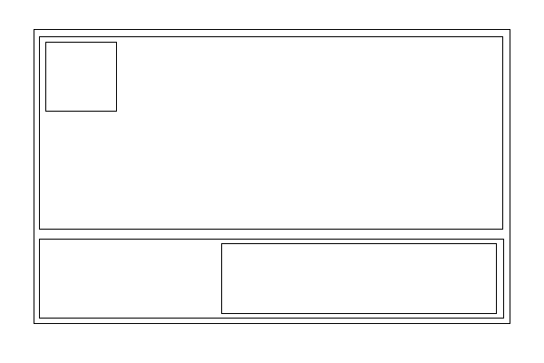
Здесь я представлю нарисованную мною схему расположения всех блоков в шапке сайта:
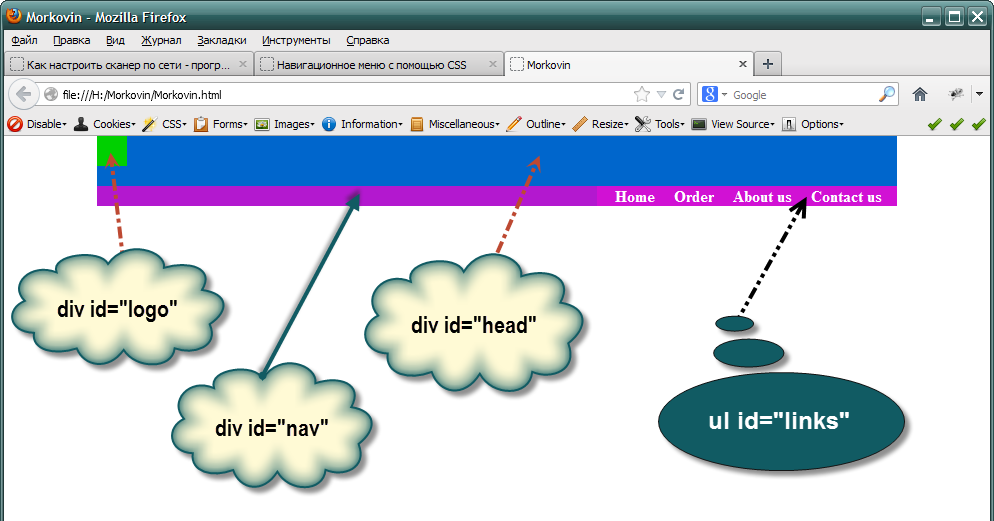
И, наконец, результат всего — готовая шапка сайта:
Красивая функция trackBy
Пример красивой функции trackBy для Angular. Функция понравилась своей лаконичностью:<% highlight typescript %>public trackByNumber = (_. … Continue reading
Шапка сайта в css – как ее сделать
От автора: приветствуем вас на нашем блоге о сайтостроении. У любого сайта есть то, чем он обычно запоминается и выделяется среди остальных. Обычно это именно шапка сайта. CSS позволяет сделать ее такой, как вам нужно.
Шапка сайта – какой она бывает
Поразительно, как много может зависеть сегодня от одного только дизайна веб-ресурса. Но что особенно сильно отделяет веб-ресурс от других? Как правило, это именно шапка сайта с фирменным логотипом и уникальным оформлением. Обычно именно по ней люди запоминают какой-то интернет-проект. Это очень хорошо запоминается в памяти людей.
Например, если вы видите белую букву “В” на синем фоне, то наверняка сразу делаете вывод – это иконка социальной сети Вконтакте. А изображение почтового голубя у всех сразу же ассоциируется с Twitter. Все это стало возможным потому, что в шапках у этих сайтов были именно такие изображения и они очень хорошо запомнились людям.
Так, это было немного размышлений, теперь давайте перейдем непосредственно к технической части.
Как в CSS можно оформить шапку сайта?
Вообще шапки бывают разными. По ширине их можно разделить на две группы: выровненные по центру и те, что на всю ширину веб-страницы.

Профессия Frontend-разработчик PRO
Готовим Frontend-разработчиков с нуля
На курсе вы научитесь создавать интерфейсы веб-сервисов с помощью языков программирования и дополнительных технологий. Сможете разрабатывать планировщики задач, мессенджеры, интернет-магазины…
Раньше шапку делали также, как и любой другой блок – обычному тегу div давали нужный идентификатор, после чего в него попадало все нужное содержимое, а потом все это оформлялось. Сегодня же уже принято верстать по-другому. Специально для создания шапки сайта в HTML5 появился парный тег – header. Его использование приветствуется, это позволяет браузерам понимать, что это за часть шаблона и за что она отвечает. Кстати, если вы хотите изучить основы HTML5, то вам прямая дорога в наш премиум-раздел, где вы можете посмотреть уроки по этой технологии.
Поэтому, для создания простейшей шапки достаточно написать в html вот такой код:
HTML/CSS tutorial for non-designers to design headers
In this article, I’ll show you how to create a beautiful header when you use the custom HTML mode in Serenytics. This mode gives you full control over what appears in your header. This tutorial will explain you the required HTML/CSS basics to create your own dashboard headers. It is mostly intended to data engineers, data scientists or business intelligence experts.
The most efficient way to follow this tutorial is to copy/paste the given snippets into a Serenytics dashboard. You’ll be able to quickly modify the code to better understand how it works.
A very simple first example
We’ll start with a first example showing a centered title with a border on a simple background. Here is the html code to copy/paste in the custom HTML input field in Serenytics:
The only tricky line is margin: 0 auto. It is used to center the child div in its parent div.
Using a gradient background
In many cases, you will change the background color to be white. One issue with pure white is that the dashboards tabs are often also white. This leads to a poor design. A easy trick is to use a vertical gradient from white to a light grey as background:
Of course, you are not limited to such simple gradient. As creating your own gradients is not so easy, you can pick good ones on websites such as https://webgradients.com/.
Here is an example using:
background-image: linear-gradient(120deg, #f093fb 0%, #f5576c 100%);
Using a photo as background
Using photos is always complicated as you need to find one that you are allowed to use, it should fit with your content (e.g. be blurred at the position of the title) and it should fit with the design of your dashboard.
I usually use pictures from www.pexels.com corresponding to the keyword texture. Here is an example:
This gives this output:
Using a pattern as background
An alternative to a photo is to repeat a SVG pattern in the background. The easiest option is to pick a pattern from http://www.heropatterns.com/. For your favourite pattern, copy the provided CSS and paste it in a class in the Serenytics CSS editor of your dashboard (in Advanced Styles Editor). And then apply this class to your header background.
Here is an example of a CSS we selected from http://www.heropatterns.com/:
And the custom HTML code we use:
The only changes compared to a simple title header are:
- we applied the class levels-pattern to the parent div.
- we changed background color and color of the child div to create a contrast with the white background.
A 3-column layout
So far, the layout we used is composed of a single centered div. But in many cases, we want 3 columns, vertically aligned and we want the middle one to be centered. This is not so easy to achieve. In this example, we’ll do it with the flex approach (the easiest one, but it may not work on old browsers). If you want to know more about flex, here is a good tutorial: https://css-tricks.com/snippets/css/a-guide-to-flexbox/
The html we use is:
This gives the following output:
What’s important here is that the “main title” block is well centered. This is achieved by the following lines:
In the parent div:
- display: flex. Use flex for this div.
- align-items: center. Center child divs along the vertical direction.
In the middle child div:
- width: 50%. This div will occupy 50% of the parent div.
- flex: 0 0 auto. This div will use the specified width (i.e. 50% of the parent div).
In the first and last child div:
- flex:1. This div will adapt its width to fit the parent div and both divs using it will have the same width.
One issue with this code is that the left and right div backgrounds span the full div. Said another way: there is no empty space between the middle div and the right/left div. To be able to tune these two divs precisely, we have to add another level of divs inside them:
This leads to a middle div which is still centered, and two side divs which span only the required width:
In this version, the left/right children have another div level, with the option display: inline-block. This is used to specify that the div size adapts to the content and don’t span the parent full width.
Here is an example using this layout and a SVG pattern as background:
Conclusion
In this article, we’ve explained the HTML/CSS code for a few header examples. You can use them as a starting point for your first projects. And they are simple enough to be modified to create your own custom headers.
CSS Header: A Complete Guide To Crafting Great Headers using CSS
Hey there! Welcome to our guide on CSS header. Here, we’ll look at the different types of headers and how to use them. We’ll also review some features and techniques to make your headers look professional and excellent. Whether you’re new to web development or an experienced coder, this guide has something for everyone. After reading this guide, you’ll have all the skills you need to design amazing headers for your website – so let’s get started!
Table Of Contents
What is CSS Header?
In CSS (Cascading Style Sheets), a header is a block of content at the top of a webpage that usually contains a logo, navigation links, and possibly other elements such as search fields or social media icons. The header is typically the first thing visitors see when they arrive at a webpage, and it usually spans the entire page width.
It is often styled differently than the rest of the page to set it apart and draw the visitor’s attention visually. You can use CSS to customize the appearance of your webpage’s header, including its font, color, size, background, and other design elements.
Different websites use different headers to capture their audience’s attention. Here are some CSS header examples:
As you can see, all of the websites listed above have unique header designs with different menus.
Now that we know what CSS headers are and what they contain let’s take a closer look at how to create them.
Components Of CSS Header Properties:
Headers are made up of different types of content like text, tags, logos, images, social media icons, etc., as seen from the examples in the last section. Here are some of the most important aspects of a CSS header:
Header Tag:
In HTML, the <header> tag is used to define the header of a web page or section of a web page. The <header> tag is typically used to contain the site logo, navigation, and other elements such as the page or section title and author information. The <header> tag can be used as a container for these elements and can be styled using Cascading Style Sheets (CSS).
Here is an example of the <header> tag in HTML:
This example shows an <header> element that contains a logo, a navigation menu, and a page title. The <header> element and its contents can be styled using CSS to control the layout and appearance of the header.
Heading Tags:
Heading tags are HTML tags used to create headings and subheadings in an HTML document. They range from <h1> to <h6>, with <h1> being the most important and <h6> being the least important. Headings help organize and structure the content on a webpage and make it easier for users to understand the information hierarchy.
They also help users with assistive technologies, such as screen readers, navigate and understand the content on a webpage.
Here is an example of how you might use heading tags in an HTML document:
HTML:
CSS:
Output:
In this example, the main heading rendered a large, bold font, the subheading would be slightly smaller and less bold, and the sub-subheading would be even smaller and less bold.
Paragraph Tag:
The paragraph tag, <p>, is an HTML element used to define a paragraph of text. It is used to enclose a block of text within an HTML document and apply a set of styles to the text. Here is an example of how you might use the paragraph tag in an HTML document:
<p>This is a paragraph of text. It is enclosed within paragraph tags and can contain text, links, images, and other HTML elements.</p>
<p>This is a paragraph of text. It is enclosed within paragraph tags and can contain text, links, images, and other HTML elements.</p>
When rendered by a web browser, the text within the paragraph tags will be displayed as a block of text with the default styles, such as font size and font family. The paragraph tag is often used with other HTML tags, such as heading tags, to create a well-structured and easy-to-read document.
Header Background:
A header background is a design element that appears behind the content of a header, which is typically the top section of a webpage. The header background can be a solid color, a gradient color, an image, or a combination.
To set the header background in HTML, you can use the style attribute and the background property. Here is an example of how you might set the header background of the header:
Example 1: Styling the background color as dark blue
Output:
Example 2: Adding Gradient color in the background. If the gradient color seems complex you can use this website to generate the gradient code: cssgradient.io
Output:
Example 3: Adding an image in the background
Output:
These examples are most commonly used in the CSS header. Still, in modern web design, developers use more complex designs that include animation, video, image sliders, interactive elements, and more.
Navbar:
A navbar, or navigation bar, is a user interface element that contains links to the main sections of a website or application. Navbars are typically displayed at the top of a page or screen, allowing users to quickly access different pages or content within a website or app.
Components in navbar
Several components are commonly found in a navbar:
- Logo: As I mentioned earlier, a logo is often included in the navbar as a way to establish the branding and identity of the website or app.
- Links: The primary purpose of a navbar is to provide access to different pages or content within a website or app, so it typically includes a set of links that allow users to navigate to other sections of the site.
- Search bar: Some navbars include a search bar that allows users to search for specific content within the website or app.
- Button: Navbars may also include a button that allows users to perform a specific action, such as signing up for a newsletter or logging in to an account.
Overall, navbars are an essential component of many websites and applications because they allow users to easily navigate and access the different pages and content.
Here is an example of how you might add a navbar in your header:
HTML:
CSS:
Output:
Sticky navbar:
A sticky navbar is a navigation bar that remains fixed to the top of the screen as the user scrolls down the page. This can be helpful because it allows users to access the navigation menu at all times without having to scroll back up to the top of the page.
To create a sticky navbar using CSS, you can use the position: sticky property in the navbar’s styling rule.
Call to Action:
A call to action (CTA) is a message or button that prompts the user to take a specific action, such as signing up for a newsletter, purchasing a product, or downloading an app.
A CTA can effectively engage users and guide them toward a specific goal in the header context. By prominently displaying a CTA in the header, you can make it more visible to users and increase the likelihood that they will take the desired action.
Call to Action Example
For example, if your website sells a product, you might include a CTA in the header that says “Buy Now” or “Add to Cart.” This makes it easy for users to quickly purchase the product without searching for the appropriate link elsewhere on the site.
Here is an example of how you might add a call to action:
Social Media Icons:
Adding social media icons to a header is a common practice because it provides users an easy way to connect with the company or brand on social media platforms.
By including social media icons in the header, users can quickly and easily access the company’s social media profiles, which can help to increase the brand’s online presence and engagement. This can be especially important for businesses that rely on social media to connect with customers and promote their products or services.
You can add icons to your header in many ways, but the most popular and common practice is to use Font Awesome.
To use an icon from Font Awesome, you will need to include the Font Awesome library in your project by linking to the hosted version on the Font Awesome website or downloading and hosting the files locally.
Once you have the library installed, you can use an icon by placing the icon element inside your HTML code and setting the class name to “fa fa-ICONNAME”, where “ICONNAME” is the title of the icon you need to use.
Social Media Icons Example
For example, to use the “search” icon, you would use the following code:
Responsive web design:
Responsive web design is a design approach that aims to make web pages look good on all devices (desktops, tablets, and phones). It involves using CSS media queries and flexible layouts to adjust the design of a website to the size of the device’s screen. This helps ensure that users have a consistent, positive experience no matter what device they use to access the website.
According to Oberlo, as of 2022, 59.4% of all website traffic worldwide was generated through mobile phones. This number has been steadily increasing in recent years, and it’s clear that websites need to be designed with mobile devices in mind.
How to Create a Responsive Web Design?
You must combine HTML, CSS, and JavaScript to create a responsive web design. Here are the steps you can follow to create a responsive web design:
- Determine the purpose and content of your website. This will help you decide on the layout and design best suits your needs.
- Choose a layout. Many different layout options exist, including fixed, fluid, and hybrid layouts.
- Use CSS media queries to specify the design adjustments that should be made for different screen sizes. Media queries allow you to apply different styles to your website based on the width of the device’s screen.
- Test your website on multiple devices to ensure that it looks and functions correctly on all of them.
- Optimize your website for mobile devices. This may include compressing and using responsive images to ensure the website loads quickly on mobile devices.
- Optimize the navigation bar using the hamburger menu.
- Regularly test and update your website to ensure it continues functioning correctly on all devices.
To learn more about how to make your website responsive, check out the w3school for in-depth details.
In addition, Google recommends responsive web design as its preferred mobile configuration, making it easier for Google’s algorithms to crawl and index a website’s content. This can positively impact the search engine rankings of a website.
Useful tips for styling header texts:
Here are a few more tips for styling header texts:
- Use hierarchy to indicate the importance of different headers. You can do this by using different font sizes, weights, and styles for different levels of headings.
- Keep your headers concise and to the point. Avoid using long, wordy titles that are difficult to read.
- Use white space to make your headers more visually appealing. Adding extra room around your headers makes them stand out and draw the reader’s attention.
- Experiment with different font combinations to find the right look for your website. You can use tools like Google Fonts to explore other font options and see how they look together.
- Test your headers on different devices to ensure they are legible and look good on all screen sizes.
Conclusion:
Finally, this guide has given you a thorough understanding of how to construct and style headers with CSS. We’ve gone over the many sorts of headers and their applications, as well as the characteristics and strategies used to style them. You are now armed with the information and abilities obtained to develop professional-looking headers for your website that will improve the user experience. Thank you for taking the time to read!
Frequently Asked Questions:
How to write CSS for the h1 tag?
To write CSS for the h1 tag, you must use a selector that targets the h1 element. Here is an example of how you could do this:
How to edit the header in CSS?
To edit the header in CSS, you must use a selector that targets the header element. The header element is usually an HTML element containing the logo, navigation, and other elements common to the top of a website.
Here is an example of how you could edit the header using CSS:
Why is a header used?
A header is a text that appears at the top of a page or document. Headers give context to the page’s title or document or provide a summary of its contents. In some cases, headers can also be used for navigation between different pages or sections of a document.
Suggested Readings
Vyom Srivastava
Vyom is an enthusiastic full-time coder and also writes at [GeekyHumans]. With more than 5 years of experience, he has worked on many technologies like Apache Jmeter, Google Puppeteer, Selenium, etc. He also has experience in web development and has created a bunch of websites as a freelancer.
Like what you see?
Subscribe to get all our latest blogs, updates delivered directly to your inbox.