Способы создания прозрачных фонов
Вы хотите научиться создавать страницы с оригинальным и ярким современным дизайном? Применение полупрозрачных элементов способно помочь Вам в решении этой непростой задачи. Сегодня мы рассмотрим основные практические способы задания прозрачности структурных элементов.

Как задать прозрачность?
Если рассматривать данную тему сквозь призму исторического развития веб-технологий, то можно выделить следующие подходы:
- Свойство opacity.
- Использование PNG -картинки
- Формат системы RGBA
- Ну, и наконец, древность или клетчатые изображения.
CSS свойство Opacity
Применение стилевого CSS свойства оpacity позволяет задать прозрачность того элемента, к которому применяется. Значения, которые можно использовать в качестве аргумента изменяются в пределах от 0 до 1.
Рассмотрим пример.
В результате мы получили полупрозрачный блок:
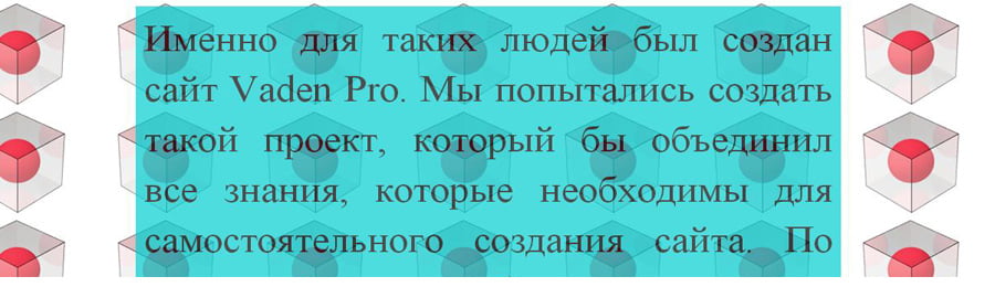
- Opacity принимает значения из диапазона: 0 (полная прозрачность) — 1 (непрозрачность).
- Кросс-браузерность. В IE до седьмой версии включительно Opacity не поддерживается. Добиться одинакового отображения элемента поможет следующая строчка:
Стоит принимать во внимание то, что свойство filter отсутствует в html спецификациях, изменяет значения от 1 до 100 и может применяться только к элементам:
- с абсолютным позиционированием (position: absolute)
- с фиксированным линейным размером (height или width).
Для лучшего понимания материала последнего пункта, в предыдущем примере зададим тексту белый цвет
и рассмотрим его под микроскопом:

Как видим, контент нашего блока (текст) тоже стал полупрозрачным. Но что делать, если на практике прозрачность содержимого вас не интересует, а интересует лишь прозрачность фона? В таком случае, переходим к следующему пункту.
Использование PNG -картинки
Интересной особенностью формата PNG является то, что он имеет 256 уровней прозрачности. Думаю, Вы уловили ход мыслей, и наверняка уже построили алгоритм работы такого подхода. Мне остается только его озвучить.
-
Создаем в Photoshop, однотонную полупрозрачную картинку (назовем ее transparent) и сохраняем в формате png.
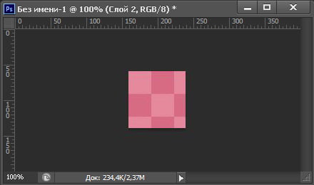
В результате мы получили блок с прозрачным фоном и непрозрачным содержимым:

- В отличии от свойства opacity прозрачность задается только для фона
- Кросс-браузерность. Работает почти во всех браузерах, и это плюс. Но прозрачность PNG не поддерживается в IE6. Если вы оптимизируете свой сайт под такую древность — придется применять другие методы или скрипты.
- При отключении отображения картинок, ваш фон пропадет (учтите этот момент при оптимизации отображения на мобильных устройствах, ведь безлимитный интернет не всегда есть под рукою).
- Для изменения цвета и/или степени прозрачности вам нужно создать новую картинку и перезалить ее на серв.
Формат системы RGBA
Одним из самых современных методов изменения транспарантности фона является применение системы RGBA.
RGBA – система представления цвета при помощи трех стандартных каналов RGB (красный, зеленый, синий), и четвертого, так называемого Alpha-канала, характеризующего степень прозрачности.
В уже известном нам примере, заменим содержимое в CSS файле на следующее:

- В отличии от свойства opacity прозрачность задается только фону
- В отличии от метода PNG картинки, для изменения цвета или степени транспарентности нам нужно просто поменять значения rgba.
- Кросс-браузерность. Работает во всех современных браузерах (начиная с IE9, Op10, Fx3,Sf3.2).Для более старых браузеров придется либо пожертвовать прозрачностью, либо применять opacity, png методы.
Клетчатые изображения, или с уважением к истории
Этот метод стоял у истоков веб-дизайна, и видел старые-старые браузеры, которые ничего толком не умели. Он заключается в создании клетчатого фона, в котором цветные квадратики чередовались с прозрачными.
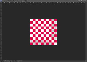
В результате применения такой картинки в качестве background получали псевдо-прозрачный фон.
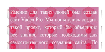
- При просмотре текста на таком фоне могут быстро уставать глаза (особенно давит рябь при прокрутке).
- В остальном особенности применения аналогичны с методом «PNG -картинки».
Подытожим?
Напоследок, несколько общих рекомендаций по использованию прозрачности в своих проектах:
Transparent Background – Image Opacity in CSS and HTML

Kolade Chris

Transparency plays an important role in front end development. It lets you choose how transparent the elements on your web pages appear.
You can adjust transparency in several ways – because of course, in CSS, there are multiple ways to do the same thing.
The CSS opacity property is the first way that might come to your mind to change transparency. But this property can’t come to the rescue all the time, especially when there is a background image with text in it that you want to make transparent.
So in this article, I’m going to show you the various ways you can adjust transparency so you can start implementing it in your coding projects.
Image Transparency with the CSS Opacity Property
To make an image transparent, you can use the CSS opacity property, as I mentioned above. The basic syntax of the opacity property is shown in the code snippet below:
The opacity property takes values from 0.0 to 1.0 , with 1 being the default value for all elements. The lower the value, the more transparent. So if an element is given an opacity of 0 , it would be invisible.
You can find examples of different opacity values in the code snippets below:
I have added some CSS to center everything on the page:

An opacity value of 1 is the default, so the image appears like this:
This code gives us 50% opacity, and you can see that the logo has faded a bit:

With an opacity of 0 , the image is 100% transparent, so it becomes invisible:

The only way to be sure the image is on the page is to inspect it with your browser devtools:
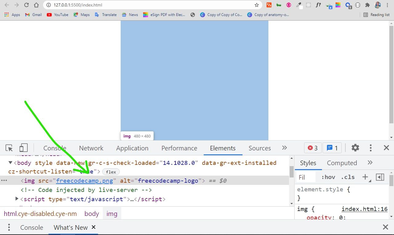
You can use this opacity value to do a lot of things – for example, you can use it to include text over a hero image on a website.
You might be wondering why you would want to make content invisible with an opacity value of 0. Well, it can be useful in animations, and in building HTM + CSS + JavaScript games as well.
You’ll definitely want to use CSS positioning to help you align things. I’ll discuss this in the next parts of the article.
Background Image Transparency in HTML and CSS
CSS offers a way to set the background image for a container element with the background-image property, so you don’t necessarily have to do it with the CSS. This means you can also place text in the container as well.
The downside of this approach is that the opacity is set for the container where the image and text are. So, the opacity affects the text as well, not only the image. This is probably not what you want!
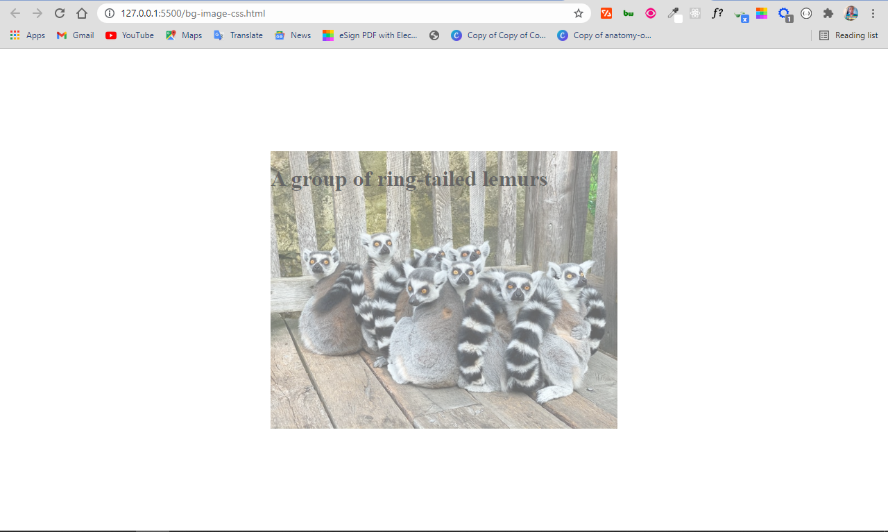
The solution
By default, when you apply an opacity to a container, the descendants inherit it as well.
A workaround in this situation is to set the background image in the HTML. This makes it easy to apply the opacity to the image only, instead of setting the background image for the container in the CSS.
This time around, the image and the text will be separated, so the text will not inherit the value set for the opacity .
This means you also have to use CSS positioning to align the text within the image.
In the CSS code snippet above, I use flexbox to center everything on the page.
The container div element with the class of showcase is positioned relative , so you can position the h1 text absolute within it. This will push the h1 text to the top-left corner of the image. The top and left properties are then used to push the text to the bottom-left corner of the image.
If you are wondering what the top and left properties are, they are the properties you get access to when you use the display property.
In addition to these two, you also get access to the right and bottom properties. They let you position an element anywhere.
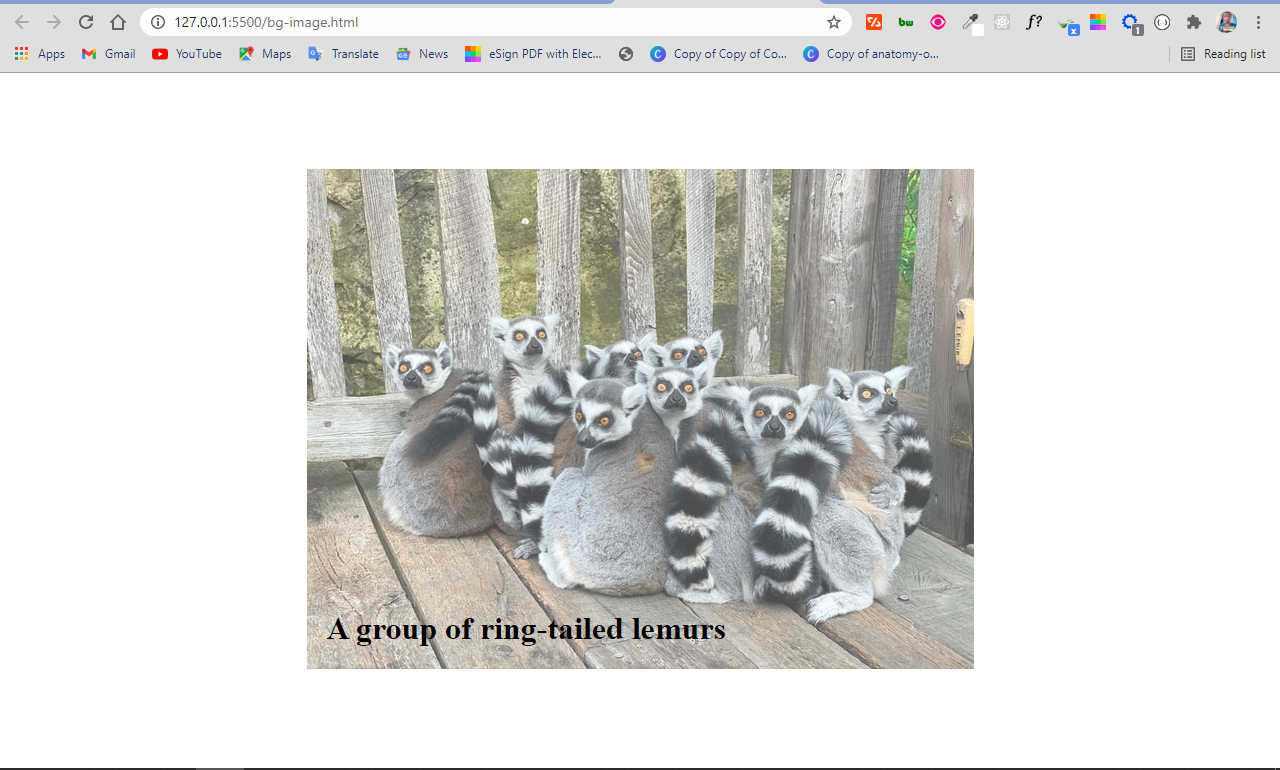
In the end, the image is opaque and the text is not affected:
Conclusion
In this article, you learned how to use the opacity property of CSS to make images transparent.
As CSS remains tricky and a bit weird, it’s helpful to combine the opacity property with other CSS features such as positioning in order to put it into proper use.
Apart from CSS positioning, you can also use the opacity property with CSS pseudo-elements such as ::before and ::after , which is sort of a hacky way of doing things.
Изменение прозрачности фонового изображения CSS

С CSS и CSS3 можно сделать много интересных вещей, но установка непрозрачного фона CSS не входит в их число. Однако существует очень много творческих подходов, которые могут помочь добиться эффекта изменения прозрачности фонового изображения CSS. Оба приведенных ниже метода имеют отличную поддержку браузеров вплоть до Internet Explorer 8.
Метод 1. Использование абсолютного позиционирования и изображения
Название этого метода описывает его содержание. Вы просто используете абсолютное позиционирование для нормального тега img и делаете его таким, как если бы вы использовали свойство CSS background-image . Для этого достаточно поместить изображение в контейнер position: relative; . Вот так обычно выглядит разметка HTML:
Вот так выглядит код CSS:
Здесь важно обеспечить абсолютное позиционирование изображения и растянуть его так, чтобы оно заполнило весь родительский контейнер. При этом важно относительное позиционирование всех элементов, чтобы вы могли установить индекс z-index , поднимающий их над изображением.
Ниже приведена демонстрация:
Hello World!

Метод 2. Использование псевдоэлементов CSS
Этот метод с первого взгляда выглядит простым, и я его определенно предпочитаю. Используя псевдоэлементы CSS :before или :after , вы устанавливаете div с фоновым изображением и задаете для него прозрачность. При этом разметка HTML будет выглядеть примерно так:
Вот так выглядит код CSS:
Здесь нам снова нужно переместить z-index содержимого (в данном случае <h1> ) над псевдоэлементом background, и мы должны явно определить position: absolute; и z-index: 1 на псевдоэлементе :before .
Остальные атрибуты псевдоэлемента располагают его так, чтобы он на 100% перекрывал родительский элемент, а также используют новое полезное свойство CSS: background-size: cover , которое определяет размер фона для покрытия элемента без изменения пропорций. Ниже приведена прекрасная демонстрация этого метода:
Hello World!
Thanks for learning with the DigitalOcean Community. Check out our offerings for compute, storage, networking, and managed databases.
CSS Background Opacity [duplicate]
I expected this to make the background have an opacity of 0.4 and the text to have 100% opacity. Instead they both have an opacity of 0.4.


8 Answers 8
Children inherit opacity. It’d be weird and inconvenient if they didn’t.
You can use a translucent PNG file for your background image, or use an RGBa (a for alpha) color for your background color.
Example, 50% faded black background:
You can use pseudo-elements ::before or ::after to get a semi-transparent background and you can do this with just one container. Use something like this:
Then apply some CSS:
Note: You might need to adjust the z-index values.
The following methods can be used to solve your problem:
CSS alpha transparency method (doesn’t work in Internet Explorer 8):
Use a transparent PNG image according to your choice as background.
Use the following CSS code snippet to create a cross-browser alpha-transparent background. Here is an example with #000000 @ 0.4% opacity
For more details regarding this technique, see this, which has an online CSS generator.

I would do something like this
It should work. This is assuming you are required to have a semi-transparent image BTW, and not a color (which you should just use rgba for). Also assumed is that you can’t just alter the opacity of the image beforehand in Photoshop.
You can use Sass’ transparentize .
I found it to be the most useful and plain to use.

This is because the inner div has 100% of the opacity of the div it is nested in (which has 40% opacity).
In order to circumvent it, there are a few things you could do.
You could create two separate divs like so:
Set your desired CSS opacity and other properties for the background and use the z-index property (z-index) to style and position the bContent div. With this you can place the div overtope of the background div without having it’s opacity mucked with.
Another option is to RGBa. This will allow you to nest your divs and still achieve div specific opacity.
The last option is to simply make a semi transparent .png image of the color you want in your desired image editor of choice, set the background-image property to the URL of the image and then you won’t have to worry about mucking about with the CSS and losing the capability and organization of a nested div structure.