Styling range input with CSS and JavaScript for better UX
To style the range input with CSS you’ll need to apply styles to two pseudo-elements: ::-webkit-slider-thumb and ::-webkit-slider-runnable-track . Find out how you can apply custom styling and make the range input more functional and appealing.
Contents of the article:
The input element with a type of range is a native HTML form UI element that allows users to select a value by dragging a slider over a range field.
The default browser styling for this element is very basic and doesn’t provide enough information to the user which might confuse one. Also, the appearance of the range input element is different across browsers.
Range input HTML:
Range input appearance on different browsers:
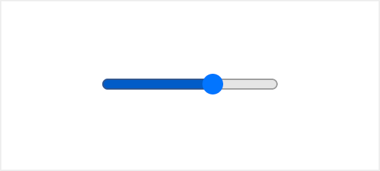 Chrome
  Edge
Edge  Firefox
  Safari
Luckily there are ways you can improve that using nothing but native CSS and JavaScript.
CSS selectors for the range input
The range input widget consists of two parts the thumb and the track. Each one of these parts has its own pseudo-class selector for styling with a vendor suffix for cross-browser support.
Thumb:
Track:
To indicate the selected value, we can add a color from the start of the track up until the thumb. To do that we can use the background-image property with the linear-gradient() value. The background-size property will be used to set the size, which can later be updated with JavaScript.
Improving usability
The default range input doesn’t specify any values selected. Which makes it hard for users to understand what value is currently selected.
While the hash marks and labels on the range input are a great way to aid users visually, this feature is yet to become available.
However, there are a few ways you can improve that with some additional HTML and JavaScript:
- Specify the output element to display the selected value
- Specify the number input that is synced to the range input
Specify the output element to display the selected value
The output element on the side of the range input will display the selected value. You’ll have to add an id attribute for the output element, and an oninput attribute for the range input with a short function as a value, that will update the output element contents.
Specify the number input that is synced to the range input
To take it a step further you can add a number input next to the range element.
That way the user will see the selected value and will have an option to modify it via the number input, which can be a better experience especially for mobile users.
A sprinkle of JavaScript
To finalize we’ll need some JavaScript code to make it all work. The oninput attribute is already updating value based on a target element.
But to update the selected area of the range input we need to calculate the ratio and apply that value to the input background-size property.
�� NOTE: the value property of the range input is a string type, if you want to use is as a numeric value you should use valueAsNumber property.
Double Range Slider | HTML, CSS, Javascript
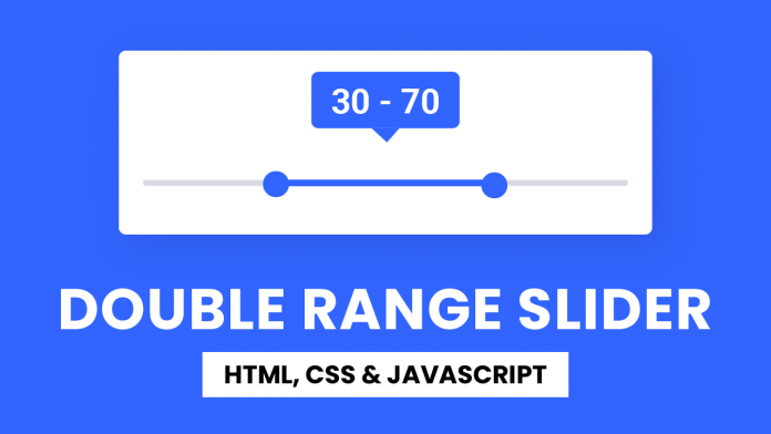
Hey everyone. Welcome to today’s tutorial. In this tutorial, we will learn how to create a double range slider. To build this slider, we need HTML, CSS and Javascript.
A typical slider consists of a slider track and a movable thumb. The user has to move the thumb horizontally across the slider to set the value. Unlike a typical slider, the double slider consists of two thumbs. In a double-range slider, the user can set two values.
This is an intermediate-level javascript project. If you are looking for more such projects to practice your javascript skills, you can check out this playlist here. This playlist consists of 100+ javascript projects.
The difficulty of these projects varies from simple to quite complex ones. Hence this playlist is suitable for all kinds of javascript learners, including javascript beginners to javascript experts.
Video Tutorial:
If you are interested to learn by watching a video tutorial rather than reading this blog post, you can check out the video below. Also do not forget to subscribe to my youtube channel, where I post new tips, tricks and tutorials regularly.
Project Folder Structure:
Before we start coding, let us take a look at the project folder structure. We create a project folder called- ‘Double Range Slider’. Inside this folder, we have three files. These files are – index.html, style.css and script.js. The first file is index.html which is our HTML document. Next, we have style.css which is the stylesheet. And finally, we have script.js which is the script file.
HTML:
We begin with the HTML code. First, copy the code below and paste it into your HTML document.
Our HTML code consists of two span elements to display the values. Followed by the span elements we have a container that wraps a div with the class name ‘slider-track’ and two range sliders.
CSS:
We use CSS to position and style these sliders. For this, copy the code below and paste it into your stylesheet.
Javascript:
We finally implement the functionality for our double range slider with javascript. For this once again copy the code provided to you below and paste it into your script file.
That’s all for this tutorial. If you face any issues while creating this code, you can download the source code by clicking on the ‘Download Code’ button below. Also, I would love to hear from you guys, so if you have any queries, suggestions, or feedback, you can comment below.
Happy Coding!
How TO — Range Sliders
Learn how to create custom range sliders with CSS and JavaScript.
Default:
Square:
Round:
Image:
Creating a Range Slider
Step 1) Add HTML:
Example
Step 2) Add CSS:
Example
.slidecontainer <
width: 100%; /* Width of the outside container */
>
/* The slider itself */
.slider <
-webkit-appearance: none; /* Override default CSS styles */
appearance: none;
width: 100%; /* Full-width */
height: 25px; /* Specified height */
background: #d3d3d3; /* Grey background */
outline: none; /* Remove outline */
opacity: 0.7; /* Set transparency (for mouse-over effects on hover) */
-webkit-transition: .2s; /* 0.2 seconds transition on hover */
transition: opacity .2s;
>
/* Mouse-over effects */
.slider:hover <
opacity: 1; /* Fully shown on mouse-over */
>
/* The slider handle (use -webkit- (Chrome, Opera, Safari, Edge) and -moz- (Firefox) to override default look) */
.slider::-webkit-slider-thumb <
-webkit-appearance: none; /* Override default look */
appearance: none;
width: 25px; /* Set a specific slider handle width */
height: 25px; /* Slider handle height */
background: #04AA6D; /* Green background */
cursor: pointer; /* Cursor on hover */
>
.slider::-moz-range-thumb <
width: 25px; /* Set a specific slider handle width */
height: 25px; /* Slider handle height */
background: #04AA6D; /* Green background */
cursor: pointer; /* Cursor on hover */
>
Step 3) Add JavaScript:
Create a dynamic range slider to display the current value, with JavaScript:
Example
var slider = document.getElementById("myRange");
var output = document.getElementById("demo");
output.innerHTML = slider.value; // Display the default slider value
// Update the current slider value (each time you drag the slider handle)
slider.oninput = function() <
output.innerHTML = this.value;
>
Round Slider
To create a round slider handle, use the border-radius property. Tip: Set the height of the slider to a different value than the slider thumbs if you want unequal heights (15px vs. 25px in this example):
Example
.slider <
-webkit-appearance: none;
width: 100%;
height: 15px;
border-radius: 5px;
background: #d3d3d3;
outline: none;
opacity: 0.7;
-webkit-transition: .2s;
transition: opacity .2s;
>
.slider::-webkit-slider-thumb <
-webkit-appearance: none;
appearance: none;
width: 25px;
height: 25px;
border-radius: 50%;
background: #04AA6D;
cursor: pointer;
>
.slider::-moz-range-thumb <
width: 25px;
height: 25px;
border-radius: 50%;
background: #04AA6D;
cursor: pointer;
>
Slider Icon/Image
To create a slider handle icon/image, use the background property and insert an image url:
<input type="range">
<input> elements of type range let the user specify a numeric value which must be no less than a given value, and no more than another given value. The precise value, however, is not considered important. This is typically represented using a slider or dial control rather than a text entry box like the number input type.
Because this kind of widget is imprecise, it should only be used if the control’s exact value isn’t important.
Try it
If the user’s browser doesn’t support type range , it will fall back and treat it as a text input.
Validation
There is no pattern validation available; however, the following forms of automatic validation are performed:
- If the value is set to something which can’t be converted into a valid floating-point number, validation fails because the input is suffering from a bad input.
- The value won’t be less than min . The default is 0.
- The value won’t be greater than max . The default is 100.
- The value will be a multiple of step . The default is 1.
Value
The value attribute contains a string which contains a string representation of the selected number. The value is never an empty string ( «» ). The default value is halfway between the specified minimum and maximum—unless the maximum is actually less than the minimum, in which case the default is set to the value of the min attribute. The algorithm for determining the default value is:
If an attempt is made to set the value lower than the minimum, it is set to the minimum. Similarly, an attempt to set the value higher than the maximum results in it being set to the maximum.
Additional attributes
In addition to the attributes shared by all <input> elements, range inputs offer the following attributes.
The value of the list attribute is the id of a <datalist> element located in the same document. The <datalist> provides a list of predefined values to suggest to the user for this input. Any values in the list that are not compatible with the type are not included in the suggested options. The values provided are suggestions, not requirements: users can select from this predefined list or provide a different value.
See the adding tick marks below for an example of how the options on a range are denoted in supported browsers.
The greatest value in the range of permitted values. If the value entered into the element exceeds this, the element fails constraint validation. If the value of the max attribute isn’t a number, then the element has no maximum value.
This value must be greater than or equal to the value of the min attribute. See the HTML max attribute.
The lowest value in the range of permitted values. If the value of the element is less than this, the element fails constraint validation. If a value is specified for min that isn’t a valid number, the input has no minimum value.
This value must be less than or equal to the value of the max attribute. See the HTML min attribute.
Note: If the min and max values are equal or the max value is lower than the min value the user will not be able to interact with the range.
The step attribute is a number that specifies the granularity that the value must adhere to. Only values that match the specified stepping interval ( min if specified, value otherwise, or an appropriate default value if neither of those is provided) are valid.
The step attribute can also be set to the any string value. This step value means that no stepping interval is implied and any value is allowed in the specified range (barring other constraints, such as min and max ). See the Setting step to the any value example for how this works in supported browsers.
Note: When the value entered by a user doesn’t adhere to the stepping configuration, the user agent may round off the value to the nearest valid value, preferring to round numbers up when there are two equally close options.
The default stepping value for range inputs is 1, allowing only integers to be entered, unless the stepping base is not an integer; for example, if you set min to -10 and value to 1.5, then a step of 1 will allow only values such as 1.5, 2.5, 3.5,… in the positive direction and -0.5, -1.5, -2.5,… in the negative direction. See the HTML step attribute.
Non-standard Attributes
orient
Similar to the -moz-orient non-standard CSS property impacting the <progress> and <meter> elements, the orient attribute defines the orientation of the range slider. Values include horizontal , meaning the range is rendered horizontally, and vertical , where the range is rendered vertically.
Note: The following input attributes do not apply to the input range: accept , alt , checked , dirname , formaction , formenctype , formmethod , formnovalidate , formtarget , height , maxlength , minlength , multiple , pattern , placeholder , readonly , required , size , and src . Any of these attributes, if included, will be ignored.
Examples
While the number type lets users enter a number with optional constraints forcing their value to be between a minimum and a maximum value, it does require that they enter a specific value. The range input type lets you ask the user for a value in cases where the user may not even care—or know—what the specific numeric value selected is.
A few examples of situations in which range inputs are commonly used:
- Audio controls such as volume and balance, or filter controls.
- Color configuration controls such as color channels, transparency, brightness, etc.
- Game configuration controls such as difficulty, visibility distance, world size, and so forth.
- Password length for a password manager’s generated passwords.
As a rule, if the user is more likely to be interested in the percentage of the distance between minimum and maximum values than the actual number itself, a range input is a great candidate. For example, in the case of a home stereo volume control, users typically think «set volume at halfway to maximum» instead of «set volume to 0.5».
Specifying the minimum and maximum
By default, the minimum is 0 and the maximum is 100. If that’s not what you want, you can easily specify different bounds by changing the values of the min and/or max attributes. These can be any floating-point value.
For example, to ask the user for a value between -10 and 10, you can use:
Setting the value’s granularity
By default, the granularity is 1, meaning the value is always an integer. To control the granularity, you can change the step attribute. For example, If you need a value to be halfway between 5 and 10, you should set the value of step to 0.5:
Setting the step attribute
Setting step to «any»
If you want to accept any value regardless of how many decimal places it extends to, you can specify a value of any for the step attribute:
JavaScript
This example lets the user select any value between 0 and π without any restriction on the fractional part of the value selected. JavaScript is used to show how the value changes as the user interacts with the range.
Adding tick marks
To add tick marks to a range control, include the list attribute, giving it the id of a <datalist> element which defines a series of tick marks on the control. Each point is represented using an <option> element with its value set to the range’s value at which a mark should be drawn.
Result
Using the same datalist for multiple range controls
To help you from repeating code you can reuse that same <datalist> for multiple <input type=»range»> elements, and other <input> types.
Note: If you also want to show the labels as in the example below then you would need a datalist for each range input.
Result
Adding labels
You can label tick marks by giving the <option> elements label attributes. However, the label content will not be displayed by default. You can use CSS to show the labels and to position them correctly. Here’s one way you could do this.
Result
Creating vertical range controls
By default, browsers render range inputs as sliders with the knob sliding left and right.
To create a vertical range, wherein the knob slides up and down, set the CSS appearance property to slider-vertical and include the non-standard orient attribute for Firefox.
Horizontal range control
Consider this range control:
This control is horizontal (at least on most if not all major browsers; others might vary).
Using the appearance property
The appearance property has a non-standard value of slider-vertical that, well, makes sliders vertical.
We use the same HTML as in the previous examples:
We target just the inputs with a type of range:
Using the orient attribute
In Firefox only, there is a non-standard orient property.
Use similar HTML as in the previous examples, we add the attribute with a value of vertical :
writing-mode: bt-lr
The writing-mode property should generally not be used to alter text direction for internationalization or localization purposes, but can be used for special effects.
We use the same HTML as in the previous examples:
We target just the inputs with a type of range, changing the writing mode from the default to bt-lr , or bottom-to-top and left-to-right:
Putting it all together
As each of the above examples works in different browsers, you can put all of them in a single example to make it work cross browser:
We keep the orient attribute with a value of vertical for Firefox:
We target just the input s with a type of range and orient set to vertical , changing the writing-mode from the default to bt-lr , or bottom-to-top and left-to-right, for pre-Blink versions of Edge, and add appearance: slider-vertical which is supported in Blink and Webkit browsers: