Using CSS background images
This article covers CSS backgrounds in detail: background color, image, repeat, attachment, and position. Near the end, it also looks at advanced techniques such as CSS sprites.
Introduction
Admit it! Since the first article in the Web Standards Curriculum, you’ve been excited to learn how to make your site look fierce and fabulous. Maybe you even skipped ahead to this section?
Background images are all about making your site look stunning, but you might be surprised how closely they build upon the fundamental concepts you have already learned.
As you previously learned from an earlier article in this series, one of the most important changes that comes with CSS is the ability to separate presentation, or the way things look, from semantics, or what things mean. The CSS background image is among the most important tools you have at your disposal, because it lets you apply decorative images to particular parts of your HTML without adding any extra weight to your HTML. Previously, authors (like you!) were forced to fill their code with img tags to achieve the same effect.
CSS and in particular the background property keep your HTML free from presentational clutter. Redesigns and other transitions, in the life of sites built with modern methods, can then be completed much more efficiently. You can update your entire site by changing only the style sheet, rather than recoding every HTML page. Depending on the size of your site, this can be a substantial time savings.
In this article, you will learn the basics of how CSS background images work. You will see how to apply a background image via CSS, adjust its placement, tile it vertically or horizontally and combine background images using CSS Sprites to improve site performance.
How does it work?
The CSS for backgrounds is split into several different properties. Using these properties, such as position and color , you can begin to control the look and feel of your page. In this article, you will go through CSS background images in detail, building an alert message as an example, step by step.
First, review the different properties you can use.
Background Properties
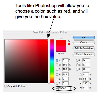
There are several ways to indicate background-color , including RGB values and keywords. Most people use hexadecimal notation, a pound/hash symbol (#) followed by six characters. The first pair indicates the red levels, and the second and third indicate the green and blue levels respectively— #RRGGBB .
Many color picker tools will help you find the hexadecimal notation of a given color. Pure red, for example would be #FF0000.
Valid values include a colour value, transparent , or inherit .
Set the background-image by showing the browser where to find the image, using the URL. For example; url(alert.png) . Note that the path is prefaced with they keyword url and wrapped in parenthesis. This syntax is important to the browser understanding that you mean to indicate a location. If your url contains special characters or white space, you may have to use apostrophes or quotations around the url inside of the parentheses.
Valid values include a URL , none , or inherit .
Images can be tiled vertically, horizontally, or both, to fill the entire width or height of an HTML element. Use background-repeat to instruct the browser to repeat a background image.
Valid values include repeat , repeat-x , repeat-y , and no-repeat .
Images can either scroll with their content, or stay fixed in place in the view screen. Valid values include scroll , fixed , and inherit .
Images can be displayed anywhere within the borders of the HTML element on which they are applied. Use background-position to precisely place your images for visual effect and layering.
There are many useful ways to indicate background position, keywords, and numeric values. Keywords (such as top and bottom ) are very useful and easy to read. Pixel values are very precise, but they do not adapt to changing heights and widths. Negative pixel values are useful when using CSS sprites, as you will see later.
When percentages and pixels are used, the starting point is always the top left corner of the HTML element, although the way image positioning works with pixels and percentages is rather different. Pixels always move the image a set number of pixels towards the bottom and right of the containing box (or towards the top and left if they are negative values), regardless of the size of the image and the containing box. Percentages, on the other hand, move the image a percentage of the difference between the containing box size, and the image size. If the image and the containing box are the same size, percentages will not move the image at all.
Valid values include length (generally in pixels), percentage (of the width of the element), and the keywords top , right , bottom , left , and center . Note that center can be used to indicate both vertical and horizontal center. Note also that you can mix percentages and pixels in rules, but not keywords and pixels or keywords and percentages.
Shorthand properties are very nifty indeed. Most developers use them to keep the CSS as lean as possible and group related properties. You can write a general rule using shorthand, and then override it as needed with specific properties.
The properties should always be indicated in the same order, to allow browsers to easily interpret the intended styles:
- color
- url
- repeat
- attachment (very rarely used; may be omitted)
- horizontal-position
- vertical-position
An example of this shorthand with all the properties used (except attachment ) is as follows:
background: green url(logo.gif) no-repeat left top;
Building an alert message
Now that you understand the basic syntax involved, you can walk through the process of building up a complete alert box example, which demonstrates all the aspects of working with background images.
The design
Imagine a graphic designer has provided a visual mock-up of the alert message you want to create for your website. The alert has a light orange background color, to make it stand out from the surrounding paragraphs. It also has an alert icon ten pixels from the top left corner.
Note that the mockup has one line of text, but it might contain more in the future. One of the most important skills of the web developer is to anticipate how a design will evolve. Part of respecting the artistic vision for a site is thinking about consistency from launch to redesign. So the alert message could contain more than one line of text, or even multiple paragraphs, lists, or other HTML elements. Strive to be as element agnostic as possible. This will increase the likelihood of code reuse, and will enable you to set up the site to be as fast and efficient as it can be. The mockup looks like Figure 1.

Figure 1: The graphic designer’s mockup of the alert box.
The designer has also provided the icon we are meant to use, as shown in Figure 2.

Figure 2: The alert icon.
The code
Based on what you have learned about CSS backgrounds in the first part of this article, you may already be envisioning how to build this alert message. I encourage you to try building it now, and then compare your work against the example below.
After building your alert box, follow the step by step instructions below. Each screenshot links to code examples, so you can check out the source file at each stage. Experiment with the code, by increasing or decreasing values, and try out alternatives. You may also want to follow along, writing each new line of code in a tool such as Opera Dragonfly or Firefox Firebug, so you can immediately see the results of each step.
Creating the CSS hook, or selector.
First you need to create a class alert , that enable you to hook up the CSS code. Create new CSS and HTML skeleton files, link the CSS style sheet to the HTML file, and add the following code to each:
Copy the following CSS and paste it into the style sheet:
Copy the following HTML and paste it into the HTML document:
The code above styles the alert with a class , rather than an id , because that enables the possiblity for more than one alert in the page. For example, you may add alerts to a form element with several potential errors. The goal is to make your CSS as flexible as possible and constrain things to correspond to the design when building the HTML content.
At this point, you have a solid foundation in place, but the alert still looks like an ordinary paragraph because you have not yet added any styles. You will add some rules to style it next.
Note: I have intentionally chosen not to limit the class alert to paragraphs; alert boxes could easily contain other elements as well. You should leave as much flexibility as you can within your CSS.
Adding the background color
You already learned about using background color in text treatments in Text styling with CSS. The same principles apply to any HTML element and can be combined with background images to create visual effects. If the background color has neither been set nor inherited, it is, by default, transparent.
As shown below, you can add the light orange background color to the alert box to make it stand out from the text around it. It is important not to make the background color too dark, because you need to keep a reasonable level of contrast between the text and the background color. Add the following property inside the CSS rule:
The alert box now looks similar to Figure 3.
Figure 3: An alert box with background color added.
Applying the background image
Next, you can add the background image to the alert. The path to the background image needs to be wrapped in url() , as shown in the code below. Add the highlighted line to the CSS rule:
The alert box now looks like Figure 4.
Figure 4: The background image has been added, but the tiling looks wrong.
Remember that each background property has a default value—if you have not specified a value, the default will be applied. Notice that the image is tiling over the entire alert, much like mosaic tiles on a kitchen floor. What is the takeaway? Background images are set to repeat both horizontally and vertically by default. Repeating backgrounds are particularly useful for gradients and patterns that fill the screen or a particular HTML element, but that effect is not desired in this case.
Controlling background repeat
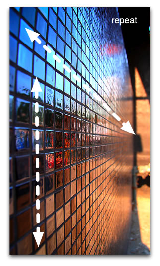
Figure 5: Much like the background image, these tiles repeat both horizontally and vertically.
Reading specifications can certainly be intimidating, but the specification is a really good place to figure out how CSS is supposed to work before you delve into the myriad browser differences. Read the colors and backgrounds portion of the W3C Specification and try to find the keyword to use when you do not want a background image to be repeated. This strategy is used in the example below:
Note that there is a section for each background property including background-repeat. Under Value, all of the possible choices are displayed, including; repeat , repeat-x , repeat-y , no-repeat , and inherit . By default (initial) background images are set to repeat. No direction is specified, which means that that the image will tile both horizontally and vertically. You have likely guessed that no-repeat is the value to set to prevent the image from tiling in either direction. Add the following highlighted line below to the CSS rule:
The alert box now looks like Figure 6.
Figure 6: The alert box, with a single copy of the background image (with no tiling).
Additionally, you can choose to repeat in both directions (like kitchen tiles) or in either direction. Gradients often repeat horizontally or vertically (see Figure 7). You do not need to know the size of the HTML element; you simply cut a slice from your gradient and set it to repeat in the direction you want; either x for horizontal, or y for vertical. Patterns often repeat in both directions and icons usually do not repeat. You will explore background-repeat further in a later example.
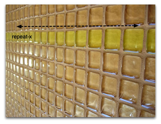
Figure 7: The greenish yellow tiles in this example repeat only horizontally.
Next, take a look at a practical example from my website. Review Figure 8.
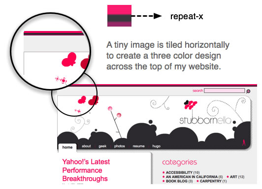
Figure 8: A repeating example from my website.
The CSS I used to add this decorative effect is relatively simple. I made the background repeat horizontally using repeat-x :
Attachment
The attachment attribute allows you to specify how the background behaves when the user scrolls down the page. The default behavior is scroll , which causes the background image to scroll along with the content.
On the other hand, setting background-attachment to fixed causes the element to be stuck to the browser window, so it stays in the same place when the content inside the element it is attached to is scrolled. This creates some odd effects, which will only be apparent when you scroll over the attached HTML element. The W3C uses it to mark the status of their specifications. For example, the “W3C Candidate Recommendation” image at top left. Scroll down the page and note that the image stays top left. It is attached to the body element, so it is always visible.
This step will have no effect on our display, because browsers set background images to scroll by default, but add it to the code anyway, to learn how the property is used. Add the highlighted line to the CSS rule:
As shown in Figure 9, the visual display of the alert box is not much different than it was before.
Figure 9: The display has not changed.
Positioning the image
Positioning is the fine tuning that enables you to place background images exactly where desired, both horizontally and vertically, within the HTML element. This property takes keyword and number values such as top , center , right , 100% , -10% , 50px and -30em .
Figure 10 shows the values you might use to place your background images in different positions.
Figure 10: Various examples of background position using keywords, percentages, and pixels.
The code below positions the background image. The goal is to position it in the top left corner, but not touching the sides, so you need to offset it by 10 pixels from both the top and left. This is accomplished by adding the following highlighted line to the CSS rule:
The first value is the horizontal offset, the second is the vertical. In this case the values are the same. After making these changes, your alert box should look like Figure 11.
Figure 11: Using CSS positioning to set the location of the background image.
Tip: Choose either keywords or number values, but do not combine them. Older browsers may ignore your declaration if you use both at once. Using right and bottom will achieve the same effect as using 100% horizontally or vertically, respectively.
Using shorthand to pull the whole thing together like a pro
As you have learned, certain CSS properties can be grouped together. Background and all of its sub-properties can be grouped in CSS rules. The CSS code described so far can be rewritten in a shortened form, as follows:
Tip: When grouping sub-properties of background , always put the properties in the following order. This is important for both cross-browser compatibility and style sheet organization and maintenance:
- color
- image
- repeat
- attachment
- horizontal position
- vertical position
Try replacing the old CSS code in your document with the shorthand shown above. After updating it, the example should look exactly the same (see Figure 12).
Figure 12: The shorthand works like a charm!
Experimenting with the code
The best way to remember all the nuances of CSS is to test the options yourself. Try changing some of the properties in the example, and see how different values affects the display. Set the background-position to 100% 100% , and notice that it provides the same result as using the right and bottom keywords. What about if you change it to -5px 0 ? Why do you think part of the image is hidden?
Testing for quality
Testing is extremely important to providing a good user experience. Just because the site looks good on your machine with your specific configuration does not mean that it will look good in every browser. Follow these basic minimum steps when testing your alert box:
- Increase or decrease the amount of text inside the alert.
- Increase the text size in your browser at least two levels. Determine if it is better to use ems to position our image. Test what happens when you increase the text size.
- Apply the class alert to other elements such as div , p , ul , strong , or em . How can you change the code to make the class agnostic?
- Include several paragraphs and a list inside an alert div . Does the code still work?
- Verify the alert visually in the Grade 1 browsers (also known as A-grade browsers). My advice is to write the code for good browsers and then adapt it for Internet Explorer–once the code works.
Rigorous testing is part of learning to write CSS. The more careful you are while learning, the faster you will be able to code.
Sprites
Users want it all. They want your site to be glamorous, interactive, and also fast. However, including large quantities of CSS background images can slow your site down considerably. The more HTTP requests you make, the slower your site will be (an HTTP request occurs whenever your computer is accessing a website and needs to ask the server to send it another asset in the site design, such as a CSS file or image… each additional request means a longer loading time for the site).
To get around this limitation, you can combine related icons into a single image, known as CSS Sprites. The background-position property allows you to then place the image in the appropriate positions so the icons display through the window of the HTML element that the CSS sprites are attached to.
In Figure 13, notice that to display the earth icon through the HTML window, you can place the image using left top . To move the position of the image so the alert icon is displayed, the background position needs to be changed to -80px 0 . The negative horizontal value pulls the image to the left.
Figure 13: Use CSS Sprites to reduce HTTP requests.
Note: If you set negative background positions, Safari will repeat your image, even if you’ve specified no-repeat . This is a consideration as you start working with background images to create more complicated layouts.
A complex sprite and background image example
Next, take a look at how you can leverage CSS sprites. Suppose a friendly designer sent us an new mockup. This one illustrates a list of links on the landing page of a blog. It points to the bloggers’ LinkedIn profile, RSS feed, Flickr photos, and bookmarks. As you evaluate each link, notice that there is a gradient starting in the center as white and transitioning to gray at the top and bottom of the link. And to further complicate things, the designer asked if we could make each link plain white with no curve when visitors hover over the link, as shown in Figure 14.
Figure 14: The new design mockup.
The logos could be included using img elements in the markup. However, using CSS sprites is a much better solution. The sprites load faster because only one image must load (not four), and it declutters your HTML, by reducing the amount of markup needed.
Creating the sprite
The first step involves cutting out the four logos and creating the sprite set, as shown in Figure 15.
Figure 15: The sprite set.
You also need to cut out a 1 pixel wide slice of the gradient. For the sake of visibility, I have cut out a slightly larger slice, but in a real-world site project you only need a one pixel image (see Figure 16).
Figure 16: The slice used for the gradient background.
The HTML that creates the list is an unordered list containing links. Note the empty span elements inside the links. It is very important not to have fixed height and width on elements that contain text. After all, you have no idea how large the text will be. What happens if the site is translated to German? You can use these extra spans to display the logos. As an alternative, you may decide that you do not want to have extraneous non-semantic markup cluttering up your HTML. In this case, you will need to use a larger sprite and leave white space between the icons. Keep in mind that this strategy is slower for users on slow connections, especially those using mobile phones to view the site. The code for the list is shown below. Copy it and then paste it into an HTML document:
Add the following CSS to a new CSS file, and link it to the HTML document:
The CSS utilizes both background images. First, take a look at the gradient background image. There are three interesting things to notice:
- The image repeats horizontally ( repeat-x .) This tiling enables you to make such a small image spread across the entire list.
- The image is centered vertically. You want the round bit of the image to appear in the middle of the list item, so you should use a background position of left center .
- In the CSS, I’ve applied a background color that is the same gray as the gray in the gradient image. This ensures, if the element grows, it will not look broken. For more information about this kind of technique, I recommend reading Bulletproof Web Design by Dan Cederholm.
The last line means that the element should not display a background color or image when the visitor hovers their cursor over it, or focuses on the element using the keyboard. You may be wondering why I applied the background properties to the link rather than the list item. The answer is that Internet Explorer 6 and earlier do not support pseudo classes like hover on elements other than links. I’ve made the adjustment in the code to accommodate this constraint.
Next you can create the CSS for the little logos. As usual, you can start by defining the most general case for all span elements within your navigation module. It is here that you define the image to be used by all spans, the repeat setting, and the background position (each is different, so you can use the first one). You can use shorthand for this rule. Note that CSS comments divide the sections of our code into manageable chunks. Add the following code to the bottom of the CSS file:
With the basic formatting completed, you can now define the exceptions, or what is different about each specific logo. In this case, the only CSS that changes is the background-position . Each respective list item needs to have the image moved 15 pixels more to the left, because each of the logo images are 15 pixels wide. Add the following to the bottom of the CSS file:
This example might seem intimidating at first. Keep your focus on the background images. In this case, using a negative pixel value pulls the background image left, so that the relevant part of the image is displayed. Positive values move the background image down and right, while negative values pull the image up and to the left.
Experiment with the background position values in the finished example, to better understand how to adjust sprite positioning.
Usage
hoffmant99 made minor changes to make sprite example work, though the student(reader of this page) needs to be aware that the file names don’t match. This can be fixed locally, change the name from “sprite_logo” to “sprite_l” and" sprite_gradient_bkg.jpg" to sprite_g.jpg".
See also
External resources
Image credits
-
, by DimsumDarren , by emdot
Exercise Questions
A paragraph is 40px by 180px and your background image is 60px by 200px. Will you see the entire image or only part of it? Why?
You want an image to be positioned in the bottom left corner of the blockquote element—please fill in the correct values.
Say you wanted each h2 in your document with a class of “question” to have a gradient pattern applied. Would you use repeat-x , repeat-y , no-repeat , or repeat to achieve something similar to the example below? Why?
Фон и границы
В этом уроке мы рассмотрим некоторые интересные возможности, которые вы можете сделать с помощью CSS-свойств фона и границ . Благодаря добавлению градиентов, фоновых изображений и закруглённых углов свойства фона и границ ответят на многие вопросы стилизации в CSS.
| Необходимые умения: | Базовая компьютерная грамотность, основное программное обеспечение, понимание работы с файлами, базовые знания HTML (смотрите Введение в HTML) и представление о том, как работает CSS (смотрите Введение в CSS). |
|---|---|
| Цель: | Научиться стилизации фона и границ объектов. |
Стилизация фона в CSS
CSS-свойство background является сокращением для ряда полных свойств фона, с которыми мы познакомимся в этом уроке. Если вы обнаружите сложное свойство background в таблице стилей, это может показаться трудным для понимания, так как одновременно может быть передано так много значений.
Мы вернёмся к тому, как работает сокращение позже, а пока давайте взглянем на различные вещи, которые вы можете делать с фоном в CSS, посмотрев на отдельные свойства background .
Фоновый цвет
Свойство background-color определяет цвет фона для любого элемента в CSS. Свойство принимает любой допустимый цвет <color> . background-color распространяется на сам контент и отступы от него (padding).
В приведённом ниже примере мы использовали различные значения цвета, чтобы добавить цвет фона к блоку, заголовку и элементу <span> .
Поиграйте с ними, используя любое доступное значение <color>.
Фоновое изображение
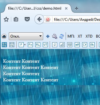
Свойство background-image позволяет отображать изображение в качестве фона элемента. В приведённом ниже примере у нас есть два блока — в одном фоновое изображение больше, чем размеры блока, а в другом — маленькое изображение звезды.
Этот пример демонстрирует две особенности фоновых изображений. По умолчанию большое изображение не масштабируется до размера блока, поэтому мы видим только его небольшой угол, в то время как маленькое изображение повторяется, чтобы заполнить весь блок. В нашем случае фактически было использовано изображение одной маленькой звезды.
Примечание: Если кроме фонового изображения вы добавили фоновый цвет, то изображение будет отображаться над цветом. Попробуйте добавить свойство background-color в приведённый выше пример, чтобы увидеть это в действии.
Свойство background-repeat
Свойство background-repeat используется для управления повторениями фонового изображения. Доступные значения:
- no-repeat — останавливает повторение фонового изображения во всех направлениях.
- repeat-x — повторение фонового изображения по горизонтали.
- repeat-y — повторение фонового изображения по вертикали.
- repeat — повторение фонового изображения в обоих направлениях. Установлено по умолчанию.
Попробуйте эти значения в примере ниже. Мы установили значение no-repeat , поэтому вы видите только одну звезду. Попробуйте разные значения — repeat-x и repeat-y — чтобы увидеть, какие эффекты они оказывают.
Изменение размеров фонового изображения
В приведённом выше примере у нас есть большое изображение, которое в конечном итоге было обрезано, так как оно больше, чем элемент, фоном которого оно является. В этом случае мы могли бы использовать свойство background-size , которое может принимать значения длины или в процентах, чтобы размер изображения соответствовал размеру фона.
Вы также можете использовать ключевые слова:
- cover — браузер сделает изображение достаточно большим, чтобы оно полностью заполнило блок, сохраняя при этом соотношение сторон. В этом случае часть изображения, скорее всего, окажется за пределами блока.
- contain — браузер сделает изображение нужного размера, чтобы поместиться в блоке. В этом случае могут появиться пробелы с обеих сторон или сверху и снизу изображения, если соотношение сторон изображения отличается от соотношения сторон блока.
Ниже я применил значения длины к размерам изображения. Глядите, как это исказило изображение.
В приведённом ниже примере я использовал большое изображение из ранее рассмотренного примера и указал значения длины, чтобы определить его размер внутри блока. Вы можете посмотреть, как это исказило изображение.
- Измените значения длины, используемые для изменения размера фона.
- Измените значение длины на background-size: cover или background-size: contain .
- Если ваше изображение меньше размеров блока, вы можете изменить значение свойства background-repeat , чтобы повторить изображение.
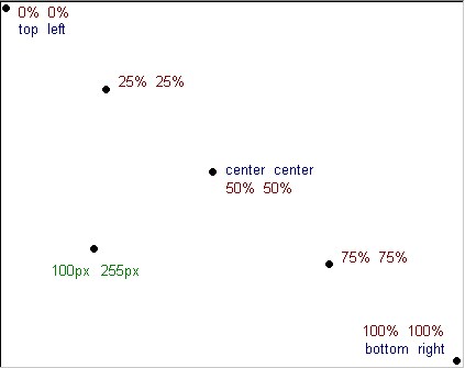
Позиционирование фонового изображения
Свойство background-position позволяет вам изменять позицию, в которой фоновое изображение появляется в блоке. При этом используется система координат, в которой левый верхний угол блока равен (0,0) , а сам блок располагается вдоль горизонтальной ( x ) и вертикальной ( y ) осей.
Примечание: По умолчанию значение background-position равно (0,0) .
Обычно свойство background-position задают в виде двух последовательных значений — значение по горизонтали, за которым следует значение по вертикали.
Вы можете использовать такие ключевые слова, как top и right (с остальными можете ознакомиться на странице background-position ):
Допустимы значения длины и процентные:
Вы также можете смешивать значения ключевых слов с длинами или процентами, например:
И наконец, вы также можете использовать синтаксис с четырьмя значениями, чтобы указать расстояние от определённых краёв блока — единица длины в данном случае представляет собой смещение от значения ключевого слова. Итак, в CSS ниже мы сместили фон на 20 пикселей сверху и на 10 пикселей справа:
Используйте приведённый ниже пример, чтобы поэкспериментировать с этими значениями и переместить звезду внутри блока.
Примечание: background-position — это сокращение для background-position-x и background-position-y (en-US), которые позволяют вам устанавливать различные значения положения по оси индивидуально.
Градиент в качестве фона
Градиент — при использовании для фона — действует так же, как изображение, и поэтому задаётся свойством background-image .
Вы можете прочитать больше о различных типах градиентов и о том, что вы можете с ними делать на странице MDN для типа данных <gradient> . Поиграть с градиентами вы можете используя один из многих генераторов градиентов CSS, доступных в Интернете, например этот. Вы можете создать градиент, а затем скопировать и вставить его в свой код.
Попробуйте использовать разные градиенты в примере ниже. В двух блоках соответственно у нас есть линейный градиент, растянутый на весь блок, и радиальный градиент с заданным размером, который поэтому повторяется.
Несколько фоновых изображений
Также возможно создавать несколько фоновых изображений — просто разделив значения свойства background-image запятыми.
Когда вы сделаете это, произойдёт наложение фоновых изображений друг на друга. Фоновые изображения будут наложены слоями, где каждое новое фоновое изображение, перечисленное в коде, будет накладываться поверх ранее указанного изображения.
Примечание: Градиенты можно легко смешивать с обычными фоновыми изображениями.
Другие свойства background- * также могут иметь значения, разделённые запятыми, как и background-image :
Каждое значение различных свойств будет соответствовать значениям в той же позиции в других свойствах. Выше, например, значение background-repeat для image1 будет no-repeat . Однако, что происходит, когда разные свойства имеют разное количество значений? Ответ заключается в том, что меньшее количество значений будет циклически повторяться — в приведённом выше примере есть четыре фоновых изображения, и только два значения background-position . Первые два значения позиции будут применены к первым двум изображениям, затем они снова будут циклически повторяться — image3 будет присвоено первое значение позиции, а image4 будет присвоено второе значение позиции.
Поиграем? В приведённом ниже примере я добавил два изображения. Чтобы продемонстрировать порядок наложения, попробуйте поменять порядок фоновых изображений в списке. Или поиграйте с другими свойствами, чтобы изменить положение, размер или повторяемость значений.
Закрепление фона
Другая опция, которую можно применить к фону, — это указать, как он будет прокручиваться при прокрутке содержимого. Это контролируется с помощью свойства background-attachment , которое может принимать следующие значения:
- scroll : Заставляет элементы фона прокручиваться при прокрутке страницы. Если содержимое элемента прокручивается, фон не перемещается. Фактически, фон фиксируется в той же позиции на странице, поэтому он прокручивается по мере прокрутки страницы.
- fixed : Фиксирует элементы фона в области просмотра, чтобы он не прокручивался при прокрутке страницы или содержимого элемента. Фон всегда будет оставаться на одном и том же месте на экране.
- local : Это значение было добавлено позже (оно поддерживается только в Internet Explorer 9+, тогда как другие поддерживаются в IE4+), потому что значение scroll довольно запутанно и во многих случаях действительно не делает то, что вы хотите. Значение local фиксирует фон для элемента, к которому он применён, поэтому, когда вы прокручиваете элемент, фон прокручивается вместе с ним.
Свойство background-attachment действует только тогда, когда есть контент для прокрутки, поэтому мы сделали пример, чтобы продемонстрировать различия между тремя значениями — взгляните на background-attachment.html (также смотри исходный код здесь).
Использование сокращённого свойства background
Как я упоминал в начале этого урока, вы часто будете видеть фон, заданный с помощью свойства background . Это сокращение позволяет вам одновременно устанавливать все различные свойства.
При использовании нескольких фонов необходимо указать все свойства для первого фона, а затем добавить следующий фон после запятой. В приведённом ниже примере у нас есть градиент с размером и положением, затем фоновое изображение со значением no-repeat и положением, затем цвет.
При записи сокращённых значений фонового изображения необходимо соблюдать несколько правил, например:
- background-color можно указывать только после последней запятой.
- Значения background-size могут быть включены только сразу после background-position , разделённые символом ‘/’, например: center/80% .
Посетите страницу MDN свойства
, чтобы увидеть полное описание.
Доступность просмотра
Помещая текст поверх фонового изображения или цвета, вы должны позаботиться о том, чтобы у вас было достаточно контраста, чтобы текст был читаемым для посетителей вашего сайта. Если указывается изображение, и текст будет помещён поверх этого изображения, вы также должны указать background-color , который позволит тексту быть разборчивым, если изображение не загружается.
Программы чтения с экрана не могут анализировать фоновые изображения, поэтому они должны быть чисто декоративными; любой важный контент должен быть частью HTML-страницы, а не находиться в фоне.
Границы
Изучая Блочную модель, мы обнаружили, как границы влияют на размер нашего блока. В этом уроке мы рассмотрим, как творчески использовать границы. Обычно, когда мы добавляем границы к элементу с помощью CSS, мы используем сокращённое свойство, которое устанавливает цвет, ширину и стиль границы в одной строке CSS.
Мы можем установить границу для всех четырёх сторон блока с помощью border :
Или мы можем нацеливаться на один край блока, например:
Индивидуальные свойства этих сокращений будут следующими:
И более детально:
Примечание: Свойства границ top, right, bottom, и left также имеют сопоставленные логические свойства, которые относятся к режиму написания документа (например, текст слева направо, справа налево или сверху вниз). Мы рассмотрим их в следующем уроке, который касается работы с разными направлениями текста.
Есть множество стилей, которые вы можете использовать для границ. В приведённом ниже примере мы использовали разные стили границ для четырёх сторон моего блока. Поиграйте со стилем, шириной и цветом границы, чтобы увидеть, как они работают.
Закруглённые углы
Закругление углов блока достигается с помощью свойства border-radius и связанных свойств, которые относятся к каждому углу блока. В качестве значения могут использоваться два значения длины или процента: первое значение определяет горизонтальный радиус, а второе — вертикальный радиус. Чаще задают только одно значение, которое используется для обоих.
Например, чтобы сделать все четыре угла блока радиусом 10px:
Или, чтобы верхний правый угол имел горизонтальный радиус 1em и вертикальный радиус 10%:
В примере ниже мы установили все четыре угла, а затем изменили значения для верхнего правого угла, чтобы сделать его другим. Вы можете поиграть со значениями, чтобы изменить углы. Взгляните на страницу свойств для border-radius чтобы увидеть доступные варианты синтаксиса.
Упражнение с границами и фоном
Чтобы проверить свои новые знания, попробуйте создать следующее, используя фон и границы, используя приведённый ниже пример в качестве отправной точки:
- Задайте рамку равную 5px black solid, с закруглёнными углами 10px.
- Добавить фоновое изображение (используйте URL balloons.jpg ) и установите размер таким образом, чтобы он покрыл весь блок.
- Задайте для <h2> полупрозрачный чёрный цвет фона и сделайте текст белым.
Примечание: вы можете посмотреть решение здесь — но сначала попробуйте сделать это сами!
Итоги
В этой теме мы рассмотрели довольно много, но как вы можете увидеть, возможностей по стилизации фона или границ блока намного больше. Изучите различные страницы свойств, если хотите узнать больше о каких-либо функциях, которые мы обсуждали. На каждой странице MDN есть много примеров использования свойств, с которыми вы можете поиграть и расширить свои знания.
В следующем уроке мы узнаем, как Режим написания вашего документа взаимодействует с вашим CSS. Что происходит, если текст не перетекает слева направо?
Как поставить фон для сайта html
Пока я творю, я живу!
Блог посвящен: HTML, CSS, PHP, WordPress, Bootstrap


Как сделать фон в HTML-странице. Основы HTML для начинающих. Урок №12
Всем привет!
Продолжаем изучать основы HTML.
В этом уроке я расскажу и на примерах покажу, как сделать фон из цвета или картинки в HTML-странице.
Все довольно просто!
Начнем из цвета!
Я думаю, вы не пропустили урок №11, там, где я рассказывал, как менять цвет текста и в конце статьи давал коды различных цветов и оттенков. Почему я напомнил вам об этом уроке? Да потому, что там есть таблица с готовыми кодами цветов, берите их и практикуйте сразу в этом уроке.
Итак, как сделать цветовой фон в HTML…
Цветовой фон в HTML
Цвет фона в HTML-документе по умолчанию белый. Как же задать цвет по желанию?
В этом нам поможет атрибут « bgcolor ». Чтобы закрасить задний фон, пропишите этот атрибут к тегу « body » :
Вот полный HTML-код:
Результат будет вот таким:

Как сделать в HTML картинку фоном
Если вы хотите сделать фон из картинки, тогда к тегу « body » пропишите атрибут « baсkground »:
Залейте любую картинку туда, где лежит ваша веб-страница (на примере у меня страница имеет название « fon » с расширением « .gif »):

Вот полный HTML-код:
Результат будет вот таким:

Если фоновая картинка размещена в папке images или в какой-то другой папке, это будет выглядеть так:

Вот полный HTML-код:
На сегодня это все! Я думаю, урок был не сложный и вы все поняли. Если есть вопросы, пишите в комментариях.
Жду вас на следующих уроках.
Свойство CSS background
Свойство CSS background задает фон на html сайте. Также с помощью него можно задавать фоны как отдельным элементам сайта (например, какой-то области, шапке сайта, колонки и т.п.), так и всему сайту целиком. Это свойство имеет множество атрибутом и нюансов. Разберем все на примерах и научимся делать как монотонные фоны, так и фоновые картинки на сайте.
1. Синтаксис CSS background
- background-attachment — задает точку привязывания отчета
- background-color — монотонный цвет фона (можно задавать в формате #RGB, названием цвета и в формате rgb());
- background-image — задание фоновой картинки;
- background-position — позиция элемента (сдвиг относительно левого верхнего края);
- background-repeat — задание повторения элемента (можно задавать повтор по осям, а также указать бесконечное количество повторов);
2. Как сделать фон на сайте html
Разработка дизайна сайта должна начинаться с определения общего цветового фона. Ведь фон это редко меняемая часть сайта, которая будет видна всегда. Очевидно, что такая важная деталь должна быть в гармонии с цветовой палитрой всего сайта.
При создании фона для сайта самое главное определиться с вопросом о том, будет ли сайт растягиваться на весь экран (резиновый дизайн) или будет фиксированной ширины. Конечно, лучше сделать так, чтобы дизайн сайта и в далеком будущем на больших разрешениях мониторов отображался также красиво, но с другой стороны, чтобы при этом сайт не был сильно растянут.
Лично я всегда выбираю такие шаблоны для сайта, чтобы ширина видимой части контента была не больше 1024 символов. Если посмотреть статистику сайта, то такое разрешение удовлетворяет большой процент пользователей. В будущем это число будет уменьшаться, т.к. новые мониторы с высоким разрешением вытесняют старые (например, full-hd есть почти у каждого).
В качестве фона можно использовать либо монотонный цвет, либо фоновое изображение. У каждого способа есть свои плюсы и минусы. Монотонный цвет не будет нагружать сайт загрузкой лишнего изображения, но и дизайн сайта не будет столь эффектным, как это можно было бы сделать с применением фонового изображения.
Рассмотрим все варианты по заданию фона на сайте.
3. CSS background-color — монотонный фон на сайте
Свойство CSS background-color — задает цвет фона. Например:
В этом случае задан цвет фона всему сайту, поскольку мы его применили к тегу <body>
Еще пример. Зададим тегу <div> по умолчанию зеленый фон:
Всю палитру цветов в кодах на html Вы сможете найти тут.
Аналогичное свойство есть у html-таблиц, но называется оно bgcolor
4. CSS background-image — фоновая картинка на сайте
Свойство CSS background-image — позволяет установить фоновое изображение на сайте.
Синтаксис CSS background-image
Например, для установки общего (глобального) фона:
Например фоновая картинка:

После двоеточия указывается адрес изображения. Можно использовать как относительный так и прямой адрес.
В CSS3 можно задать несколько фоновых изображений (они как бы накладываются друг на друга как слои).
Задавая фон в виде картинки есть возможность настраивать так же ряд важных свойств CSS
- background-repeat
- background-attachment
- background-position
- background-size
- background-clip
Рассмотрим в отдельности эти параметры
4.1. CSS background-repeat
Свойство CSS background-repeat определяет повторять ли фон. Можно отдельно настраивать повторение по вертикали и горизонтали.
Синтаксис CSS background-repeat
Где value может принимать следующие значения:
- repeat-x — повторять фоновое изображение по горизонтали;
- repeat-y — повторять фоновое изображение по вертикали;
- no-repeat — не повторять фоновое изображение;
- repeat (по умолчанию) — повторять фоновое изображение по горизонтали и вертикали;
- space — все пространство заполняется максимально возможным количеством изображений, первое и последнее (по горизонтали и вертикали) поровну обрезаются;
- round — аналогично предыдущему, с тем отличием, что первое и последнее масштабируются для заполнения;
Например, по горизонтали не повторять, по вертикали повторять фоновое изображение:
4.2. CSS background-attachment
Свойство CSS background-attachment задает привязки фона изображения. Можно зафиксировать задний фон, чтобы при прокрутке скроллом он не крутится или же наоборот фон будет прокручиваться вместе с сайтом.
Синтаксис CSS background-attachment
Где value может принимать следующие значения:
- scroll (действует по умолчанию) — фон прокручивается вместе с сайтом;
- fixed — при прокрутке скролла фон остается неизменными;
- local — изображение прокручивается с контентом, но не с элементом, его содержащим;
Я думаю, что Вы видели такие сайты и понимаете о чем идет речь.
4.3. CSS background-position
Свойство CSS background-position задает расположение фона относительно левого верхнего угла.
Синтаксис CSS background-position
В параметрах мы указываем выравнивание (смещение) в пикселях или процентах сначала по оси Х, потом по оси У. value , value2 может принимать следующие значения:
- top — выравнивание по верхнему краю;
- left — выравнивание с левого края;
- right — выравнивание с правого края;
- bottom — выравнивание по нижнему краю;
- center — выравнивание по центру;
- число/проценты — можно задавать отступ в виде числа или процентов;
По умолчанию фон располагается в верхнем левом углу.
Можно указывать в пикселях Npx задание отступа от разных краев. Проще понять это на примере:
Фон будет выравнивать по правому краю со смещением 50 пикселей вниз.
Или например сместим фон на 100px вправо и расположим его по центру относительно высоты.
Все эти параметры можно задать в таблице стилей CSS. Этот параметр выравнивает расположение фона на странице.
4.4. CSS background-size
Свойство CSS background-size позволяет задавать размеры фона.
Синтаксис CSS background-size
Где первый параметр задает значение по оси Х, второй параметр по оси У. Можно задавать как в процентах, так и пикселях.