14 Style Sheets
Style sheets represent a major breakthrough for Web page designers, expanding their ability to improve the appearance of their pages. In the scientific environments in which the Web was conceived, people are more concerned with the content of their documents than the presentation. As people from wider walks of life discovered the Web, the limitations of HTML became a source of continuing frustration and authors were forced to sidestep HTML’s stylistic limitations. While the intentions have been good — to improve the presentation of Web pages — the techniques for doing so have had unfortunate side effects. These techniques work for some of the people, some of the time, but not for all of the people, all of the time. They include:
- Using proprietary HTML extensions
- Converting text into images
- Using images for white space control
- Use of tables for page layout
- Writing a program instead of using HTML
These techniques considerably increase the complexity of Web pages, offer limited flexibility, suffer from interoperability problems, and create hardships for people with disabilities.
Style sheets solve these problems at the same time they supersede the limited range of presentation mechanisms in HTML. Style sheets make it easy to specify the amount of white space between text lines, the amount lines are indented, the colors used for the text and the backgrounds, the font size and style, and a host of other details.
For example, the following short CSS style sheet (stored in the file «special.css»), sets the text color of a paragraph to green and surrounds it with a solid red border:
Authors may link this style sheet to their source HTML document with the LINK element:
HTML 4 provides support for the following style sheet features:
Flexible placement of style information Placing style sheets in separate files makes them easy to reuse. Sometimes it’s useful to include rendering instructions within the document to which they apply, either grouped at the start of the document, or in attributes of the elements throughout the body of the document. To make it easier to manage style on a site basis, this specification describes how to use HTTP headers to set the style sheets to be applied to a document. Independence from specific style sheet languages This specification doesn’t tie HTML to any particular style sheet language. This allows for a range of such languages to be used, for instance simple ones for the majority of users and much more complex ones for the minority of users with highly specialized needs. The examples included below all use the CSS (Cascading Style Sheets) language [CSS1], but other style sheet languages would be possible. Cascading This is the capability provided by some style sheet languages such as CSS to allow style information from several sources to be blended together. These could be, for instance, corporate style guidelines, styles common to a group of documents, and styles specific to a single document. By storing these separately, style sheets can be reused, simplifying authoring and making more effective use of network caching. The cascade defines an ordered sequence of style sheets where rules in later sheets have greater precedence than earlier ones. Not all style sheet languages support cascading. Media dependencies HTML allows authors to specify documents in a media-independent way. This allows users to access Web pages using a wide variety of devices and media, e.g., graphical displays for computers running Windows, Macintosh OS, and X11, devices for television sets, specially adapted phones and PDA-based portable devices, speech-based browsers, and braille-based tactile devices.
Style sheets, by contrast, apply to specific media or media groups. A style sheet intended for screen use may be applicable when printing, but is of little use for speech-based browsers. This specification allows you to define the broad categories of media a given style sheet is applicable to. This allows user agents to avoid retrieving inappropriate style sheets. Style sheet languages may include features for describing media dependencies within the same style sheet.
Alternate styles Authors may wish to offer readers several ways to view a document. For instance, a style sheet for rendering compact documents with small fonts, or one that specifies larger fonts for increased legibility. This specification allows authors to specify a preferred style sheet as well as alternates that target specific users or media. User agents should give users the opportunity to select from among alternate style sheets or to switch off style sheets altogether. Performance concerns Some people have voiced concerns over performance issues for style sheets. For instance, retrieving an external style sheet may delay the full presentation for the user. A similar situation arises if the document head includes a lengthy set of style rules.
The current proposal addresses these issues by allowing authors to include rendering instructions within each HTML element. The rendering information is then always available by the time the user agent wants to render each element.
In many cases, authors will take advantage of a common style sheet for a group of documents. In this case, distributing style rules throughout the document will actually lead to worse performance than using a linked style sheet, since for most documents, the style sheet will already be present in the local cache. The public availability of good style sheets will encourage this effect.
14.2 Adding style to HTML
Note. The sample default style sheet for HTML 4 that is included in [CSS2] expresses generally accepted default style information for each element. Authors and implementors alike might find this a useful resource.
HTML documents may contain style sheet rules directly in them or they may import style sheets.
Any style sheet language may be used with HTML. A simple style sheet language may suffice for the needs of most users, but other languages may be more suited to highly specialized needs. This specification uses the style language «Cascading Style Sheets» ([CSS1]), abbreviated CSS, for examples.
The syntax of style data depends on the style sheet language.
14.2.1 Setting the default style sheet language
Authors must specify the style sheet language of style information associated with an HTML document.
Authors should use the META element to set the default style sheet language for a document. For example, to set the default to CSS, authors should put the following declaration in the HEAD of their documents:
The default style sheet language may also be set with HTTP headers. The above META declaration is equivalent to the HTTP header:
User agents should determine the default style sheet language for a document according to the following steps (highest to lowest priority):
- If any META declarations specify the «Content-Style-Type», the last one in the character stream determines the default style sheet language.
- Otherwise, if any HTTP headers specify the «Content-Style-Type», the last one in the character stream determines the default style sheet language.
- Otherwise, the default style sheet language is «text/css».
Documents that include elements that set the style attribute but which don’t define a default style sheet language are incorrect. Authoring tools should generate default style sheet language information (typically a META declaration) so that user agents do not have to rely on a default of «text/css».
14.2.2 Inline style information
style = style [CN] This attribute specifies style information for the current element.
The syntax of the value of the style attribute is determined by the default style sheet language. For example, for [[CSS2]] inline style, use the declaration block syntax described in section 4.1.8 (without curly brace delimiters).
This CSS example sets color and font size information for the text in a specific paragraph.
In CSS, property declarations have the form «name : value» and are separated by a semi-colon.
To specify style information for more than one element, authors should use the STYLE element. For optimal flexibility, authors should define styles in external style sheets.
14.2.3 Header style information: the STYLE element
Start tag: required, End tag: required
type = content-type [CI] This attribute specifies the style sheet language of the element’s contents and overrides the default style sheet language. The style sheet language is specified as a content type (e.g., «text/css»). Authors must supply a value for this attribute; there is no default value for this attribute. media = media-descriptors [CI] This attribute specifies the intended destination medium for style information. It may be a single media descriptor or a comma-separated list. The default value for this attribute is «screen».
Attributes defined elsewhere
- lang (language information), dir (text direction)
- title (element title)
The STYLE element allows authors to put style sheet rules in the head of the document. HTML permits any number of STYLE elements in the HEAD section of a document.
User agents that don’t support style sheets, or don’t support the specific style sheet language used by a STYLE element, must hide the contents of the STYLE element. It is an error to render the content as part of the document’s text. Some style sheet languages support syntax for hiding the content from non-conforming user agents.
The syntax of style data depends on the style sheet language.
Some style sheet implementations may allow a wider variety of rules in the STYLE element than in the style attribute. For example, with CSS, rules may be declared within a STYLE element for:
- All instances of a specific HTML element (e.g., all P elements, all H1 elements, etc.)
- All instances of an HTML element belonging to a specific class (i.e., whose class attribute is set to some value).
- Single instances of an HTML element (i.e., whose id attribute is set to some value).
Rules for style rule precedences and inheritance depend on the style sheet language.
The following CSS STYLE declaration puts a border around every H1 element in the document and centers it on the page.
To specify that this style information should only apply to H1 elements of a specific class, we modify it as follows:
Finally, to limit the scope of the style information to a single instance of H1 , set the id attribute:
Although style information may be set for almost every HTML element, two elements, DIV and SPAN , are particularly useful in that they do not impose any presentation semantics (besides block-level vs. inline). When combined with style sheets, these elements allow users to extend HTML indefinitely, particularly when used with the class and id attributes.
In the following example, we use the SPAN element to set the font style of the first few words of a paragraph to small caps.
In the following example, we use DIV and the class attribute to set the text justification for a series of paragraphs that make up the abstract section of a scientific article. This style information could be reused for other abstract sections by setting the class attribute elsewhere in the document.
14.2.4 Media types
HTML allows authors to design documents that take advantage of the characteristics of the media where the document is to be rendered (e.g., graphical displays, television screens, handheld devices, speech-based browsers, braille-based tactile devices, etc.). By specifying the media attribute, authors allow user agents to load and apply style sheets selectively. Please consult the list of recognized media descriptors.
The following sample declarations apply to H1 elements. When projected in a business meeting, all instances will be blue. When printed, all instances will be centered.
This example adds sound effects to anchors for use in speech output:
Media control is particularly interesting when applied to external style sheets since user agents can save time by retrieving from the network only those style sheets that apply to the current device. For instance, speech-based browsers can avoid downloading style sheets designed for visual rendering. See the section on media-dependent cascades for more information.
14.3 External style sheets
Authors may separate style sheets from HTML documents. This offers several benefits:
- Authors and Web site managers may share style sheets across a number of documents (and sites).
- Authors may change the style sheet without requiring modifications to the document.
- User agents may load style sheets selectively (based on media descriptions).
14.3.1 Preferred and alternate style sheets
HTML allows authors to associate any number of external style sheets with a document. The style sheet language defines how multiple external style sheets interact (for example, the CSS «cascade» rules).
Authors may specify a number of mutually exclusive style sheets called style sheets. Users may select their favorite among these depending on their preferences. For instance, an author may specify one style sheet designed for small screens and another for users with weak vision (e.g., large fonts). User agents should allow users to select from alternate style sheets.
The author may specify that one of the alternates is a style sheet. User agents should apply the author’s preferred style sheet unless the user has selected a different alternate.
Authors may group several alternate style sheets (including the author’s preferred style sheets) under a single . When a user selects a named style, the user agent must apply all style sheets with that name. User agents must not apply alternate style sheets with a different style name. The section on specifying external style sheets explains how to name a group of style sheets.
User agents must respect media descriptors when applying any style sheet.
User agents should also allow users to disable the author’s style sheets entirely, in which case the user agent must not apply any persistent or alternate style sheets.
14.3.2 Specifying external style sheets
Authors specify external style sheets with the following attributes of the LINK element:
- Set the value of href to the location of the style sheet file. The value of href is a URI.
- Set the value of the type attribute to indicate the language of the linked (style sheet) resource. This allows the user agent to avoid downloading a style sheet for an unsupported style sheet language.
- Specify that the style sheet is persistent, preferred, or alternate:
- To make a style sheet persistent, set the rel attribute to «stylesheet» and don’t set the title attribute.
- To make a style sheet preferred, set the rel attribute to «stylesheet» and name the style sheet with the title attribute.
- To specify an alternate style sheet, set the rel attribute to «alternate stylesheet» and name the style sheet with the title attribute.
User agents should provide a means for users to view and pick from the list of alternate styles. The value of the title attribute is recommended as the name of each choice.
In this example, we first specify a persistent style sheet located in the file mystyle.css:
Setting the title attribute makes this the author’s preferred style sheet:
Adding the keyword «alternate» to the rel attribute makes it an alternate style sheet:
For more information on external style sheets, please consult the section on links and external style sheets.
Authors may also use the META element to set the document’s preferred style sheet. For example, to set the preferred style sheet to «compact» (see the preceding example), authors may include the following line in the HEAD :
The preferred style sheet may also be specified with HTTP headers. The above META declaration is equivalent to the HTTP header:
If two or more META declarations or HTTP headers specify the preferred style sheet, the last one takes precedence. HTTP headers are considered to occur earlier than the document HEAD for this purpose.
If two or more LINK elements specify a preferred style sheet, the first one takes precedence.
Preferred style sheets specified with META or HTTP headers have precedence over those specified with the LINK element.
14.4 Cascading style sheets
style sheet languages such as CSS allow style information from several sources to be blended together. However, not all style sheet languages support cascading. To define a cascade, authors specify a sequence of LINK and/or STYLE elements. The style information is cascaded in the order the elements appear in the HEAD .
Note. This specification does not specify how style sheets from different style languages cascade. Authors should avoid mixing style sheet languages.
In the following example, we specify two alternate style sheets named «compact». If the user selects the «compact» style, the user agent must apply both external style sheets, as well as the persistent «common.css» style sheet. If the user selects the «big print» style, only the alternate style sheet «bigprint.css» and the persistent «common.css» will be applied.
Here is a cascade example that involves both the LINK and STYLE elements.
14.4.1 Media-dependent cascades
A cascade may include style sheets applicable to different media. Both LINK and STYLE may be used with the media attribute. The user agent is then responsible for filtering out those style sheets that do not apply to the current medium.
In the following example, we define a cascade where the «corporate» style sheet is provided in several versions: one suited to printing, one for screen use and one for speech-based browsers (useful, say, when reading email in the car). The «techreport» stylesheet applies to all media. The color rule defined by the STYLE element is used for print and screen but not for aural rendering.
14.4.2 Inheritance and cascading
When the user agent wants to render a document, it needs to find values for style properties, e.g. the font family, font style, size, line height, text color and so on. The exact mechanism depends on the style sheet language, but the following description is generally applicable:
The cascading mechanism is used when a number of style rules all apply directly to an element. The mechanism allows the user agent to sort the rules by specificity, to determine which rule to apply. If no rule can be found, the next step depends on whether the style property can be inherited or not. Not all properties can be inherited. For these properties the style sheet language provides default values for use when there are no explicit rules for a particular element.
If the property can be inherited, the user agent examines the immediately enclosing element to see if a rule applies to that. This process continues until an applicable rule is found. This mechanism allows style sheets to be specified compactly. For instance, authors may specify the font family for all elements within the BODY by a single rule that applies to the BODY element.
14.5 Hiding style data from user agents
Some style sheet languages support syntax intended to allow authors to hide the content of STYLE elements from non-conforming user agents.
This example illustrates for CSS how to comment out the content of STYLE elements to ensure that older, non-conforming user agents will not render them as text.
14.6 Linking to style sheets with HTTP headers
This section only applies to user agents conforming to versions of HTTP that define a Link header field. Note that HTTP 1.1 as defined by [RFC2616] does not include a Link header field (refer to section 19.6.3).
Web server managers may find it convenient to configure a server so that a style sheet will be applied to a group of pages. The HTTP Link header has the same effect as a LINK element with the same attributes and values. Multiple Link headers correspond to multiple LINK elements occurring in the same order. For instance,
It is possible to specify several alternate styles using multiple Link headers, and then use the rel attribute to determine the default style.
In the following example, «compact» is applied by default since it omits the «alternate» keyword for the rel attribute.
This should also work when HTML documents are sent by email. Some email agents can alter the ordering of [RFC822] headers. To protect against this affecting the cascading order for style sheets specified by Link headers, authors can use header concatenation to merge several instances of the same header field. The quote marks are only needed when the attribute values include whitespace. Use SGML entities to reference characters that are otherwise not permitted within HTTP or email headers, or that are likely to be affected by transit through gateways.
LINK and META elements implied by HTTP headers are defined as occurring before any explicit LINK and META elements in the document’s HEAD .
Основы CSS
CSS — это язык, отвечающий за визуальное представление документов, написанных на HTML.
Файлы CSS сохраняются в специальном формате .css
Зачем использовать CSS?
- Делает HTML-страницы красивее;
- Экономит время разработчиков;
- Страницы загружаются быстрее;
- Совместим с несколькими устройствами;
- Поддерживается всеми последними браузерами.
История CSS

Концепция каскадных таблиц стилей была предложена в 1994 году Хоконом Виум Ли, норвежским ученым и
ИТ-специалистом.История CSS
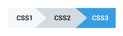
CSS1 был опубликован в 1996 году.
CSS2 был выпущен в 1998 году.
CSS3 появился в июне 1999 года.
Базовый синтаксис
CSS-правило состоит из селектора, перечня свойств и их значений.
Селектор
Селектор указывает, к каким HTML-элементам будут применяться стили.
Заголовок первого уровня
Свойство + значение
Свойство определяет, что именно будет изменено: фон, цвет текста, положение на странице или что-то еще.
Значение свойства — это своего рода уточнение того, на что оно будет изменено.
Свойство + значение
Стоит ставить пробел перед значением свойства.
Разделение правил
Комментарии
Комментарий в CSS — это произвольный текст, который носит чисто информативный характер и не влияет на визуальное отображение сайта.
Любой текст, помещенный между /* и */ , будет считаться комментарием.
Многострочный комментарий
Отключение фрагментов кода
Внешние таблицы стилей
Атрибут href указывает адрес файла, а атрибут rel со значением stylesheet сообщает браузеру, что мы подключаем именно стили.
Внутренние таблицы стилей
Inline-стили
Такой способ подключения считается плохой практикой, поскольку усложняет поддержку проекта: код становится труднее читать.
Механизмы свойств
Наследование
Наследование в CSS — это механизм, с помощью которого значения свойств элемента-родителя передаются его элементам-потомкам.
Стили, присвоенные одному элементу, наследуются всеми потомками (вложенными элементами), но только в том случае, если они где-то явно не переопределены.
Наследование
Текст на странице
Текст внутри main
Текст на странице
Наследуемые свойства
font-size, font-family, font-style, font-weight, color, text-align, text-transform, text-indent, line-height, letter-spacing, word-spacing, white-space, direction
и другие.Наследуемые свойства
list-style, cursor, visibility, border-collapse
Наследуемые свойства можно и нужно задавать через предков, следуя структуре документа.
Ненаследуемые свойства
Параметры позиционирования, размеров, отступов, фона, рамок:
background, border, padding, margin, width, height, position и другие.
Не наследуются они из соображений здравого смысла.
Составные свойства
В CSS есть обычные свойства, управляющие одним параметром отображения, и есть составные свойства, управляющие одновременно несколькими параметрами.
Составные свойства
Составные свойства
Ваша работа заполнит большую часть жизни и единственный способ быть полностью довольным — делать то, что по-вашему является великим делом. И единственный способ делать великие дела — любить то, что вы делаете.
Селекторы
Указание класса

Селекторы
Строка .feature-kitten — это селектор. Она говорит браузеру применить список свойств (отступ и фон) ко всем элементам, у которых атрибут class имеет значение feature-kitten .
Селекторы по тегам и классам
Селекторы по тегам содержат имя тега без символов и > .
Селекторы по классам начинаются с точки, за которой идёт имя класса.
Группировка селекторов
Селектор по id
Стилизация списка внутри навигации
- Первый пункт
- Второй пункт
- Третий пункт
Стилизация списка внутри навигации
Добавить класс и использовать селектор по этому классу;
Использовать специальный селектор, чтобы стили применялись к спискам внутри блока с классом blog-navigation .
Вложенные селекторы
Взаимодействие различных стилей
Стили по умолчанию
- Первый пункт списка
- Второй пункт списка
- Третий пункт списка
Базовые стили хранятся внутри браузера, это браузерные стили по умолчанию.
Каскадность
На этот элемент могут одновременно влиять CSS-правила по тегу p и по классу beloved-color из прописанных разработчиком стилей, да ещё и CSS-правило по тегу p из браузерных стилей.
Каскадность
После того, как все правила для элемента собраны, браузер комбинирует все свойства из этих правил и применяет их к элементу.
Каскадность
Конфликт свойств
На один и тот же список на странице действуют стили с разными значениями свойства list-style . Это и есть конфликт.
Конфликт свойств
- Сравниваются приоритеты стилевых файлов, в которых находятся конфликтующие свойства.
- Сравнивается специфичность селекторов у CSS-правил с конфликтующими свойствами.
- Побеждает то свойство, которое находится ниже в коде.
Подробнее можно почитать в спецификации.
Исключение — !important
Когда при объявлении стиля используется модификатор !important , это объявление получает наивысший приоритет среди всех прочих объявлений.
Хотя технически модификатор !important не имеет со специфичностью ничего общего, он непосредственно на неё влияет.
Множественные классы
Допустим, на сайте есть разные типы уведомлений:
Множественные классы
Фон обычных сообщений серый, фон ошибок красный:
Множественные классы
Ошибка! Всё пропа-а-а-ло!
Класс alert с общими стилями есть у всех сообщений.
Класс alert-error с частными стилями есть только у ошибок.Типы единиц измерения
Абсолютные
Абсолютные единицы измерения привязаны к настоящим физическим размерам и связаны между собой жёсткими пропорциями.
px (pixel) определяет размер в пикселях.
Абсолютные
Единицы измерения могут быть указаны как целое число или в десятичной форме:
Абсолютные
Помимо пикселей, существуют и другие абсолютные единицы измерения.
cm определяет размер в сантиметрах:
Абсолютные
mm определяет размер в миллиметрах (10mm = 1cm):
Абсолютные
in (inches) определяет размер в дюймах (1in = 2.54cm):
Абсолютные
pt (points) определяет размер в пунктах (1pt = 1/72 of 1in).
Абсолютные
pc (pica) определяет размер в пайках (1pc = 12pt).
Абсолютные
Хотя сантиметры, миллиметры, дюймы, точки и пайки предназначены для отображения элементов на веб-странице, браузеры не всегда могут точно рассчитать физический размер экрана.
Относительные
% устанавливает измерение в процентах от родительского элемента.
Относительные
Относительные
em используется для обозначения размера шрифта относительно текущего шрифта родительского элемента.
Это текст c обычной высотой. А этот 1.5em
Относительные
rem используется, если нужно изменить размер шрифта элемента по отношению к размеру шрифта корневого элемента <html>
Единицы, зависящие от размера области просмотра
Словосочетание область просмотра (viewport) относится к области веб-страницы, которую пользователь может видеть без прокрутки.
Единицы измерения, которые зависят от области просмотра, используются для обеспечения правильного отображения веб-страницы на устройствах с разными размерами экрана.
vw и vh
- vw — 1% ширины области просмотра.
- vh — 1% высоты области просмотра.
vmin — 1% меньшего размера области просмотра.
Если ширина браузера меньше его высоты, 1vmin равно 1vw .
vmax — 1% большего размера области просмотра.
Если высота браузера больше его ширины, 1vmax равно 1vh .
Относительные
Единицы измерения, зависящие от области просмотра, такие как % , подходят для определения размеров блочных элементов:
Правильная запись
Цвета в вебе
Ключевые слова
- Чёрный black
- Белый white
- Красный red
- Зелёный green
- Синий blue
Самый простой способ указания цвета в вебе — ключевые слова. При этом используются английские названия цветов.
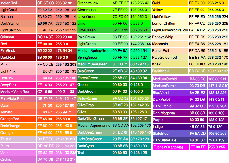
Ключевые слова
Ключевые слова регистронезависимые — можно писать их как угодно и браузер всё поймёт.
Ключевые слова
transparent
Ключевое слово transparent задаёт прозрачный цвет текста. Технически это равносильно записи любого цвета с нулевой прозрачностью rgb(0 0 0 / 0) , но бывают случаи, когда просто прозрачность и прозрачность цвета могут работать иначе, например, в градиентах.
Ключевые слова
currentColor
За ключевым словом currentColor скрывается цвет, указанный в свойстве color элемента. Очень удобно указывать это слово в качестве значения других свойств, чтобы многократно не указывать один и тот же цвет.
HTML Styles — CSS
CSS saves a lot of work. It can control the layout of multiple web pages all at once.
CSS = Styles and Colors
What is CSS?
Cascading Style Sheets (CSS) is used to format the layout of a webpage.
With CSS, you can control the color, font, the size of text, the spacing between elements, how elements are positioned and laid out, what background images or background colors are to be used, different displays for different devices and screen sizes, and much more!
Tip: The word cascading means that a style applied to a parent element will also apply to all children elements within the parent. So, if you set the color of the body text to "blue", all headings, paragraphs, and other text elements within the body will also get the same color (unless you specify something else)!
Using CSS
CSS can be added to HTML documents in 3 ways:
- Inline — by using the style attribute inside HTML elements
- Internal — by using a <style> element in the <head> section
- External — by using a <link> element to link to an external CSS file
The most common way to add CSS, is to keep the styles in external CSS files. However, in this tutorial we will use inline and internal styles, because this is easier to demonstrate, and easier for you to try it yourself.
Inline CSS
An inline CSS is used to apply a unique style to a single HTML element.
An inline CSS uses the style attribute of an HTML element.
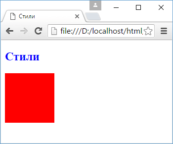
The following example sets the text color of the <h1> element to blue, and the text color of the <p> element to red:
Example
Internal CSS
An internal CSS is used to define a style for a single HTML page.
An internal CSS is defined in the <head> section of an HTML page, within a <style> element.
The following example sets the text color of ALL the <h1> elements (on that page) to blue, and the text color of ALL the <p> elements to red. In addition, the page will be displayed with a "powderblue" background color:
Example
<h1>This is a heading</h1>
<p>This is a paragraph.</p>External CSS
An external style sheet is used to define the style for many HTML pages.
To use an external style sheet, add a link to it in the <head> section of each HTML page:
Example
<h1>This is a heading</h1>
<p>This is a paragraph.</p>The external style sheet can be written in any text editor. The file must not contain any HTML code, and must be saved with a .css extension.
Here is what the "styles.css" file looks like:
"styles.css":
Tip: With an external style sheet, you can change the look of an entire web site, by changing one file!
CSS Colors, Fonts and Sizes
Here, we will demonstrate some commonly used CSS properties. You will learn more about them later.
The CSS color property defines the text color to be used.
The CSS font-family property defines the font to be used.
The CSS font-size property defines the text size to be used.
Example
Use of CSS color, font-family and font-size properties:
<h1>This is a heading</h1>
<p>This is a paragraph.</p>CSS Border
The CSS border property defines a border around an HTML element.
Tip: You can define a border for nearly all HTML elements.
Example
Use of CSS border property:
CSS Padding
The CSS padding property defines a padding (space) between the text and the border.
Example
Use of CSS border and padding properties:
CSS Margin
The CSS margin property defines a margin (space) outside the border.
Example
Use of CSS border and margin properties:
Link to External CSS
External style sheets can be referenced with a full URL or with a path relative to the current web page.
Example
This example uses a full URL to link to a style sheet:
Example
This example links to a style sheet located in the html folder on the current web site:
Example
This example links to a style sheet located in the same folder as the current page:
You can read more about file paths in the chapter HTML File Paths.
Chapter Summary
- Use the HTML style attribute for inline styling
- Use the HTML <style> element to define internal CSS
- Use the HTML <link> element to refer to an external CSS file
- Use the HTML <head> element to store <style> and <link> elements
- Use the CSS color property for text colors
- Use the CSS font-family property for text fonts
- Use the CSS font-size property for text sizes
- Use the CSS border property for borders
- Use the CSS padding property for space inside the border
- Use the CSS margin property for space outside the border
Tip: You can learn much more about CSS in our CSS Tutorial.
HTML Exercises
HTML Style Tags
Tag Description <style> Defines style information for an HTML document <link> Defines a link between a document and an external resource For a complete list of all available HTML tags, visit our HTML Tag Reference.
Основы CSS3. Селекторы

Любой html-документ, сколько бы он элементов не содержал, будет по сути «мертвым» без использования стилей. Стили или лучше сказать каскадные таблицы стилей ( Cascading Style Sheets ) или попросту CSS определяют представление документа, его внешний вид. Рассмотрим вкратце применение стилей в контексте HTML5.
Стиль в CSS представляет правило, которое указывает веб-браузеру, как надо форматировать элемент. Форматирование может включать установку цвета фона элемента, установку цвета и типа шрифта и так далее.
Определение стиля состоит из двух частей: селектор , который указывает на элемент, и блок объявления стиля — набор команд, которые устанавливают правила форматирования. Например:
В данном случае селектором является div . Этот селектор указывает, что этот стиль будет применяться ко всем элементам div.
После селектора в фигурных скобках идет блок объявления стиля . Между открывающей и закрывающей фигурными скобками определяются команды, указывающие, как форматировать элемент.
Каждая команда состоит из свойства и значения . Так, в следующем выражении:
background-color представляет свойство, а red — значение. Свойство определяет конкретный стиль. Свойств css существует множество. Например, background-color определяет цвет фона. После двоеточия идет значение для этого свойства. Например, выше указанная команда определяет для свойства background-color значение red . Иными словами, для фона элемента устанавливается цвет «red», то есть красный.
После каждой команды ставится точка с запятой, которая отделяет данную команду от других.
Наборы таких стилей часто называют таблицами стилей или CSS ( Cascading Style Sheets или каскадные таблицы стилей). Существуют различные способы определения стилей.
Атрибут style
Первый способ заключается во встраивании стилей непосредственно в элемент с помощью атрибута style :
Здесь определены два элемента — заголовок h2 и блок div. У заголовка определен синий цвет текста с помощью свойства color . У блока div определены свойства ширины ( width ), высоты ( height ), а также цвета фона ( background-color ).
Второй способ состоит в использования элемента style в документе html. Этот элемент сообщает браузеру, что данные внутри являются кодом css, а не html:
Результат в данном случае будет абсолютно тем же, что и в предыдущем случае.
Часто элемент style определяется внутри элемента head , однако может также использоваться в других частях HTML-документа. Элемент style содержит наборы стилей. У каждого стиля указывается вначале селектор , после чего в фигурных скобках идет все те же определения свойств css и их значения, что были использованы в предыдущем примере.
Второй способ делает код html чище за счет вынесения стилей в элемент style . Но также есть и третий способ, который заключается в вынесении стилей во внешний файл.
Создадим в одной папке с html странице текстовый файл, который переименуем в styles.css и определим в нем следующее содержимое:
Это те же стили, что были внутри элемента style . И также изменим код html-страницы:
Здесь уже нет элемента style , зато есть элемент link , который подключает выше созданный файл styles.css: <link rel=»stylesheet» type=»text/css» href=»styles.css»/>
Таким образом, определяя стили во внешнем файле, мы делаем код html чище, структура страницы отделяется от ее стилизации. При таком определении стили гораздо легче модифицировать, чем если бы они были определены внутри элементов или в элементе style , и такой способ является предпочтительным в HTML5.
Использование стилей во внешних файлах позволяет уменьшить нагрузку на веб-сервер с помощью механизма кэширования. Поскольку веб-браузер может кэшировать css-файл и при последующем обращении к веб-странице извлекать нужный css-файл из кэша.
Также возможна ситуация, когда все эти подходы сочетаются, а для одного элемента одни свойства css определены внутри самого элемента, другие свойства css определены внутри элемента style , а третьи находятся во внешнем подключенном файле. Например:
А в файле style.css определен следующий стиль:
В данном случае в трех местах для элемента div определено свойство width , причем с разным значением. Какое значение будет применяться к элементу в итоге? Здесь у нас действует следующая система приоритетов:
Если у элемента определены встроенные стили (inline-стили), то они имеют высший приоритет, то есть в примере выше итоговой шириной будет 120 пикселей
Далее в порядке приоритета идут стили, которые определены в элементе style
Наименее приоритетными стилями являются те, которые определены во внешнем файле.
Атрибуты html и стили css
Многие элементы html позволяют устанавливать стили отображения с помощью атрибутов. Например, у ряда элементов мы можем применять атрибуты width и height для установки ширины и высоты элемента соответственно. Однако подобного подхода следует избегать и вместо встроенных атрибутов следует применять стили CSS. Важно четко понимать, что разметка HTML должна предоставлять только структуру html-документа, а весь его внешний вид, стилизацию должны определять стили CSS.