Как сделать — адаптивную форму входа, авторизации
Узнайте, как создать адаптивную форму входа в систему с помощью CSS.
Нажмите на кнопку, чтобы открыть форму входа:
Как создать форму для входа
Шаг 1) добавить HTML:
Добавьте изображение внутри контейнера и добавьте входные данные (с соответствующей меткой) для каждого поля. Оберните элемент <form> вокруг них, чтобы обработать входные данные. Вы можете узнать больше о том, как обрабатывать входные данные в нашем учебнике PHP.
Пример
Шаг 2) добавить CSS:
Пример
/* Bordered form */
form <
border: 3px solid #f1f1f1;
>
/* Full-width inputs */
input[type=text], input[type=password] <
width: 100%;
padding: 12px 20px;
margin: 8px 0;
display: inline-block;
border: 1px solid #ccc;
box-sizing: border-box;
>
/* Set a style for all buttons */
button <
background-color: #4CAF50;
color: white;
padding: 14px 20px;
margin: 8px 0;
border: none;
cursor: pointer;
width: 100%;
>
/* Add a hover effect for buttons */
button:hover <
opacity: 0.8;
>
/* Extra style for the cancel button (red) */
.cancelbtn <
width: auto;
padding: 10px 18px;
background-color: #f44336;
>
/* Center the avatar image inside this container */
.imgcontainer <
text-align: center;
margin: 24px 0 12px 0;
>
/* Avatar image */
img.avatar <
width: 40%;
border-radius: 50%;
>
/* Add padding to containers */
.container <
padding: 16px;
>
/* The "Forgot password" text */
span.psw <
float: right;
padding-top: 16px;
>
/* Change styles for span and cancel button on extra small screens */
@media screen and (max-width: 300px) <
span.psw <
display: block;
float: none;
>
.cancelbtn <
width: 100%;
>
>
Создание модальной формы входа
Шаг 1) добавить HTML:
Пример
<!— Button to open the modal login form —>
<button onclick="document.getElementById(‘id01’).style.display=’block’">Login</button>
<!— The Modal —>
<div > <span onclick="document.getElementById(‘id01’).style.display=’none’"
class="close" title="Close Modal">×</span>
Шаг 2) добавить CSS:
Пример
/* The Modal (background) */
.modal <
display: none; /* Hidden by default */
position: fixed; /* Stay in place */
z-index: 1; /* Sit on top */
left: 0;
top: 0;
width: 100%; /* Full width */
height: 100%; /* Full height */
overflow: auto; /* Enable scroll if needed */
background-color: rgb(0,0,0); /* Fallback color */
background-color: rgba(0,0,0,0.4); /* Black w/ opacity */
padding-top: 60px;
>
/* Modal Content/Box */
.modal-content <
background-color: #fefefe;
margin: 5px auto; /* 15% from the top and centered */
border: 1px solid #888;
width: 80%; /* Could be more or less, depending on screen size */
>
/* The Close Button */
.close <
/* Position it in the top right corner outside of the modal */
position: absolute;
right: 25px;
top: 0;
color: #000;
font-size: 35px;
font-weight: bold;
>
/* Close button on hover */
.close:hover,
.close:focus <
color: red;
cursor: pointer;
>
/* Add Zoom Animation */
.animate <
-webkit-animation: animatezoom 0.6s;
animation: animatezoom 0.6s
>
Совет: Можно также использовать следующий код JavaScript для закрытия модального, щелкнув за пределами модального содержимого (а не только с помощью кнопки «x» или «Cancel», чтобы закрыть его):
Пример
<script>
// Get the modal
var modal = document.getElementById(‘id01’);
// When the user clicks anywhere outside of the modal, close it
window.onclick = function(event) <
if (event.target == modal) <
modal.style.display = "none";
>
>
</script>
Совет: Пойдите к нашему учебнику формы HTML для того чтобы выучить больше о формах HTML.
Совет: Перейдите в наш CSS Form учебник, чтобы узнать больше о том, как стиль элементов формы.
Creating a simple login form
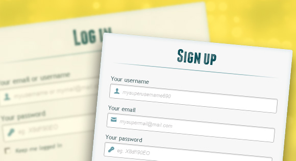
I am trying to create a simple HTML log-in that is placed in a box. I want to have something like this:

I have tried a few things but they all seem to have been in vain. Here is my code thus far. HTML:
I want the login box to be in the center of my browser, so I have made use of #login_form . I have a few questions: is the use of the fieldset tag a better way? When I used the fieldset tag, it created more issues; the appearance of the form and the size of the text & password fields changed.
I understand that <table> should be used for tabular data only, but the use of label in any other way seems to mess the size/width of password and username fields (it also requires more styling).
Is it poor coding practice to use <table> in a form? Will future browsers render the pages wrongly if I use <table> ? Is keeping the name and id of the form the same a bad idea? I feel like keeping them the same does not create any issues (even with the use of jQuery in the same page).
✨Build a Login and Register Form with HTML and CSS✨

Photo By unsplash.com
In this article, today we will learn how to build a simple but aesthetic Login and Register Form.
You can access the full code here and the demo page here!
Table of Contents
- Gather Resources
- Getting Started with Fire-UI
- Start building your Landing Page
- Setup Fire-UI
- Create Navigation Bar (Navbar)
- Create Login and Register Form
1. Gather Resources
Before we continue further, some resources you might need before we start coding �������� :
- Basic knowledge of HTML
- Text Editor (Either Visual Studio Code or Sublime Text is recommended)
- A Search Engine (Google, Mozilla, etc will be fine)
So that’s all for our resources, and I believed that you have downloaded all these resources. If haven’t, you can open the link provided above.
2. Getting Started with Fire-UI
Fire-UI is a CSS Library allowing for easier and more standards-compliant web design.
You can read the following blog to know more about Fire-UI

Fire-UI : A User-Friendly and Reliable CSS Framework
Stanley Owen ・ Dec 19 ’20 ・ 1 min read
To keep it simple and fast, we will move on to the next part.
3. Start building your Landing Page
a. Setup Fire-UI
Now open your text editor and type the basic of HTML:
Exit fullscreen mode
Save the following files with index.html , then we will start setting up Fire-UI. There are some methods to configure and connect Fire-UI. But in this tutorial, we will keep it simple, which is using CDN through jsdelivr :
Exit fullscreen mode
Thus, your index.html will now look like this:
Exit fullscreen mode
After that, save the file as .html extension like the picture below: 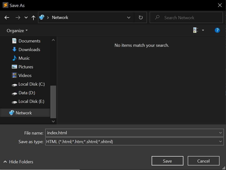
Find the file that you have just save it recently, run it with your default browser and you will see the result like this: 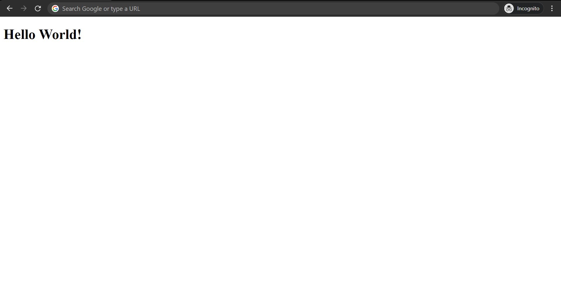
Before continuing further, you can access our full code in the following link: here
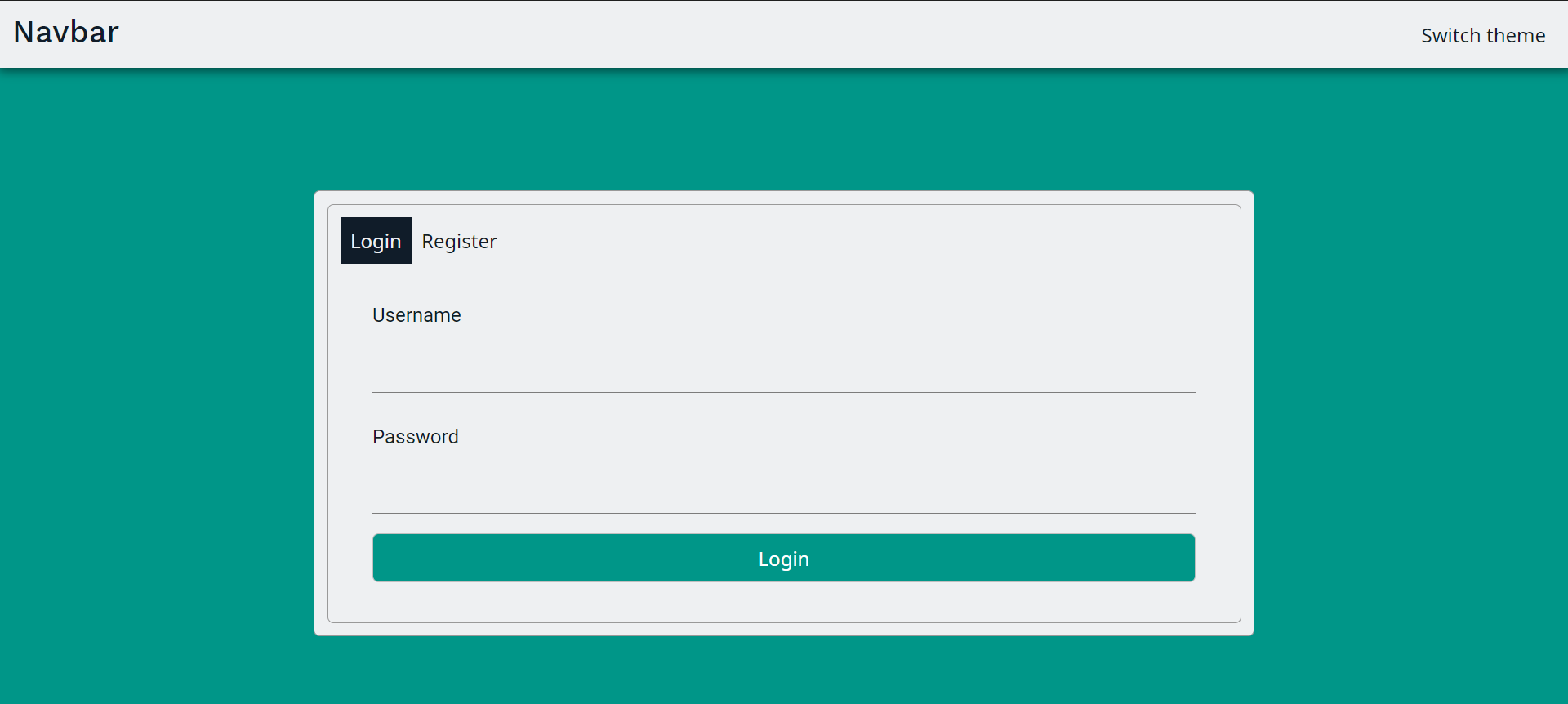
Now what we are going to to is to create navigation bar (navbar). If you didn’t sure what is navbar, here is how navbar look like: 
So what we need is:
- Remove the content of body
- Add the attribute theme = ‘light’ in the body element
- Copy and paste the Navbar code
Exit fullscreen mode
b. Create Login and Register Form
Then we come to the challenging part, which is building the login and register form.
Copy these code to your text editor:
Exit fullscreen mode
Well, we are not done yet, we will create a custom CSS to make it more aesthetic. Now we will create a index.css file which contains the following code:
Exit fullscreen mode
And we are done with our simple login and register template!
Don’t forget to give a star on GitHub if you like this article!
Happy Coding! ��
You may also like these articles:
Todo Application — An Open Source and Easy to Use Web Application
Stanley Owen ・ Feb 7 ・ 1 min read

AbstractMark, the modern markdown language.
Justin Maximillian Kimlim ・ Feb 15 ・ 2 min read
Build an Awesome Profile Page with Fire-UI
Stanley Owen ・ Jan 19 ・ 13 min read
Top comments (6)
![]()
Don’t forget to use <label> s for your inputs and make sure they are properly associated (this is important for screen readers). You have done this with your checkbox correctly you just need to implement it on your inputs.
Also you don’t need to use <input type=»submit» anymore, a simple <button> will do the trick and make your markup cleaner.
Taking the time to focus on semantics will make your life as a developer much easier and learning good habits now will make you 10x better than most developers in no time looking at what you have done as a student, as this is 100 times better than what I would have done!
![]()
First of all, Stanley Owen and I appreciate your taking the time to write this comment. As developers of Fire UI, we actually focus more on the main library than the examples making the examples somehow written in not up-to-date HTML tags, we are really sorry for this negligence. Of course, we’ll update this soon. Another factor of this causing is indeed Stanley Owen and I are both junior high school student making us, developers of Fire UI can only googling for learning, and as you know, today technology is evolving everyday and sometimes the query of Google shows up the result coming from the past years, which are maybe not relevant nowadays.
Of course, any contributions like Opening issues like this on GitHub, opening PR, using this Fire UI on your project, or even star it on GitHub, if you will, will be much appreciated.
fire-ui / fire-ui
A user-friendly and reliable CSS library
Fire UI

Table of Contents
Quick start
There are several quick start options available:
Bug and feature requests
Have a bug or a feature request? please open an issue if your problem or idea is not addressed yet.
Contributing Guidelines
Thanks for your interest in contributing to Fire UI! Please take a moment to review this document before submitting a pull request.
Форма входа и регистрации с помощью HTML5 и CSS3
Здравствуй, дорогой хабрадруг! В этом туториале мы научимся создавать две формы HTML5: форма входа и форма регистрации. Эти формы будут меняться друг с другом местами с помощью псевдо-класса CSS3 :target. Мы будем использовать CSS3 и шрифт с иконками. Идея этого демо в том, чтобы показать пользователю форму входа и предоставить ему ссылку “перехода” к форме регистрации.
В этом туториале я подробно расскажу о том, как создавать эффект как в Демо 1.
Здесь мы использовали несколько приемов HTML5. Например, элемент type=password автоматически скрывает то, что пользователь печатает и заменяет символы точками или звездочками (зависит от браузера). Элемент type=email позволяет браузеру проверить правильность формата email адреса. Кроме того, мы использовали параметр require=required; браузеры, поддерживающие данный параметр не позволят пользователю отправить форму до тех пор, пока поле не заполнено, JavaScript здесь не требуется. Параметр autocomplete=on будет автоматически заполнять некоторые поля. Мы также использовали замещающийся текст, который поможет пользователю при заполнении формы.
Теперь о двух хитрых моментах. Вы наверное заметили две ссылки <a href> в начале формы. Этот ловкий прием позволит нашей формы вести себя правильно при работе с якорями (anchors).
Второй момент связан с применением шрифта с иконками. Мы будем использовать data-attribute, чтобы отобразить иконки. Устанавливая параметр data-icon=”icon_character” с соответствующим символов в HTML, мы должны назначить лишь одно правило в CSS для установления стиля всех иконок. Подробнее об этом приеме можно почитать на сайте: 24 Ways: Displaying Icons with Fonts and Data- Attributes.
Для чистоты кода я пропущу базовые параметры (html, body и т.п.), но вы сможете найти их в исходных файлах. Повторяю, что я использую приемы CSS3, которые не будут работать во всех браузерах. Итак, давайте же приступим!
Стилизуем формы, используя CSS3
Во-первых, давайте назначим нашим формам базовый стиль.
Мы добавили две тени к элементу: одна — с целью создать внутреннее голубое свечение, а вторая — внешняя тень. Чуть позже я объясню вам z-index.
Здесь мы назначим свойства для шапки:
Замечу, что сегодня только браузеры с webkit поддерживают background-clip: text, поэтому мы сделаем полосатый фон только для webkit и привяжем его к заголовку H1. Так как параметр background-clip: text работает только в Webkit браузерах, я решил работать только со свойствами webkit. Именно поэтому я разделил CSS на две части и использовал только градиент webkit. Однако вы не должны использовать лишь webkit на своих вебсайтах! Так, например, параметр -webkit-text-fill-color: transparent позволяет нам иметь прозрачный фон, но только для браузеров webkit, все другие браузеры проигнорируют это свойство.
Мы также создали тонкую линию под заголовком с помощью элемента :after pseudo-class. Мы использовали градиент с 2px в высоту и уменьшили прозрачность по краям до нуля.
Теперь давайте позаботимся о полях ввода и придадим им приятный вид.
Во-первых, мы стилизуем поля и уберем обводку. Но будьте осторожны: обводка помогает пользователю понять, на каком поле он находится. Если же вы уберете ее, то нужно применить свойства :active и :focus.
Здесь мы использовали псевдо класс :not, чтобы стилизовать все поля, кроме чекбоксов. Кроме того, я решил убрать обводку и добавил свойства :focus и :active.
Теперь время веселиться: шрифт с иконками. Так как мы не можем использовать псевдо-классы :before и :after, мы добавим иконку в параметр label, а затем разместим в поле. Я буду использовать библиотеку fontomas. Вы можете сами сопоставить иконки с соответствующей буквой. Помните атрибут data-icon? Именно в него нужно вставить букву. Я использовал data-icon=’u’ для логина, ‘e’ для email, ‘p’ для пароля. Как только я выбрал буквы, я скачал шрифт и использовал генератор шрифтов fontsquirrel для конвертации в формат, пригодный для @font-face.
Вот собственно и все. Вам не требуется иметь отдельный класс для каждой иконки. Мы использовали параметр content: attr(data-icon), чтобы получить букву из атрибута data-icon. Таким образом, нам нужно лишь назначить шрифт, выбрать цвет и разместить иконку.
Теперь назначим правила для кнопки отправки формы.
Трюк заключается в том, чтобы использовать box-shadow, чтобы создать несколько рамок. Естественно, вы можете использовать лишь одну рамку, но также можно и несколько. Мы будем использовать параметр length для создания “фейковой” второй белой рамки, 3px в ширину, без размытия.
Теперь стилизуем чекбокс, здесь мы ничего необычного не сотворим:
Стилизуем подвал формы, используя множественные линейные градиенты, чтобы создать полосатый градиент.
Сейчас вы видите, что у нас две приятные формы, но ведь мы хотим, чтобы отображалась только лишь одна из них. Пришло время анимации!
Создаем анимацию
Первое, что мы сделаем, мы спрячем вторую форму, назначив opacity на 0:
Помните, что форма входа имеет параметр z-index: 22? Второй форме мы назначим этот параметр на 21, чтобы поставить его “под” форму входа.
Теперь самое интересное: меняем формы местами, используя псевдо класс :target. Вам нужно понять одну вещь по поводу :target: для перемещения мы будем использовать якоря. Нормальное поведение якоря — прыжок на определенный элемент страницы. Но мы не хотим этого, мы лишь хотим поменять формы местами. И тут приходит на помощь наш трюк с использованием двух ссылок в начале страницы. Вместо того, чтобы направить нас прямо на вторую форму, рискуя испытать эффект “прыжка”, мы придадим ссылкам параметр display: none. Это поможет избежать прыжков. Я обнаружил этот трюк на сайте: CSS3 create (французский язык).
Вот, что происходит: когда мы кликаем на кнопку Присоединиться, мы направляемся на #toregister. Затем происходит анимация и лишь потом переходим на элемент #register. Мы используем анимацию под названием fadeInLeft. Так как мы “прячем” форму, используя нулевую прозрачность, мы применим анимацию, которая будем постепенно появляться. Мы также изменили z-index, чтобы она появилась поверх другой формы. То же самое происходит для другой формы same happens for the other form.
Вот код для анимации. Мы использовали CSS3 animation framework от Dan Eden и адаптировали этот фреймворк под наш туториал.
Форма, которая “исчезает”, будет иметь анимацию затемнения влево:
Теперь вы можете использовать другие анимации от Dan Eden’ с помощью файла animate.css: просто измените класс .animate class и названия анимаций. Вы также обнаружите несколько других анимаций в конце файла animate-custom.css file.
Вот и все, друзья. Надеюсь вам понравился этот туториал!
Заметим, что в некоторых браузерах параметр background-clip: text не поддерживается. В Internet Explorer 9 анимации не работают. В Internet Explorer 8 и ниже псевдо-класс :target pseudo-class не поддерживается, поэтому там этот эффект вообще работать не будет.