Анимация появления текста на CSS
На этом уроке мы создадим простую CSS анимацию появления текста. Разобьем наш текст на отдельные фразы и будем их друг за другом прокручивать наподобие слайдов. Такой прием часто можно увидеть в шапке сайта или на баннере.
HTML код
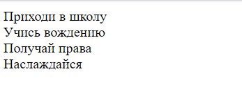
Создадим родительский контейнер для текстовых блоков. Все текстовые блоки будут абсолютно одинаковыми по форме, но разными по содержанию.
CSS код
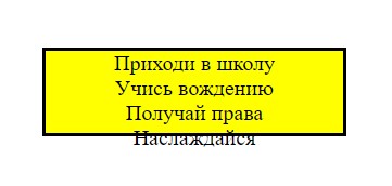
Для того, чтобы наш контейнер размещался в центре экрана, применим к тегу body флексы и стилизуем сам контейнер.
body <
display: flex;
align-items: center;
justify-content: center;
height: 25vh;
>
.container <
text-align: center;
height: 60px;
background: yellow;
border: 3px solid black;
padding: 0 50px; /* отступы по краям */
>
Далее стилизуем блок с текстом.
.text <
font-family: Arial, Helvetica, sans-serif;
font-size: 40px;
line-height: 60px; /* равен высоте контейнера */
text-transform: uppercase;
>
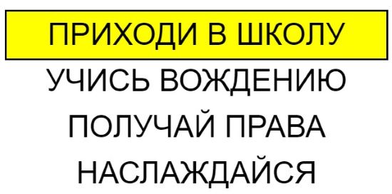
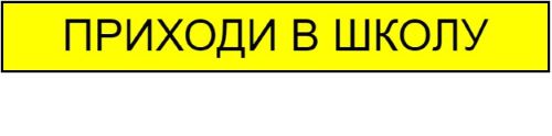
Мы хотим, чтобы в желтом контейнере поочередно происходила смена блока с текстом, а все что находится за пределами контейнера надо скрыть. Для этого добавим к контейнеру одно важное свойство, overflow: hidden.
.container <
.
overflow: hidden;
>
Теперь остался видимым только первый блок с текстом.
CSS Анимация
Создадим 7 кадров keyframes от 0% до 100% с примерным шагом 16%. Такое число мы получим в результате деления 100/6. Откуда взялись эти 7 кадров? У нас есть четыре тестовых строки, которые нужно прогнать туда и обратно. Поскольку первая строка появится в первом кадре по умолчанию, то общее количество кадров вычисляем формуле 8-1=7. При движении наверх, мы будем наращивать значение margin-top на 60 пикселей, а при движении вниз уменьшать на 60 пикселей.
@keyframes slide <
0% <
margin-top: 0;
>
16% <
margin-top: -60px;
>
33% <
margin-top: -120px;
>
50% <
margin-top: -180px;
>
66% <
margin-top: -120px;
>
82% <
margin-top: -60px;
>
100% <
margin-top: 0;
>
>
Дадим произвольное название анимации slide, укажем время продолжительности анимации и установим бесконечность infinite. Применим анимацию к первому блоку с текстом, который потащит за собой остальные три блока. Когда первый блок уйдет наверх за пределы желтого контейнера, то она спрячется, благодаря свойству overflow: hidden. На место первой строки встанет другая и так далее по кругу.
.text:first-child <
animation: slide 12s infinite;
>
Посмотрите пример на CodePen

Копирование материалов разрешается только с указанием автора (Михаил Русаков) и индексируемой прямой ссылкой на сайт (http://myrusakov.ru)!
Добавляйтесь ко мне в друзья ВКонтакте: http://vk.com/myrusakov.
Если Вы хотите дать оценку мне и моей работе, то напишите её в моей группе: http://vk.com/rusakovmy.
Если Вы не хотите пропустить новые материалы на сайте,
то Вы можете подписаться на обновления: Подписаться на обновления
Если у Вас остались какие-либо вопросы, либо у Вас есть желание высказаться по поводу этой статьи, то Вы можете оставить свой комментарий внизу страницы.
Порекомендуйте эту статью друзьям:
Если Вам понравился сайт, то разместите ссылку на него (у себя на сайте, на форуме, в контакте):
Она выглядит вот так:
Комментарии ( 0 ):
Для добавления комментариев надо войти в систему.
Если Вы ещё не зарегистрированы на сайте, то сначала зарегистрируйтесь.
Как сделать появляющийся текст в html

Для создания появляющегося текста в HTML можно использовать CSS анимацию. Вот пример кода:
В данном примере мы создали класс .fade-in , который устанавливает начальное значение непрозрачности элемента в 0. Затем мы добавили анимацию fadeIn , которая будет применяться к элементу с классом .fade-in . Анимация fadeIn задает изменение непрозрачности элемента от 0 до 1 за 1 секунду.
Ключевой момент здесь — использование @keyframes , где мы указываем настройки анимации. В нашем случае, мы указали, что на 0% непрозрачность элемента должна быть равна 0, а на 100% — 1.
Таким образом, при загрузке страницы элемент с классом .fade-in будет иметь непрозрачность 0 и станет видимым с анимацией, когда посетитель прокрутит страницу.
15 Gorgeous CSS Text Animation Effects [Examples]
One important factor of website design is the font choice and the style of typography that you select. This can easily be a make or break situation. Fonts catch the eye very quickly and can engage the user or push them away, so it’s important to make the right choice.
However, fonts and typography don’t have to be static. You can introduce CSS text effects on your website to help you stand out. Things such as scrolling text, shadows, text glow, style, colour, 3D effect and many more.
On this article we’ll be focusing on CSS Text Animations. These are simple and easy to integrate into your design, with pure HTML, CSS and (in some of them) some JavaScript. You can use them on scrolling animation websites.
15 Amazing Text Animations with CSS
These CSS text animations can be used to make your webpage more interesting and give it a unique design and feel. You have to be careful though, not all of these CSS text effects will benefit every design. For example, with a minimalistic design, you may want to choose a more subtle effect (just check these Minimalist WordPress themes by yourself and you will easily find out that they could ruin their clean design)
However, there should be a design in here that fits every user’s needs and expectations to improve your design and look. Check out these 15 text animation CSS codepens that we have selected for you.
1. Scroll Trigger Text Animation
A great example of how you can take advantage of CSS text animation which is triggered by a user scrolling. This one uses a trigger both for scrolling up and down, so the animation will always work in any direction.
Scroll-triggered animations are perfect for one-page websites.
If you do not know how to create a one-page website, fullPage.js library will make it easy for you. You can even use it in WordPress builders like Elementor and Gutenberg.
And if you are looking for scroll trigger animations, this article on How to Create CSS Animations on Scroll might be very helpful for you.
2. Text Colour Animation Effect (CSS only)
This one is just pure HTML and CSS, so it will be very easy to use and does not require any JavaScript. It sends a colourful transition of different colours across the text using a gradient, giving a very modern look.
You can easily change the chosen colours to fit your own brand by altering the hex codes in the CSS.
3. Static CSS Colour Change
Great for a big title, this one changes the colour of each word without any transition. This CSS text effect can be useful if you have a minimalistic design and don’t want things to look too busy.
Made purely with HTML and CSS, you can easily change the colours and speed of the animation. Just try it yourself by modifying the CSS of the codepen.
4. Morphing CSS Text Effect
A more advanced animation which is made with pure HTML, CSS and JavaScript. As you can see in the text animation CSS codepen, you can make more advanced animations when you add a little JavaScript. However, this one is still relatively easy to edit and mould to your brand or style.
5. Bouncing With Reflection Text Animation (CSS only)
A bouncing CSS text effect that has a reflection, made with only HTML and CSS, making it very portable across different websites.
It uses a span HTML element to position each letter in a row and bounces each one during the text animation, so be careful where you place it.
6. Water Wave Text Animation (CSS only)
A calm water CSS text effect, it animates the effect of a calm wave within the text. Great for a range of different titles on a website, could really make it stand out.
This one only uses HTML and CSS, making it easy to work with.
7. Crossing On Scroll CSS Text Effect
If you are looking for something to trigger a text animation, an on-scroll animation like this one may be of use to you. It uses HTML, CSS and JavaScript to pull this off. The animation is light and very smooth. Scrolling the letters individually could also add more value to this CSS text effect.
8. Loading Style CSS Text Animation
Looks like a loading progress bar but in the form of a font. Change the text to anything you want and use this unique animation. You can easily change the colours of the text animation in the CSS codepen.
9. Flip Text Animation (CSS only)
Can be used as a loading animation when waiting for a response on a webpage, made with only HTML and CSS. The text flips over from left to right and is a very smooth animation.
10. Fade In Text Animation (CSS only)
A subtle text animation (CSS) that fades in when the page loads. Very smooth animation and has a subtle blur effect upon fading in. Made with pure HTML and CSS.
11. 3D Text Grow Animation
Text animation (CSS) with a 3D effect that grows up and down. A very fun and engaging animation to use.
12. Animated Blobs Text animation (CSS only)
A very subtle CSS text animation with a colourful background and engaging font type. Made with pure HTML and CSS, it is easy to change colours and font type to fit your brand and style.
13. Basic Text Animations (CSS only)
If you are looking for some basic reusable text animations (pure CSS) that can be quickly used in many places on a webpage, these ones are for you. Made with only HTML and CSS, they are easy to edit and learn from.
14. Sliding Text Animation Carousel (CSS only)
A catchy and engaging CSS text animation great for the main title on a webpage. It loops through different words and has a sliding animation effect to transition between each word. Made with pure HTML and CSS, so it is easy to work with and edit.
15. Typing Text Animation
A great way to showcase a range of words or sentences across a screen in one area. The typing CSS text effect looks great for many designs and uses a smooth animation. Made with HTML, CSS and JavaScript but a great one to learn from and it is easy to edit the words you need to use.
Conclusion
CSS Text animations are great, they help create an inviting space for the visitors and help catch the eye towards a certain location. They can suit very well in one-page websites with full screen sections, creating a very appealing design for the user. I’m thinking about product landing websites, squeeze pages, etc.
FullPage.js library is the perfect tool to create this kind of fullscreen website. It is available for WordPress builders like Elementor and Gutenberg. Add one of these CSS text animations in fullscreen mode and I’m sure the result will be promising. For example, as we explained in the 1st CSS text animation, the scroll-triggered animation fits very well in a one-page website with multiple sections.
It can be difficult to choose the right animation though, not all animations will work well on all designs, so be sure to ask yourself if the animation is too busy and maybe opt for a more subtle one. Don’t overuse CSS text effects either, it will make the page look tacky and overrun with animations.
Анимация текста, плавное появление букв
Подскажите как добиться такой анимации текста, как на этом сайте — https://alethemes.com/ale-fashion/ . Появление текста "upcoming collection. ". Возможно ли такого добиться на чистом css? Или может есть какие-то сайты, ресурсы с готовыми подобными решениями.
Объяснение
Нельзя просто взять и написать document.querySelector(‘div с текстом’) , нужно использовать textContent (или innerText , но лучше textContent ), чтобы получилось примерно так: document.querySelector(‘Какой-то селектор’).textContent
[. text] — это spread syntax, для "выворачивания" данных, в данном случае это текст, мы "выворачиваем" текст ( . text ), то есть получаем каждую букву отдельно (Пример . ‘hello’ -> h e l l o ), а дальше это всё мы получаем в массиве т.к. всё завёрнуто в квадратные скобки.
Полное объяснение кода:
Сначала берём текст (строку), далее в цикле for. in , на каждой итерации получаем индекс текущего элемента массива. Создаём новый элемент <span> , в текст ему записываем текущую букву обращаясь к [. text] . Если текущий символ это пробел, тогда добавляем ему в стили margin: auto 3px . Далее в стилях также указываем задержку для анимации чтобы буквы появлялись постепенно, сначала берём текущий индекс и делим его на 10, чтобы задержка была не слишком долгая, и в самом конце просто обращаемся к content , (к слову, необязательно записывать в отдельную переменную элемент, у которого есть id , можно просто написать его id чтобы сразу к нему обратиться) и конечно же в content добавляем текущий элемент. (Через DevTools (инструменты разработчика) вы можете конкретно увидеть результат в HTML)
Обновление
Только что заметил кое-что, у букв есть эффект подпруживания, и угол отличный от моего, так что вот второе более корректное решение:
Объяснение ко второму решению. (CSS Анимация)
С самого сначала текст немного прозрачный, находится на 40 пикселей выше чем обычно и сужен по x координате на 30%, чтобы предать эффекта скорости. Далее сам текст уменьшается по y координате на 30% и сдвигается немного вниз чтобы был эффект подпруживания, эффект прозрачности пропадает т.к. мы его больше не задаём. Далее когда анимация достигает завершения (100%), все стили пропадают, т.к. их на 100% мы не задавали.