Creating a simple navigation bar
Before starting this tutorial, let me assume that you’ve come from the CSS tutorial about Styling Text on my website. So, at the moment, we’ve some basic tools ready in our hands:
- Basic selectors, class selectors, id selectors
- Commonly used properties: color & background-color
- Position properties
- And some properties used for styling text
In this tutorial, we will make use of these tools to create a simple navigation bar. And this is how the navigation bar will look like:
Screen shot: 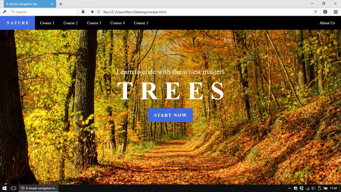
This tutorial is just an example, you should give the navigation bar your own style (size, color, font, etc…)
Preparing HTML code
From the expected result above, the navigation bar will contains 7 links.
2 of those links have unique style and should have their own id :
- The first one which is a logo, has unique background-color
- The last one which is About Us , stay at a special position (detached from the rest).
The navigation bar itself can have an id if you expect it will be an unique part of your website.
To-dos in CSS
Styling task can be divided into these sub-tasks;
- Coloring the <nav> container and make it fixed on top of the viewport.
- Sizing up all the links.
- Give the #logo unique style (maybe unique background-color or fancy font :D).
- Set position of the #about to the right corner of the navigation bar.
1. Styling the <nav> container
To pin the navigation bar at top of the web browser’s viewport is a simple task which we have done once in the tutorial about position-properties.
Just remember to set the container’s width to 100% . Because the rule position: fixed; will make the container collapse if we don’t specify container’s width .
2. Setting size of <a> elements
We’ve done this once in the tutorial about container-types.
3. Give #logo unique style
This part is optional and it depends on your own style, you may want to use an image or text as my example.
4. Positioning the #about
This is the last and the easiest task. We will just set its position to the right corner of the navigation bar. 😀
Clean up code
Congrazz! 😀
You’ve created a simple navigation bar for your website. Just save these code snippets somewhere in your computer so we can make use of them in future.
Summary
This navigation bar is simple and ready to use but it also has some drawbacks:
- Lack of hover effect. It’s a small feature to make our website more interactive. Visitors who use computers will be more pleasure when they hover mouse pointer on a link and see some effects. Maybe the text color or the link’s background will be slightly changed, etc…
- Links’ widths are fixed. In case our links contain words which have different lengths, the total look will be a bit cluttered. And we still have to change CSS code to adapt to the certain texts.
- The navigation bar itself is not responsive and well adapt to mobile screen. Normally, on mobile screen, the main block of links can be toggled by clicking on a button.
There is no disappointment here. It just means that we can make everything better in future when we have more tools in our hands (advanced selectors, spacing properties, screen size query, etc…).
It’s time to come back to our unfinished CSS tutorials. There’re many interesting stuff waiting for us.
CSS Navigation Bar
Наличие простой в использовании навигации важно для любого веб-сайта.
С помощью CSS можно преобразовать скучные HTML-меню в хорошо выглядящие навигационные панели.
Панель навигации = список ссылок
Панель навигации требует стандартного HTML-кода в качестве базового.
В наших примерах мы будем строить панель навигации из стандартного HTML списка.
Панель навигации в основном представляет собой список ссылок, поэтому использование элементов <ul> и <li> имеет смысл:
Пример
Теперь давайте удалим маркеры и поля и отступы из списка:
Пример
- list-style-type: none; -Удаляет пули. Панели навигации не нужны маркеры списка
- Установите margin: 0; и padding: 0; , чтобы удалить настройки браузера по умолчанию
Код в приведенном выше примере является стандартным кодом, используемым как в вертикальных, так и в горизонтальных навигационных панелях.
Вертикальная панель навигации
Чтобы построить вертикальную панель навигации, в дополнение к приведенному выше коду можно присвоить элементы <a> внутри списка.
Пример
- display: block; — Отображение ссылки в виде блока элементов делает всю ссылку области клики (не только текст), и это позволяет нам указать ширину (и обивка, маржа, высота и т.д., если вы хотите)
- width: 60px; — Элементы блока занимают всю ширину, доступную по умолчанию. Мы хотим указать ширину 60 пикселей
Можно также задать ширину <ul> и удалить ширину <a>, так как они будут занимать всю ширину, доступную при отображении в виде элементов блока. Это приведет к тому же результату, что и в предыдущем примере:
Пример
ul <
list-style-type: none;
margin: 0;
padding: 0;
width: 60px;
>
li a <
display: block;
>
Примеры вертикальной панели навигации
Создайте основную вертикальную панель навигации с серым цветом фона и измените цвет фона ссылок, когда пользователь наводит на них указатель мыши:
Пример
ul <
list-style-type: none;
margin: 0;
padding: 0;
width: 200px;
background-color: #f1f1f1;
>
li a <
display: block;
color: #000;
padding: 8px 16px;
text-decoration: none;
>
/* Change the link color on hover */
li a:hover <
background-color: #555;
color: white;
>
Активная/Текущая ссылка навигации
Добавьте «активный» класс к текущей ссылке, чтобы пользователь знал, на какой странице он находится:
Пример
Центрировать ссылки и добавить границы
Добавьте text-align:center в <li> или <a> для центрирования связей.
Добавьте свойство border в <ul> добавьте границу вокруг навигационной области. Если требуется также, чтобы границы внутри навигационной области, добавьте border-bottom для всех элементов <li>, за исключением последнего:
Пример
li <
text-align: center;
border-bottom: 1px solid #555;
>
li:last-child <
border-bottom: none;
>
Полная высота фиксированной вертикальной навигации
Создание полной высоты, «липкой» боковой навигации:
Пример
Примечание: Этот пример может работать неправильно на мобильных устройствах.
Горизонтальная панель навигации
Существует два способа создания горизонтальной панели навигации. Использование встроен ные или плавающ ие элементы списка.
Встроенные элементы списка
Один из способов построения горизонтальной панели навигации — это указать элементы <li> как встроенные, в дополнение к «стандартному» коду выше:
Пример
- display: inline; -По умолчанию элементы <li> являются блок-элементами. Здесь мы удаляем разрывы строк до и после каждого элемента списка, чтобы отобразить их на одной строке
Плавающие элементы списка
Другим способом создания горизонтальной панели навигации является размещение элементов <li> и указание макета для навигационных ссылок:
Пример
a <
display: block;
padding: 8px;
background-color: #dddddd;
>
- float: left; — Используйте float, чтобы получить элементы блока, чтобы скользить рядом друг с другом
- display: block; — ОтоБражение ссылки в виде блока элементов делает всю ссылку области клики (не только текст), и это позволяет нам указать обивка (и высота, ширина, поля и т.д., если вы хотите)
- padding: 8px; — Поскольку элементы блока занимают всю имеющуюся ширину, они не могут плавать рядом друг с другом. Таким образом, указать некоторые обивка, чтобы сделать их хорошо выглядеть
- background-color: #dddddd; — Добавить серый фон-цвет для каждого элемента
Совет: Добавьте цвет фона в <ul> вместо каждого элемента <a>, если требуется цвет фона с полной шириной:
Пример
Примеры горизонтальной панели навигации
Создайте основную горизонтальную панель навигации с темным цветом фона и измените цвет фона ссылок, когда пользователь наводит на них указатель мыши:
Пример
ul <
list-style-type: none;
margin: 0;
padding: 0;
overflow: hidden;
background-color: #333;
>
li a <
display: block;
color: white;
text-align: center;
padding: 14px 16px;
text-decoration: none;
>
/* Change the link color to #111 (black) on hover */
li a:hover <
background-color: #111;
>
Активная/Текущая ссылка навигации
Добавьте «активный» класс к текущей ссылке, чтобы пользователь знал, на какой странице он находится:
Пример
Выравнивание ссылок по правому краю
Выравнивание ссылок по правому краю путем плавающих элементов списка вправо ( float:right; ):
Пример
Разделители границ
Добавьте свойство border-right в < li > для создания разделителей ссылок:
Пример
/* Add a gray right border to all list items, except the last item (last-child) */
li <
border-right: 1px solid #bbb;
>
li:last-child <
border-right: none;
>
Фиксированная панель навигации
Убедитесь, что панель навигации находится в верхней или нижней части страницы, даже если пользователь прокручивает страницу:
Fixed Top
Фиксированное дно
Примечание: Фиксированное положение может не работать должным образом на мобильных устройствах.
Серая горизонтальная навигационная
Пример серой горизонтальной панели навигации с тонкой серой границей:
Пример
ul <
border: 1px solid #e7e7e7;
background-color: #f3f3f3;
>
Липкий навигационной
Используйте position: sticky; для <li> для создания липкой навигационной навигации.
Липкий элемент переключается между относительным и фиксированным, в зависимости от положения прокрутки. Он позиционируется относительно до тех пор, пока в видовом экране не будет выполнено положение смещения, после чего оно «вставляется» (например, положение: фиксированное).
Пример
Примечание: Internet Explorer, EDGE 15 и более ранние версии не поддерживают липкое позиционирование. Safari требует a-WebKit-префикс (см. пример выше). Вы также должны указать по крайней мере один из top , right , bottom или left для липкого позиционирования для работы.
Другие примеры
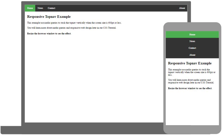
Отзывчивый topnav
Как использовать CSS Media запросы для создания адаптивной верхней навигации.
Отзывчивый сиденав
Использование запросов CSS Media для создания адаптивной боковой навигации.
Simple Top Navigation Menu Using HTML and CSS — [With Source Code]
Every website needs some sort of navigation so that users coming onto this web page can easily navigate between the pages of the website.
There are so many different navigation menus one can create like side navigation on a website, top navigation that stays on the top, maybe, one on the right side?
Well wherever you place it, these navigation menus or navbar menus are really an essential part of a website.
Creating them from scratch can not be so straightforward when you are just starting with HTML and CSS coding.
So in this blog post, we will create a top navigation menu or navbar from scratch using HTML and CSS and I will also attach the source code for it.
Creating The Folder Structure For Website
I have created a folder for myself called Nav1 and inside this folder with Visual Studio code which will be my editor in which I will write my HTML and CSS code.
Once the folder is open in visual studio code, I will create two files, an index.html and a style.css file.
Creating The HTML Structure
We will start by creating the basic HTML structure for our website.
We are using the Emmet extension for visual studio code so we will start writing html and Emmet will give us the boilerplate HTML structure for the website.
Then we will link our style.css to the HTML page.
Then we will go ahead and add some elements to our body of the website.
From the above image we can see that we have added a header element inside our body.
Inside the header tag, we have created two elements, 1 is an anchor element which will be used as a placeholder for the logo for our website.
The other element inside the header is the nav element. Nav elements are usually kept for adding menu to the navigations.
Inside the nav we have an unordered list and a few elements inside it defining the pages that we want the user to navigate to using anchor elements.
This is how our HTML looks like in a browser till now.
The next step is to add some CSS styles to these elements that we have created so that our website looks the way we want it to look.
The first thing we will do, and this is totally optional is to add a font to your website. In this example, I am using Google Quicksand Font. The usage of the font is explained in the image above.
By adding the above css code, we give our header a display property of flex and make the alignment for the header. After these above css changes the header looks like this.
How to create a navigation bar with HTML / CSS / and Javascript.

In this tutorial we will be going over how create a sticky navigation bar using HTML, CSS, and Javascript. As our user scrolls down the page, the navigation bar is going invert the color of the text and the navigation bars background, creating a pretty neat fade in effect.
To begin lets open up our command line and create a new directory called navbar and migrate our way into it.
Now that we are in our new directory we need to create an index page and a style page.
The index.hmtl page is where we will be writing our html and javascript code, as well as how our browser will be viewing the content. The style.css page is where our page is going to get its ascetics from.
Lets go ahead and open index.html with your preferred text editor and get started by adding the following.
This is going to create the link between our index.html file and the style.css page, and gives us access to some cool fonts we have pulled from google. Within the script tags we are calling our jQuery library so we can play-around with our html using Javascript.
Now in between the body tags we are going to create the links we want embedded in our nav bar. To do this we will need a div class we can call “wrapper” and within it a second div with a class of logo. The logo is going to live opposite of links.
To test our code lets open a new tab in your web browser and in the search bar type /// and then navigate your systems file tree to the index.html document we are currently working on. If done correctly we should have a screen that looks like this.
Awesome, what website dosent have some kind of content for us to read on it though. Lets put in some dummy data now. After the </nav> we want to create a section a new section and fill it with some content. We will do that by creating two new divs, one with a class of sec1 and the second with a class called content.
Notice the two <p></p> tags there. This is where you would want to fill in some text. If you are using a code editor such as atom type lorem and press tab, the editor will automatically fill in a paragraphs worth of jiberish. Lets refresh our page and hopefully you will see something like this.
Alright, now that the html is done jump over to your style.css page and lets get to making this look pretty.
If we go ahead and refresh our window lets look at what this did.
Thats no good, we are going to need a way to get that text from jumping to the top of the screen. A good idea would be to work on the selection tags that this content lives within.
Now we have given the section and its content a defined placement as well as changed the font size a bit.
Cool, that nav bar is looking pretty janky though. Maybe we could move that logo a bit to the right and put those links to the left. While were at it lets also space the links out in a horizontal order.
And lets check our work out by refreshing our browser.
Looking good! theres still so much to do. How about we bring those links down to the same level as the logo, space them out a bit, and make them black.
So cool, I want that login button to be red however, with white text, and the button should be round a bit.
Amazing! Now this part wont make too much sense yet, but we want to have a second color scheme to this bar. In our style sheet we are going to add the following in combination with the existing code already implemented.
No need to refresh the page, because these additions will do nothing….YET. Now we need to put a little java script into the mix. If you navigate back you your index.html page. In between the last script tag and the end of the head tag add this…
Now, lets take a moment to explain what this is doing. In our web browsers there is a scroll bar, and that scroll bar has a value depending on where it is. When its in the very most top portion you could say it has a value of 0, and when you scroll that number changes to 1, 2, 3, 4, 5 etc… So what this Javascript code is doing, is telling the web browser that if my position is not at the upmost position than I want to add a class to my nav called black. This logic will be true every time the webpage is loaded because it loading in the upright position.
So cool, but i feel like we are missing something….. Oh yes! we need a sweet image to fill up the body of this website. Go google a nice high res photo of something you like, save it in the same directory as your index and style sheets. Navigate to your style.css page and lets update section.sec1 with the following.
And just like that, we have our finished project.
This is a fun entry level project for incorporating javascript logic with traditional html and css. Thank you for following.