Оформление Web-страниц
В современной версии стандарта HTML5 практически все оформление страницы делается при помощи каскадных листов стилей, CSS. Команда CSS состоит из селектора и соответствующих ему свойств:
- Все относящиеся к селектору свойства записываются в фигурных скобках
- Описания свойств разделяются точкой с запятой. Не поставил «;» между свойствами – получил ошибку
- Свойства и их значения разделяются двоеточием
- Вокруг селекторов, свойств, их значений можно ставить любое количество пробелов, знаков табуляции и переносов строки
Способы использования CSS в HTML
- внешние стили, подключаются тегом <link> в голове документа, т.е. внутри тега <head>:
- внутренние стили, внутри тега <style> (a <style> – внутри тега <head> документа html)
- встроенные стили, как значение атрибута style:
Наследование
У элементов есть связи внутри объектной модели DOM.
- Тег, внутри которого находятся другие теги, для них предок, а они – потомки.
- Тег, который находится непосредственно в предке, без промежуточных елементов – дочерний элемент, а предок для него – родитель.
Свойства предков могут наследоваться потомками.
Виды селекторов
Селектор – от to select: выбирать, отбирать. Чаще всего используются первые шесть.
- универсальный (*): Выбирает все элементы (теги) на странице;
- элемент: выбирает все элементы (теги) с указанным именем;
- класс (class): выбирает все элементы (теги) с указанным классом (в атрибуте class);
- идентификатор (id): выбирает элемент (тег) с указанным уникальным идентификатором (атрибут id);
- вложенные селекторы, запись через пробел;
- дочерний селектор, должен располагаться непосредственно внутри родительского элемента. Записывается через >. Также используются дочерние псевдоклассы :first-child, :last-child, :only-child, :nth-child (odd), :nth-child (even) и др.
- Соседние селекторы: i + b. Стиль применяется к тегу b, соседнему по оотношению к i.
- Родственные селекторы: i
=»значение»] Стиль применяется в том случае, если у атрибута имеется указанное значение или оно входит в список значений, разделяемых пробелом. Пример: [class
Свойства селектора будут применены ко всем выбранным элементам (тегам) на странице.
Ниже для удобства свойства разбиты на несколько категорий.
Стили по умолчанию
У Web-страницы без стилевого файла есть оформление: элементы имеют отступы, используются шрифты с определенными параметрами и так далее. Например, ссылки – синие и подчеркнуты. Это браузерные стили по умолчанию, они определены в стандарте CSS консорциумом W3C.
Все свойства CSS
Фон – background
- background-color: red; или функция rgba(255, 0, 0, 0.5) задает цвет фона. Фон с указанием альфа-канала будет полупрозрачным.
- background: white url(«image.jpg») no-repeat 50% 0; Общее свойство, описывающее фон страницы.
Размеры, ширина, высота – width, height
- ширина, width: 100px;
- минимальная ширина, min-width: 100px;
- максимальная ширина, max-width: 100px;
- высота, height: 100px;
- минимальная высота, min-height: 100px;
- касимальная высота, max-height: 100px;
Цвет – color
- color: green;
Шрифт – font
- font-family: arial sans-serif;
Гротеск: sans – без + serif – засечек. Антиква, serif – с засечками: - font-size: 16pt;
Текст – text
- text-align: justify; (left, right, center)
- text-decoration: underline;
- line-height: 20pt;
Блочная модель
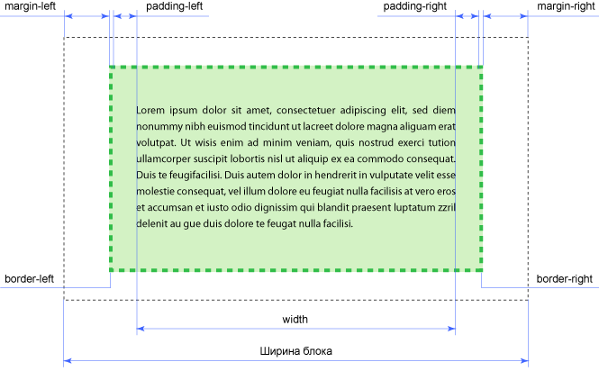
Любой блочный элемент состоит из четырех составляющих:
- Основой блока выступает его контент: текст, изображения и т.д. Контент имеет 2 размера: ширина (задается свойством width) и высота (height);
- вокруг контента идет внутреннее поле (padding), создающее пустое пространство от контента до внутреннего края границ;
- затем идут границы (border).
- Завершают блок внешние отступы (margin, от «маргиналии»), пустое пространство от внешнего края границ.
Похоже на матрешки: поменять местами контент, padding, border и margin невозможно!
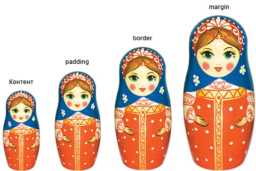
Каждая составляющая, кроме контента, может иметь различные размеры с каждой из четырех сторон.
Часто задаются по часовой стрелке: top, right, bottom, left.
Таким образом, блочный макет страницы с контентом описывается максимум 14 размерами. Если толщина рамки со всех сторон одинаковая, параметров 11.
Схлопывание отступов
У блочных элементов, расположенных рядом друг с другом по вертикали, отступы не суммируются, а объединяются между собой. Само схлопывание действует на два и более блока (один может быть вложен внутрь другого) с отступами сверху или снизу, при этом примыкающие отступы комбинируются в один. Этот эффект работает только для блоков, у которых не заданы поля и границы. Для отступов слева и справа схлопывание никогда не применяется.
Зачем? Для корректного отображения текста: расстояние между абзацами (тег <p>) без схлопывания увеличится в два раза, тогда как верхний отступ первого абзаца и нижний отступ последнего абзаца останутся неизменными. Схлопывание гарантирует, что расстояние в абзацах везде будет одинаковым.
box-sizing
Свойство box-sizing применяется для изменения алгоритма расчета ширины и высоты элемента; чтобы свойства width и height задавали размеры не контента, а размеры блока.
- box-sizing: content-box; свойства width и height задают ширину и высоту контента и не включают в себя значения отступов, полей и границ.
- box-sizing: border-box; Свойства width и height включают в себя значения полей и границ, но не отступов (margin).
- box-sizing: padding-box; Свойства width и height включают в себя значения полей, но не отступов (margin) и границ (border).
- box-sizing: inherit; Наследует значение родителя.
Рамка – border
У рамки есть дополнительные свойства: тип линии, скругление и т.д. Примеры:
- обобщенное правило. border: 2px dashed blue;
- радиус скругления рамки. border-radius: 5px;
- Скруглить квадрат до круга – border-radius: 50%; пример.
- border-collapse: collapse (separate, inherit); Устанавливает, как отображать границы вокруг ячеек таблицы. Это свойство играет роль, когда для ячеек установлена рамка, тогда в месте стыка ячеек получится линия двойной толщины. При значении collapse линия между ячейками отображается только одна.
Поля – margin и padding
Поля страницы можно инспектировать в браузере по нажатию F12, вкладка Elements
- margin: 0 auto; (внешнее поле) Так заданное поле центрирует блок
- padding: 20px; (внутреннее поле)
Положение и видимость
- display: block; (inline, inline-block, none). display: none используется для скрытия элемента со страницы.
- position: relative; (absolute)
- float: right; (left)
- object-fit: cover; (contain, scale-down. Для тегов img и video) : 50% 50%;
- overflow-y: scroll;
Горизонтальное и вертикальное выравнивание
- Центрирование блочного элемента:
- Центрирование строчного элемента: text-align: center;
- Центрировать горизонтально и вертикально: #mysection
Flexbox
Остальное
- list-style: none; (применяется для скрытия буллетов у ненумерованных списков)
Геометрия в CSS
Альтернативы CSS?
Сравнение стилевых языков. Существует XSL (eXtensible Stylesheet Language) – семейство рекомендаций консорциума W3C, описывающее языки преобразования и визуализации XML-документов. Состоит из трех частей:
- XSL Transformations (XSLT) – язык преобразования XML-документов.
- XSL Formatting Objects (XSL-FO) – язык разметки типографских макетов и иных предпечатных материалов.
- XPath – язык путей и выражений, используемый в том числе и в XSLT для доступа к отдельным частям XML-документа.
Языком, лежащим в основе XSL, является XML, а это означает, что XSL более гибок, универсален. Почти не используется в вебе, потому что более сложен и требует более строгого подхода. Дизайнеры и верстальщики всего мира сделали все, чтобы технологии, основанные на XML, не стали рабочими стандартами веба. Что, конечно, не избавило от недостатков HTML и CSS. В итоге имеем постоянно и стихийно меняющиеся технологии разных версий, по-разному поддерживаемые разными браузерами. Хороший дизайнер должен учитывать особенности поддержки технологий разными версиями разных браузеров. С прекращением поддержки старых версий операционной системы Windows и ростом популярности мобильных технологий ситуация улучшилась, но пока еще далека от идеала.
Применение свойств классов к простому html-коду: 
Основы CSS — Руководство для самых маленьких
Приветствую, дорогие друзья! В этом уроке вы узнаете что такое CSS, для чего нужен и как его правильно использовать. Это базовый урок из серии «Для самых маленьких», в котором я постараюсь объяснить наиболее понятным языком основы стилизации документов посредством CSS — Каскадных таблиц стилей (Cascading Style Sheets).


Часть 1. Основы CSS
В данном уроке мы затронем стилизацию документа, созданного с использованием языка разметки, т.е. придание определенной формы, определенного цвета, последовательности, размеров различных элементов и текста на странице, рассмотрим наиболее эффективные приемы работы с каскадными таблицами стилей. Поняв основы, вы сможете самостоятельно правильно и эффективно стилизовать HTML документы.
Вообще, CSS довольно элементарный формальный язык, который придумали для описания внешнего вида документов. Это говорит о том, что он довольно прост и состоит из самобытных примитивных конструкций, которые не так сложны для изучения. Самое сложное не синтаксис, не правила написания конструкций, а огромное количество CSS свойств для запоминания, которые выполняют различные задачи. Благо, все правила англоязычные с соответствующей смысловой нагрузкой. Простой перевод на наш язык дает понятие о том, что это правило делает и наоборот — при переводе того, что мы хотим добиться определенным свойством на английский язык, велика вероятность того, что мы получим правильное свойство. Это значительно упрощает запоминание CSS правил на интуитивном уровне. Например, если нужно задать фоновый цвет достаточно сделать перевод на английский, в результате чего получаем background-color (отдельные слова в CSS пишутся через дефис).

1.1 Использование CSS в HTML документах
CSS довольно просто использовать в HTML документах. Его можно:
Подключить как внешний CSS файл к документу. Для этого достаточно прописать тег <link rel=»stylesheet» href=»путь/до/файла.css»> в теге <head>. Это наиболее распространенный способ подключения таблиц стилей к документу, когда внешнее оформление страниц выносится в отдельный внешний CSS файл.
Прописать стили в самом документе, используя тег <style>.

Это менее популярный способ внутренней стилизации, который применяется в особых случаях, когда: А. Базовые стили должны быть моментально интерпретированы браузером до загрузки основных CSS файлов; Б. Когда стили должны быть опционально изменены в процессе работы над веб-сайтом, например, опциональный размер шрифта и другие опции оформления при работе сайта на какой-либо CMS, поддерживающей создание параметров в админ. панели или в других случаях, когда это действительно необходимо.
Пример вывода опции из админки в тело документа:
Инлайновое использование CSS свойств в конкретных тегах с помощью атрибута style.

Такой способ внутренней стилизации используется очень редко в особых случаях, когда необходимо: А. Вывести из админ. панели сайта параметры для конкретных тегов; Б. Сделать динамическую стилизацию элементов посредством JavaScript.
Пример инлайнового вывода фонового изображения секции из админ. панели сайта:
1.2 CSS синтаксис
Как я уже говорил ранее, CSS имеет довольно простой синтаксис. Давайте разберем его.

Правила объявлений настолько просты, что их можно описать в одном предложении. Сначала пишется селектор, который выбирает конкретный элемент на странице, после фигурных скобок пишутся свойства со значениями после двоеточия, а сами свойства отделяются друг от друга точкой с запятой. Это все.
Просто, не правда ли?
Самое сложное в CSS объявлении — селектор. Подробнее узнать о том, как формируются и как используются селекторы вы можете в уроке Все CSS селекторы в одном уроке — это очень важная тема, так как здесь раскрывается вся магия выборки элементов на странице, рекомендую посмотреть этот урок в обязательном порядке всем новичкам.
Вкратце CSS селектор — (от слова select — выбирать) — это конструкция, с которой начинается каждый блок объявлений и которая служит для выборки элемента или однотипных элементов на странице для дальнейшей стилизации. Чаще всего в качестве селектора используется определенный класс тега, например:
Здесь селектором выступает класс my-class тега div, который получает необходимое оформление в CSS файле. В данном случае фоновый цвет — серый. Соответственно, если на странице есть несколько тегов (не только div) с классом my-class, все эти элементы получат одинаковое оформление — серый фон цвета #999.
1.3 Каскадирование, наследование и приоритет
Понять принцип каскадирования несложно. Давайте взглянем на пример:
Из примера мы видим, что в CSS написан каскад, в котором класс .parent стоит на первом месте, после него через пробел указан дочерний класс .children, который отвечает уже за стилизацию только дочернего элемента. Дочерний тег обязательно должен быть вложен в тег с классом .parent. Если в HTML документе мы вынесем тег .children из тега div с классом .parent, он потеряет свое оформление, так как каскад уже не будет работать, структура нарушена.
Что мы получим в результате нашего примера. Тег с классом .children получит цвет текста #666, так как имеет более длинный каскад, а .parent покрасится в цвет #999. Родительский класс будет иметь внутренние отступы 10px, в то время, как дочерний этих отступов иметь не будет, так как свойство padding не распространяется на дочерние элементы. Однако если мы уберем color: #666; у селектора .parent .children, то его текст покрасится в цвет родителя color: #999;

Каскадирование и наследование позволяют стилизовать конкретные элементы на странице и определять приоритет применяемых стилей. Давайте рассмотрим иерархию приоритетов.
- Самым высоким приоритетом обладают свойства, в конце объявления которых указана конструкция !important. Не важно, какую вложенность имеет селектор, каким образом используются стили — инлайново или подключением внешнего файла, у них будет наибольший приоритет. Я крайне не рекомендую использовать !important при стилизации, так как в процессе поддержки или даже в процессе разработки в дальнейшем обязательно возникнет путаница, которую спасет только рефакторинг стилей. Как показывает практика, всегда есть способ не использовать !important.
Пример использования !important: - Следующим по значимости приоритетом обладают инлайновые стили, прописанные в самом теге через атрибут style, которые мы рассмотрели ранее: <section style=»background-color: #eee;»>
- Стили, заданные в теге style в самом документе имеют меньший приоритет;
- Еще меньшим приоритетом обладают стили, подключенные к документу как внешний CSS файл посредством тега <link>
- Самый низкий приоритет, окромя стандартных стилей браузера имеют стили родительских селекторов перед дочерними, например:
В результате тег <p>, находящийся в теге с классом .my-class получит значение свойства margin: 15px.
Стоит также отметить, что количество классов или идентификаторов, а также наличие дополнительных псевдоклассов и конструкций в селекторе повышают приоритет для стилизации:
И т.д. по логической цепочке.
И в завершение по приоритетам важно отметить, что стили, идущие в последующих объявлениях ниже по документу также имеют наибольший приоритет. Например:
В результате последний селектор в потоке документа получит значение свойства margin: 15px, так как является наиболее приоритетным. Однако если бы селектор первого объявления был длиннее, значния его свойств несомненно бы превалировали.
Что касается наследования, здесь все просто. Все дочерние элементы наследуют некоторые свойства родителя. Какие именно свойства наследуются предстоит выяснить вам в процессе изучения различных свойств и применении их на практике. Например, цвет текста всегда наследуется потомками, а отступы — нет.
Часть 2. CSS свойства
Я думаю нет смысла перечислять все CSS свойства, так как их очень много и практичней обратиться к справочнику всех CSS свойств. Я рекомендую изучить CSS свойства в справочнике на HTMLBook.
Однако рассмотрим 10 самых используемых CSS свойств в верстке. Я взял 10 больших CSS файлов из своих проектов и отсортировал свойства по частоте использования.
CSS Свойство
Частота использования
Описание
Часть 3. Медиа-запросы
Медиа-запросы в CSS — это база для создания отзывчивой верстки, позволяющая стилизовать элементы в зависимости от размера экрана или устройства, на котором отображается веб-сайт. Технически Медиа-запрос — это простое логическое выражение, которое может быть или истинным или ложным. Условиями для такого выражения являются либо параметры устройства, на котором отображается веб-страница, либо размер экрана в пикселах.
В данном руководстве мы рассмотрим базовые возможности медиа-запросов, которые необходимы для адаптивной верстки сайтов и практически полезны.
Медиа-запрос пишется в самом файле стилей или в теле документа (тег style) и начинается с объявления правила @media. Структура медиа запроса довольно проста:

Условием может выступать либо устройство — all (все устройства), screen, print, tv и т.д., либо медиа-функции, которые задают параметры устройства или разрешение экрана, на котором отображается документ.
Наиболее часто используемые медиа-функции определяют именно максимальное и минимальное разрешение экрана устройства:

Здесь устройства с максимальным разрешением экрана 480px или минимальным разрешением 320px будут отображать текст тега с классом .my-class серым. Данное условие я привел для примера, практически оно бесполезно. Чаще всего требуется указать либо только максимальное разрешение, либо только минимальное, в пределах которого будет прменяться свойство.
Кроме всего прочего, как мы видим из примера, функции могут содержать условия and (И), not (НЕ) и only (Для старых браузеров, не поддерживающих медиа-запросы). Нет логического оператора or (ИЛИ), его роль выполняет запятая. Медиа-функции, как мы видим заключают в обычные круглые скобки.
Размещение свойств в медиа-запросе не дает никакого приоритета, поэтому логичней размещать медиа-запросы в конце CSS документа, либо загружать тегом link внешний CSS файл с медиа-запросами после загрузки основных стилей сайта для правильного переопределения последних на разных разрешениях или на различных устройствах.
Часть 4. Рекомендации
Ну и конечно-же мои рекомендации. За всю практику верстки у меня накопились некоторые правила, которыми я с радостью поделюсь.
Before You Begin

I’ve made a website where you can discover foreign language music and learn a language using songs lyrics in 19 languages. Check it out and view it as an example of what you could built after a bit of practice.
Introduction
Take a moment and picture yourself as having all the skills and experience of a full-fledged web developer and as having accomplished all of your programming goals.
This course will get you one step closer to fulfilling that vision. Let’s begin. Here is a link to the HTML Course if you would like a refresher.
HTML Full Course in One Article
The Essentials of Web Development
CSS means Cascading Style Sheets. Files containing CSS code end in “.css” and are used to give style to HTML elements. Basically, CSS is used to turn a website with basic structure and content into something much prettier.
Linking to Your CSS File
If you are just reading this for the concepts, you don’t have to worry about linking the CSS file to the HTML file.
But, if you are using Visual Studio Code to follow along with this course, you will have to link them yourself. You connect the files by putting a link element inside the head of your HTML file. Set the “rel” attribute to “stylesheet” and the “href” attribute to your CSS file’s pathway. If your CSS file is in the same folder as your HTML file and is not nested any further, you simply set “href” to the CSS file’s name.
Because of Emmet shortcuts, in Visual Studio Code, you can type “link” and then press the tab button to automatically add everything you need except for the “href” value. You will have to edit that separately.
CSS Structure
CSS code looks like this and has a three-part structure:
- Selector: A word or series of words that tells the browser what element or elements you want to style.
- Property: The property you want to style
- Value: The style you will give the property (end the style declaration with a semicolon)
As an example, if you wanted to change the background color of the body element, you would write:
The body is empty in the above example.
While it is good practice to use the “!+TAB” way of generating the HTML base code, the following code examples will not include the base code because that makes the concepts easier to understand. They will also omit the body element.
Before you learn the many properties that can be styled using CSS, it is crucial to understand how to select an element or how to select a group of elements. We will use the “background-color: yellow” example to explain the many selector options available to you.
Element Selectors
The first type of selector is the element selector.
In an element selector, you simply write the element’s name. The following example targets all of your HTML’s h2 elements.
Note that in the above code, there was an h2 element without any h1 element. If you remember from the HTML Full Course, this is bad code! You should first use h1 elements and then gradually work your way down.
ID Selectors
Id selectors are commonly used when you wish to select only one element. Id attributes are included in elements’ opening HTML tags and must be unique to that element. They look like this:
The ID selector begins with “#” and then you include what you assigned the “id” attribute in your HTML code. For this example, the first heading of a website was given a unique “id” of “first-heading”, and now, because of our CSS, the first heading’s background color is yellow.
Class Selectors
The attribute “class” can also be added to elements’ opening tags and used in our selector statements. Unlike the “id” attribute, classes don’t have to be unique to each element and are used to group elements with similar styles.
Class selectors begin with “.” and then have the value you assigned to the “class” attribute in your target elements.
You can assign more than one class to an element. Just put a space between each class name, wrap the names in quotation marks, and assign it to the “class” attribute. Now we can use CSS to target both of the classes. Here’s what it could look like:
Attribute Selectors
We can also select elements using attribute selectors. Attribute selectors select all the elements that have a certain value assigned to an attribute. Follow the following format in your selector statement: [attribute-name = “assigned-value”].
You can be even more specific with attribute selectors by selecting elements whose attribute value starts, ends, or contains a string of text. Here’s what they would look like:
Starts With: [attribute-name ^= “string”]
Ends With: [attribute-name $= “string”]
Contains: [attribute-name *= “string”]
In addition to selecting by element, id, class, or attribute, there are many other options and variations which will be covered below.
Select All Selectors
Select all selectors style all of the elements. For example, the following code targets everything, including the body element, and makes them all have a yellow background.
You can also select all the elements that are nested after an element or group of elements. Use selectors to select the intended elements, put a space, and type “*”. This code selects all the elements that are nested inside h1 elements and, therefore, only the span element gets a yellow background:
Descendant Selectors
Descendant selectors are used to select all the elements of a certain type that are nested within another certain type of element, regardless of how far nested they are. The following example targets all the span elements that are nested within h1 elements.
You can also select the immediate children that are nested within an element or nested within each element in a group of elements using the “greater than” symbol. Here is an example that targets the italicized elements that are nested one level down within every element that has the class “all-headers”:
Sibling Selectors
Next, we have sibling selectors. There are two main types: general and adjacent.
The general sibling selector targets all the siblings of a certain type that follow the first targeted element or group of elements. It uses a “
” symbol and looks like this:
Here we are targeting all span elements that follow h1 elements. Follow, in this case, means that the targeted span elements come after the h1 elements and are in the same “level” as the h1 elements, so to speak. In other words, neither of them are nested within each other. So, that was the general sibling selector.
We also have the adjacent sibling selector that only selects elements that are immediate neighbors of the first targeted element(s). Use a “+” symbol to code this selector.
Multiple Selectors
You can list multiple selection statements before you declare properties and values. This is achieved by separating each selection statement with a comma. Here is an example that styles both h1 and span elements.
Pseudo-Elements
Now we get to the more complicated selector statements, the first one being pseudo-elements. Pseudo-elements are kind of like sub-elements that can be targeted in selection statements. Here are two examples (Note that we use two colons to connect elements with their pseudo-elements):
Placeholders
This code makes the placeholder’s background turn yellow for each element that has the type “text”.
First Letters
This code makes the first letter of each paragraph have a blue background color.
There are many more pseudo-elements, but the point of this lesson is just to make you aware of their existence. Same thing with the following selection type, pseudo-classes.
Pseudo-Classes
Using a colon, we can target an element’s properties when something special happens to that element. The most often used pseudo-class is “hover” and here’s what it would look like:
Without hovering over the button, the button has no background color.
But when the website user hovers their cursor over the button, the background color turns yellow.
CSS Specificity
The final point about selector statements in CSS has to do with specificity scores. For every CSS selector, a specificity score is calculated that helps the browser decide between conflicting selectors.
When more than one selector is trying to change the same property, the browser ends up implementing the property value that comes from the selector statement with the highest specificity score.
From lowest to highest specificity, the order goes as follows:
Element Selectors < Class Selectors < ID Selectors
When you make complicated selector statements, it gets pretty difficult to figure out if one selector is more specific than another. Luckily, Visual Studio Code comes to the rescue. If you hover over the selection statement in your CSS file, it will tell you the score.
If you have two selectors that both try to change the same property and each of the selectors has the same specificity score, the browser will pick the selector that comes last in the file. Otherwise, it goes with the highest scoring selector.
Styling Text
Now that you know how selectors work, we can see some examples of properties and their possible values. First, we will go over how to style text.
The text’s size can be changed using the “font-size” property, which is usually given a height in pixels. This code sizes the text to the height of 30 pixels.
Boldness
The “font-weight” property determines the text’s degree of boldness. Values range from least bold (“100”) to most bold (“900”). You can also assign the words “bold” or “normal” to this property. Here is what this property looks like in action:
Fonts
You can use the property “font-family” to change your text’s font style. Some of the available font families that work for most browsers include Arial, Courier New, Georgia, and Times New Roman. The code looks like this:
To play on the safe side, you might want to specify a list of fonts. The browser tries to load the first font and will move on to the next one if the first one doesn’t work out. Simply list the fonts and separate them with commas. You can have as many backup fonts as you want.
If you want to use less standard font styles, you might want to check out Google Fonts. You can look around until you find a font you like. Then click “select this style” and look for the link tag with the attributes “href” and “rel”. Copy and paste that link tag into the head element of your HTML code. Then follow the CSS guidelines under the phrase “CSS rules to specify families” to set the font-family to that font in your CSS file.
Google Fonts also is great for seeing what fonts look good together if you click on the font and then scroll down to the “Pairings” section.
Text Alignment
The “text-align” property can take the values “left”, “right”, and “center”. This property aligns the text to either the left side, the right side, or to the center of the text’s parent element. Here’s an example:
Line-Height
You can change the height of each line of text using the “line-height” property. This property is by default set to “normal”. But you can use a unitless number to change this. Unitless numbers are numbers without a specified unit type like 2 or 1.1. I won’t get too far into the weeds here, but we use unitless numbers over “unit-full” numbers because it ensures that the line-height will scale proportionally when the page is zoomed in or out.
Letter Spacing
The property “letter-spacing” changes the length of the space between each letter. It usually takes a number of pixels, and can also be set to “normal” to get the default spacing.
Word Spacing
To change the spacing between words, give the property “word-spacing” a value in pixels or you can set it to normal.
Text Transform
You can use the “text-transform” property to make each word capitalized, to make the letters uppercase, or to make the letters lowercase. Here’s what they would look like:
Underlining Text
While you could use HTML to underline the text, underlining in CSS gives you more customization options. You add an underline by setting the “text-decoration” property to “underline solid” or to “underline dotted” to create a solid or a dotted line respectively.
You can also change the color of the line using the “text-decoration-color” property, like this:
Often, you will want to remove underlines from links. This is achieved by setting “text-decoration” to “none”.
Text Shadow
You can add a “text-shadow” to the text. The value given to the “text-shadow” property follows the following form: “offset-x offset-y blur-radius color”. These terms will be explained below the code example.
Each of the offset values (“offset-x” and “offset-y”), take a number of pixels that can be positive or negative. If they were negative it would look like “-2px”. Positive offset values make the shadow go to the right and down. Negative offset values, alternately, make the shadow go to the left and up.
The blur-radius is used to give a blur to the shadow and it takes a positive pixel value.
Finally, the color determines the color of the shadow (more on colors in the “Colors” section below).
You can even give the text multiple text shadows. Put a comma after the first shadow’s values and then add the second shadow’s values like this:
Text Color
You can change the color of any text that is nested inside another element. Select the parent element with your selector and then use the property “color”.
There are many more options than basic colors. The next section goes into details on all the options you may choose.
Colors
Besides just writing the name of the color for properties like “background-color” and “color” and “line-decoration-color”, you can use “hue, saturation, lightness, and alpha (HSLA)”, “red, green, blue, and alpha (RGBA)”, and also “hex-codes” to get more specific colors.
For HSLA colors, the first number ranges from 0 to 360 and is the hue of the color. The hue represents the location of the color on a color wheel in terms of degrees.
The second number ranges from 0% to 100% and is the saturation of the color. 0% means the color is grayed out and 100% means the color is completely not grayed out.
The third number also ranges from 0% to 100% and is the color’s lightness. 0% means the color is completely darkened and 100% means the color is completely lightened.
Finally, the fourth number is a decimal number that ranges from 0 to 1 and is the color’s alpha. At 0, alpha makes the color completely see-through. At 1, alpha makes the color completely not see through.
RGBA is simpler to understand. R, G, and B range from 0 to 255 and represent how red, green, and blue the color is. 0, 0, 0 means no red, no green, and no blue is added, and 255, 255, 255 means maximum red, maximum green, and maximum blue is added.
Alpha, once again, determines the color’s see-through-ness.
Hex-codes
Hex-codes are written using hexadecimal numbers that represent the RGBA numbers but instead of each value going from 0 to 255, each value goes from 00 to FF. In other words, rather than having each digit range from 0 to 9, your options include 0, 1, 2, 3, 4, 5, 6, 7, 8, 9, A, B, C, D, E, and F. Two of the 16 options are chosen to determine R. Two are chosen to determine G. And it’s the same thing for B and A. The R, G, and B values are completely lacking their respective colors at 00, and are full of their respective colors at FF. And then Alpha just ranges from 00 to FF instead of from 0 to 1. Hex-codes begin with “#” and then have 8 digits.
Backgrounds
There are several options for styling an element’s background like, for example, the body’s background, which covers the whole page. These options include having a solid background color, a linear-gradient, and a background image.
Background Color
To get a solid background color, set the “background-color” to one of the color options we went over in the last section.
Linear Gradient
You could also use a linear gradient to style the background which gradually changes the background from one color to another, as you go across the screen.
To make a linear gradient, have the “background” property’s value follow this form: “linear-gradient(gradient-direction, first-color, second-color, third-color, etc…)”.
The “gradient-direction” should be set to a certain number of degrees. “45deg” means the gradient will run diagonally. “90deg” means the gradient will run from left to right. For the colors, you can use any of the previously listed techniques to specify the gradient colors.
Background Image
Nowadays, many websites have background images. You do this with the “background-image” property, which you set to a URL link. The string that goes in the URL link can either be an image file hosted online or a locally hosted image in one of your computer’s files. Here is what an image from Unsplash would look like in the background:
When you have finished setting the background image, you can now make some more modifications to the background.
Currently, the image size is repeated as many times as necessary to fill the body. To stop a background from repeating, use the “background-repeat” property and set it to “no-repeat”.
Alternately, the property “background-size” can be used to cover the image across the entire body with the value “cover”. Then you don’t have to worry about repeating images.
To change what part of the photo is covering the body when “background-size” is set to “cover”, use the “background-position” property. You can target each of these regions of the photo: “top”, “bottom”, “left”, “right”, and “center”.
CSS Variables
CSS Variables are used to store property values like long URLs or specific colors. It can save a lot of typing time and make your code easier to read. Within a selector’s curly brackets, write code that mirrors the following:
The variable “special-color” can now be used in future CSS declarations that select elements that are nested within the body element.
You can give a fallback value to CSS variables for when the variable doesn’t work. Change the “var( — variable-name);” to “var( — variable-name, fallback-value);”.
If there was an error with the special color like if “ — special-color” was spelled wrong, the background would be blue.
You can define global variables in CSS with the following code that doesn’t go within the curly brackets after a CSS selector statement but instead exists by itself:
Global variables can be accessed by any selector, and for any element(s).
Box Model
The next topic we will cover is the Box Model. Every HTML element belongs to a box like this and when you hover over the HTML in Google Chrome’s Developer Console. It is the box that gets highlighted on the website.
Looking at the box model diagram, the inside rectangle is the element, then (from the inside out) we have the padding, then the border, and finally the margin. E.P.B.M. I suggest making an acronym so you can quickly remember the order. It’s common to mix up padding and margin, but you’ll get the hang of it quickly.
Element
Sizing an element is achieved with the “width” and “height” properties. Usually, either the number of pixels, percentages of the parent’s width and height, or percentages of the view-width and the view-height are used. Here, the element with an “id” of “unique” is given a different width and height to showcase the various options.
These values are also used to size the width of paddings, borders, and margin, so it is important to remember them.
Box Sizing
By default, or if you set the property “box-sizing” to “content-box”, the width and height properties determine only the element’s size. You can change that, however. If you set “box-sizing” to “border-box”, the width is calculated including the element, the padding, and the border. To further explain these differences, take a look at this code and the resulting effects.
Child 2’s width property has accounted for not just the element size, but also the padding and the border. The child was limited to 100 pixels in width, and as a result, had to shrink the element size.
Child 1, on the other hand, only had the element limited to 100 pixels in width. The border, with a width of 10px, extended beyond the element’s 100 pixels.
Padding
The padding creates distance between the border and the element’s content. You can style all the padding sides at once, like this:
Or you can style each side’s padding individually, like this:
I often catch myself trying to call the property “padding-bot,” which is not a thing. Something to watch out for.
You also may want to get rid of all the padding. To do this, set the padding property to “0”.
I’ll give a more detailed example that may clarify padding for you. This is what the element with an id of “not_padded” looks like without padding:
And this is the element with an id of “padded” when it is in fact padded:
As you can see, the div with the id “padded” is pushed closer to the middle of its parent as the padding takes up space on all four sides.
Border
The border surrounds the padding and you can change the border’s style, color, and width, as well as the roundness of the border. Let’s start with width.
Border-width is determined by the “border-width” property. Use a number of pixels (20px), a percentage of the parent’s width or height (50%), or a percentage of the view-width or view-height (60vw or 80vh).
After setting the width of the border, we can change the color, with the “border-color” property and the style with the “border-style” property.
For “border-color” just set it to one of the many color options previously mentioned.
For “border-style” just set it to one of these options: “solid”, “dashed”, “dotted”, or “none”. “Solid” makes a solid border, “dashed” makes a dashed border, “dotted” makes the border dotted, and “none” gets rid of the border. Here’s an example:
The final relevant property for borders is “border-radius.” We use this property to determine the border’s roundness. If you want the border to be a circle, set “border-radius” to 50%. You can give other percentage values to this property that range from 0 to 100, or you can give pixel values. This is how you would make a circular-bordered image.
If you want the image to be a perfect circle, you must make sure the width and height properties are equal to each other and then set the “border-radius” to “50%”.
Margin
Margin determines the space between the border and other elements and is often used to separate items from one another. The “margin” property accepts a number of pixels, a percentage of its element’s parent’s width, or a percentage of the view-width or view-height. You can specify the length of all the side’s margins at once like this:
Or you can change each side’s margin individually, like this:
Here’s an example. The children div in this code has no margin and are stacked right on top of each other:
And this is what the children look like with margin (they have pushed away from each other and are now separated):
The last thing about margins is that it is often used to horizontally center an element within its parent. You do this by setting the margin to ”0 auto”. Here’s an example:
Outline
There is one more thing we should talk about in this section that isn’t technically part of the box model, but it makes sense to talk about it here. That thing is the outline.
Outlines take up no space and exist outside of the border. You can give an outline width, style, and color just like you would give a border.
Display
The display property determines how your element is displayed. There are several options available to you.
Setting the “display” property to “none” completely hides the element. It’s like it doesn’t even exist since it takes up no space.
Inline
Setting “display” to inline gets rid of the element’s default margin and makes the margin width 0. Neighboring inline items will fit side by side in a line (hence the name inline). You can still make inline elements have margin by specifying the margin after you’ve changed the display property. Inline displays also are unaffected by the width and height properties. So setting the elements’ widths to 100 px doesn’t change the elements’ size, as showcased in this example:
Image and Span elements by default have an inline display. Since you almost always want your website’s text to remain inline, you will often wrap text within the span element, give the span element some id, and then reference that “id” in a selector to style the text. That way you can style portions of your website’s text without that portion jumping to a new line. That could happen if you use the div element instead of nav to wrap the text.
Block
Setting an element’s “display” to “block” makes the element, by default, take up 100% of its parent’s width. You still have control over the height and width of the element, however.
If you do not specify the height and width, and the element is unable to take up 100% of its parent’s width, it takes up as much as it can. Otherwise, it will take up 100%.
Neighboring block elements go on separate lines.
A “block” display is the default for form elements, div elements, section elements, and header elements. For that reason, you should wrap elements inside of div or section elements when you want them to appear on new lines and not be inline next to each other.
Inline-Block
There is a hybrid between “inline” displays and “block” displays, called “inline-block”.
Setting an element’s “display” to “inline-block” lets you control the width and height of the element while still having the element be with other “inline” elements on the same line.
Next, we have “flex” displays. Setting an element’s “display” to “flex” turns that element’s box into a flexbox and puts the element’s children in either a row or a column.
Flexboxes give greater control over where child elements are placed in a parent element.
The first step is to, of course, set the “display” in the parent element to “flex”. Then you should specify which direction the flex should go. The “flex-direction” property takes either “row”, “row-reverse”, “column” or “column-reverse” as values. The default direction is “row”.
The row options treat the parent like a row and give you greater control over the placement of child elements in the horizontal direction.
And the column options treat the parent like a column and give you greater control over the placement of child elements in the vertical direction.
The reverse options look at the order of the children from top to bottom and left to right in the HTML code and reverse the children’s order upon display in either a row or a column.
Enabling flexbox opens up two properties: “justify-context” and “align-items” which have different functions depending on whether you chose a row direction or a column direction. “Justify-context” controls the element’s positioning along the main-axis and “align-items” controls the element’s positioning along the cross-axis.
A row’s main-axis is the horizontal direction and a row’s cross-axis is the vertical direction. It’s pretty much the opposite for columns. A column’s main-axis is the vertical direction and a column’s cross-axis is the horizontal direction.
Here are possible values for justify-context, which controls the main-axis alignment:
- Flex-start: Moves the children to the beginning of the row or column. This is the default value of justify-context.
- Flex-end: Moves the children to the end of the row or column.
- Center: Centers the children in the middle of the row or column.
- Space-between: Shoves the two outer children to the edges of the row or column and spreads the empty space between the children.
- Space-around: Spreads the children apart from each other in a row or column so that the distances between them are equal to each other and the distance before the first and after the last child is half as large as each of the spaces in the middle.
- Space-evenly: The space between the children in a row or column, as well as space before the first child and after the last child, are all equal to each other.
Here are the possible values for align-items, which controls the cross-axis alignment:
- Flex-start: Moves all the children to the beginning of the row or column. This is the default-value of align-items.
- Flex-end: Moves all the children to the end of the row or column.
- Center: Centers the children in the middle of the row or column.
- Stretch: Stretches the children to cover the entire cross-axis if the children were given no width or height.
- Baseline: Aligns the children near an imaginary line where the cross axis starts.
To further exemplify these concepts, I will show you a base HTML code and will list the resulting website display for each possible value of justify-context and align-items, combining them into three examples so as to save time and space.
Flex- start, for both justify-content and align-items, is the default value and would look like the examples of “flex-direction: row” and “flex-direction: column” presented above. Therefore, flex-start needs no further explanation.
We will take a closer look at flex-end, however. Setting justify-content and align-items to flex-end makes the children move towards the end of the row, and to the bottom of the column.
Centering the children in the middle of the parent can be achieved by setting justify-content and align-items to the value “center”, like this:
Setting align-items to “stretch”, as explained above, stretches the children to cover the entire cross-axis if no length was established for the cross-axis direction. Also, this example showcases the value “space-around” for justify-content which spreads out the space between the children with half the distance of each inside empty space going before the first of the children and after the last of the children. It looks like this:
Here is an example with justify-content set to “space-between” and align-items set to “baseline”.
Remember, “space-between” pushes the first and last child to the far edges of the main axis and equalizes the space between the children. And baseline places the children along the cross-axis.
For the last example, we will switch to a flex-direction of “column”. There are no more align-items values left to cover so this example will use “center” for align-items. It will also use “space-evenly” for justify-content, the last value left to be covered which equalizes the lengths of the spaces before, between, and after the children.
If the children of a flexbox, or if the children of any element are too big to fit in the row or column, you can set the “flex-wrap” property to either “nowrap” or “wrap.”
The value “nowrap” makes overflowing items get smaller until they fit in the row or column.
Or you can set it to “wrap” which wraps the overflowing items to the next line.
The other alternative to deal with overflowing items is to use the property “overflow” and set it to “hidden” or “scroll”. You don’t have to have a flex-box to use the “overflow” property.
So, to explain, here is an overflowing div element that goes beyond its parent element’s width and height:
If you set overflow to “hidden”, the child element is contained to the parent’s width and height:
And if you set overflow to “scroll”, it looks like this:
Order
Finally, you can specify the order of a flexbox’s children using the “order” property in each child. Just set this property’s value to an integer. The order will go from least to greatest.
Here is a code example of three children without being ordered:
And here they are with the “order” property:
Position
The “position” property controls the position of your selected element. These are your options for the “position” property’s values: “static”, “relative”, “absolute”, “fixed”, and “grid”.
Static
“Static” is the “position” property’s default value. By default, the browser just does what it does and follows something called the “normal flow.”
Setting the position property to “relative”, “absolute”, or “fixed”, unlocks additional properties of “top”, “right”, “bottom”, “left” that can help you position elements on the screen.
But when “position” is set to “static”, using these additional properties changes nothing. This is what you would code, to make an element take on the default positioning.
Relative
Setting an element’s “position” property to “relative” doesn’t immediately change the element’s position in the normal flow. But it does unlock the previously mentioned properties of “top”, “right”, “bottom”, and “left”. Now you can give positive and negative distance measurements (numbers of pixels, percentage of the view-width, or view-height) to move the element around.
Here are the functions of the four positioning properties:
Top: Positive values move the element below its default/static positioning. Negative values move the element above its static positioning.
Bottom: Positive values move the element up from its static positioning. Negative values move the element down.
Left: Positive values move the element to the right of its static positioning. Negative values move the element to the left of its static positioning.
Right: Positive values move the element to the left of its static positioning. Negative values move the element to the right of its static positioning.
Here is an example that moves the element fifty pixels to the right of its static positioning and one hundred pixels down.
Relative positions do not cause changes in any other element’s position (it does not move non-selected elements around).
Absolute
“Absolute” positioning removes the element from the normal flow and the browser positions the other elements as if the absolutely positioned element was not there.
If you just set the “position” property to “absolute”, however, it will remain in its static positioning. Like this:
With absolutely positioned elements, you won’t want the element positioned where the browser first loads it. The unlocked properties “top”, “left”, “bottom”, and “right” can be used to space the element away from each edge of the screen and must be assigned values to make absolutely positioned elements actually change their positions. Here is what each of the unlocked values does:
Top: Positive values distance the element away from the top of the screen. Negative values distance the element above the top of the screen.
Bottom: Positive values distance the element away from the bottom of the screen. Negative values move the element down below the bottom of the screen.
Left: Positive values move the element to the right of the left side of the screen. Negative values move the element to the left of the left side of the screen.
Right: Positive values move the element to the left away from the right side of the screen. Negative values move the element to the right of the right side of the screen.
What follows is an example that showcases many of the above concepts for absolute positioning.
The last point for absolute positioning is that absolutely positioned elements will be positioned after relatively positioned elements if they are not given a top or bottom value. Keep this in mind if you run into problems down the line with absolute positioning.
Fixed
When you position your elements to be “fixed” it makes them similar to absolutely positioned elements in that they are taken out of the normal flow, however, the difference is that fixed positioned elements cannot be scrolled. The properties left, right, top, and bottom all work the same as with absolute positioning. Fixed positioning is often used for navigation bars at the top or bottom of your website.
As you can see with this example, regardless of where we scroll to on the webpage, the fixed element stays in the same position:
Positioning Tips
Here are a few quick tips for positioning. If you want the element to be positioned all the way to one side of the screen, whether it’s the top, bottom, right, or left side, do something like this (the element’s positioning must not be static):
Here’s an example:
Another tip is that if you want to quickly center an element horizontally within its parent, you can do this in the HTML code by wrapping that element in a “center” element, like this:
Z-Index
The property “z-index” is used to bring items forward (on top of other elements) or backward (behind other elements).
Assign an integer to the “z-index” property. When there is an overlap between elements, the element with the greater z-index appears in front.
There is one more display type that I have waited to explain because it entails a completely different way of positioning elements, a grid system. To use a grid, set the parent element’s “display” property to “grid”.
Column and Row Size
Next, you should specify the number and size of the columns, as well as the number and size of the rows. This is achieved with the properties “grid-template-columns” and “grid-template-rows”. These properties take at least one distance value that is typically a number of pixels or percentages of the view-width or view-height.
I will show the various CSS properties that should be given values for the grid to work. Then, toward the end of the Grid section, there will be a large example. Here is the first CSS example:
The above code makes four columns with widths of 200 pixels each. It also makes four rows with different heights.
When specifying column widths or row heights you may use the distance value (“fr”). Rows with their height set to “fr” get their height from the amount of free space remaining in the parent. So the first row in the above example gets a height of 2/3 of the remaining free space of the parent’s height that hasn’t been taken up by the other rows. The parent’s height is 500 pixels and the two rows take up a total of 200 pixels. 300 pixels are remaining so the first row gets a height of 200 pixels and the last row gets a height of 100 pixels.
Space Between Columns and Rows
You can put space between the columns or rows with the property “grid-column-gap” or “grid-row-gap”. The distance value determines the width of the space for “grid-column-gap” and the height of the space for “grid-row-gap”.
You can also change both gaps at once with the “grid-gap” property.
Each of the following grid properties goes in the children of the parent element we used to create the grid.
Grid-Column and Grid-Row
You can use the “grid-column” property to say how many columns that item will span. Likewise, you can use the “grid-row” property to say how many rows that item will span. Here’s an example:
The above code makes the item take up the first three columns and the first two rows. 1 represents the first line of the grid from either the top or left (for “grid-row” or “grid-column” respectively). The 4 means the fourth line from the left. And the 3 means the third line from the top. So 1 to 4 covers the first three spaces, and 1 to 3 covers the first two.
Grid Template Areas
Another to assign children to different parts of the grid is with grid template areas.
The first step is to create the areas using the property “grid-template-areas” in the parent element. The following code creates three rows and three columns:
The “heading” area spans the first three columns in row 1. The “.” is used to indicate an empty area. The “first_centered” area is in the middle of the second row. And the “second_centered” area is in the middle of the third row.
Essentially, we are naming areas of the grid to which we will assign the items. Then, to assign an item, target the item with a selector and then use the “grid-area” property giving it the value of the grid area’s name without quotation marks, like this:
You can change all the grid items’ positioning within their grid areas at once using the “justify-items” property or the “align-items” property in the grid parent.
Or, you can change the positioning of each child one at a time using “justify-self” or “align-self” properties on the child.
The “justify-self” property controls the child’s position along the horizontal axis and the “align” property controls the child’s position along the vertical axis.
“Justify-self” and “align-self” takes the possible values of “stretch”, “center”, “start”, or “end”.
“Stretch” stretches the child to span the entire axis within its grid area.
“Center” moves the child to the center of the axis within its grid area.
“Start” moves the child to the start of the axis within its grid area.
“End” moves the child to the end of the axis within its grid area.
Okay, now it’s time for the big grid example that combines a lot of the properties into a complex grid layout. It’s not the prettiest example, but it gets the job done.
I encourage you to try and make sense of it on your own with the help of the above explanations.
Transitions
Transitions are often used on hovers or when new information appears or disappears. Transitions transition properties from one value to another. For example, we could transition the colors, or change the opacity.
If we wanted to change the background color of a button when we hover over it, we would target that button, use the property “transition”, and give it a value that follows the form “property duration function”.
You must first assign an original value to a property. Then create the transition using the transition property, and finally specify, when a hover happens, what the background color should transition into.
“1s” means that the transition will take one second to finish.
“Linear” is an example of a function that determines the transition’s rate of change. There are other functions, but linear is the easiest to understand because it makes the transition have a constant rate of change.
You can even give multiple transitions in the same transition value, like this:
Animations
Animations are used more often than transitions for more complicated transitions because they make it easier to transition a property between more than two values.
To create an animation, use the “animation-name” and “animation-duration” property in the animated element’s declaration. Set “animation-name” to whatever you want to call the animation and set “animation-duration” to the number of seconds you want the animation to take (like 3s). Also, you have to make sure that the property you are animating is assigned a value in the original CSS styling statement. Otherwise, the animation will not work.
The next step is to add the keyframes which detail how your animation will transition. It looks like this.
The above code only runs the animation once when the page loads. It transitions from a yellow background to an orange background at the halfway point, and finally to a red background, and then to the original yellow background color.
You can make the animation keep the last animated property value after the animation finishes by setting the “animation-fill-mode” property to “forwards”. Here is an example that puts this concept into practice:
There is one more important concept for animations. The animation can run more than once if you use the “animation-iteration-count” property. This property can take a positive int or “infinite”. The number you include determines the number of times the animation will run. “Infinite” means the animation is continuous and never stops.
Responsive Design
It’s an expectation nowadays that websites should be mobile, tablet, and desktop friendly and for that, you need responsive design. Standard CSS uses a mobile-first design where we design first for smartphone users and as our code is written we test for the screen size and make changes to the style when the screen width or height exceeds a limit.
To test screen widths, we use media queries.
Let’s say our website’s background should be colored blue on a phone, green on a tablet, and stay green on a desktop. We might do something like this:
If you are able, try to make the browser window change sizes to see how this page is responsive. When the screen width is below 500px, it looks like this:
And when the screen width is above 500 pixels, it looks like this:
Conclusion
Way to go! Seriously! If you made it to the end, you have now gotten a basic understanding of CSS and have been exposed to all of the fundamentals.
My advice is to work on some personal projects that utilize these concepts. Doing so will help these concepts become second nature to you and you might even learn something new as well.
Or, you can move onto more complicated programming subjects like JavaScript to build on your newly acquired base knowledge. The JavaScript course is coming soon.
Regardless of what you do, I hope this article has helped advance you along your programming journey.
Основы CSS — Основы современной верстки
В прошлых уроках мы познакомились с разметкой элементов с помощью HTML. Многие из этих элементов уже имеют какое-то свое визуальное оформление: параграфы имеют отступы, ссылки выделяются подчеркиванием и цветом, заголовкам устанавливаются другие значения размера шрифта. Обычно этого недостаточно для создания полноценных современных сайтов. Какие-то стили нам просто не подходят, а какие-то элементы мы хотим стилизовать отдельно.
Для визуального оформления WEB-страницы создан язык CSS. CSS переводится как каскадные таблицы стилей (Cascading Style Sheets). Именно этот язык отвечает за то, как наши HTML-элементы будут выведены пользователю в браузере.
В этом уроке мы разберем ту часть аббревиатуры, которая относится к таблицам стилей. Что такое каскадность и как это работает, вы сможете прочитать в следующем уроке.
Стили CSS
Любые стили CSS, будь то цвет текста или целая анимация, записываются по одной и той же формуле: название свойства: значение; .
Чтобы добавить стиль к элементу, необходимо использовать селектор. Он указывает, к какому именно элементу или элементам нужно добавить наши стили. Для примера возьмем следующую HTML-разметку:
Изменим размер и цвет шрифта в этом предложении. Это можно сделать следующей CSS-записью:
Что означает эта таинственная запись выше? Ее можно условно разбить на три основные составляющие:
- p — это селектор. Здесь мы говорим, чтобы браузер выбрал все параграфы на странице. О том, какие бывают селекторы, мы поговорим чуть позже.
- Фигурные скобки < >. Они отделяют селектор от правил. Все правила записываются уже внутри этих фигурных скобок.
- Свойства. Они записываются по схеме, которая представлена ниже. Чем больше у вас будет практики, тем больше различных свойств и их значений вы будете знать. Не пытайтесь выучить их все сразу. Всегда используйте документацию. Даже опытные разработчики прибегают к ней, чтобы вспомнить правильные значения того или иного свойства.
Разберем некоторые свойства, которые помогут вам оформлять текст:
- font-size . Это свойство позволяет задать размер шрифта. Со временем вы узнаете множество различных единиц, в которых можно записать значение. На начальном этапе используйте значения в пикселях. Это достаточно простая и понятная единица измерения, которая не зависит от того, какие еще стили указаны у текста.
- color . Это свойство поможет вам установить новое значение цвета для выбранного текста. Цвет может записываться разными способами. Помимо этого есть большой набор цветов, которые можно записать словами. Это отличный способ познакомиться со свойством color . Посмотреть на все такие записи можно здесь.
- text-align . Свойство, устанавливающее выравнивание текста. Оно может принимать одно из следующих значений: left , right , center , justify .
Подключение CSS
Использовать CSS на странице можно с помощью нескольких способов:
- использование специального файла
- использование тега <style> внутри HTML-разметки
- записывая стили непосредственно у нужного тега. Этот способ называется инлайн (inline) записью.
Разберемся с каждым способом отдельно.
Использование отдельного CSS-файла.
Данный способ один из самых удобных в реальной разработке. Так как стилей в проекте обычно много, то держать их в HTML-файле не очень удобно. Связано это с тем, что HTML-файл становится очень большим и ориентироваться в нем становится невозможно. Чтобы этого избежать, можно создать отдельный CSS-файл. Этот файл будет иметь расширение .css, имя же может быть произвольным.
Представим, что на компьютере создана отдельная директория с проектом. Она может выглядеть следующим образом:
Добавим основную информацию в файл index.html:
Теперь необходимо подключить файл main.css в наш файл index.html. Для этого используется специальный тег <link> . У данного тега необходимо указать атрибут href , значением которого будет путь до файла main.css. Тег <link> указывается в секции <head> .
Дополнительно разберем эту запись: ../css/main.css . Ее можно условно разбить на три составляющие:
- ../ — переход в директорию выше. Изначально файл index.html находится в директории html/, поэтому мы «выходим» из нее в директорию site/.
- css/ — переход в директорию css/.
- main.css — указание имени и расширения файла, который мы хотим подключить.
Если бы наши файлы index.html и main.css находились в одной директории, то подключение выглядело бы следующим образом: href="main.css" .
После подключения файла мы можем записывать все нужные стили именно в файле main.css. Они автоматически подключатся на наш сайт.
Использование тега style
Вторым способом использования CSS является использование стилей в специальном теге <style> . Для этого нет необходимости создавать отдельный файл и подключать его к HTML. В этом случае тег <style> обычно указывается внутри секции <head> . Хоть это и не обязательное правило, но желательно придерживаться именно такой структуры.
Данный способ не является основным, хотя и рекомендуется для некоторых стилей. Это позволит отобразить некоторые стили еще до того, как загрузится CSS-файл. Какие стили рекомендовано так выносить, вы сможете узнать в процессе становления вас как профессионала.
Inline-стили
Последним вариантом использования CSS являются инлайн-стили. Они подключаются с помощью атрибута style у любого тега в разметке. Это наименее предпочтительный способ. Его тяжело читать, особенно если у тега десяток стилей. К тому же вы не сможете записать стили для всех одинаковых тегов. Придется для каждого указывать отдельно. Это приведет к постоянному копированию стилей.
Возьмем прошлый пример и добавим inline стили:
Классы и идентификаторы
При создании разметки разработчикам удобно отделять одинаковые теги друг от друга с помощью имён. Например, на странице есть два заголовка:
Оба заголовка второго уровня, но в дизайне они могут иметь разные CSS стили. Вы уже познакомились с селектором по тегу и он не поможет дать каждому из заголовков уникальные стили.
Дать имена тегам позволяют атрибуты class и id . Эти атрибуты принимают произвольные имена, с помощью которых можно обратиться к элементу в CSS.
Различие класса и идентификатора в количестве использований:
- class — значение атрибута может устанавливаться сколько угодно раз в рамках одной страницы
- id — значение атрибута устанавливается у одного элемента на странице. Не может быть двух одинаковых идентификаторов на странице
Если значений у атрибута несколько, то они указываются через пробел, например:
Чтобы обратиться к элементам по их классу или идентификатору, используются специальные селекторы, которые мы сейчас и рассмотрим.
Селекторы
Селекторы — краеугольный камень всего CSS.
«Не так важны стили, как то, к чему они применяются» © Народная мудрость
Селекторы позволяют выбирать элементы, к которым будут применяться стили. Это очень мощный и многогранный инструмент, который позволяет выбирать не только по тегу, но и по классу, идентификатору, наведению мыши, разным атрибутам, выбирать только четные или нечетные элементы и так далее.
Разбор каждого селектора — это тема для целого курса. Сейчас нас интересуют три основных селектора, которые можно назвать базовыми:
- Селектор по тегу. Такой селектор мы применяли на протяжении всего урока. Цель простая — просто указать тег, для которого будут применяться стили.
- Селектор по классу. Если нужно выбрать только конкретные элементы в HTML, то можно дать тегу произвольный класс и, используя конструкцию .название-класса , добавить стили.
- Селектор по идентификатору. Еще один случай выборки по дополнительному атрибуту тега. Главная разница заключается в самом HTML — идентификатор не может повторяться в рамках одной страницы. Одно имя может использоваться только один раз. В связи с этим нет возможности задать стили для идентификатора и использовать его на других элементах. Для выбора идентификатора используется конструкция #имя-идентификатора .
Рассмотрим все три селектора на реальном примере:
После применения этих стилей получится следующая картина:
- Черный фон секции <main> . Для этого использовали класс content и селектор .content ;
- Заголовок первого уровня имеет белый цвет, размер шрифта 20 пикселей и расположение по центру. У заголовка есть идентификатор main-title , поэтому для добавления стилей мы смогли использовать селектор по идентификатору #main-title ;
- Все параграфы будут иметь белый цвет текста. Для этого использовался селектор по тегу.
Вложенность селекторов
В реальной разработке не всегда удается пользоваться только этими тремя видами селекторов в том виде, в котором вы их только что изучили. Зачастую нам необходимо ограничить область, для которой будут применяться стили. Разберем на примере:
Как добиться того, чтобы заголовки новостей были больше? Можно для каждого заголовка в новости добавить свой класс. Это хорошее решение, если новостей немного или нет необходимости для каждой такой секции вводить новые стили для заголовков.
Более простым решением станет использование вложенности селекторов. Вначале посмотрим, как решить нашу задачу:
Этот селектор комбинирует два уже известных типа:
- Селектор по классу .news
- Селекторы по тегу article и h2
Разделив их пробелом, мы сказали браузеру: «Возьми все заголовки <h2> из <article> , который лежит внутри элемента с классом news ». В примере это элемент <section >.
Читать селекторы стоит именно таким образом — справа налево. Такой подход называется вложенностью селекторов. Можно комбинировать что угодно и с какой угодно глубиной.
Важно: для удобной работы не стоит использовать очень большую вложенность. Старайтесь использовать комбинацию не более 2 или 3 селекторов
Важно понимать, что такая запись .news article h2 выберет все заголовки второго уровня во всех <article> , которые лежат внутри блока с классом news . Давайте немного видоизменим верстку, чтобы это проверить.
Ко второй новости мы добавили блок «Похожие новости». Самое интересное, что наше правило font-size: 32px; применится и к заголовку «Похожие новости», и к заголовку «Похожая новость 1». Так как оба заголовка так или иначе лежат внутри <article> , которые находятся в блоке с классом .news .
Такой тип селекторов называется контекстным или селектор потомков. С его помощью мы выбираем всех потомков, которые встречаются внутри самого левого селектора.
Как же нам выбрать только те заголовки, которые относятся непосредственно к новостям, а не к похожим новостям или заголовкам других секций? Здесь нам на помощь придет дочерний селектор. Его суть в выборе только тех элементов, которые непосредственно лежат внутри нужного нам блока. Без учета всех остальных вложенностей. Чтобы указать такой селектор, используется символ > . Укажем, что нам нужны только те <article> , которые лежат внутри .news . И нам нужны заголовки, которые находятся внутри этих <article> . Это делается следующим образом:
Теперь размер шрифта для заголовков «Похожие новости» и «Похожая новость 1» не будет увеличен, так как мы указали более конкретный селектор для заголовков.