How to Change Font with HTML

Kolade Chris

Back in the days of HTML4, there was a <font> tag you could use to change the font size, font family, and the color of a text.
But with HTML5, the <font> tag has been deprecated. So if you want to change anything related to the font, you have to do it with CSS.
In this article, I will show you how to change the font size, font weight, font style, and font family of text using CSS.
How to Change the Font Size of Text
The font size of text represents how big that text is.
To change the font size of some text, you need to use the font-size property and then specify the value in pixels ( px ), rem , or em .
You can do it using inline CSS like this:
You can also do it in embedded or internal CSS:
And finally you can do it in external CSS:
To get rid of the default white background and center the text both horizontally and vertically, I wrote this CSS:
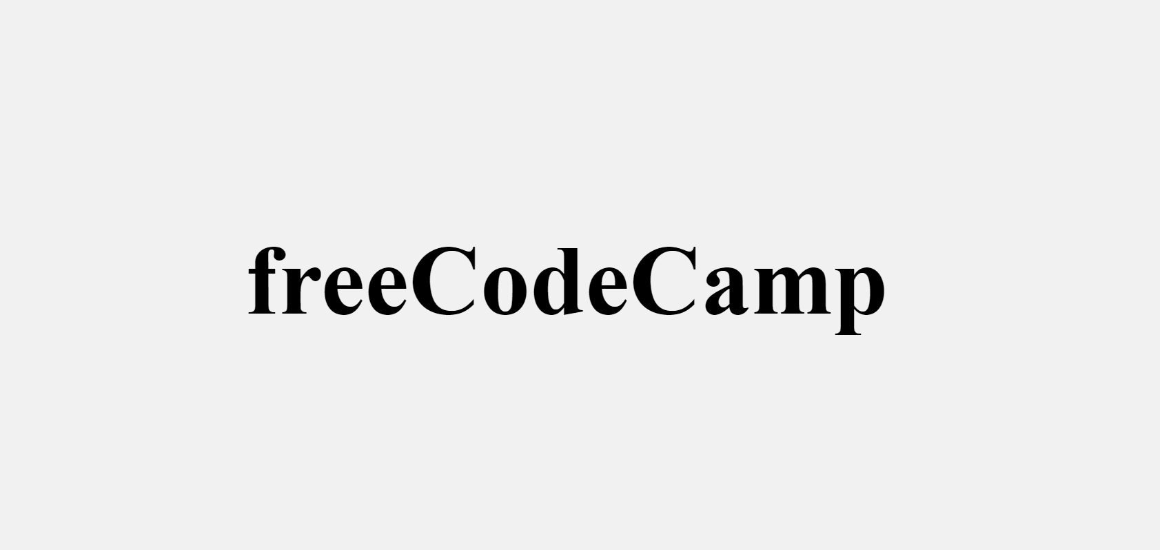
In the browser, it looks as shown below:
How to Change the Font-weight of Text
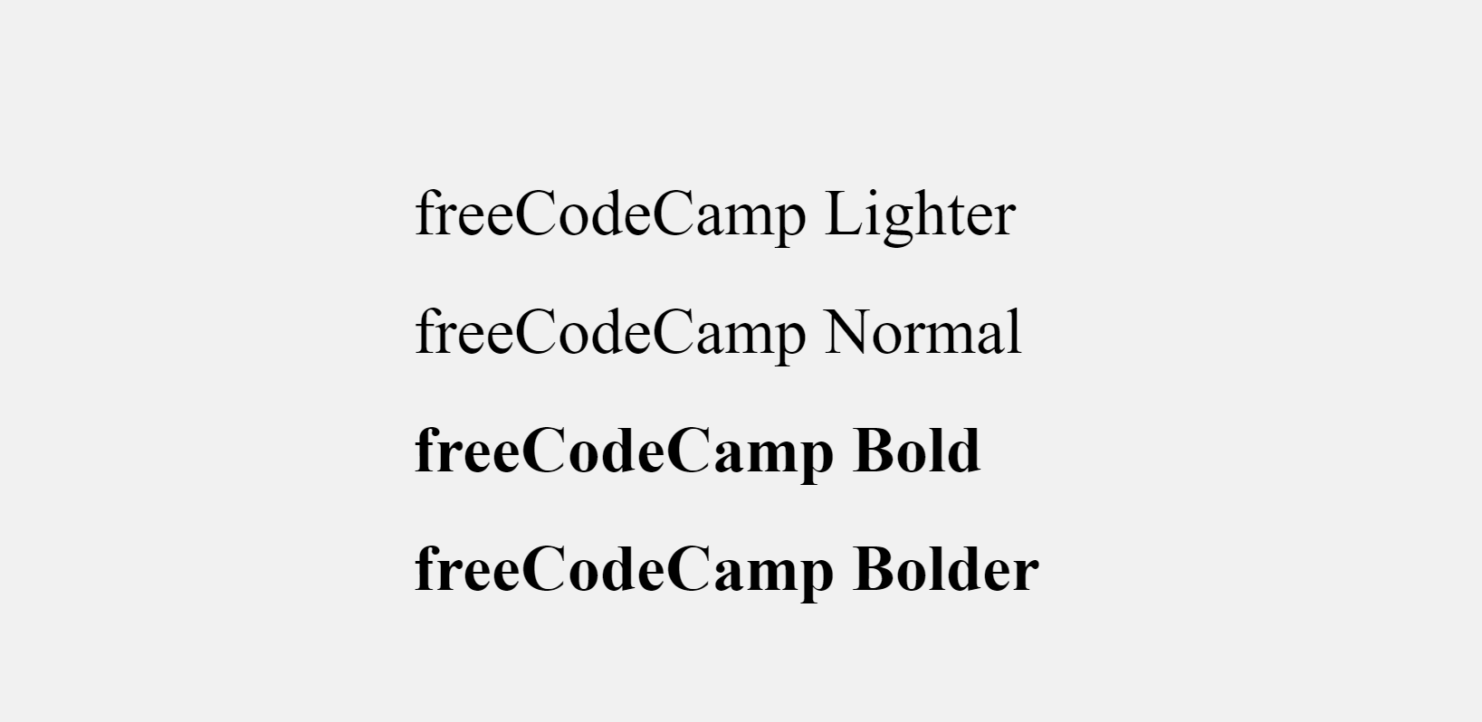
Font-weight is the property that helps set how bold or light specific text will be.
You can use font-weight to change the lightness or boldness of text, then give it a value such as normal , lighter , bold , or bolder . You can also use values like 100, 200, 500, and so on.
Just like font size, you can change the font-weight in inline, embedded, or external CSS.
How to Change the Font Style of Text
Font style is the typeface variation of the text. This typeface variation could be normal , bold , or italic .
To change the font style, you need the font-style property with a value of normal , oblique , or italic .
Normal is the default font style, so you don’t need to specify it unless you have to override it.
As usual, you can change the font style in inline, internal, or external CSS.
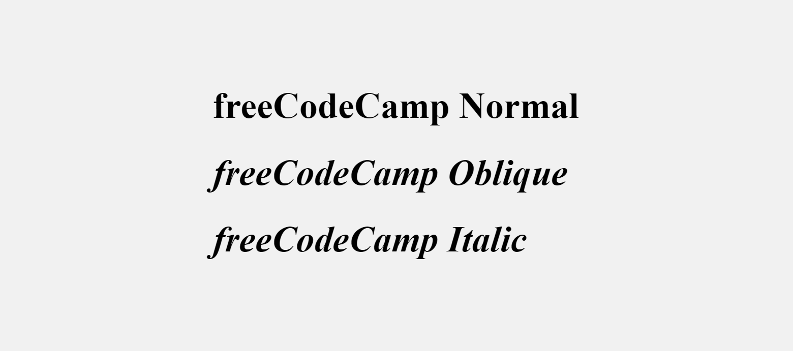
Here’s the output in the browser:
How to Change the Font Family of Text
A font family represents a collection of fonts that share the same design and typography.
To change the font family of some text, you need to use the CSS font-family property.
You can then choose to do it with inline CSS, internal CSS, or external CSS.
The code snippet below shows how to change the font-family in inline CSS:
In an external CSS file you can change the font family like this:
Make sure the external CSS is linked to the HTML file, otherwise it won’t work.

The Verdana font family looks like this inside the Google Chrome browser:
You might have noticed that there are other font families in the value – Geneva, Tahoma, and sans-serif.
Those are fallbacks the browser can use in case Verdana is not available on the user’s device.
If you don’t like the fonts built into your device, you can get other ones from Google Fonts.
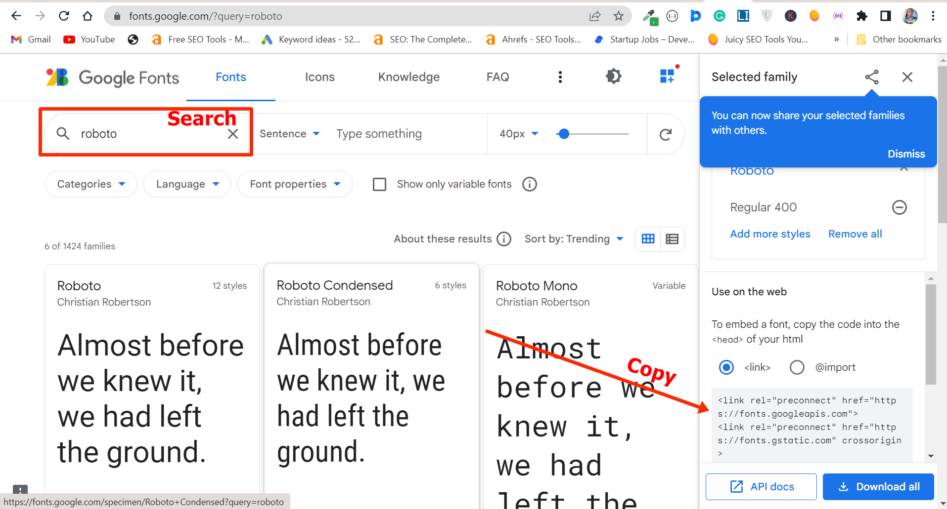
Search for your favorite font and copy the link to it, then paste the link in the <head> section of your HTML so you can have access to it in your HTML stylesheet
In my case, I used the Roboto font like this:

And this is how it looks in the browser:
Conclusion
This article walked you through how to change the font size, font weight, font style, and font family of text in inline, internal, or external CSS.
You might be wondering which is best to use between inline, internal, or external CSS.
If you’re working on a small project, you can use internal or embedded CSS, but if you’re working on a big project or in a team, you should not use internal CSS.
This is because it is a best practice to keep your CSS away from your HTML.
Inline CSS is a no-no in most situations because it might affect the readability of your HTML.
It’s also been suggested that inline CSS can negatively affect the SEO of a website.
CSS — Работа с текстом

Задавать стили CSS к тексту можно на уровне элемента body (для всей веб-страницы), элемента p (для абзаца), элемента span (для выделенного фрагмента текста) или любого другого элемента HTML.
Основные свойства CSS для работы с текстом
1. Свойство font-size
Свойство font-size изменяет размер шрифта. Оно задаётся с помощью значения и единицы измерения ( em , px , pt , % ). Единицы измерения em и % являются относительными и зависят от размера шрифта установленного в документе. Единицы измерения px и pt являются абсолютными и их размер зависит от разрешения экрана. Также у данного свойства есть предопределенные значения small и larger , которые соответственно уменьшают или увеличивают текст по отношению к базовому.
Lorem ipsum dolor sit amet
Lorem ipsum dolor sit amet
Lorem ipsum dolor sit amet
Lorem ipsum dolor sit amet
Lorem ipsum dolor sit amet
Lorem ipsum dolor sit amet
2. Свойство font-weight
Свойство font-weight изменяет жирность шрифта. Свойство font-weight имеет 2 часто используемых значения: normal (обычное) и bold (жирное). Остальные значения используются очень редко, перечислим их: числовые от 100 до 900 с шагом 100 (100 – самое тонкое начертание, 900 – самое жирное начертание), bolder и lighter .
Lorem ipsum dolor sit amet
Lorem ipsum dolor sit amet
Lorem ipsum dolor sit amet
Lorem ipsum dolor sit amet
Lorem ipsum dolor sit amet
Lorem ipsum dolor sit amet
3. Свойство font-style
Свойство font-style устанавливает тексту курсивное начертание. Оно принимает следующие значения: normal (обычное начертание шрифта), italic (курсивное начертание).
Lorem ipsum dolor sit amet
Lorem ipsum dolor sit amet
4. Свойство font-family
Свойство font-family изменяет шрифт или список шрифтов с помощью которых отображается текст. В качестве значений свойство font-family принимает названия шрифтов (например: font-family: «Tahoma», «Arial») или предопределенные названия группы шрифтов (serif, sans-serif, monospace, fantasy, cursive).
Lorem ipsum dolor sit amet
Lorem ipsum dolor sit amet
Lorem ipsum dolor sit amet
Lorem ipsum dolor sit amet
Lorem ipsum dolor sit amet
Lorem ipsum dolor sit amet
5. Свойство color
Свойство color изменяет цвет шрифта. Установить цвет можно несколькими способами: #ff0000 (шестнадцатеричное значение цвета), orange (зарезервированное название цвета), rgb(120,17,90) (RGB значение).
Lorem ipsum dolor sit amet
Lorem ipsum dolor sit amet
Lorem ipsum dolor sit amet
6. Свойство background-color
Свойство background-color можно использовать для выделения текста цветом, т.е. текст делается похожим на текст выделенный маркером. Установить цвет можно такими же способами, как и для свойства color.
Lorem ipsum dolor sit amet
Lorem ipsum dolor sit amet
Lorem ipsum dolor sit amet
6. Свойство text-decoration
Свойство text-decoration можно использовать для декоративного оформления текста. В качестве значений свойства text-decoration можно использовать следующие: none (без декоративного оформления), underline (подчёркивание), overline (линия над текстом), line-through (зачёркивание), blink (эффект мигания).
Lorem ipsum dolor sit amet
Lorem ipsum dolor sit amet
Lorem ipsum dolor sit amet
Lorem ipsum dolor sit amet
Lorem ipsum dolor sit amet
Подчёркивание также можно создать с помощью свойства CSS border .
Lorem ipsum dolor sit amet
Lorem ipsum dolor sit amet
7. Свойство text-transform
Свойство text-transform управляет регистром символов. В качестве значений свойства text-transform можно использовать следующие: none (по умолчанию), lowercase (переводит все символы в строчные), uppercase (переводит все символы в прописные), capitalize (каждое слово начинается с прописного символа).
Lorem ipsum dolor sit amet
Lorem ipsum dolor sit amet
Lorem ipsum dolor sit amet
Lorem ipsum dolor sit amet
8. Свойство white-space
При обработке текста браузер не отображает больше одного пробела между словами, а также игнорирует переносы строк, которые вы выполнили в HTML коде. При помощи свойства white-space вы можете настроить поведение браузера с помощью следующих значений: normal (по умолчанию), nowrap (не переносит текст, пока не встретит тег br ), pre (отображает текст как в коде на HTML), pre-wrap (отображает все пробелы между словами и переносит текст, если он не помещается в контейнер).
Lorem ipsum dolor sit amet
Lorem ipsum dolor sit amet
9. Свойство text-align
Свойство text-align предназначено для выравнивания текста в горизонтальном направлении. Значения свойства text-align указывают, что текст будет выровнен: left (по левому краю), center (по центру), right (по правому краю), justify (по ширине, т.е. одновременно по левому и правому краям).
Lorem ipsum dolor sit amet. Impedit, quo voluptas assumenda est, qui minus id quod. Quas molestias excepturi sint, obcaecati cupiditate non numquam eius. Perspiciatis, unde omnis iste natus error sit voluptatem. Et harum quidem rerum facilis est laborum et molestiae consequatur. Minus id, quod maxime placeat, facere possimus. Quo minus id, quod maxime placeat facere. Et molestiae consequatur, vel eum iure reprehenderit, qui dolorem ipsum, quia consequuntur.
Lorem ipsum dolor sit amet. Impedit, quo voluptas assumenda est, qui minus id quod. Quas molestias excepturi sint, obcaecati cupiditate non numquam eius. Perspiciatis, unde omnis iste natus error sit voluptatem. Et harum quidem rerum facilis est laborum et molestiae consequatur. Minus id, quod maxime placeat, facere possimus. Quo minus id, quod maxime placeat facere. Et molestiae consequatur, vel eum iure reprehenderit, qui dolorem ipsum, quia consequuntur.
Lorem ipsum dolor sit amet. Impedit, quo voluptas assumenda est, qui minus id quod. Quas molestias excepturi sint, obcaecati cupiditate non numquam eius. Perspiciatis, unde omnis iste natus error sit voluptatem. Et harum quidem rerum facilis est laborum et molestiae consequatur. Minus id, quod maxime placeat, facere possimus. Quo minus id, quod maxime placeat facere. Et molestiae consequatur, vel eum iure reprehenderit, qui dolorem ipsum, quia consequuntur.
Lorem ipsum dolor sit amet. Impedit, quo voluptas assumenda est, qui minus id quod. Quas molestias excepturi sint, obcaecati cupiditate non numquam eius. Perspiciatis, unde omnis iste natus error sit voluptatem. Et harum quidem rerum facilis est laborum et molestiae consequatur. Minus id, quod maxime placeat, facere possimus. Quo minus id, quod maxime placeat facere. Et molestiae consequatur, vel eum iure reprehenderit, qui dolorem ipsum, quia consequuntur.
10. Свойство vertical-align
Свойство vertical-align может использоваться для строчных элементов (в том числе для элементов со свойством display:inline-block ), ячеек таблицы, и предназначено для выравнивания текста по вертикали. Значения свойства vertical-align указывают, что текст будет выровнен: top (по верхнему краю строки), middle (по середине), bottom (по нижнему краю строки), baseline (значение по умолчанию, выравнивание по базовой линии), sub (текст отображается в виде нижнего индекса, как подстрочный), super (текст отображается в виде верхнего индекса, как надстрочный).
Lorem ipsum dolor sit amet.
Lorem ipsum dolor sit amet.
Lorem ipsum dolor sit amet.
Lorem ipsum dolor sit amet.
Lorem ipsum dolor sit amet .
11. Свойство line-height
Свойство line-height предназначено для задания высоты строки, которая влияет на расстояние между строчками текста. В качестве значений свойства line-height можно использовать следующие: число (множитель по отношению к значению высоты строки по умолчанию), проценты (например: 120% от высоты строки по умолчанию), px (например: 16px), em (например: 3em), зарезервированное слово normal (автоматический расчёт высоты).
Lorem ipsum dolor sit amet. Eos et quas molestias excepturi sint. Tempora incidunt, ut aliquid. Quibusdam et molestiae non provident, similique sunt in culpa, qui in. Eligendi optio, cumque nihil molestiae consequatur, vel eum fugiat. Alias consequatur aut fugit. Ducimus, qui blanditiis praesentium voluptatum deleniti atque corrupti.
Lorem ipsum dolor sit amet. Eos et quas molestias excepturi sint. Tempora incidunt, ut aliquid. Quibusdam et molestiae non provident, similique sunt in culpa, qui in. Eligendi optio, cumque nihil molestiae consequatur, vel eum fugiat. Alias consequatur aut fugit. Ducimus, qui blanditiis praesentium voluptatum deleniti atque corrupti.
Lorem ipsum dolor sit amet. Eos et quas molestias excepturi sint. Tempora incidunt, ut aliquid. Quibusdam et molestiae non provident, similique sunt in culpa, qui in. Eligendi optio, cumque nihil molestiae consequatur, vel eum fugiat. Alias consequatur aut fugit. Ducimus, qui blanditiis praesentium voluptatum deleniti atque corrupti.
Lorem ipsum dolor sit amet. Eos et quas molestias excepturi sint. Tempora incidunt, ut aliquid. Quibusdam et molestiae non provident, similique sunt in culpa, qui in. Eligendi optio, cumque nihil molestiae consequatur, vel eum fugiat. Alias consequatur aut fugit. Ducimus, qui blanditiis praesentium voluptatum deleniti atque corrupti.
Lorem ipsum dolor sit amet. Eos et quas molestias excepturi sint. Tempora incidunt, ut aliquid. Quibusdam et molestiae non provident, similique sunt in culpa, qui in. Eligendi optio, cumque nihil molestiae consequatur, vel eum fugiat. Alias consequatur aut fugit. Ducimus, qui blanditiis praesentium voluptatum deleniti atque corrupti.
CSS Basics for Typography

In 2020 there are a lot of developers and designers who want to learn the basics of CSS. In this series of articles, I will teach you those main topics. In this specific article, I will review the essential CSS properties of typography while using many visual examples.
font-family
This font-family property is used to declare what font we want to use. It can receive an array of fonts. This can be useful to us for two reasons:
- If the first font isn’t working in a specific operating system, the browser will use the next font until something matches it.
- If the font has missed some of the characters, it will fill in the missing characters from the next font at the list.
font-weight
This property, like his name, is for declaring the font-weight of the text. The default value of this property is normal , and the second common value of it is bold .
In more advanced fonts there are more than two states. Instead of using names in the values, these fonts are using numeric values: 100 / 200 / 300 / 400 / 500 / 600 / 700 / 800 / 900 and 950 . Which are equal to the common mapping names (in design apps), see table:
The normal keyword is equal to 400 value, and the bold keyword is equal to 700 value. Examples:
font-size
This property, like his name, is for declaring the font-size of the text. Even today, the most common sizing unit is pixels. Example:
From my perspective, it is better to control the font-size with rem units. If you want to know more about how to work with rem units, you can read my article “Update your font-size to REM units”.
line-height
This property is telling the browser the height of the line in ratio to the text-size . This property can get fixed value like pixel, but the most common way is to give it a value of ratio without any unit.
The line-height property, is a type of inherited property, which usually means you declare it one time in the root element, and it will affect all the elements on our website. This way if we have different font-size in inner elements, the line-height will stay with the same ratio, and we won’t need to declare it multiple times. Example:
font-style
We use it to update the text font into an italic variant state.
Text color property
The color property is used to color the text. It can receive color keywords, for example, red , magenta . It can receive a HEX color code and color functions like RGB and HSL. If you want to know more about CSS colors, you can read my article “Why CSS HSL Colors are Better!”.
text-align
This property, like his name, is to control the alignment of text in its reading axis(inline-axis). Besides the possibilities to align left and right , we have the center value and the less known justify value, which aligns the text in both ways.
Besides, there is an extensive property, text-align-last , which allows you to differentiate the last line from all the other lines. For more info: text-align-last in MDN.
direction
The direction property sets the direction of text, table columns, flexbox, grids, and more. It has two values:
- ltr value — for Latin languages that are read from left to right.
- rtl value — for Semitic languages that are read from right to left.
When using the direction property the text-align property is being updated automatically as well in the same direction unless it is defined otherwise. Example:
vertical-align
This property is used mainly for vertical inline text content. The main common values are baseline (default value), text-top , and text-bottom which are relative to the line-height of the text in the container.
There are more values like top and bottom that can act differently only if the line-height of to row is different from the line-height of the inline elements.
This property can be used even unit values which are positioned according to the baseline value, which means 0px = baseline , with this, you can play with negative & positive values, for example -2px or 2px .
Note: this vertical alignment is good for text elements. For vertical alignment of boxes, it is better to use CSS flexbox.
text-decoration
This property’s most used case is for adding underline to links, and it could also be used for creating overline and line-through . Example:
But in the last years, this property has been given a lot of extensions, and now you can use all the values together, for example:
Another possibility we now have is to play with the style of the lines and with their color.
text-transform
The text-transform property specifies how to capitalize on texts. We use it to make text appear in all-uppercase or all-lowercase, or to make each word capitalized.
letter-spacing
The letter-spacing property, as his name is, decreases or increases the spacing between the letters of the words. When using this property with px units, you can use fragments of pixels for example 0.1px . To decrease the spacing, this property can get negative values as well, like -1.5px , for example.
word-spacing
The letter-spacing property, as his name, allows us to define the space between the words.
text-indent
The indent property is used to indent the first line in a paragraph. Inside with a positive value or outside with a negative value.
::first-letter
The ::first-letter pseudo-element selector allows us to style the first letter in different styles from the regular text in paragraphs, for example.
Besides the ::first-letter pseudo-element, there is the ::first-line pseudo-element, which allows you to style the first-line of a paragraph differently. Because I haven’t seen a common use for it, I have decided not to give it a big stage in my article, but just to notify you that it exists.
text-shadow
The text-shadow property allows us to add shadow to text. For it to work, we need to provide it with at least the offset-x and the offset-y of the shadow. If we provide only these two values, the shadow will be left without a spread and with the same color of the text.
The third numeric value will be the spread of the shadow. We can also give it a different color value, in the beginning, or the end of the value.
Besides, we can add multiple text-shadows, using a comma in the value.
text-stroke
The text-stroke property is a non-standard property that works in all main browsers. It works with the -webkit prefix, even on Firefox & old Edge. The property receives two values, stroke-width and stroke-color.
More and More and More!
There are more properties of CSS for typography and big new topics like Variable Fonts, which are dynamic. But in this article, I have tried to show the main basic elements to control typography with CSS.
If this topic interests you, you can continue and explore this vast topic in CSS. Here some more properties and topics we haven’t talked about: Variable Fonts, font-variant , text-justify , unicode-bidi , all the ways of breaking words in CSS, and I may have missed several more��.
To Summarize
In this article, my primary purpose was to show the most useful properties for CSS typography and to provide you with this knowledge.
Final Words
I hope I inspired you and showed you some new possibilities.
If you like this post, I would appreciate applause and sharing ��.
I create lots of content on CSS. Be sure to follow me via Twitter, Linkedin, and Medium.
Also, you can see all of my content on my website: eladsc.dev.
Who Am I?
I am Elad Shechter, a Web Developer specializing in CSS & HTML design and architecture.
CSS text styling fundamentals
This article covers the fundamentals of styling text on the web, including web fonts, font size, line height, and more.
Introduction
The web is composed of a lot of different things, technical, social, and structural, but at its heart is something we all understand: human language. The beauty of the web is that it allows human-readable text to be presented so that it transcends barriers such as disability and geography. Of course, as humans we have been working out ways to format text so that it is legible to others for many centuries, but in printed form.
Web design has a lot of parallels with print design, but it also has a lot of differences and a lot more limitations. In this article we explore how to style text on the web using CSS.
Note: The article Web Typography lays a good foundation for this chapter by explaining a number of typographic concepts. Make sure you read it before this one.
Print to web?
The main shock that print designers get when coming to the web is the lack of control. In print design, designers have ultimate control over how their creations will look, and are safe in the knowledge that the space the work appears in will not change dimensions, number of colors available, or any other such property.
On the web, however, you can not guarantee that your beautifully crafted design will look identical to you and your users. They might be using a different operating system, or a different device altogether, or they might be visually impaired, meaning that they might be using your site with a lot of magnification, or a custom style sheet that changes your fonts and colors, or a screen reader, which reads the text out to them.
So, you need to accept this uncertainty and move on. You will discover strategies to make your designs more flexible so they look better in widely varying viewing contexts later, but for now, let’s review the basics.
Font styles
CSS has a number of properties beginning with font- , which allow you to control many features of the text characters (or glyphs) themselves. We’ll take a look at these in the following sections.
Choosing a font with font-family
font-family allows you to specify which font, or fonts, a selection of elements will use. Try adding the following CSS line to a body rule, then save and reload:
This will apply Arial — a sans-serif font (no serifs, the little decorative features at the end of the strokes of the text) — to the whole document, rather than the default serif font (fonts that have serifs), provided this font is available on your user’s system. It probably will be, because Arial is a ubiquitous font.
Web-safe fonts
There are about 11 fonts that are installed across almost all systems, termed web safe fonts because they are safe for use in your pages. The list includes:
- Sans-serif: fonts without serifs: Verdana, Arial, Trebuchet MS
- Serif: fonts with serifs: Times new roman, Georgia
- Monospaced: fonts in which every glyph takes up the same space, like in computer code: Andale mono, Courier new
- Cursive: fonts that have a decorative, often handwritten-looking style: Comic Sans
- Fantasy: fonts that have a bold, often ornamental or quirky style, which are meant to be used for headings, not body copy: Impact
Font stacks
If you want, you can also apply a number of fonts to a single element selection, known as a font stack. Try changing the line you added above to the following:
Unless you have Helvetica neue, you’ll probably not see much difference from what was there before, so it is important to understand how it works. When you specify a font stack like this, the browser goes through them from left to right, until it finds a font that is installed on the system, and therefore can be used.
- The browser searches for Helvetica neue on the user’s system, and uses this font if it finds it.
- If Helvetica neue is not found, the browser searches for Arial on the user’s system, and uses it if it finds it.
- If Arial isn’t found, we’ll use Verdana.
- As a last resort, if none of the fonts in the font stack are found the font falls back to sans-serif, which instructs the browser to use whatever font is the system’s default sans-serif font. You do not know exactly what will be used in this eventuality, which is an annoying loss of control, but at least this is better than ending up with the browser default — Times new roman — which is a serif font.
Note that fonts with more than one word in their names must be surrounded by quotes.
Overriding body fonts
So far you have set fonts on the <body> element, which sets a page-wide default that affects everything; now you will learn how to override some of the <body> ‘s child elements to set things up nicely.
For a start, it is often a good idea to use a different font for at least some of your headings, to make them stand out and give your site a bit more character. Add the following to your styles:
Save and reload and notice that the page now looks very different.
As for other content elements we could affect, how about emphasized text? You could, for example, use <em> for all references involving dates to make them stand out a bit. As it is, the browser gives emphasis a default italic look, but this does not stand out as much as it could. Add the following rule:
Your fonts (especially your headings) are one of the biggest contributors to the overall personality of your site, so choose them carefully to fit. This may sound difficult to begin with, but you will soon get the hang of it. As a rule, Times new roman is good for corporate sites, whereas a sans-serif like Arial might be better for a less formal site. Cursive fonts need to be used sparingly — for example, Comic sans is hated by many designers, but it is suitable in some cases, such as creating a chalk-on-blackboard effect on a children’s site.
Headings used to be difficult to deal with. Given that the only web safe fantasy font seems to be Impact (not bad, but imagine if all sites had to use it) and you do not want to be stuck with a default system font, such as the dreadful Papyrus, designers used to use various image techniques for their headings. As you should know by now, using images for text on a web site is really bad because images cannot be read by screen readers or search engines. In the next section, you will find some solutions to resolve this problem.
Image replacement
Image replacement is a very common technique to display better looking headings and company logos, while not making the text inaccessible or compromising on search engine optimization. Here is an overview of how it works:
Create an image file of your heading with the desired design. Add the following rule to your CSS, and then save and reload the page, making sure the image is in the same directory as the HTML file:
There are many variations on image replacement, but this is basically how most of them work: first of all, we include our image as a background image on the element we want to replace, setting the dimensions of the element to make sure the image can be fully seen. Then we use a very large negative text indent to push the actual heading text right off the page so you cannot see it, just leaving the background image in view. Don’t worry about the unfamiliar CSS properties for now; you will learn more about these later in the article series.
This works pretty well — you get the heading look you want displayed on the page, across most browsers (most modern browsers display background images), and the actual text is still there (just not visible) to provide screen readers and search engines with what they need. There are some disadvantages, however:
- This technique is very inflexible. You have to create an image for each bit of text you want to replace, and then change them every time you want to change size, color, wording, or anything else. And imagine trying to use image replacement on bits of text inside paragraphs as well as headings? Too fiddly.
- Text scales nicely as you zoom in; images don’t. If you zoom in too much, the graphical heading will start to look grainy and pixelated.
- If you use too much text replacement, the extra HTTP requests could slow down your page load. Some more sophisticated image replacement techniques can slow down the page even more, as they use Flash (siFR) or SVG (cufon).
Web fonts
Thankfully, CSS3 introduces Web fonts, a feature that allows us to specify our own custom font files to download along with our web pages. This is great, as it completely gets around the problem of fonts not being available on users’ machines. To specify a web font for download on a page, you reference the font in a special @font-face block that goes at the top of the page, and looks something like this:
There are more available options, but it is best to keep it simple for now. Basically, this involves specifying the name of the font family, and then pointing to the font file you want visitors to download along with your web page. This should always go at the top of your CSS file, so you can use it afterwards.
You then include the font in your page in exactly the same way as you would other fonts:
Simple huh? Well, not quite. the reality is that not all browsers support the same font formats, so the syntax to make this work across browsers is more complicated. Luckily, it is not necessary to write it yourself, as there are a number of services available that will do the hard work for you. This article describes a free service called Font Squirrel, which not only has lot of great fonts available for you to use, but also generates all the CSS and font files you’ll need.
Follow these steps:
Obtain a font file. Almost all formats will work. A font I like for headings is called Romantiques, and I got it from Fontspace.com. Download the zip file, and then unzip it.
Visit fontsquirrel.com and choose the @font-face generator.
Click "Add fonts", select the Romantique font file you want to use, and check the disclaimer checkbox agreement.
Click the “Download your kit” button. After a few seconds, you are prompted to save your web font kit. Save it in your example files.
Unzip the kit, and you will see several files. The files you are interested in are the different font format files, and the stylesheet.css .
Copy all the font files ( .eot , .svg , .ttf , and .woff ) to a sensible location in your example files. Saving the files in the same directory as the HTML file is easiest.
Open the stylesheet.css file and copy the CSS rule inside it into the top of your example file styles. It looks like this:
- Again, the font-family dictates the name of the font, used to identify it in the code.
- The src values specify the locations of the font files. Different browsers coming across this keep going through the list until they find a format they understand, at which point they download that font file and use it in the page (although some browsers are a bit buggy, and may download more than just the one they need, wasting bandwidth in the process). IE uses the .eot version; most modern browsers will use the .woff , which is smaller in file size than the others; older browsers other than IE that do not support .woff will use the .ttf or .svg files.
- the font-weight and font-style specify attributes such as the weight of the font, and if it is italic, but it is not necessary to worry about those for now.
Note: If you didn’t save the font files in the same directory as your example file, you must update the file paths to match the location of the fonts.
Delete the h1 rule you added previously, and replace it with this:
Save the page and reload it. Notice that the font is applied to all first and second level headings in the page. This is a very useful technique, and much more flexible than image replacement. Try adding a color to your headings:
There are some issues with using custom fonts in this manner. Consider the following:
- File size: For the purposes of this article, I deliberately selected a large sized font to highlight file size problems. Most western font file are not this big, but the Romantique files were mostly a few hundred KB, with the SVG weighing in at almost 1MB! This is a lot of extra weight to add to a page, especially for those downloading on slower bandwidth, such as mobile networks. And while Western glyph sets usually only have tens of characters in them, maybe a few hundred if a set is really complete, some language font sets (especially CJK ) can have literally thousands of characters, and be many MB in size. Be aware!
- Font size: You will notice that the font size is a lot smaller than with the image replacement version. Different base font sizes can also vary dramatically, so take that into consideration when setting font sizes, and investigate how fallback font sizes will match up to the primary fonts you want to use. or FOUT-b-Gone.
- Number of glyphs/font quality: There are a lot of free fonts available, from sites like Font squirrel, DaFont, My Fonts, and Google web fonts, however they are not all high quality, and some may have a very limited glyph set, so you’ll get horrible little blank squares displayed instead of characters if you have characters on a page that are not present in your chosen font. This presents far more of a problem in body text than headings, and you need to be especially careful of this if you are using web fonts on sites with user generated content, because you cannot control exactly which characters visitors enter. Some fonts may also look bad on certain operating systems (they can look bad on Windows if the user does not have cleartype enabled). The only answer here is to test your fonts thoroughly before using them in your design. For example, the comma in the first <h2> looked terrible after I set my fonts to Romantique, so I removed it.
Note: There are professional paid font services you can use for your web font needs, such as Fontdeck and Typekit. If you have the money to spend, their font options provide higher quality.
Setting units and sizing with font-size
The next CSS property to look at is font-size . This allows you to set the size of the text inside selected elements, using any CSS units available, such as pixels, ems, percentage, and more.
You can also use size keywords: xx-small , x-small , small , medium , large , x-large , and xx-large . These tend to be best used when you want to set font sizes relative to each other. For example, the body size is medium , then you could set the top level heading to xx-large , and then perhaps set the second level heading to x-large .
Using size keywords, headings will always stay proportionate to one another, regardless of the fonts used and the visitor’s operating system. But they do not offer a great amount of control — you do not see them used very often. Check out the following typical font-sizing exercise.
Setting a base font size
The first thing to do is set a base font size for the whole document. This is usually accomplished by adding a rule to the <body> element. Add the following to your body rule:
Why 62.5%? The answer is that the default font-size for most browsers is 16px. 62.5% of 16 is 10, so by using this percentage you are setting the base font for the whole site to 10px, which makes subsequent math calculations easier.
Setting heading and body sizes
Next, turn your attention to the font-sizes for different content. The base font size is 10px, making it easy to work out the sizes of the rest of the page text. For example, if you want the first level headings to be 42px, you can set the font-size to 420%, or 4.2ems. Percentages and ems work almost equivalently for our purposes. The differences are not really that important, at least for now. Both units set sizes proportionately to the size of parent font size, and the added bonus is that you can also set other dimensions in your design to percentages of ems, such as margins, the width of content blocks, and more. It is nice to be able to control a whole site relative to the text sizes.
The other option you often see involves using pixels. Pixel units seem to give more control, as you set an absolute pixel size, but the font size does not change proportionally to anything else. However, this is not a best practice, because older browsers like IE6 cannot resize text that is set to pixel values, which is a big accessibility problem.
For now, stick to using ems when writing rules.
Add the following rules to your styles:
If you view the page in different browsers, you will notice that this rather complex font looks better in some browsers than others, and none look quite as good at the image replacement version. This is the kind of testing you should do before embarking too far into a project with a chosen font. Also, it does not look that great at a smaller size on the h2 s. But for the purposes of this example, leave it as is.
Next, set the body text and list to make it easier to read:
The rule above sets the body copy back to the default browser size, but it looks good and is readable.
Next, set the emphasis slightly smaller, to make it stand out even more nicely:
If you are wondering why you had to set it to 0.8em to get it slightly smaller, rather than say 1.5 or 1.4, try it and see. The reason is that the parent elements of <em> (either <p> or <li> ) have been set to 1.5em. The sizing is relative to the font size of the immediate parent, so in this context 16px is equal to 1em. We have set 0.8em for the emphasiTed text, so the size comes out as 16px x 0.8 = about 13px.
Note: The pixel sizes we are talking about here are called the computed values. Regardless of the units and values you use to set your font sizes, computers display graphics display in pixels, so the browser must convert everything into pixel values before it can display them to visitors.
Changing the details with font-weight, font-style, and font-variant
Next, you’ll check out these properties:
- font-weight allows you to set the boldness of text in selected elements.
- font-style allows you to set a element’s text to be oblique or italic.
- font-variant allows you to set and element’s text to be small-caps, also known as copperplate letters.
Using font-weight
Use this property when you want text to be bolder. Possible values are:
- bold and bolder provide two levels of extra boldness.
- lighter provides a level of less boldness.
- 100 , 200 … all the way up to 900 provide incremental levels of boldness.
- normal is the default non-bold setting.
Most of these settings don’t really make a visual difference, especially when setting small font sizes, and when the font you are using doesn’t have different levels of boldness defined in it.
For this example, add the following rule to highlight the first lines below each heading:
And then save the page, reload the browser window, and review the results.
Note: bold is equivalent to 700 .
Setting font-style
font-style can take the values italic , oblique , and normal . Normal is the default, as before, italic tells the browser to use the italic version of the font (if available), and oblique tells the browser to use the normal version of the font, but slant it. If you specify italic , unless the font you are using has a specific italic version available the browser will fall back to generate an oblique version to use.
Add the following line to the rule you added in the previous section:
Working with font-variant
font-variant can take two values, normal , which is the default as expected, and small-caps , which uses all capital characters, but large ones for the capital letters, and small ones for the lower case letters. Add the following to the em rule and see what happens:
Conclusion
You should now have a grasp of text styling fundamentals and be able to apply the techniques to your own pages. For more information, see the other tutorial articles in this section.