Как сделать — пользовательские ползунки
Узнайте, как создавать пользовательские ползунки диапазона с помощью CSS и JavaScript.
Default:
Square:
Round:
Image:
Создание ползунка диапазона
Шаг 1) добавить HTML:
Пример
Шаг 2) добавить CSS:
Пример
.slidecontainer <
width: 100%; /* Width of the outside container */
>
/* The slider itself */
.slider <
-webkit-appearance: none; /* Override default CSS styles */
appearance: none;
width: 100%; /* Full-width */
height: 25px; /* Specified height */
background: #d3d3d3; /* Grey background */
outline: none; /* Remove outline */
opacity: 0.7; /* Set transparency (for mouse-over effects on hover) */
-webkit-transition: .2s; /* 0.2 seconds transition on hover */
transition: opacity .2s;
>
/* Mouse-over effects */
.slider:hover <
opacity: 1; /* Fully shown on mouse-over */
>
/* The slider handle (use -webkit- (Chrome, Opera, Safari, Edge) and -moz- (Firefox) to override default look) */
.slider::-webkit-slider-thumb <
-webkit-appearance: none; /* Override default look */
appearance: none;
width: 25px; /* Set a specific slider handle width */
height: 25px; /* Slider handle height */
background: #4CAF50; /* Green background */
cursor: pointer; /* Cursor on hover */
>
.slider::-moz-range-thumb <
width: 25px; /* Set a specific slider handle width */
height: 25px; /* Slider handle height */
background: #4CAF50; /* Green background */
cursor: pointer; /* Cursor on hover */
>
Шаг 3) добавить JavaScript:
Создайте ползунок динамического диапазона для отображения текущего значения с помощью JavaScript:
Пример
var slider = document.getElementById("myRange");
var output = document.getElementById("demo");
output.innerHTML = slider.value; // Display the default slider value
// Update the current slider value (each time you drag the slider handle)
slider.oninput = function() <
output.innerHTML = this.value;
>
Круглый ползунок
Для создания круглого маркера ползунка используйте border-radius свойство. Совет: Установите высоту ползунка на другое значение, чем ползунок, если вы хотите неравные высоты (15пкс vs. 25пкс в этом примере):
Пример
.slider <
-webkit-appearance: none;
width: 100%;
height: 15px;
border-radius: 5px;
background: #d3d3d3;
outline: none;
opacity: 0.7;
-webkit-transition: .2s;
transition: opacity .2s;
>
.slider::-webkit-slider-thumb <
-webkit-appearance: none;
appearance: none;
width: 25px;
height: 25px;
border-radius: 50%;
background: #4CAF50;
cursor: pointer;
>
.slider::-moz-range-thumb <
width: 25px;
height: 25px;
border-radius: 50%;
background: #4CAF50;
cursor: pointer;
>
Иконка слайдер/изображение
Чтобы создать значок или изображение маркера ползунка, используйте background свойство и вставьте URL-адрес изображения:
Input range slider CSS styler across browsers
Style <input> range sliders CSS across browsers!
Use convenient controls, or edit CSS properties directly. CSS property inputs indicate when the value is
You’ll figure it out, I believe in you!
This styler is kinda tested in Chrome and Firefox (end of 2020), and Safari 13 (OS X 10.15). It even kinda works in the old Edge (not the Chromium based) .
It does not work in IE though.
Read this great article if you want to know how <input> range CSS styling works under the hood.
It’s a shame that in 2020 styling of sliders is not yet standardized. Here is a proposal for standardization that I know of.
Go to the explanation below for more details.
Examples: (gray border indicates edges of <input> elements)
<input> element itself
handle (thumb) *
track *
track progress indication
Some more details
For progress indication to work, you need to add a script to your page, see above. You can dowload, put it into your assets, and add it as external script:
or just copy-paste the contents right inside a <script> element.
The idea is borrowed from this great article.
TODO: figure out how to neatly display focus outline. Currently it looks ugly as fuck in general, that’s why it is disabled by default.
Handle may be one pixel off center with respect to track. You’ll have to wangjangle with it a bit.
Handles are represented with an HTML element (like <div> or something), apparently elements don’t like to be at fractional coordinates.
Creating a custom CSS range slider with JavaScript upgrades

Range sliders are an awesome tool for letting users select a value or filter items based on numeric ranges. They’re often used by developers to create progress bars, volume controls in audio and video players, product filters on ecommerce websites, and even for zooming features.
But adding a slider widget to a web page can be trickier than you might think. Sure, you can simply use an <input /> element of type range , but styling it consistently across different browsers can be a real headache.
That’s why we’ve put together this guide to show you how to create a custom range slider using CSS only. If you’re feeling adventurous, we’ll even show you how to take it to the next level with JavaScript.
Here is the final project:
You can interact with it, and after that, get started!
Understanding the HTML range input type
In its simplest form, an input element of type range will look like this:
This code will result in a widget that is inconsistent across browsers, as we can see below:
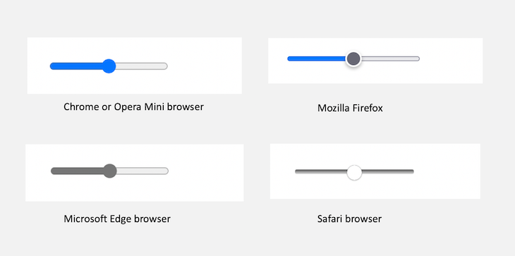
These irregularities call for customization if we want the slider widget to fit a particular theme or brand.
Why is the input range tricky to style?
As you can see in the image below, a range slider widget consists of certain key elements — a thumb (label 1) and a slider track (label 2) contained within a container input element (label 3, shown in gray):
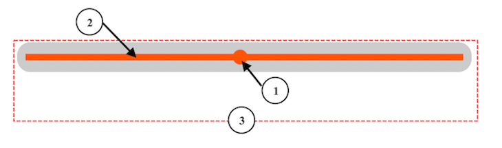
To customize this slider widget, we only need to target the different components. However, inspecting the widget from the browser’s developer tools shows that the components are not exposed to us:
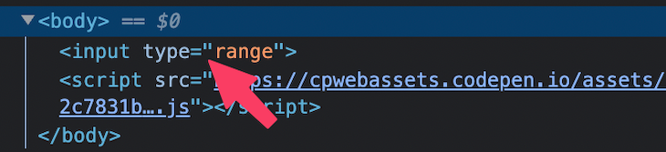
In the image above, we see only the rendered <input /> and not those elements responsible for the slider track and the thumb.
This is because the range element is implemented as a web component. Browsers internally encapsulate and hide elements and styles that make up the input slider inside a shadow DOM.
If you’re on Chrome, you can enable the Show user agent shadow DOM option from Settings to see the shadow DOM:
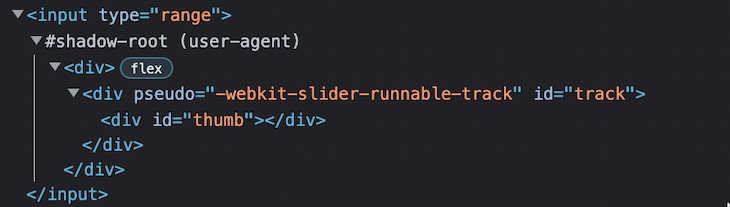
In the shadow DOM, as seen above, we can see the sub-component elements in a structured manner.
This shadow DOM helps isolate components — in our case, the input range — from the actual DOM, including their styles. Doing so prevents those isolated components from conflicting with the styles of other elements in the real DOM.
For instance, targeting the thumb component using its ID from our CSS file will not affect the thumb appearance:
This implementation is beneficial because we can use web components without worrying about style conflicts from the hosting document. However, the inconsistencies between how the different browsers implement those web components make them tricky to style.
Creating a custom range slider with CSS only
Let’s create a range slider that looks like the below with a CSS-only solution:
As we mentioned earlier, we’ll target the different slider parts to add a custom style. Since we don’t have access to the parts directly, we’ll capitalize on the various browser vendor prefixes.
For instance, to customize the range slider for the WebKit and Blink-based browsers — like Safari, Chrome, Opera, and Edge — we’ll use the ::-webkit-slider-runnable-track pseudo-element to target the slider track and the ::-webkit-slider-thumb pseudo-element to target the thumb.
For Mozilla Firefox, we’ll use ::-moz-range-track pseudo-element to target the track and ::-moz-range-thumb for the thumb.
Now that we know which CSS pseudo-elements to use, let’s start by adding the base styles.
Adding the base styles
We’ll start by removing the default styles of the native range input and then adding custom styles:
The range input’s appearance property tells the browser to remove the default appearance styles so that we can apply a custom style.

Over 200k developers use LogRocket to create better digital experiences
 Learn more →
Setting the -webkit-appearance property to none; on the container element only removes the track and not the thumb:
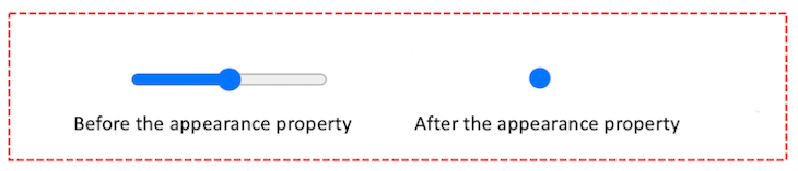
The above is what it looks like in Chrome. The other WebKit-based browsers will also remove the track bar only.
However, Mozilla does not only remove the track; it also eliminates some default appearances from the thumb:
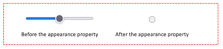
Let’s move on to customizing the track and slider thumb.
Customizing the track
We can style the slider track in two ways. The first method is applying the custom styles directly in the input[type=»range»] selector:
With this method, we don’t have to target the track component specifically. The input container element takes the slider role.
However, for this project, we’ll go with the next approach — using the browser’s vendor prefixes to specifically target the slider track. So, let’s remove the just-added style declarations.
As we mentioned above, the ::-webkit-slider-runnable-track pseudo-element will target the slider track for WebKit-based browsers. Meanwhile, the ::-moz-range-track pseudo-element will target the track for Mozilla Firefox:
The range slider should now look like so:
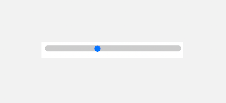
Customizing the slider thumb
For WebKit-based browsers, we’ll start by removing the default styles of the native slider thumb and then adding custom styles:
For Mozilla Firefox, we’ll only apply the custom styles:
Due to how Mozilla handles the thumb, we reduced the border from the 2px applied for WebKit browsers to 1px so the thumb can fit appropriately in the range slider.
Keep in mind that Mozilla applies a grey border to the thumb by default. You can add a border: none; property if you don’t want to apply a border.
The slider should now look like so:

As we can see, both the slider track and thumb have rounded shapes. If you want to make the shape rectangular, you can remove the border-radius CSS property from the components:
Styling the range slider to show track progress
With CSS only, we can style the range slider to show track progress by filling the space to the left of the thumb with box-shadow and then hiding the overflow from the input[type=»range»] selector.
Let’s locate the ::-webkit-slider-thumb and ::-moz-range-thumb pseudo-elements and then add the following box-shadow declaration:
After that, in the input[type=»range»] selector, let’s add the following declarations:
The styled slider should now behave like the first example in the GIF below:
How to improve the CSS range slider with JavaScript
With the addition of JavaScript, we’ll create a range slider that looks like so:
Due to the overflow: hidden and box-shadow tricks we used to customize the slider progress with the CSS-only solution, the slider thumb cannot be larger than the track, the way it’s shown below:
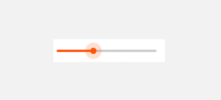
To achieve the above design, we’ll modify the CSS style rules and apply a bit of JavaScript.
On the input[type=»range»] selector, let’s remove the overflow: hidden declaration and then set a height and background color properties:
With the height and background color on the input element, we don’t need to specifically target the track component.
So, we can remove the pseudo-elements that we used earlier to target the track lines for each browser’s vendors:
For the slider thumb, we’ll remove the box-shadow declaration that we added in the CSS-only solution:
Notice we added a CSS transition property for a smooth transition effect. We’ll see the effect when we implement the hover, active, and focus states for the slider thumb.
Adding hover, active, and focus states
For the sake of accessibility and a positive UX, we’ll add styles for focus, hover, and active states to provide a visual effect while interacting with the slider.
If you take a look at the input[type=»range»] selector, we applied the CSS outline: none; property to remove the default focus styles. We can now target the slider thumb using the pseudo-elements, then use the :focus , :hover , and :active pseudo-classes on them to provide a custom style:
The second example in the GIF below demonstrates how the slider should behave with the custom styling we just added:
Adding JavaScript to style the range slider progress
We’ll start with a quick way of adding the slider progress. Let’s add an id attribute to the input element so that we can reference it with JavaScript:
We also added an oninput attribute in the HTML that’ll trigger an event when the user drags the range slider.
In JavaScript, we’ll create the progressScript() function to handle the input event:
We achieved the progress style effect with the code by applying a linear-gradient to the background of the runnable track.
The result now looks like so:
By default, the range input has a minimum and maximum value of 0 and 100 , respectively. We can specify a min and max attributes to change the default.
Let’s change the default while also displaying the input value as we interact with the widget. We’ll update the HTML to include the min , max , and value attributes:
Then, we’ll target these elements in JavaScript and dynamically update the display value and slider progress when the user drags the range slider:
We used the addEventListener() method in the code to handle the input event. The result now looks like so:
As we can see, the progress bar is always in sync with the max attribute of the input range. We can also customize the thumb to have a rectangular shape by removing the border-radius property:
The above style rule also modifies the height property to achieve the following result:
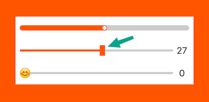
Applying a custom image to our slider control
Let’s get more creative and create a slider control using emoji or custom image as the thumb, like so:
On top of the last slider example, we’ll replace the background color that we applied on the thumb with a background image so that the thumb becomes an image rather than a colored circle:
We’ve also increased the thumb size via the height and width properties. Furthermore, notice that we included a background-size property. Without this property, we won’t be able to see the thumb image.
Rotating the thumb emoji
To make the thumb rotate when we drag it, we will apply a transform property on it like so:
In the style rule, we used a CSS variable so we can dynamically update the amount of rotation. Let’s grab the CSS variable in our JavaScript file and update it based on the slider progress to get the angle of rotation:
The widget should now behave like so:
Conclusion
Creating a custom range slider that looks great and works seamlessly on any browser without sacrificing accessibility can be daunting.
This guide walked you through how to customize a range slider using CSS only, ensuring a consistent look and feel across browsers. We also showed how to enhance this slider widget with JavaScript if you want to take it up a notch.
But wait, there’s more! We’ve even created an audio player guide that demonstrates how you can use this slider to create a progress bar and volume control in your projects.
Have questions or suggestions? Share them in the comments section below. And if you found this guide helpful, don’t forget to spread the word!
Is your frontend hogging your users’ CPU?
As web frontends get increasingly complex, resource-greedy features demand more and more from the browser. If you’re interested in monitoring and tracking client-side CPU usage, memory usage, and more for all of your users in production, try LogRocket.https://logrocket.com/signup/
LogRocket is like a DVR for web and mobile apps, recording everything that happens in your web app, mobile app, or website. Instead of guessing why problems happen, you can aggregate and report on key frontend performance metrics, replay user sessions along with application state, log network requests, and automatically surface all errors.
Ползунок в HTML (оформление и вывод значения)
Всем привет!
Сделать ползунок в HTML – не проблема, для многих сделать это – проще простого. А вот оформить и красиво вывести значение ползунка умеют не все.
Так вот, в сегодняшней статье я расскажу, как создать ползунок, как вывести результат и как оформить ползунок.
С чего же начнем? Начнем с того, что я покажу, каким тегом создается ползунок, и какие атрибуты у него есть.
Для создания ползунка в HTML существует тег «input»:
В результате получится вот такое:
Заметьте, что ручка ползунка всегда находится посредине, а специальным атрибутом это можно изменить, впрочем, не только это.
- Autocomplete — автозаполнение значения (положения) ползунка.
- Autofocus — автоматческая фокусировка на ползунке после полной загрузки страницы.
- Disabled — блокировка ползунка. Пример:
- Max — указывает максимальное значение ползунка.
Значение по умолчанию: «100». - Min — указывает минимальное значение ползунка.
Значение по умолчанию: «0». - List — создание меток на шкале ползунка.
Обратите внимание на имя « rangeList1 ». Посмотрите, где я его прописал в коде. Это имя может быть любым, но должно быть уникальным и писаться латинскими буквами. Имя в id должно соответствовать имени « list ».
Name — присваивает имя ползунку.
Step — устанавливает интервал увеличения значения (перемещения) ползунка.
Значение по умолчанию: «1».
Value — указывает числовое значение ползунка, отправляемое на сервер или используемое сценариями.
Как вывести значение ползунка?
Все, конечно, круто, но какой смысл в ползунке, если он ничего не выводит.
Сейчас мы все исправим и выведем значение средствами JavaScript без какой-либо магии.
Вот этот код нужно вставить в ползунок.
Заметьте, если в скобках вы указали « rangeValue », тогда при выводе результата нужно тоже указать это же имя, а иначе работать не будет:
А вот и результат:
Также в интернете нашел вот такой способ, как мне показалось, очень интересный:
Как оформить ползунок?
Итак, мы имеем стандартный ползунок, и отображается он на каждом браузере по-разному:

Приступим к изменению вида
В браузерах Chrome, Safari и Opera
Отменим стандартные стили Webkit/Chrome. Для этого зададим свойству « -webkit-appearance » значение « none »:
Вот теперь можно добавить любые свойства, например, границу, цвет фона, закругление границы и так далее, что только душа пожелает:
В результате это выглядит пока что вот так:

Теперь изменим ползунок:

В браузере Firefox
Псевдоэлемент « ::-moz-range-track » повлияет на полосу ползунка, а « ::-moz-range-track » повлияет на ручку ползунка.
В браузере Internet Explorer
Дошла очередь до самого известного и самого корявого, как по мне, браузера Internet Explorer:
Так что, если хотите, чтобы ползунки более-менее отображались одинаково на всех браузерах, придется писать большой код на CSS, для каждого браузера свой.