The Tkinter Label Widget
The Label widget is a standard Tkinter widget used to display a text or image on the screen. The label can only display text in a single font, but the text may span more than one line. In addition, one of the characters can be underlined, for example to mark a keyboard shortcut.
When to use the Label Widget
Labels are used to display texts and images. The label widget uses double buffering, so you can update the contents at any time, without annoying flicker.
To display data that the user can manipulate in place, it’s probably easier to use the Canvas widget.
Patterns #
To use a label, you just have to specify what to display in it (this can be text, a bitmap, or an image):
If you don’t specify a size, the label is made just large enough to hold its contents. You can also use the height and width options to explicitly set the size. If you display text in the label, these options define the size of the label in text units. If you display bitmaps or images instead, they define the size in pixels (or other screen units). See the Button description for an example how to specify the size in pixels also for text labels.
You can specify which color to use for the label with the foreground (or fg) and background (or bg) options. You can also choose which font to use in the label (the following example uses Tk 8.0 font descriptors). Use colors and fonts sparingly; unless you have a good reason to do otherwise, you should stick to the default values.
Labels can display multiple lines of text. You can use newlines or use the wraplength option to make the label wrap text by itself. When wrapping text, you might wish to use the anchor and justify options to make things look exactly as you wish. An example:
You can associate a Tkinter variable with a label. When the contents of the variable changes, the label is automatically updated:
You can use the label to display PhotoImage and BitmapImage objects. When doing this, make sure you keep a reference to the image object, to prevent it from being garbage collected by Python’s memory allocator. You can use a global variable or an instance attribute, or easier, just add an attribute to the widget instance:
Reference #
Display a single line of text, or an image.
master Parent widget. **options Widget options. See the description of the config method for a list of available options.
config(**options) [#]
Modifies one or more widget options. If no options are given, the method returns a dictionary containing all current option values.
Tkinter Label
Summary: in this tutorial, you’ll learn about Tkinter Label widget and how to use it to display a text or image on the screen.
Introduction to Tkinter Label widget
Tkinter Label widget is used to display a text or image on the screen. To use a Label widget, you use the following general syntax:
The Label widget has many options that allow you to customize its appearance:
| Options | Meaning |
|---|---|
| anchor | When the text and/or image are smaller than the width, the anchor option determines where to position them tk.W , tk.CENTER or tk.E for left, center, and right alignment respectively. |
| background | Set the background color for the label |
| borderwidth | Add a border around the label. |
| class_ | Specify a custom widget class name for changing the label’s appearance. |
| compound | Specify how to display both text and image on the Label. |
| cursor | Specify the mouse cursor’s appearance when the mouse is over the widget. |
| font | Specify the font style for displaying text |
| foreground | Specify the color of the text |
| image | Specify an image or images to show in addition to text or instead of text. |
| justify | If the text contains newline characters, the justify option specifies how each line is positioned horizontally. The valid values are tk.LEFT (left-justify), tk.CENTER (center), and tk.RIGHT (right-justify). |
| padding | Add more space around the label. |
| relief | Use this option to create an effect for the Label .e.g, flat, raised, sunken, groove, and ridge. |
| style | Specify the custom widget style. |
| takefocus | is a boolean value that specifies whether the label is visited during focus traversal. It defaults to False which doesn’t get focus. |
| text | Specify a string of text to show in the widget |
| textvariable | A StringVar instance that holds the text value of the widget. It overrides the text option if both textvariable and text are available. |
| underline | Specify the position of the letter that should be underlined e.g, underline = 0 would underline the letter E in the text=’Exit’ |
| width | Specify the number of characters to show |
| wraplength | Chop the text into the lines which less than the length specified by the wraplength option. |
The following shows a skeleton program that we’ll use to illustrate various options of the Label widget:
Displaying a regular label
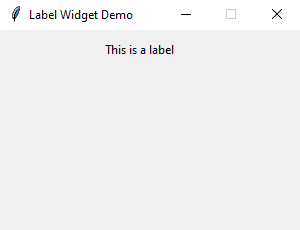
The following program shows how to display a regular label on the root window:
- First, import Label class from the tkinter.ttk module.
- Second, create the root window and set its properties including size, resizeable, and title.
- Third, create a new instance of the Label widget, set its container to the root window, and assign a literal string to its text property.
Setting a specific font for the Label
To set a particular font for a label, you pass the font keyword argument to the Label constructor like this:
The font keyword argument is a tuple that contains font name and size. For example:
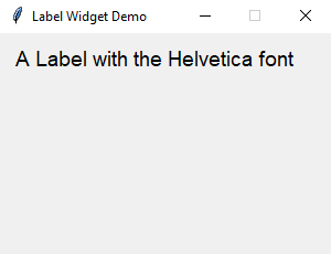
The following example shows a label with the Helvetica font:
Displaying an image
To use a Label widget to display an image, you follow these steps:
First, create a PhotoImage widget by passing the path to the photo to the PhotoImage constructor:
Second, assign the PhotoImage object to the image option of the Label widget:
The following example shows how to use a Label widget to display an image:
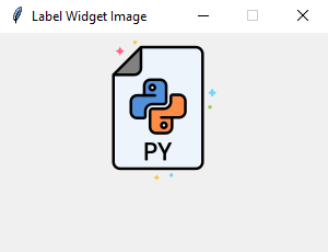
Note that the image file is located at the /assets/ folder.
To display both text and image, you’ll use the text attribute and compound option.
The compound option specifies the position of the image relative to the text. Its valid values are:
| Compound | Effect |
|---|---|
| ‘top’ | Display the image above the text. |
| ‘bottom’ | Display the image below the text. |
| ‘left’ | Display the image to the left of the text. |
| ‘right’ | Display the image to the right of the text. |
| ‘none’ | Display the image if there’s one, otherwise display the text. The compound option defaults to ‘none’ . |
| ‘text’ | Display the text, not the image |
| ‘image’ | Display the image, not the text. |
The following program shows how to display both text and image on a label:
Что такое label в python
Виджет Label представляет текстовую метку. Этот элемент позволяет выводить статический текст без возможности редактирования.
Для создания элемента Label применяется конструктор, который принимает два параметра:
Параметр master представляет ссылку на родительский контейнер, а параметр options представляет следующие именованные параметры
anchor : устанавливает позиционирование текста
background : фоновый цвет
borderwidth : толщина границы метки
cursor : курсор указателя мыши при наведении на метку
font : шрифт текста
foreground : цвет текста
height : высота виджета
image : ссылка на изображение, которое отображается на метке
justify : устанавливает выравнивание текста. Значение LEFT выравнивает текст по левому краю, CENTER — по центру, RIGHT — по правому краю
pading : отступы от границ вилжета до его текста
relief : определяет тип границы, по умолчанию значение FLAT
text : устанавливает текст метки
textvariable : устанавливает привязку к элементу StringVar
underline : указывает на номер символа в тексте кнопки, который подчеркивается. По умолчанию значение -1, то есть никакой символ не подчеркивается
width : ширина виджета
wraplength : при положительном значении строки текста будут переносится для вмещения в пространство виджета
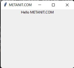
Выведем в окне приложения простейший текст:
Установка шрифта
Параметр font принимает определение шрифта в виде:
Первое значение передает имя шрифта в кавычках, а второе — числовой размер шрифта. Например, установим шрифт Arial высотой в 14 единиц:
Установка изображения
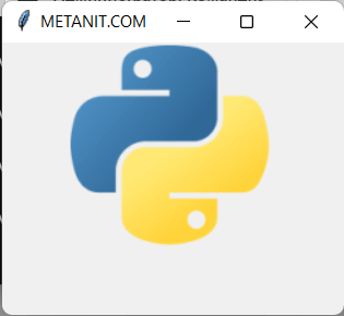
За установку изображения на метке отвечает параметр image . Самый простой способ определения изображения представляет создание объекта PhotoImage , в конструктор которого передается путь к изображению:
В моем случае изображение представляет файл python_logo.png, которое находится в одной папке с файлом приложения и которое изображает логотип python:
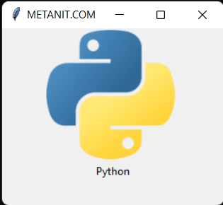
Если необходимо также отображать и текст, то для этого можно установить параметр compound , который определяет положение текста по отношению к изображению с помощью одного из следующих значений:
top : изображение поверх текста
bottom : изображение под текстом
left : изображение слева от текста
right : изображение справа от текста
none : при наличии изображения отображается только изображение
text : отображается только текст
image : отображается только изображение
Например, отобразим картинку поверх текста:
Стилизация
По умолчанию метка не имеет границы. Для установки толщины границы используется параметр borderwidth , при этом нам также надо установить тип границы с помощью параметра releaf , который может принимать значения: «flat», «raised», «sunken», «ridge», «solid» и «groove»:
# Label — метка
Библиотека tkinter содержит набор компонентов или виджетов, одним из которых является метка — Label() . Метки (или надписи) — это достаточно простые виджеты, содержащие строку (или несколько строк) текста и служащие в основном для информирования пользователя.
Добавим метку в окно:
Для создания метки используется конструктор Label() . В этом конструкторе с помощью параметра text можно установить текст виджета. Чтобы сделать элемент видимым, у него вызывается метод pack() . В итоге вверху окна будет красоваться метка с текстом:
Для создания двух и более виджетов достаточно просто создать метку и добавить её в окно:
Каждый виджет, имеет ряд атрибутов, которые влияют на ее визуализацию и которые мы можем настроить через конструктор: