Полиграфическая верстка, СМИ «с нуля», многостраничники
Чтобы у читателей оставалось приятное впечатление от чтения газеты, журнала, брошюры или рекламной листовки, необходимо использовать знаки набора по назначению. И хотя, бороться с безграмотностью — тяжелая задача корректоров, к всеобщему большому сожалению, не все современные печатные издания имеют корректоров, и не вся рекламная полиграфия вычитывается специалистами, прежде чем отправиться в печать.
Поэтому верстальщик должен знать, как правильно использовать типографские знаки и вводить их с клавиатуры. Чтобы читателю «было приятно в руки взять» печатное издание.
Обычно текст на верстку поступает уже в наборе (не в рукописном варианте). А компьютерный набор (который, конечно, сильно упростил жизнь полиграфистам) отличается от «правильного», типографского. Ввести с клавиатуры тире или кавычки-ёлочки без особого тайного знания не получается, я не говорю уже о прочих знаках, которые часто используются в полиграфии.
Если ввести кавычки с обыкновенной компьютерной клавиатуры нажатием клавиш Shift+2 на русской раскладке, то мы получим «компьютерные» кавычки, другое их название — машинописные. Текстовые редакторы иногда автоматически заменяют компьютерные кавычки на нужные нам «ёлочки», но не всегда.
Вместо тире многие используют клавишу, которая идет в верхнем ряду цифр, сразу после нуля. В нижнем регистре — это дефис: «-», а в верхнем (то есть с нажатой Shift) — это подчёркивание: «_». Хуже всего, когда вместо тире ставят два дефиса подряд. Это неправильно! Еще одна часто возникающая ошибка, когда вместо тире используют знак дефиса и не отбивают его пробелами.
Нельзя путать дефис «-», минус «−», короткое тире «–» и тире «—». Читатель заметит, что все эти знаки выглядят по-разному. Соответственно, у них разное предназначение.
Можно использовать Alt-коды.
Например:
Alt+0171 — открывающая кавычка «
Alt+0187 — закрывающая кавычка »
Alt+0151 — тире
Alt+0150 — короткое тире –
Все коды удержать в голове очень сложно. Можно использовать шпаргалку. Кстати, знание кодов не всегда выручает, так как не все шрифты имеют полные наборы символов.

Очень удобная вещь. Очень легко вводятся самые распространенные: неразрывный пробел и кавычки. Кстати говоря, в InDesign’е для вставки неразрывного пробела по умолчанию не назначена горячая клавиша, а с клавиатурой Бирмана эта проблема отпадает сама собой. Как поставить знак ударения, Илья подробно рассказывает в видео на своем сайте, там же есть и другие советы по использованию раскладки.
Quick Tip: Using Em Dashes, En Dashes and Hyphens within InDesign
When using dashes you have three options available, a hyphen, an en dash and an em dash. Choosing the right dash for the job in hand is usually overlooked and misunderstood. This Quick Tip will outline the differences between the three dashes as well as advice on when and how to use them correctly within your designs.
The Hyphen
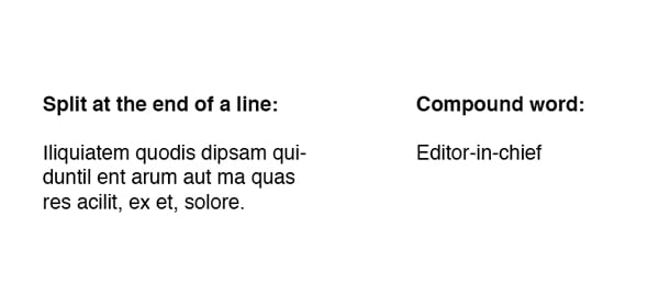
First up is the Hyphen. It has two main functions, to divide a word that needs to be split at the end of a line and to join a compound word.

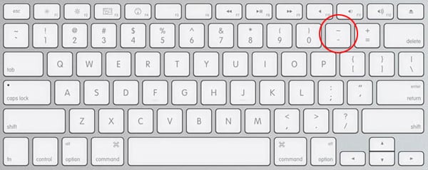
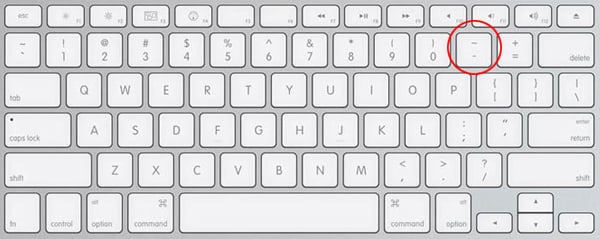
On a standard English keyboard the hyphen can be found to the right of the zero.
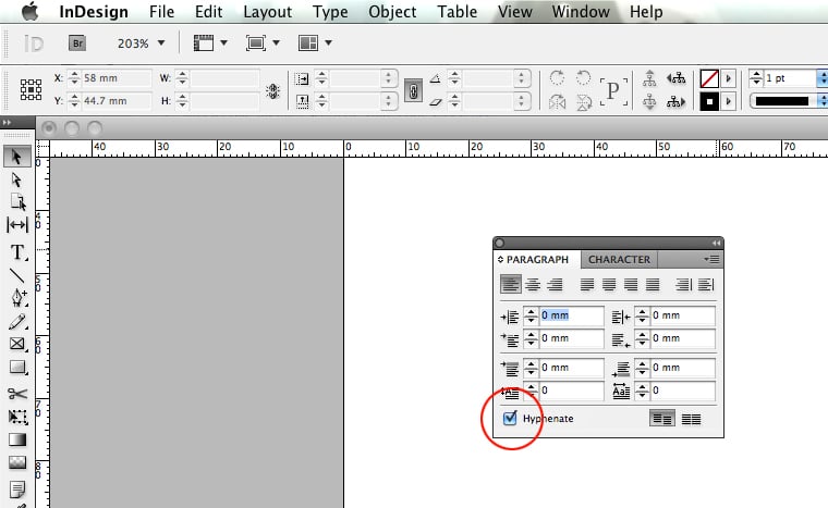
Indesign will hyphenate your body copy automatically if the «Hyphenate» tick box is selected, it can be found within the paragraph panel. If it is not activated go to Window > Type and Tables > Paragraph.


The tick box is located at the bottom left of the palette. Activate the tick if it isn’t already. However some designers like to have full control over the hyphenation and prefer to add their own. To deactivate automatic hyphenation simply select your text box/boxes and deselect the option on the paragraph palette.


99% of the time I prefer to avoid using hyphens, however if it is necessary to use a hyphen I try to stick to these points. Only occasionally split a word at the end of the sentence. And try to split the word between syllables, for example, Design would be split De-sign. Always keep a dictionary handy for checking syllable breaks.
One final note to mention is don’t confuse a Hyphen for a Minus Symbol. A Minus Symbol is different to a Hyphen as a minus symbol will usually match the horizontal line on a plus sign.


En Dash
The En Dash is commonly used to substitute the word ‘to’ when adding dates. Notice how the En Dash has a space on either side.
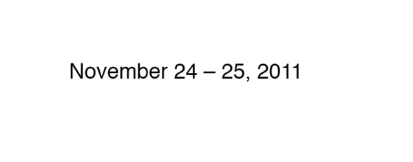
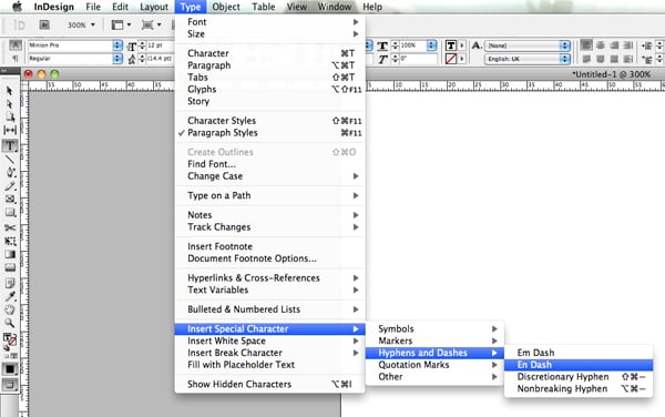
Unlike a Hyphen the En Dash is not visible on the keyboard and must be activated. The shortcut is Option + Hyphen or you can go to Type > Insert Special Character > Hyphens and Dashes > En Dash.

Em Dash
The Em Dash is used to indicate a break or interruption in thought or to separate a sentence from a bullet point. The Em Dash has no space on either side.
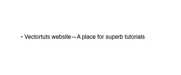
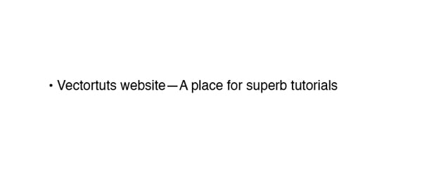
Like the en dash the em dash is not visible on keyboard and must be activated. The shortcut is Option + Shift + Hyphen or you can go to Type > Insert Special Character > Hyphens and Dashes > Em Dash.


Glyphs
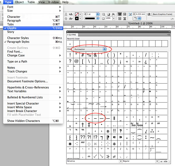
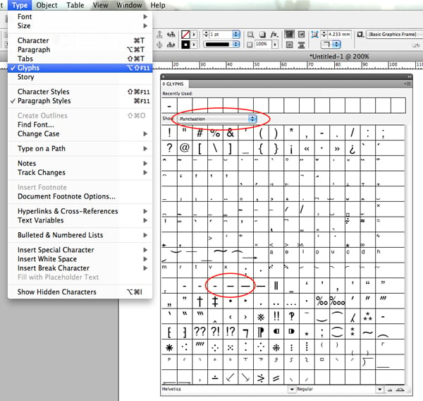
There is another way of selecting dashes. Go to Type > Glyphs and a new floating palette will open. The glyphs palette will display a visual reference to all of the characters within the typeface you have selected. As there is a lot of content to scroll through lets narrow down our search. In the drop down menu titled ‘Show’ select Punctuation, within this option the dashes can be found. By hovering your cursor over each of the glyphs InDesign will display their names.
Conclusion
Once you start to notice the different ways Dashes are used, you’ll be able to spot them in everything you read. This is a great skill for any designer to have, I hope you’ve enjoyed this tut.