Understanding CSS Multiple Backgrounds
CSS background is one of the most used CSS properties. However, using multiple backgrounds is still not well known across all developers. I will hugely focus on the potential of using multiple backgrounds and leverage the CSS to its full power.
In this article, I will explain the background-image property in detail, and provide a visual explainer on how we can stack multiple backgrounds, and the actual benefit of it. Of course, there will be some visual examples, you’re in for a treat!
If you don’t know about CSS background property, I prefer to have a look at this reference by Mozilla Developer Network (MDN) that explains about how CSS background works.
Introduction
The CSS background property is a shorthand for the following properties.
background-clip, background-color, background-image, background-origin, background-position, background-repeat, background-size, and background-attachment.
For this article, I will focus on background-image , background-position , and background-size . Are you ready? Let’s dive in!
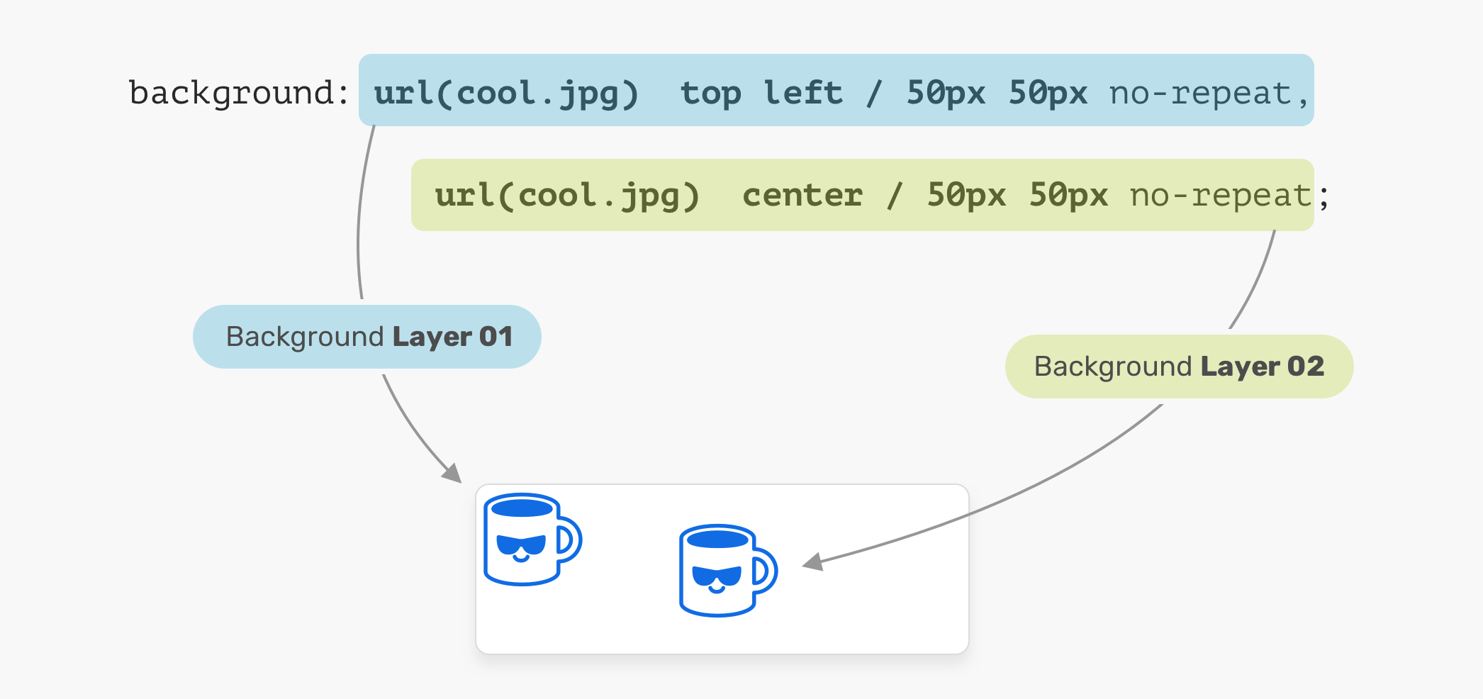
Consider the following example.
The background image is positioned at the top-left corner of the element, with a size of 50px * 50px . It’s important to understand and remember the order of the position and size.
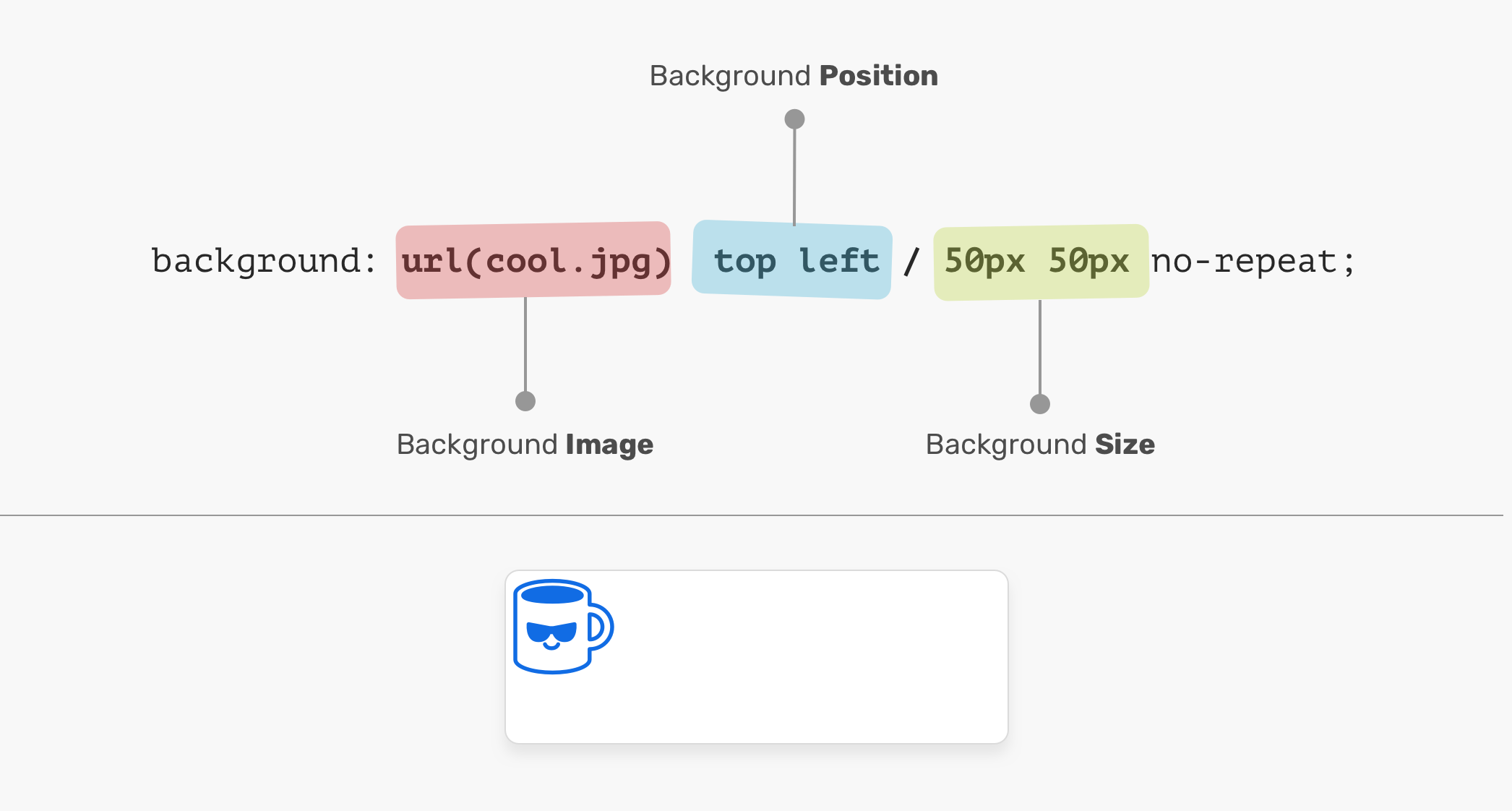
In the figure above, the background-position is followed by the background-size . It can’t work the other way around! In other words, the following CSS is invalid:
Background Position
An element is positioned relative to the positioning layer set by the background-origin property. I like the flexibility of the background-position . It has multiple ways of positioning elements:
- Keyword values ( top , right , bottom , left , center )
- Percentage values. E.g: 50%
- Length values. E.g: 20px 2.5rem
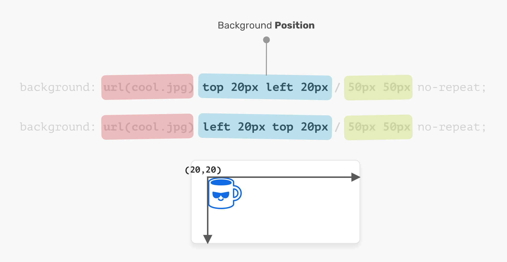
- Edge offset values. E.g: top 20px left 10px
The coordinates system starts from the top-left corner, with the default value of 0% 0% .
It’s worth mentioning that the value top left is the same as left top . The browser is smart enough to determine which one of them is for the x-axis, and which is for the y-axis.
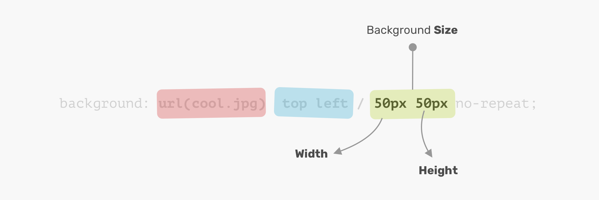
Background Size
The name of the property is self-explanatory. The size consists of width & height. For the background-size property, the first one is width, and the second is height.
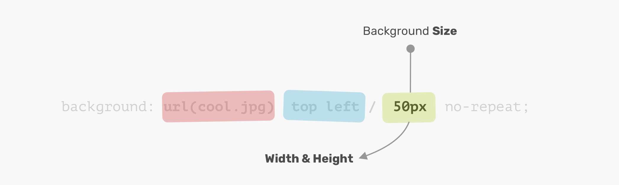
It’s not necessary to use two values. You can use one value and it will be used for the width and height.
Disclaimer: it’s worth mentioning that the CSS spec says: “If only one value is given the second is assumed to be auto”. However, that is not implemented in browsers and will change in the future. Thanks to Ilya Streltsyn for the note.
Now that I went through the basics of how a CSS background works, let’s explore how to use multiple backgrounds.
Multiple Backgrounds
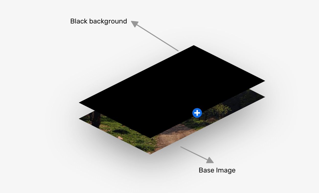
The background property can have one or more layers, separated by a comma. If the size of multiple backgrounds is the same, one of them will cover the other background.
In the figure above, we have two background layers. Each one of them is positioned differently. That is a basic usage of multiple backgrounds. Let’s explore a more advanced example.
The Stacking Order
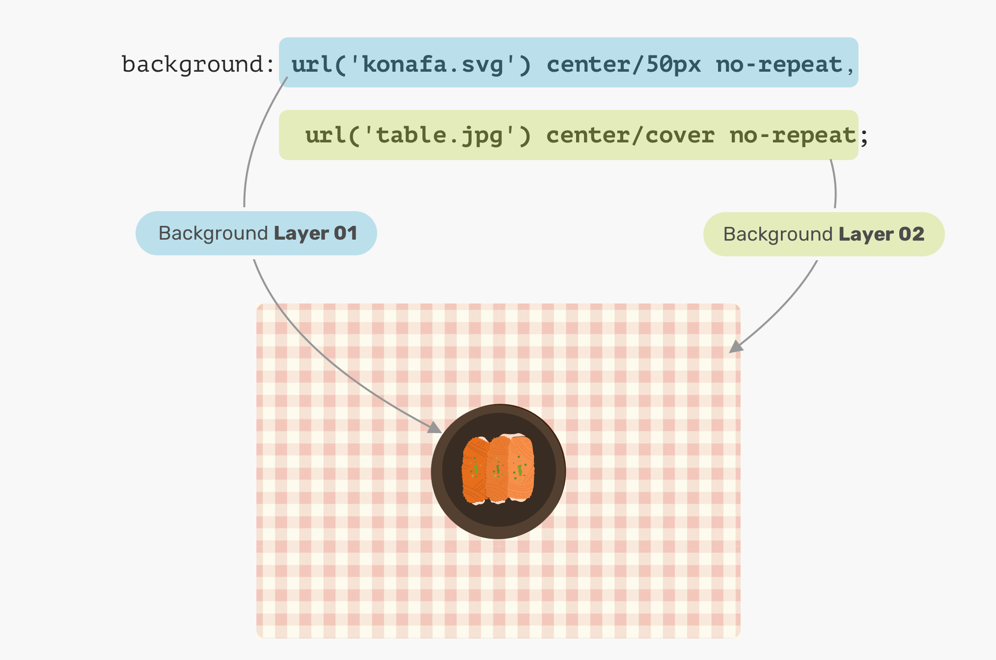
When placing multiple backgrounds, and one of them is taking the full width and height of its parent, the stacking order will take place. It can be a bit confusing to decide when backgrounds should stack above each other. Consider the following example.
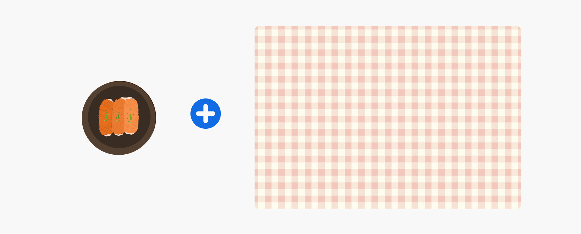
We have a plate and a table. What would you expect the result of the CSS above? Which will come first? The plate, or the table?
The answer is the table. In CSS, the first background can stack on the second one, and the second can stack on the third, and so on. By replacing the order of the backgrounds, the result will be as expected.
Solid Colors
Say you want to draw two rectangles with CSS backgrounds, how would you do it? Thankfully, it’s fairly easy with CSS gradients. When a linear-gradient has the same color stops, the result will be a solid color. That’s it!

We can take this way further by exploring a very, very useful use-case for CSS gradients, which is drawing in CSS. Stay tuned for the use-cases section!
Use Cases and Examples
Hero Section Overlay
Often times, you might need to place an overlay on top of the hero section, so the text can be easy to read. This can be easily done by stacking two backgrounds.

What’s even better is that we can use the same method above to apply tints to an element. Consider the following:

Drawing with CSS
The possibilities of using CSS gradients to draw are endless. You can use linear-gradient or radial-gradient and more. For this basic example, I will explain how to draw a laptop.

Let’s disassemble the laptop and see what gradients we need to use.
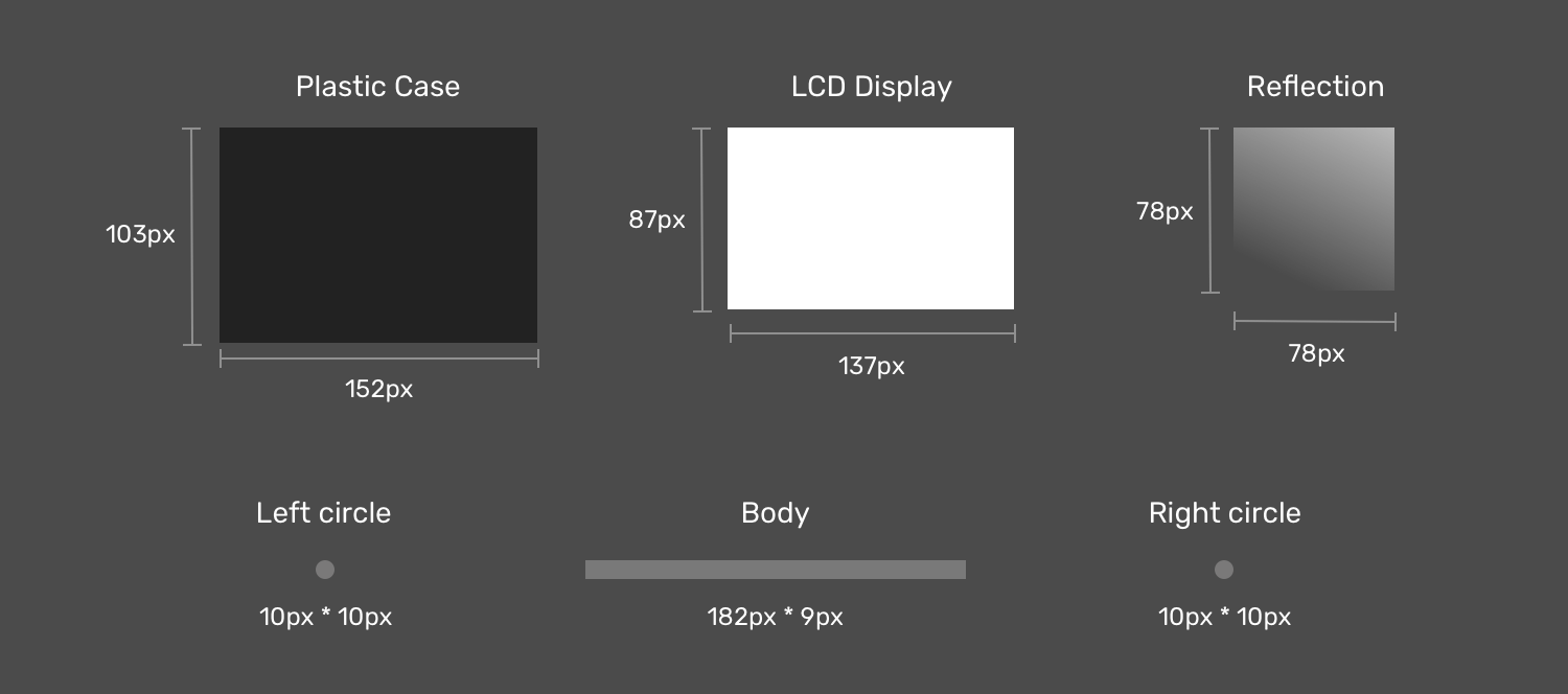
Notice how when the laptop items are dissembled, it’s easier now to think about how to implement this as multiple CSS backgrounds now. If you noticed, I created two circles to act as the rounded corners for the body since there is no direct way of doing a gradient with rounded edges.
Next is the drawing. The first thing is to define each gradient as a CSS variable, and its size. I like to use CSS variables since it can reduce code complexity and makes the code cleaner and easier to read. Once done, I will move to the step of positioning them.
Now that we defined the gradients and their sizes, the next step is to position them. Consider the following figure for a better visual explainer.

Display Reflection
As explained previously, an element that needs to be on the top should be defined first. In our case, the display reflection should be the first gradient.

LCD Display
The display is centered in the x-axis and is positioned 6px from the y-axis.

Plastic Case
The case is positioned below the display, and it’s centered on the x-axis and positioned 0px from the y-axis.

That’s the most interesting component in the drawing. First, the body is a rectangle, and we have two circles for each side (left and right).

Final Result
See the Pen Single Div by Ahmad Shadeed (@shadeed) on CodePen.
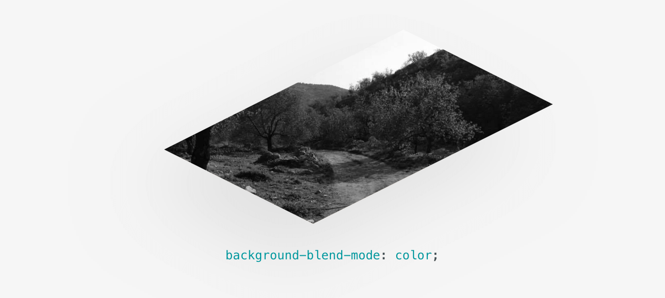
Blending Multiple Backgrounds
Having multiple backgrounds is exciting when you can blend them. The simplest use-case that I can explain is desaturating an image. Consider that you have a background-image in CSS, and you want to turn it into black and white.
The End
That’s a wrap. Do you have a comment or a suggestion? Please feel free to ping me on @shadeed9.
Thank you for reading.
I’m writing an ebook
I’m excited to let you know that I’m writing an ebook about Debugging CSS.
CSS Multiple Backgrounds
In this chapter you will learn how to add multiple background images to one element.
You will also learn about the following properties:
- background-size
- background-origin
- background-clip
CSS Multiple Backgrounds
CSS allows you to add multiple background images for an element, through the background-image property.
The different background images are separated by commas, and the images are stacked on top of each other, where the first image is closest to the viewer.
The following example has two background images, the first image is a flower (aligned to the bottom and right) and the second image is a paper background (aligned to the top-left corner):
Example
Multiple background images can be specified using either the individual background properties (as above) or the background shorthand property.
The following example uses the background shorthand property (same result as example above):
Example
CSS Background Size
The CSS background-size property allows you to specify the size of background images.
The size can be specified in lengths, percentages, or by using one of the two keywords: contain or cover.
The following example resizes a background image to much smaller than the original image (using pixels):
Lorem Ipsum Dolor
Lorem ipsum dolor sit amet, consectetuer adipiscing elit, sed diam nonummy nibh euismod tincidunt ut laoreet dolore magna aliquam erat volutpat.
Ut wisi enim ad minim veniam, quis nostrud exerci tation ullamcorper suscipit lobortis nisl ut aliquip ex ea commodo consequat.
Here is the code:
Example
The two other possible values for background-size are contain and cover .
The contain keyword scales the background image to be as large as possible (but both its width and its height must fit inside the content area). As such, depending on the proportions of the background image and the background positioning area, there may be some areas of the background which are not covered by the background image.
The cover keyword scales the background image so that the content area is completely covered by the background image (both its width and height are equal to or exceed the content area). As such, some parts of the background image may not be visible in the background positioning area.
The following example illustrates the use of contain and cover :
Example
#div1 <
background: url(img_flower.jpg);
background-size: contain;
background-repeat: no-repeat;
>
#div2 <
background: url(img_flower.jpg);
background-size: cover;
background-repeat: no-repeat;
>
Define Sizes of Multiple Background Images
The background-size property also accepts multiple values for background size (using a comma-separated list), when working with multiple backgrounds.
The following example has three background images specified, with different background-size value for each image:
Example
Full Size Background Image
Now we want to have a background image on a website that covers the entire browser window at all times.
The requirements are as follows:
- Fill the entire page with the image (no white space)
- Scale image as needed
- Center image on page
- Do not cause scrollbars
The following example shows how to do it; Use the <html> element (the <html> element is always at least the height of the browser window). Then set a fixed and centered background on it. Then adjust its size with the background-size property:
Example
Hero Image
You could also use different background properties on a <div> to create a hero image (a large image with text), and place it where you want.
Example
CSS background-origin Property
The CSS background-origin property specifies where the background image is positioned.
The property takes three different values:
- border-box — the background image starts from the upper left corner of the border
- padding-box — (default) the background image starts from the upper left corner of the padding edge
- content-box — the background image starts from the upper left corner of the content
The following example illustrates the background-origin property:
Example
CSS background-clip Property
The CSS background-clip property specifies the painting area of the background.
How to Add Multiple Background Images with CSS
CSS3 allows adding multiple background images for a given element just using a comma-separated list to specify as many images as you want.
To add multiple background images, you can use the CSS background-image or background property.
Note that if you use the background-image property, the comma-separated list of the background-position and/or the background-repeat values will assign the position and repeat, respectively, for the specified multiple background images.
So, we’re going to demonstrate examples with both of the mentioned properties. Let’s see how to create multiple background images, step by step!
CSS Multiple Backgrounds
В этой главе вы узнаете, как добавить несколько фоновых изображений в один элемент.
Вы также узнаете о следующих свойствах:
- background-size
- background-origin
- background-clip
CSS несколько фонов
CSS позволяет добавлять несколько фоновых изображений для элемента через свойство background-image .
Различные фоновые изображения разделяются запятыми, и изображения укладываются поверх друг друга, где первое изображение ближе всего к зрителю.
В следующем примере имеется два фоновых изображения, первое изображение — цветок (выровненный по нижнему и правому краю), а второе изображение представляет собой бумажный фон (выровненный по левому верхнему углу):
Пример
Несколько фоновых изображений могут быть указаны с помощью отдельных свойств фона (как указано выше) или background Сокращенное свойство.
В следующем примере используется сокращенное свойство background (тот же результат, что и в примере выше):
Пример
Размер фона CSS
Свойство CSS background-size позволяет задать размер фоновых изображений.
Размер может быть указан в длинах, процентах или с помощью одного из двух ключевых слов: содержать или охватывать.
В следующем примере размер фонового изображения значительно меньше исходного изображения (с использованием пикселов):
Lorem Ipsum Dolor
Lorem ipsum dolor sit amet, consectetuer adipiscing elit, sed diam nonummy nibh euismod tincidunt ut laoreet dolore magna aliquam erat volutpat.
Ut wisi enim ad minim veniam, quis nostrud exerci tation ullamcorper suscipit lobortis nisl ut aliquip ex ea commodo consequat.
Пример
Двумя другими возможными значениями для background-size являются contain и cover .
Ключевое слово contain масштабирует фоновое изображение так, чтобы оно было максимально большим (но и его ширина, и его высота должны уместиться внутри области содержимого). Таким образом, в зависимости от пропорций фонового изображения и области расположения фона, могут быть некоторые области фона, которые не охватываются фоновым изображением.
Ключевое слово cover масштабирует фоновое изображение таким образом, что область содержимого полностью покрывается фоновым изображением (ширина и высота которого равны или превышают область содержимого). Таким образом, некоторые части фонового изображения могут не отображаться в области фонового позиционирования.
В следующем примере демонстрируется использование contain и cover :
Пример
Определение размеров нескольких фоновых изображений
Свойство background-size также принимает несколько значений для размера фона (с помощью списка с разделителями-запятыми) при работе с несколькими фоновыми рисунками.
В следующем примере задано три фоновых изображения с разным значением размера фона для каждого изображения:
Пример
Полный размер фоновое изображение
Теперь мы хотим иметь фоновое изображение на веб-сайте, который охватывает все окна браузера в любое время.
- Заполните всю страницу изображением (без пробелов)
- Масштабирование изображения по мере необходимости
- Центрировать изображение на странице
- Не вызывать полосы прокрутки
В следующем примере показано, как это сделать; Используйте элемент HTML (HTML-элемент всегда по крайней мере высота окна браузера). Затем установите фиксированный и центрированный фон на нем. Затем настройте его размер с помощью свойства «размер фона»:
Пример
CSS фон-происхождение свойства
Свойство CSS background-origin указывает, где расположено фоновое изображение.