Creating basic navigation menus
In this tutorial we will take you through how to create different types of basic navigation menu using HTML lists and links.
Introduction
In this article you’ll learn about different types of navigation menus and how to create them in HTML. We’ll also touch on the subject of menu usability and accessibility. We won’t go into styling menus yet, but this article will lay the foundations.
the HTML5 <nav> element
HTML5 defines a <nav> element that can be used to contain the primary navigation of a website, be it a list of links or a form element such as a search box. This is a good idea. Previously, we would have contained the navigation block inside something like <div >. While this works fine for styling purposes, it is a <div> , and therefore semantically anonymous. The <nav> element provides a consistent way to unambiguously define the primary navigation areas. This is good for both search engine optimization and for visually impaired users. A screen reader user can more easily find the navigation area if it is clearly signposted (this does depend on whether the screen reader supports the <nav> element, so it might be a way off yet). A navigation block would look something like this:
Bear in mind that <nav> should only be used for the main navigation elements, not for advertising links at the bottom of the page, or for a secondary navigation relating to a small part of the page.
Your main HTML menu tools: links, anchors and lists
There are several different types of menu and navigation idioms to consider in HTML, all connected closely with <link> and <a> (anchor) elements. In a nutshell:
- Link <link> elements describe relationships across several documents. You can, for example, tell a user agent that the current document is part of a larger set that spans several documents, including a table of contents, and define the relationships among the documents.
- Anchor <a> elements allow you to either link to another document, resource, or document section, or to a certain section of the current document. These are not automatically followed by the user agent; instead, they’ll be activated by your visitors by whatever means available to them (mouse, keyboard, voice recognition, etc.).
If you haven’t yet read the HTML Links and HTML Lists articles, you should. They contain lots of basic information that will help you understand this tutorial.
Anchors/links do not just become menus on their own; you must structure and style them to let both the browser and your users know that their function is as a navigation menu, not just a set of random links. HTML lists are quite handy for this purpose. If the order of the pages is not important you can use an unordered list. However, if the order in which the visitors go through all the documents is important then you should use an ordered list.
Using <nav> and lists to create menus works well for several reasons:
- It is easy to differentiate the primary navigation lists/links from other lists and links on the page because they are the ones inside the <nav> . Not only will does this make the navigation meny easier to for screen readers, as mentioned above, but it makes targeting the menu with CSS and JavaScript easier as well.
- Lists can be nested, which means you can easily create several levels of navigation hierarchy.
- Even without any styling applied to the list, the browser rendering of the HTML makes sense, and it is easy for a visitor to grasp that these links belong together and make up a logical unit.
You nest lists by embedding the nested list inside the <li> element, not after it. You can see a correct and an incorrect example below.
Notice that browsers display both examples in the same way. Browser display should never be an indicator for the quality of your code. An invalid HTML construct will be hard to style, add behaviour to with JavaScript, or convert to another format. The structure of nested ULs should always be:
The need for flexibility
The menu of a site is unlikely to stay the same for very long — sites tend to grow and change as functionality is added and the user base grows, so you should create menus with scope for menu items to be added and removed as the site progresses, and for menus to be translated into different languages (so links will change in length). Also, you may find yourself working on sites where the HTML for menus is created dynamically using server-side languages rather than with static HTML. This does not, however, mean that knowing HTML will become obsolete; it will actually become more important, as this knowledge will still be needed to create HTML templates for the server-side script to populate.
Types of menus
There are several types of menus you will be called upon to create in HTML as you work on different websites. Most of these can be created with lists, although sometimes interface restrictions force you to use something different (more on that later). The list-based menus you will be likely to create are as follows:
- In-page navigation: For example, a table of contents for a single page, with links pointing to the different sections on the page.
- Site navigation: A navigation bar for your whole website (or a subsection of it), with links pointing to different pages on the same site.
- Content-contextual navigation: A list of links that point to pages closely related to the subject of the page you’re currently on, either on the same site, or on different ones.
- Sitemaps: Large lists of links that point to all the different pages of a website, grouped into related sublists to make them easier to make sense of.
- Pagination: Links pointing to other pages that make up further sections or parts of a whole, along with the current page, for example, part 1, part 2, and part 3 of an article.
In-page navigation (table of contents)
We’ve already covered this to a certain degree in the tutorial about links, but here’s a more in-depth description of what in-page navigation means and what you need to make it work. Each menu link looks like this:
The href attribute points to a corresponding anchor (the target)further down the page via the anchor’s id attribute value, preceded by a hash symbol (#). That anchor looks like this:
Each section of the page also has a “Back to menu” link that works in the same way, but points back to the menu instead. Technically, this is all you need to make this kind of navigation work; however, there is an annoying bug in Internet Explorer that forces you do to a bit more work.
You can try out this bug for yourself:
- Open the document in Internet Explorer 6 or 7.
- Do not use a mouse; instead use the keyboard to navigate the document. You can hit the tab key to jump from link to link and the enter key to activate a link — in this case to jump to the section it points to.
- Seemingly all is well when you do that — the browser scrolls down to where you wanted to go.
- If you hit the tab key again the right behaviour for the browser is to take you to (give focus to) the first link inside the section you chose. Internet Explorer, however, will take you back to the start of the menu at the top of the page!
The way around this is terribly confusing and deals with a special property of Internet Explorer called <hasLayout> . You can trigger this in several ways, all of which are explained in Ingo Chao’s article On having layout. The easiest way is to wrap the anchor in an element and then set that element’s width using CSS. In this case we used <section> elements and then set their width to 100% using CSS. This is what IE needs — the anchor must be inside an element with <hasLayout> .
Having to do this is annoying, but it also helps you if you want to style the sections differently — you can’t add styling to a whole section unless you wrap it in an appropriate block level element.
Note that keyboard navigation around links in Opera works slightly differently — try looking at the above example in Opera, then hold down Shift and use the arrow keys to navigate around links (it also works on form elements). This is called spatial navigation.
Site navigation
Site navigation is most probably the most common menu type you’ll need to create. It is a menu of a site or a subset of it, showing both the options visitors can choose from and the hierarchy of the site. Lists are perfect for this purpose.
There aren’t many surprises here, at least not from a pure HTML point of view. In later articles we’ll talk about styling these kind of menus with CSS and adding behaviour via JavaScript. One important thing to consider is how to highlight the current document in the menu, to give the user a sense of being in a particular place, and that they are changing location (even though in reality they aren’t, unless of course they are using a mobile device to browse the Web!). In this case we are just removing the link to the current page — this makes sense, as you don’t need to link to the same document you are on, and it makes it clear where you are in the menu. We’ll look at that next.
Providing visitors with a “You are here” feeling
One golden rule of web development and navigation is that the current document should never link to itself, and its link should be visibly different from the other entries in the menu. This is important as it gives the visitors something to hold on to and tells them where they are on their journey through your site. There are edge cases like web applications, permalinks in blogs, and so-called "one page websites", but in most cases a link to the document you are already viewing is redundant and confusing to the visitor.
In HTML links, we saw that a link is an agreement and a liability: you offer visitors a way to reach more information, but you must be careful — you’ll lose credibility and trust if that link doesn’t give the users what they want, or if it results in unexpected behaviour. If you offer, for example, a link that points to the current document, activating it will reload the document. This is something users don’t expect, and results in confusion and frustration.
This is why the current page should never be linked to from the menu. You could remove it altogether or, even better, highlight it (e.g., by surrounding it with a <strong> element). This gives users a visual clue and also tells vision-impaired visitors that this is something different.
How many options should you give users at one time?
Another issue to consider is how many options to give visitors at once. A lot of menus you see on the web try to make sure that every page in the site can be accessed from one single menu. This is where scripting and CSS trickery comes in — you can make the menu more manageable by hiding certain parts until users select certain areas (rollover menus, as they are sometimes called). This is clever from a technical point of view, but there are several issues with this approach:
- Not all visitors will be able to use the clever trick as intended; keyboard users, for example, will have to tab through all links on the page just to reach the one they are looking for.
- You’ll need to add a lot of redundant HTML to each document of your site to achieve this. If we drill down three levels in a menu to reach the document we want to read, we don’t need to see options leading us to 4, 5, and 6 levels deep.
- You can overwhelm visitors if you present them with too many options at once. It’s easier to make a decision from a short list than a long one.
- If there is not much content on a page but a lot of links, search engines will assume that there is not much valid information on the page and won’t give the page much attention, so it is harder to find when searching the Web.
It is up to you how many items you put into a menu — different designs call for different choices — but if in doubt, you should try cutting your menus down to only the links to the main sections of the site. You can always provide further submenus where appropriate.
Contextual menus
Contextual menus are links that build on the content of the current document and offer more information related to the current page you are on. A classic example is the “Related articles” links you often see at the bottom of news articles, as shown in Figure 1.
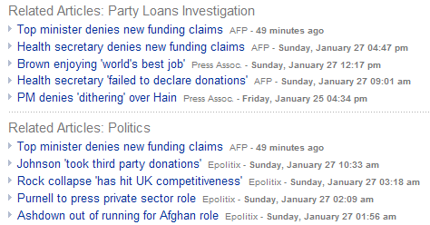
Figure 1: An example of a contextual menu in a news article, offering related news items at the bottom.
This is a slightly different thing from context menus in software user interfaces, which offer different options depending on where they are accessed (like the right-click or Ctrl+click menus you find in desktop applications that offer specific options depending on where the mouse pointer is).
Contextual menus on websites are a great way to promote content on other parts of the site; in terms of HTML they are just another list of links.
Sitemaps
Sitemaps are what you might expect: maps of all the different pages of your site (or the main sections of very large sites). They allow your site’s visitors to get a glimpse of the overall structure of your site, and quickly go anywhere they want, even if the page they need is deep within your page hierarchy.
Both sitemaps and site searches are a great way of offering visitors a fallback option when they are lost or to offer quick access for those who are in a hurry. From an HTML point of view they could either be one massive nested list full of links or, in the case of very large sites, section headings with nested links of section-specific hierarchies, or even search forms for each of the sections.
Pagination
Pagination is necessary when you have to offer a way to navigate through large documents split into separate pages. You’ll find pagination in large image archives or search result pages, for example Google or Yahoo search.
Pagination is different from other types of navigation because it does normally link back to the same document, but results in more options or further information being displayed. Some examples of pagination are shown in Figure 2:
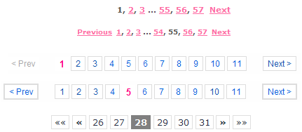
Figure 2: Pagination menus allow visitors to go through large sets of data without losing track of where they are.
The HTML is nothing ground-breaking. Once again, you offer a list of links with the current link (indicating which chunk of data is shown and how far down in the pagination you are) being highlighted (e.g., with a <strong> element) and not linked.
The main difference from site navigation is that there is a lot of programming logic going on with pagination. Depending on where you are in the whole data set you may need to show or hide the previous, next, first, and last links. If you have massive amounts of information to navigate through, you will also want to offer links to landmarks like 0-100 results, 101-200 results, etc. This is why you are not very likely to hard-code menus like these in HTML, but create them on the server-side instead. This does not change the rules, however; the current chunk still should not link to itself, and you shouldn’t offer links that lead nowhere.
When lists are not enough — image maps and forms
In most cases an ordered or unordered list is a sufficient HTML construct for menus, especially as the logical order and nesting also allows for styling with CSS very nicely. There are, however, some situations that may require different design techniques.
Creating hotspots with image maps
One technique is to use a client-side image map. Image maps turn an image into a menu by turning sections of the images into interactive areas that you can link to different documents. For example, using an image map, a user could navigate by clicking the different sections of the triangle, as shown in Figure 3.
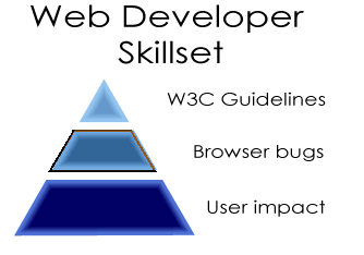
Figure 3: By defining a map with area elements you can turn parts of an image into interactive links.
You can turn any image into a menu by defining a map with different areas (also called hotspots). You give the map a name attribute and connect the image and the map using the usemap attribute on the <img> element. The code in our example looks like this:
Note that this works exactly like in-page links, which means that you need to precede the value of the usemap attribute with a hash.
Each area has several attributes:
- href defines the URL the area should link to (which could also be a target in the same document).
- alt defines alternative text that can be displayed if the image is not viewable for whatever reason.
- shape defines the shape of the area. This can be rect for rectangles, circle for circles, or poly for irregular shapes defined using polygons.
- coords defines the coordinates in the image that should become hotspots. These values are measured from the top left corner of the image, and can be measured in pixels or percentages. For rectangular areas you only need to define the top left and the bottom right corner; for circles you need to define the center of the circle and the radius; for polygons you need to provide a comma-delimited list of all the corner points.
Image maps are not much fun to define and type in as HTML, which is why image manipulation tools like Adobe Image Ready or Fireworks offer an option to create them visually (they generate the HTML for you).
Saving screen space and preventing link overload with forms
Another technique you can employ is to use a form control for navigation. For example, you could use a <select> element, with the different pages as the <option> s. Your visitors can choose an option, then submit the form to jump to different pages.
The most obvious benefit of using this type of menu is that you can offer many options without using much space on the screen, as browsers render the menu as one line as seen in Figure 4.
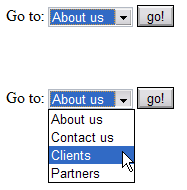
Figure 4: Select menus take up only one line on the screen.
You can go further with this, grouping the different menu options using the <optgroup> element. This will show a menu with non-selectable options (the group names) as shown in Figure 5:
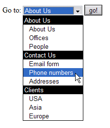
Figure 5: Select menus can use option groups that allow you to tell visitors which options belong together.
This technique has the benefit of using up hardly any space but it also means that you need to have a server-side script to send the visitors to the pages they choose. You can also use JavaScript to make the links work, but you cannot rely on JavaScript being available to all users in all browsers; you must make sure your users can still make use of the menu with JavaScript disabled.
Another, less obvious benefit is that you don’t offer too many links in the same document. This means that you don’t overwhelm users of assistive technologies (who often tend to be presented with the links in one big list). It also means that search engines don’t consider the links on your page worthless as the link-to-text ratio makes the document appear to be a sitemap. However, many assistive technologies can produce a map of your pages’ links; if your important links are all in a select menu, there is a chance that a visitor might never chance upon them. It is therefore a good idea to offer anchor links to the main destination pages and <select> element menus to offer more options. Visitors will be able to use them, but machines like search engine robots don’t need to know they exist.
Where to put the menu, and offering options to skip it
One last thing to mention about HTML menus is that the placement of the menu plays a large role. Consider visitors who have no scrolling mechanism or who might rely on keyboard navigation to find their way around your site. The first thing they’ll encounter when they load the document is its location and the title; next the document gets read top to bottom, stopping at each link to ask the visitor whether they want to follow the link. Other options are to get a list of all the links, or to jump from heading to heading.
If the menu is at the top of document, it will be the first thing the user will encounter, and having to skip through 15 or 20 links before they get to any actual content could be annoying. There are two workarounds available. First, you could put the menu after the main content of the document in the HTML source (you can still place it at the top the screen using CSS if you wish). Second, you could offer a skip link. Skip links are simply links placed before the main menu that link to the start of the content, allowing the visitor to skip over the menu and get to the content immediately. You can add another “Go to menu” link at the end of the document to make it easy to get back up to the top. Skip links are not only useful for users with disabilities, but they make life easier when you navigate a site on a mobile device with a small screen.
Conclusion
There are many ways to construct navigation menus, but no real standards — either official or de facto — for doing so. The best way to see what works and what doesn’t is to visit as many sites as possible and to note, from a user standpoint, how they provide navigation functionality. Then, either emulate menus you like, or strike out and create your own. Your menu design might be the Next Big Thing!
CSS Dropdown Menu: How to Make It + HTML Tutorial
A dropdown menu contains a list of pages and subpages. Users can access its content by clicking on or hovering over the menu.
This design element reduces the clutter of buttons, links, and text which is useful for enhancing a website or an app’s user experience on small screens.
Keep reading as we will cover the steps to create a dropdown menu using HTML and CSS. You will also learn to apply styles to the newly built dropdown menu to match your project’s branding.
How to Create a CSS Dropdown Menu
This tutorial requires a text editor to create the HTML and CSS file containing the dropdown menu’s code. Alternatively, you can do this through the File Manager of your hosting control panel. The following dropdown menu guide will use the latter method.
Step 1. Create a File With HTML Code
To begin, create an HTML file for the actual dropdown menu content and syntax. Navigate to the File Manager from your hPanel dashboard and generate a new file called menu.html inside the public_html directory.
The menu.html file will contain the dropdown menu’s elements ‒ one parent element with five menu items. Each sub-menu will redirect users to different pages on your website.
Add the following code to the menu.html file:
The dropdown, mainmenubtn, and dropdown-child classes represent different HTML elements. CSS will use them to access a specific element and alter its design.
This is how the HTML menu will look without any CSS rules:

Pro Tip
Don’t forget to replace the links inside the href attributes with the URLs of your website pages and rename the sub-menus to reflect the actual page content.
Step 2. Add CSS and Create the Dropdown Effect
Now that you have HTML elements to work with, let’s create the dropdown effect and CSS rules for each of them.
Generate an internal stylesheet within the menu.html file by placing the following code inside the <style> element:
Pro Tip
In this example, the CSS styles are placed in the same HTML file (internal stylesheet). Use external CSS by linking the HTML document to a separate CSS file for easier modification.
The .mainmenubtn class name contains the CSS properties of the dropdown button. It sets the button’s background and font colors and omits the border. The cursor property dictates that the mouse cursor will change to the hand with the index finger extended symbol when hovering over the dropdown button.
Adding a hover selector to the .mainmenubtn class determines what the dropdown menu will look like when a user hovers over it.
The .dropdown class sets the dropdown menu’s position. In the above example, the CSS rules position the menu items under the parent menu. The inline-block property makes them appear without having a line break separating them.
The .dropdown-child class refers to the actual dropdown menu content. Using a display value of none makes the sub-menus invisible. .dropdown:hover .dropdown-child turns the entire element into a hoverable dropdown menu.
Pro Tip
Feel free to experiment with other CSS properties to get the desired design. You can even add JavaScript to create a responsive dropdown menu with dynamic animations.
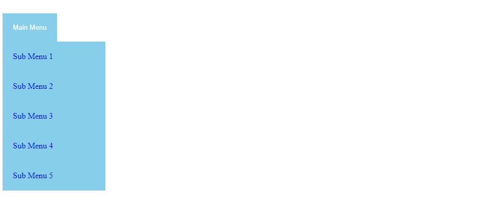
Once you’re done, save and download the file. Here’s what the dropdown menu will look like when you open it on a web browser:
Examples of HTML and CSS Dropdown Menus
Plenty of modern CSS dropdown menu templates are available so you don’t have to code one from scratch. At the very least, they’re a great source of inspiration.
The following dropdown menu template by kkrueger utilizes HTML and CSS. Each parent menu smoothly expands on hover, creating a dynamic and memorable look for the web page.

Another example comes from Bhakti Pasaribu. He utilizes JavaScript to create an interactive dropdown menu. The options appear with a flip animation upon clicking the parent menu. Another animation replaces the parent menu with the selected option, creating a seamless transition effect. This dropdown menu template is simple and dynamic in a unique way.

Minimalism enthusiasts may like what Chris Ota has to offer. His collapsable menu is subtle and doesn’t hog too much space. Still, it places user experience at the forefront. You can easily replace the list item descriptions with icons, further strengthening your site’s branding.
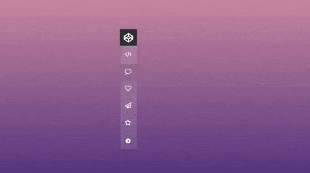
If you’re looking for a more flashy menu with visual effects, we recommend checking out the Molten dropdown menu by Zealand. It utilizes CSS keyframe animations to create an eye-catching flickering flame around the navigation bar.

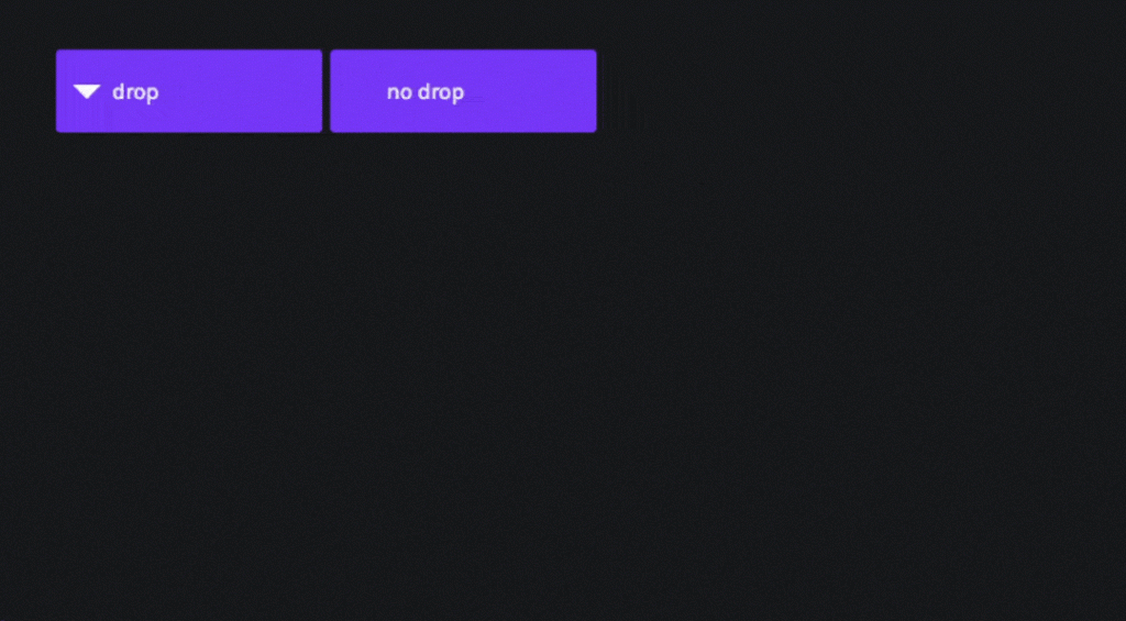
Recursive Hover Nav by sean_codes offers a mega menu solution without obstructing the site’s user experience. The multi-level dropdown menu is built using HTML, CSS, and JavaScript.
As your mouse hovers over the parent menu, the sub-menus appear with a slide transition animation. While it doesn’t have flashy effects like the other examples, this template is more practical when it comes to managing a menu with lots of content.
Pro Tip
When designing a dropdown menu, make sure to consider the site’s user experience. A beautifully made CSS dropdown menu doesn’t guarantee great usability. In most cases, less is more.
Conclusion
Having a dropdown menu makes it easier to design an effective user interface. It reduces the number of elements cluttering your web page and, with an appropriate design, enhances the site’s aesthetics.
You can create a dropdown menu from scratch using HTML, CSS, and JavaScript. Alternatively, adopt one of the many dropdown menu templates coded by professional designers and adjust it to your preference.
We hope this article has provided you with a better understanding of how to design a CSS dropdown menu. Good luck.
Linas started as a customer success agent and is now a full-stack web developer and Technical Team Lead at Hostinger. He is passionate about presenting people with top-notch technical solutions, but as much as he enjoys coding, he secretly dreams of becoming a rock star.
How to create a navigation bar with HTML / CSS / and Javascript.

In this tutorial we will be going over how create a sticky navigation bar using HTML, CSS, and Javascript. As our user scrolls down the page, the navigation bar is going invert the color of the text and the navigation bars background, creating a pretty neat fade in effect.
To begin lets open up our command line and create a new directory called navbar and migrate our way into it.
Now that we are in our new directory we need to create an index page and a style page.
The index.hmtl page is where we will be writing our html and javascript code, as well as how our browser will be viewing the content. The style.css page is where our page is going to get its ascetics from.
Lets go ahead and open index.html with your preferred text editor and get started by adding the following.
This is going to create the link between our index.html file and the style.css page, and gives us access to some cool fonts we have pulled from google. Within the script tags we are calling our jQuery library so we can play-around with our html using Javascript.
Now in between the body tags we are going to create the links we want embedded in our nav bar. To do this we will need a div class we can call “wrapper” and within it a second div with a class of logo. The logo is going to live opposite of links.
To test our code lets open a new tab in your web browser and in the search bar type /// and then navigate your systems file tree to the index.html document we are currently working on. If done correctly we should have a screen that looks like this.
Awesome, what website dosent have some kind of content for us to read on it though. Lets put in some dummy data now. After the </nav> we want to create a section a new section and fill it with some content. We will do that by creating two new divs, one with a class of sec1 and the second with a class called content.
Notice the two <p></p> tags there. This is where you would want to fill in some text. If you are using a code editor such as atom type lorem and press tab, the editor will automatically fill in a paragraphs worth of jiberish. Lets refresh our page and hopefully you will see something like this.
Alright, now that the html is done jump over to your style.css page and lets get to making this look pretty.
If we go ahead and refresh our window lets look at what this did.
Thats no good, we are going to need a way to get that text from jumping to the top of the screen. A good idea would be to work on the selection tags that this content lives within.
Now we have given the section and its content a defined placement as well as changed the font size a bit.
Cool, that nav bar is looking pretty janky though. Maybe we could move that logo a bit to the right and put those links to the left. While were at it lets also space the links out in a horizontal order.
And lets check our work out by refreshing our browser.
Looking good! theres still so much to do. How about we bring those links down to the same level as the logo, space them out a bit, and make them black.
So cool, I want that login button to be red however, with white text, and the button should be round a bit.
Amazing! Now this part wont make too much sense yet, but we want to have a second color scheme to this bar. In our style sheet we are going to add the following in combination with the existing code already implemented.
No need to refresh the page, because these additions will do nothing….YET. Now we need to put a little java script into the mix. If you navigate back you your index.html page. In between the last script tag and the end of the head tag add this…
Now, lets take a moment to explain what this is doing. In our web browsers there is a scroll bar, and that scroll bar has a value depending on where it is. When its in the very most top portion you could say it has a value of 0, and when you scroll that number changes to 1, 2, 3, 4, 5 etc… So what this Javascript code is doing, is telling the web browser that if my position is not at the upmost position than I want to add a class to my nav called black. This logic will be true every time the webpage is loaded because it loading in the upright position.
So cool, but i feel like we are missing something….. Oh yes! we need a sweet image to fill up the body of this website. Go google a nice high res photo of something you like, save it in the same directory as your index and style sheets. Navigate to your style.css page and lets update section.sec1 with the following.
And just like that, we have our finished project.
This is a fun entry level project for incorporating javascript logic with traditional html and css. Thank you for following.
Как делать меню в html
Course Navigation

In the last article, we created the entire structure of our website using HTML elements and Tags. Let’s now start building the website in parts.
The first part of the website is the header. So the first thing we will create is the navigation menu in the Header of the webpage.
The navigation bar contains:
- A logo aligned to the left.
- A menu of five items aligned to the right.
Let’s look at the part of the code of the header menu from our index.html file. Below is the portion of code of the Header menu where the highlighted part is the top navigation bar:
The first task is to add the image for the logo. Steps to include image and create logo:
- Download image by clicking here.
- Copy and Paste the image to the directory: root/images. Where root is the top directory of our project. In our case it is named as “sample project”.
- Include the image in the code using img tag.
The second task is to create an unordered-list in HTML inside the navigation section of the header menu:
- Add an unordered list in the navigation menu section with 5 list-items named “Home”, “About Us”, “Our Products”, “Careers”, and “Contact Us”.
The code of the Header section after adding the above two things will look like as shown below:
If you now open the index.html file in a browser, you will see the below output:

This looks very different than what we saw in the screenshots of the final project. This is because our website is missing CSS for now. That is we have just created the structure of the navigation bar, to make it look beautiful, we will have to add styles using CSS.
We will design the navigation bar later but first create a file named “style.css” and add it to the folder “sample project/css“. Also include the CSS file created to the “index.html” file by adding the below line in between head tags.
Before we begin styling the navigation menu, the first thing needed to do is to set the default CSS values for the HTML elements. Copy and Paste the below code in your “style.css” file:
As you can see in the above CSS that we have set the default values for almost every useful HTML element required for the project. Also, we have created a CSS class named “container“. This basically defines a container with a width of 1200px and all of the text within it aligned to center. Add this class named container to the <header> tag.
The next step is to assign some id’s to our HTML elements and then use those id’s in the CSS file to style them. Here, we already have assigned id’s to the HTML elements as you can see in the above code. Let’s just begin adding styles to them.