Создаем анимированные кнопки при помощи CSS3
В данной статье я хочу поделиться с вами некоторыми экспериментами по созданию анимированных кнопок при помощи CSS3. Идея заключается в создании анимированных ссылок с разными стилями, hover-эффектами и пр.
В данных примерах используются иконки с webiconset.com, а также шрифт от Just Be Nice.
Мы рассмотрим каждый пример и разберем как выглядит их HTML-структура и стили для разных состояний кнопок.
Обратите внимание, что анимация/переходы будут работать только в браузерах, которые поддерживают эти CSS3-свойства.
Чтобы не захламлять код в уроке я не буду использовать префиксы для различных браузеров. Их вы сможете увидеть в архиве с примерами.
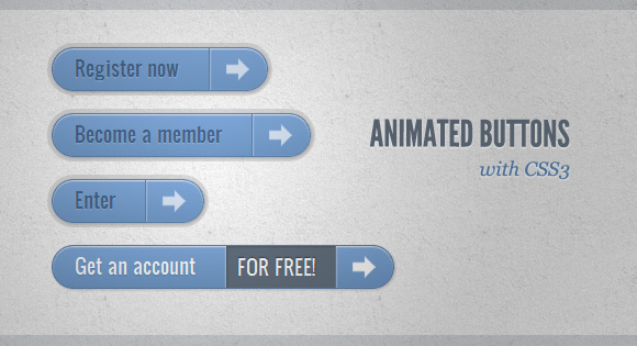
Пример 1
В этом примере мы создадим большую кнопку с несколькими элементами на ней. Она будет иметь иконку, основной текст, стрелку с правой стороны и цену, которая будет появляться только когда мы наводим курсор.
HTML-разметка
Структура довольно проста: иконка изображения и другие элементы в тегах span:
В стилях мы убедимся что переходы установлены правильно для элемента, который мы хотим анимировать при наведении. Цена будет невидимой, установим её прозрачность на 0. Применение множества box-shadow позволит нам создавать реалистичные эффекты:
При наведении мыши на кнопку мы будем менять тень, а также покажем цену и спрячем изображение:
В активном состоянии сделаем кнопку нажатой добавив тень. Значок стрелки справа будет увеличен:
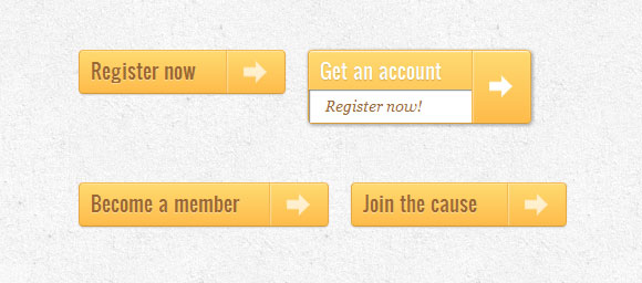
Пример 2
Второй пример будет очень похож на первый, только мы добавим несколько новых эффектов.
HTML-разметка
Разметка на этом примере будет такой же, как и в первом примере.
Стили почти такие же, как и в первом примере, мы просто адаптируем цвета. Но мы сделаем другой эффект при наведении. Цена увеличится до исходного размера и иконка исчезнет. Для стрелки изменим цвет фона на красный:
Активное состояние будет таким же, как и в предыдущем примере. Мы будем только изменять цвета. Когда мы нажимаем кнопку, мы будем также поворачивать стрелку:
Пример 3
В этом примере мы попытаемся сделать что-то совершенно другое. Кнопка будет расширяться вниз при наведении и раскрывать еще одно сообщение. Значок стрелки будет слегка вращаться.
HTML-разметка
Разметка в примере 3, будет несколько иной, чем в предыдущих примерах. Текст, который будет скользить вниз, будет в теге span с классом «a-btn-slide-text»:
В нормальном состоянии кнопка будет иметь определенную высоту, мы будем анимировать её при наведении с целью вывода дополнительных сообщений. Дополнительное сообщение «a-btn-slide-text» будет позиционироваться абсолютно и мы будем увеличивать его высоту от 0 до 30 пикселей при наведении.
При наведении мы будем менять высоту кнопки и дополнительный текст. Мы также будем вращать значок стрелки на 45 градусов:
В активном состоянии кнопка будет немного двигаться и изменять цвет, так что кнопка будет казаться нажатой:
Пример 4

В примере 4, мы будем выдвигать дополнительное сообщение, как и в предыдущем примере, но мы сделаем это теперь с правой стороны. Это будет выглядеть как будто кнопка открывает сообщение внутри себя.
HTML-разметка
Разметка в этом примере такая же, как и в предыдущем.
Стили кнопки будут похожи на предыдущий пример. Мы только изменим цвет и положение дополнительного текста:
При наведении мы увеличим справа padding кнопки, а также ширину тега span с классом «a-btn-slide-text»:
В активном состоянии создадим эффект нажатия при помощи тени:
Пример 5

В этом примере мы будем использовать символьный шрифт для иконок. Идея заключается в создании следующего эффекта: при наведении мыши иконка исчезает и появляется движущаяся стрелка.
HTML-разметка
Структура будет состоять из 4 тегов span внутри ссылки. Span с классом «a-btn-slide-icon» будет анимировать стрелку, она будет двигаться сверху вниз.
Поскольку мы будем использовать шрифт для отображения иконки с левой стороны, мы должны будем подключить этот шрифт.
Мы будем скрывать стрелку, установив её значение top равным -30px.
При наведении мы будем прятать значок слева и бесконечно проигрывать анимацию для стрелки:
При нажатии на кнопку мы сделаем её красной и создадим эффект нажатия добавив тень:
И, наконец, простая анимация для перемещения стрелки сверху вниз:
Пример 6
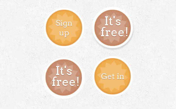
В этом примере мы создадим круглую кнопку со звездочкой в ней. Мы заставим звезду вращаться при наведении курсора (с небольшим импульсом) и сделаем появление дополнительного текста.
HTML-разметка
У нас будет три тега span в нашей кнопке-ссылке. В последнем будет скрытый текст, который показывается при наведении.
Мы поиграемся немного с nth-child в этом примере. Так как у нас есть 3 тега span, мы будем обращаться к ним так: .a-btn span:nth-child(1), .a-btn span:nth-child(2) and .a-btn span:nth-child(3).
Мы сделаем кнопки круглыми и добавим необычные тени к ним. Для того, чтобы отцентрировать основной текст по вертикали, мы установим display равным table-cell. Звезды и скрытый текст будет позиционироваться абсолютно.
При наведении мы будем менять тень кнопки так, что она кажется поднятой. Скрытый текст будет проявляться, и мы применим анимацию для начального текста. Мы также применим анимацию вращения для звезды:
Теперь сделаем кнопку якобы нажатой при нажатии на нее:
Анимация вращения/пульсации выглядит следующим образом:
Пример 7

В последнем примере мы создадим псевдо 3D-кнопку, использовав некоторые классные тени.
HTML-разметка
Структура будет такая же как и в пятом примере
Стиль будет также очень похож на пример 5, мы просто изменим некоторые цвета и тени:
При наведении мы будем увеличивать кнопку и вращать маленькую иконку:
При нажатии на кнопку, мы сделаем кнопку меньше и нажав на неё, изменим тень:
Вот и всё! Надеюсь, вам понравилось создание некоторых крэйзи-кнопок при помощи CSS3 и вы получили вдохновение для своих экспериментов!
Animating buttons with CSS and keyframes
Let’s say that you have a button in your HTML, and you want it to be animated when someone clicks it. I am going to show you here how you could do it with CSS Animations and a little bit of javascript.
Initial setup
To begin with, I will be setting up some simple HTML and CSS with 3 neon styled buttons, so we can demonstrate some alternatives.
Exit fullscreen mode
Exit fullscreen mode
This is how it looks like at Codepen. At the moment, buttons do nothing.
Refresh Button
The first button I will be working with is the Refresh button. I am going to make the button’s border wider when it is clicked, and then narrow it again by adding a class to the button element.
So in my CSS I’ll add a keyframes at-rule with the animation steps and a class defining the animation style.
Exit fullscreen mode
What I am declaring with the blinkingBorder keyframes at-rule is that the border-width property should start and finish at 0.1em , and to grow to 1em in the middle of the animation.
Elements with the blink class should render the blinkingBorder animation for 0.1 seconds only 1 time.
To make this come to life, we have to create a click event handler for the refresh button and add (and the remove) the blink class to it.
Exit fullscreen mode
I wrote the class adding logic into the animateButton function so I can reuse it later with the other buttons. I’ll be adding a little more code to it later, though.
So let’s see how this animation turned out on Codepen. Click on the Refresh button to test it.
Back Button
The second button I’ll be addressing is the Back button. What I want here is that when the button is clicked, I get like a courtain effect opening to the left. To achieve this behavior, I’ll first add some background CSS properties to the btn-back class, and use the linear-gradient CSS function.
Exit fullscreen mode
What I’m declaring here is that the half of the button’s background should be hotpink, instead of transparent ( background: linear-gradient(90deg, hotpink 0 50%, transparent 50% 100%); ), that it should be 2 times wider than the button ( background-size: 200%; ), and that it should be positioned at the top-right button’s corner ( background-position: 100%; )
Next, I’ll set the CSS Animation at-rule and class.
Exit fullscreen mode
This CSS is setting the animation to start with a black font color and a background position at the top-left corner, and end with a hotpink font color and a background position at the top-right corner. It last half a second and it runs once.
The trick here is to slide the button’s background to the left, which is half hotpink and half transparent, giving us the visual effect that it is filling out that hotpink color from the button.
Lastly, I’ll set up the click button’s handler function in Javascript, which is pretty similar to the Refresh button’s code. You’ll see that the animateButton function is reused.
Exit fullscreen mode
So let’s see you is it the aniamtion rendering on Codepen. Check the Back button out.
Next Button
This one will be the same as the Back button, except that I’ll change the color, and that the background will slide from left to right, and the button will stay filled at the end of the animation. This will render a visual effect of the button filling in with a greenyellow color, from left to right.
To achieve the «stay filled at the end» part, what I’ll do is to add a new btn-next-final class to the button when the animation finishes.
So the CSS will look like this.
Exit fullscreen mode
The new javscript is very similar, but I will be adding a parameter to the animateButton function so it takes a new classNameFinal parameter, with an undefined defualt value. This will be the class that I will add to the button at the end of the animation.
Exit fullscreen mode
Ok, let’s see how is this button behaving on Codepen. Click the Next button to see the animation.
Ok! I’m sure there are many more better ways to animate this buttons, so if you are in the mood to comment, please do so!
10 Best CSS button hover effects
I bet the last time you created a CSS hover effect for a button on your site, you flipped the colour of the text with the colour of the background and used a transition of somewhere between 0.3 and 0.5 seconds.
Am I right? Do you feel seen?
Or perhaps you google a bit and found a list of cool CSS animations to add to your website and picked a couple of them, right?
Even if not, would you agree that this is the most common way to create CSS hover animations for buttons? I’m not knocking it — I’ve done it many times myself. It works.
But. there are plenty of other ways you can animate your buttons with CSS, which could make your site more fun and help it stand out from the crowd.
So let’s explore some other options!
CSS button gradient effects
At the time I’m writing this, you can’t animate gradients with CSS — at least, not directly. There is, however, a way to trick CSS into doing what we want — we just make the background larger than the button, and move the background on hover. The result is an animated gradient effect on your buttons.
Here are a few examples — you can take one of these and change the gradient colours and angle if you want:
You can also create an animated gradient effect around the border, instead of the background. Or both:
CSS button hover effects using box shadow
Remember when you were a kid, and you drew a rectangle, then you added a little shading around two edges to make it look kinda 3D? Well CSS box-shadow does that:
But, box-shadow gives us a lot of control of how the shadow appears:
- How big should the shadow be?
- How far from the box?
- What colour?
- Multiple shadows, or just one?
- Inside the box, or outside?
- Solid shadow, or blurry?
And, we can animate all of this! Here are some creative ideas on how you can use box-shadow in your button hover effects:
Check out Mozilla’s article on box-shadow to learn more.
Expanding CSS button hover effect
Here’s a unique hover effect that might be useful to you:
It looks like a text link with a little icon next to it, but looks can be deceiving — the whole thing is actually the button. When you hover, the icon expands and spreads over the text. Very nice!
CSS button on hover fill effects
As I said earlier, the most common button hover effect has to be a simple fill — simply flipping the background colour and the text colour, usually with a fade-in of half a second or so. To be fair, there’s a reason this is common — it does the job and does it well. But that doesn’t mean you can’t get creative with it.
There are lots of ways you can do create the fill effect besides a fade. You could have the background spread out from the centre, slide it in from the side, or spin it around and lock it into place, just to name three. Here are a few ways you could mix it up a bit:
If you like beautifying elements like buttons, you will for sure like turning checkboxes into beautiful toggle switch elements. Check out the best examples we’ve found on CSS toggle switches.
3D rotating button effect on hover with CSS only
You might have seen these 3D rotating buttons before. This one is particularly cool because it’s done purely in CSS, and because it has two "cubes" that rotate in different directions (although you could just get rid of the second one if you don’t want it).
Here’s how it looks:
Note that you’ll need to change the data-attr and the text within the span to change the text shown.
Apple style swipe effect on hover
These buttons visually mimic the effect on iOS when you swipe a menu item (e.g., a note in your Notes app) to make the buttons appear. Here though, it’s just a visual effect — you don’t have to click on the green bit that slides in, you can click any part of it:
The cool thing about these is you can give the visitor an additional call to action (though personally, I’d have used red instead of green for the cancel button).
CSS Button hover background change
OK, time to think outside the box.
I mean that literally — why not have our CSS button’s hover effect change something other than the actual button itself? Like the background, maybe?
This is one of those cool ideas that’s good to have in your back pocket for future use.
Hidden door CSS button effect
Oh! look, a Twitter icon. I guess I just click this and it takes me to the user’s twitter page. Like the 10 zillions other Twitter buttons I’ve seen in my life.
Oh well, might as well click it:
Woah! Is it a Twitter button, or the entrance to a shuttle bay on the Starship Enterprise?
Although there is some JS in the Pen, that’s just to import the Twitter link, in this case to creator Tim Holman’s Twitter link. The JS doesn’t have any effect on how the button works — and of course you don’t have to use it for Twitter — you can adapt it for anything.
Animated Pac-Man CSS button on hover
Here’s an incredible piece of work by Dario Corsi. Check it out:
There’s so much to appreciate about this:
- It’s pure CSS — not an image or line of JS insight
- Of all the ghosts, Dario chose Blinky, the leader of the ghosts and Pac-Man’s arch enemy
- Blinky’s eyes look in the direction he’s moving!
- The animation stops in-place when you stop hovering, rather than resetting to the beginning
A true 3D button animation using three.js
This one isn’t pure CSS, but I thought I’d include this to show you the type of things that are possible when bringing JS into the picture. This is a "true" 3D hover effect button by Robin Delaporte:
Look at that! If you move your mouse around the button area, the shapes react to your mouse movements.
Now, when I say "true" 3D, obviously it’s not actually 3D since it’s a flat image on your screen! I just mean that there’s a Z-axis involved. These are not simply 2D objects at different depths, moving at different rates (as is the case with parallax ). The angle and position of the object along the Z-axis are calculated in JS. This means you can move or rotate it along the third dimension, and add lighting effects to really bring it to life.
To do this, Robin has used a JS library called three.js — a very popular library for making 3D animations on the web, and it’s actually fairly easy to get started with. Of course, you’ll need some practice to create something like this, but if you really study it, you can make some amazing stuff.
Speaking of easy-to-use JS libraries that help you make great stuff, you might also like fullPage.js. fullPage helps you make gorgeous one-page sites quickly and easily, and it works like a charm alongside WordPress, React, and Vue.
We’ve been talking a lot about using animations to improve the visual appeal of your site in this post, and if you’re into this sort of thing have a look at the effects you can use with fullPage. You can use different effects as you scroll from one full-screen page to the next (the card effect is pretty snazzy for instance), or in sliders. All of this is built-in and works out of the box.
Создание анимационной кнопки

От автора: В этом уроке мы будем создавать анимационную кнопку, точную кнопку, которая будет реагировать на наведение курсора мышки. А с помощью фреймворка JQuery заставим нашу кнопку плавно изменять цвет при наведении курсора на кнопку. Таким образом, мы заставляем пользователя нажать на кнопку (заставляем его действовать).
Давайте перечислим все наши действия, которые мы будем выполнять в уроке:
Нарисуем кнопку в Photoshop’е
Сверстаем кнопку с помощью HTML/CSS
Добавим эффект плавности с помощью фреймворка JQuery

Профессия Frontend-разработчик PRO
Готовим Frontend-разработчиков с нуля
На курсе вы научитесь создавать интерфейсы веб-сервисов с помощью языков программирования и дополнительных технологий. Сможете разрабатывать планировщики задач, мессенджеры, интернет-магазины…
Перед тем, как мы приступим к практическим шагам, я Вам рекомендую просмотреть демо-результат работы.
Также скачайте исходники себе на компьютер!
Шаг 1: Photoshop
Наша кнопка будет размерами 200х50px. Но мы будем рисовать сразу две кнопки, для двух различных состояний, поэтому высота полотна у нас будет 100px (дальше вы поймете, почему мы две кнопки рисуем).
Давайте для начала зайдем в Photoshop и создадим полотно (Ctrl + N) размерами 200х100px.
Чтобы нам было проще рисовать кнопки, мы разделим полотно специальными линиями. Чтобы их включить, жмем Ctrl + R или View> Rulers.
Создаем форму кнопки. На панели инструментов выбираем инструмент Rounded Rectangle Tool, а в панели параметров (вверху) поставим округлость углов 8px.
Когда у нас выбран и настроен для работы инструмент Rounded Rectangle Tool, создаем нашу кнопку путем зажимания ЛКМ в верхнем углу полотна и тянем к правому углу.
Оформляем кнопку. Для этого нужно открыть меню с настройками стилей, кликнуть 2 раза ЛКМ на слой с формой кнопки.
Добавим градиент. Для этого нажмите на Gradient Overlay. Затем нажмите на градиент для открытия окна редактирования градиента, чтобы выбрать нужные нам цвета.
Добавляем внутреннее свечение. Это даст кнопки тонкие белые границы. Жмем Inner Glow, ставим непрозрачность на 100% и меняем цвет свечения на белый (# FFFFFF), а размер свечение в 3px.
Добавляем темно зеленую 1px границу нашей кнопке. Для этого заходим в Stroke и ставим размер 1px, позиция inside (рамка будет внутренней), а цвет рамки темно зеленый – (#60694f).
Пишем текст на нашей кнопке, например «отправить». Для этого на панели инструментов выбираем инструмент Horizontal Type Tool, а в панели параметров ставим шрифт Arial, стиль шрифта Bold (жирный), размер шрифта 24px, сглаживание Sharp, затем нажмите на любом месте полотна и напишите свой текст.

Оформляем текст кнопки. Для этого опять открываем меню с настройками стилей (Layer Styles), кликаем 2 раза ЛКМ на слой с текстом. И делаем градиент, как это мы делали, только на этот раз для левой стороны цвет — #505548, а для правой — #9ca388. У вас должно получиться вот так:
Теперь добавим к нашему тексту внутреннюю тень. Заходим в Inner shadow. Ставим угол наклона тени 90 градусов, расстояние в 1px, размер ставим 2px, цвет внутренней тени черный (#000000) и помутнения (Opacity) на 75%.
Добавим к тексту немножко внешней тени. Нажимаем на Drop Shadow и делаем цвет тени светло-зеленого цвета (#dde4cf). Ставим помутнения на 100%, угол тени 90 градусов, расстояние 1px и размер в 2px (равно как и во внутренней тени).
Создаем изображение кнопки для состояния нover
Hover — состояние кнопки когда пользователь помещает над кнопкой курсор.
У нас уже есть изображения кнопки для нормального состояния, теперь мы создадим изображение для состояния, когда курсор на кнопке.
Мы все наши слои поместим в папку с названием «norm» (изображение нормального состояния кнопки), потом папку «norm» копируемо и переименовуем в «hover» (изображение активного состояния кнопки).
Создаем папку «norm», нажимаем (Ctr + G) или кнопку в виде папки, называем ее «norm» и перетаскиваем все наши слои в папку.
Теперь копируемо папку «norm», нажимаем по ней ПКМ (правый курсор мыши) и жмем Duplicate group, новую папку называем «hover».
Жмем на папку «hover», а затем нижней кнопкой клавиатуры или инструментом Move Tool (V) опускайте кнопку Hover в нижнюю часть холста, как это на скриншоте показано. Кнопки нужно стыковать краями. Для того чтобы это лучше сделать, можете увеличить изображение инструментом Zoom Tool (Z).
Меняем настройки слоев в папке Hover
Заходим в папку «hover», дважды щелкнув на слой формы кнопки, чтобы вызвать меню Layer Styles, затем заходим в настройки Gradient overlay и настраиваем градиентную заливку. Левой стороне — цвет #656664, а правой — #959691.
Дважды щелкните на слой с текстом в папке Hover, чтобы открыть меню Layer Styles. Во вкладке Drop shadow меняем цвета теней на серый цвет (#cdcfcd).
Последний штрих, который мы добавим – это градиент для текста. Заходим в Gradient overlay и в левой стороне меняем цвет на #f4f3f3, а для правой — (#f5f5f5). Смотрим скриншот конечного варианты кнопки: