Как сверстать веб-страницу. Часть 1
Уважаемый читатель, этой статьей я открываю цикл статей, посвященных вёрстке.
В первой части будет описано, как это сделать с помощью стандартных средств на чистом HTML и CSS. В последующих частях рассмотрим как сделать тоже самое, но с помощью современных фреймворков и CMS.
Часть 1. Верстка стандартными средствами
Преимущество данной верстки состоит в том, что код получается более «чистым», а значит быстрее загружается и легче изменяется под специфические нужды. Недостаток такой верстки заключается в том, что она требует значительно больше времени, чем при использовании фреймворков.
Итак, давайте приступим. В качестве нашего подопытного мы возьмем бесплатный psd шаблон Corporate Blue от студии Pcklaboratory.
Структура файлов
Первым шагом давайте создадим простую структуру файлов для наших файлов.
- Создаем папку с названием нашего проекта, например Whitesquare.
- В ней создаем пустой файл index.html.
- В папке проекта создаем папку css с пустым файлом styles.css.
- В папке проекта создаем пустую папку images.

Предварительный осмотр
После создания структуры файлов открываем psd файл в Photoshop. Важно внимательно осмотреть шаблон и оценить его. Нам нужно понять следующие вещи:
- Как будут нарезаться изображения?
- Какими будут основные стили?
- Какой макет у нас получится?
Только после того, как вы мысленно себе ответите на эти вопросы, можно переходить к нарезке изображений и написанию кода. Давайте рассмотрим эти вопросы по-порядку.
Общие изображения
На данном этапе нужно нарезать и сохранить только общие изображения, которые будут на всех страницах сайта и не относятся к контенту. В нашем случае это будет светло-серый фон страницы, фон заголовка, пустое изображение, два логотипа и кнопки социальных сетей.
Сохраним логотипы следующим образом:
/images/logo.png
/images/footer-logo.png
В качестве пустых картинок из макета будем использовать однопиксельное серое изображение, которое будем растягивать по необходимости
/images/ sample.png
Повторяющиеся фоновые изображения необходимо вырезать минимальным кусочком достаточным для образования полного изображения повторением по вертикали и горизонтали.
/images/bg.png
/images/h1-bg.png
Иконки социальных сетей с одинаковыми размерами удобно сохранить в один файл и использовать как спрайты для более быстрой загрузки. Для этого можно склеить картинки вручную в Photoshop, а можно сначала нарезать по одной, а затем склеить с помощью специально сервиса, например http://ru.spritegen.website-performance.org. В итоге получится два файла:
/images/social.png
/images/social-small.png
Общее правило при именовании изображений заключается в том, что мелкие и простые картинки, такие, как иконки, логотипы и т.д. сохраняются в формате png, а фотографии в формате jpg.
Основные стили
И только теперь можно начинать писать код. Но начнем мы это делать не с привычного HTML, а с переноса правил в CSS.
На данном этапе желательно перенести все визуальные стили из дизайна в CSS, которые будут применяться по умолчанию для каждого тега.
Основной цвет фона примерно соответствует цвету #f8f8f8. Он будет показан в случае, если фоновая картинка не загрузится. Наверху страницы находится серая дизайнерская полоска. Применим ее через свойство border для body.
Основным шрифтом является тот шрифт, которым написан текст в области контента. Чтобы узнать его стили нужно выделить его в Photoshop’е и посмотреть свойства шрифта. В данном случае это Tahoma 12px с цветом #8f8f8f. Так же в этом макете параграфы имеют увеличенные отступы.
Прописываем все эти стили в styles.css:
В дальнейшем мы все стили будем писать в этот же файл, поэтому будем называть его просто «стили».
Каркас HTML
И вот, наконец, мы можем попрактиковаться в написании HTML кода. Запишем в index.html следующее:
Здесь мы указываем, что используем разметку HTML5, кодировку utf-8, страница называется Whitesquare. Также подключаем наш файл стилей и внешний файл со стилями шрифтов.
В последнем блоке в секции head мы подключаем специальный скрипт, который позволяет поддерживать Html5 теги в браузерах Internet Explorer меньше 9 версии. Мета-тег X-UA-Compatible сообщает, что в случае использования браузера Internet Explorer, он должен отразить сайт самым современным способом.
Весь html код в дальнейшем будет относиться к этому же файлу, поэтому специально указывать куда прописывать html код автор больше не будет.
Макет
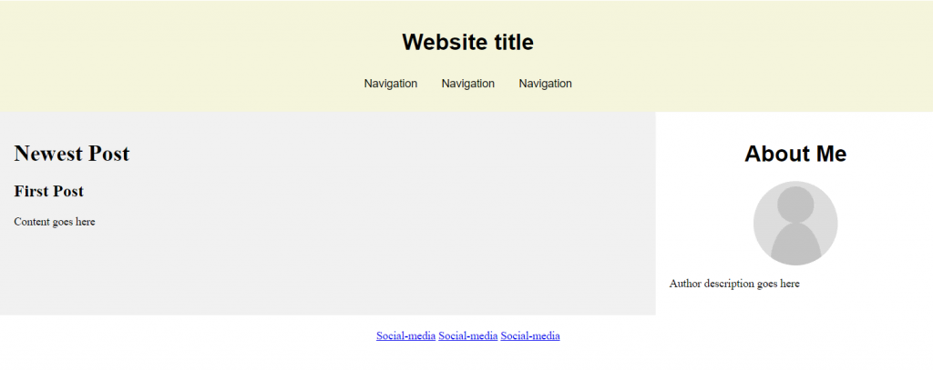
В данном случае, мы видим, что сайт состоит из двух колонок: основного контента и сайдбара. Над ними находится шапка (header), в которой располагаются три горизонтальных блока: логотип с поиском, меню и название страницы. В самом низу под колонками располагается серый горизонтальный блок футера (footer).
Опишем это в теге body:
Wrapper используется для объединения блоков и их выравнивания по центру страницы.
Затем укажем стили блоков:
Логотип

Вставляем логотип в тег header:
Дополнительных стилей не требуется.
Поиск

Вставляем форму поиска в тег header:
И стили выравнивания по правому краю для нее:

Для отображения меню необходимо создать список со ссылками внутри тега nav:
CSS стили для него будут следующие:
Здесь мы указали, что для всех навигаций ссылки не будут иметь подчеркивания, убрали стандартные отступы для элементов списка, отобразили список горизонтально и указали нужные цвета и шрифт.
Заголовок страницы

Заголовок страницы помещается в div с идентификатором heading
Заголовок имеет следующие стили:
Рисуем серую полоску фоном на div’e, и в нее вкладываем инлайновый h1 с нужным шрифтом и фоном цвета страницы, чтобы создалось впечатление прозрачного фона для h1.
Колонки
Для того, чтобы создать колонки страницы нужно прописать следующие стили:
Здесь мы задали фиксированную ширину 250 пикселей для сайдбара, прибили его к левому краю и отодвинули колонку с контентом вправо на 280 пикселей от левого края. Также добавили отступ у контента снизу.
Подменю

Подменю создаем аналогично главному меню. Для этого в теге aside прописываем следующее:
И применяем к подменю следующие стили:
Для подменю применяется более тонкий шрифт и квадратные маркеры. Для отображения разделителей рисуем верхнюю границу у каждого элемента списка, кроме первого.
Контент сайдбара
В контенте сайдбара помимо подменю в макете располагается также изображение с расположением офисов.
В html это выглядит так:
В стилях укажем шрифты, цвета и отступы:
Данные стили применяются только к заголовкам и параграфам, лежащим непосредственно внутри сайдбара, но не глубже.
Цитата
Вёрстку контента начнём с добавления цитаты.

Добавим код цитаты в раздел section
И применим для него стили:
Здесь нет ничего нового, так же — шрифты, фоны и отступы.
Контент
Все стили для текста контента мы уже добавили. Поэтому остается добавить только три параграфа с самим текстом после
Следующим шагом нужно добавить два изображения, которые находятся в конце текста контента. Делается это с помощью тега :
, которому зададим следующие стили:
Здесь мы убрали стандартные отсупы у figure, отобразили его как инлайновый блок и применили нужный шрифт. Изображение отображаем как блочный элемент с белой рамкой. Вторую серую рамку можно сделать через css-свойство outline. Самое интересное находится в последнем правиле, которое задает левый отступ у всех figure кроме первого внутри тега section.
Блок «Our team»
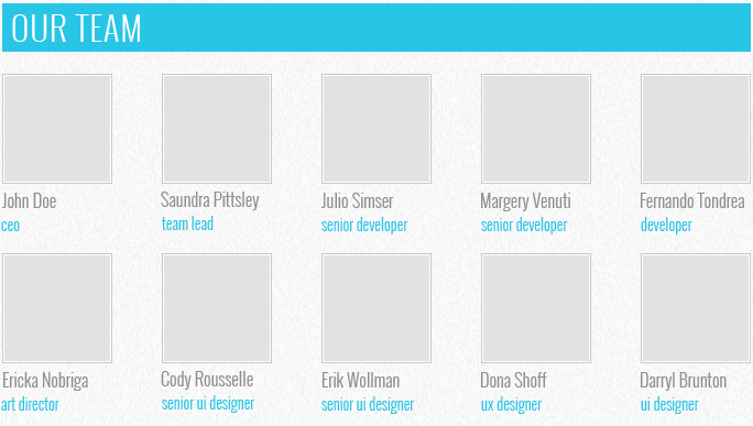
При верстке этого блока добавим сначала заголовок:
А затем два блока-строки с карточками сотрудников
Таким образом, карточка (figure) состоит из фотографии (img), подписи (figcaption) с именем сотрудника и его должностью (div). Карточки будут иметь следующие стили:
Здесь мы задали шрифт и отступ для подписи, размер и цвет должности, добавили верхний отступ для карточек и указали, что для всех карточек в строке, кроме первой, должен быть отступ слева.
Футер
Футер состоит из четырёх больших блоков: ленты Твиттера, карты сайта, социальных ссылок и логотипа с копирайтом.

Для начала создадим контейнер футера с этим блоками:
И применим к нему оформление:
Контейнер с находится внутри тега footer, это даёт нам возможность через тег footer задать серую область по всей ширине экрана, а через внутренний div отцентрировать с максимальной шириной 960 пикселей. Также этот div задает обоим блокам высоту 90 пикселей.
Лента Твиттера
Верстаем содержимое ленты Твиттера:

Из интересных моментов здесь следующее: подчеркивание у заголовка мы сделали через нижнюю границу, а сам блок твиттера, как и последующие блоки выровняем по левому краю и задаём ширину.
Карта сайта
Карта сайта представляет собой два блока со ссылками:
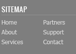
Ссылкам задаем цвет и оставляем подчеркивание только для наведённых.
Колонки со ссылками делаем через инлайновые блоки и затем свойством #sitemap div + div отодвигаем вторую колонку от первой.
Социальные ссылки

Вставляем набор ссылок в контейнер
Здесь мы применили технику спрайтов – когда один файл с изображением применяется для разных картинок. Все ссылки разделились на большие иконки (.social-icon) и маленькие (.social-icon-small). Мы задали этим классом отображение в виде инлайнового блока с фиксированными размерами и одинаковым фоном. А затем с помощью css сдвинули этот фон так, чтобы на каждой ссылке отобразилось соответствующее изображение.
Копирайт
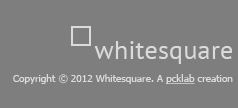
Блок с копирайтом и логотипом – это картинка со ссылкой и параграф с текстом под ним.
Стили делают аналогично предыдущим блокам с той лишь разницей, что блок прибивается к правому краю и выравнивание внутри него так же по правому краю:
Making a Website With HTML in 7 Simple Steps + Post Development Suggestions
Building a website nowadays is simple and doesn’t require coding knowledge. Platforms such as WordPress or website builder offer a simple visual interface and drag-and-drop features to ease the development process.
However, you may want to build websites from scratch with Hypertext Markup Language (HTML). While it is more difficult, HTML websites are more flexible and faster as they require fewer resources to run.
To help you get started, this article will explain the steps in making a website with HTML. We will also provide you with post-development practices to improve your HTML site’s appearance and functionality.
How to Make a Website With HTML
This section will provide step-by-step instructions to code a site with HTML. Before proceeding, refer to our HTML cheat sheet if you are unfamiliar with the standard markup language.
1. Pick an HTML Code Editor
A code editor is software used to write your website. While you can create an HTML page with a default text editor like Notepad, it lacks features that help simplify the development process, such as:
- Syntax highlighting – marks HTML tags in different colors based on their categories. This makes the code structure easier to read and understand.
- Auto-completion – automatically suggests HTML attributes, tags, and elements based on the previous value to speed up the coding process.
- Error detection – highlights syntax errors, allowing a web developer to quickly notice and fix them.
- Integration – some code editors integrate with plugins, Git, and FTP clients to make the deployment process more efficient.
- Live preview – instead of opening HTML files manually on browsers, you can install a plugin to get a live preview of the site.
Since there are many options, we have listed some of the best HTML code editors to help you find one that fits your needs:
- Notepad++ – a free, lightweight text editor with added features for coding and plugin support.
- Atom – an open-source HTML editor with a live website preview feature and extensive markup and scripting language compatibility.
- Visual Studio Code (VSCode) – a popular tool for web development with a comprehensive extension library to expand its functionalities.
2. Plan the Site Layout
Creating a layout plan allows you to better visualize your website’s look. You can also use it as a checklist to track what elements to include in your site.
In addition, a layout plan helps you determine your site’s usability and navigation, which affect user experience. Some elements to consider when planning include the sites’ header, footer, and navigation.
You can use pen and paper or web design software such as Figma to design a website layout. It doesn’t have to be detailed as long as it roughly represents the look and feel of your site.
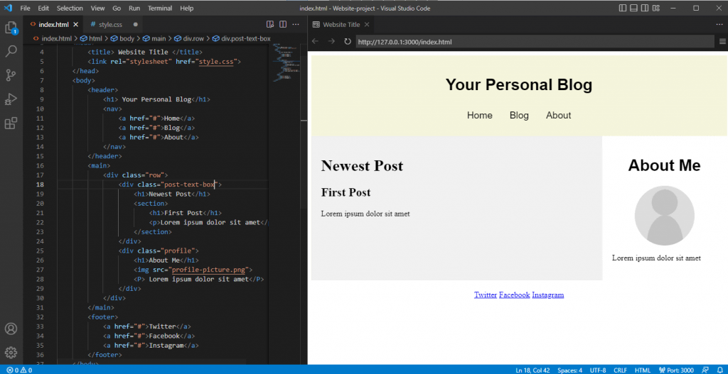
3. Write the HTML Code
Once the tool and layout plan is ready, you can start writing your site’s code. The steps may vary depending on your code editor, but the general idea is similar.
In this tutorial, we will show you how to do it using VSCode:
- Create a new folder on your computer. It will be the directory for all of your site’s files.
- Open VSCode → File → Open Folder.
- Locate the new folder and click Select Folder.
- Select New File. Name the file index.html and press enter.
- Click Create File to confirm.
- Once prompted to the index.html editor tab, enter the following basic HTML document structure:
To help you understand the code, here’s an explanation of each tag:
- <!DOCTYPE html> – tells web browsers that the website is an HTML page.
- </html> – the HTML document opening tag indicating where the code starts.
- <head> – a tag containing the site’s metadata.
- <title> – defines the text shown on the browser tab when visiting the web page.
- <body> – contains all visible content on the web page.
Pro Tip
Learn the difference between making a website using WordPress vs HTML to know which technique suits you best.
4. Create Elements in the Layout
Add HTML code into the index.html file to create the elements of your planned layout. Depending on your website design, you will need different HTML semantic elements.
These elements will separate your site into multiple sections and become the containers for the content. Here are the tags we will use:
- <header> – container for introductory content or navigation.
- <main> – represents the primary content of a web page.
- <div> – defines a section in an HTML document.
- <footer> – contains the content displayed at the bottom of your website.
Put these elements within the <body></body> tags in your index.html file’s code. Ensure to close each element with a closing tag, or your code won’t work.
Here’s how the complete code looks:
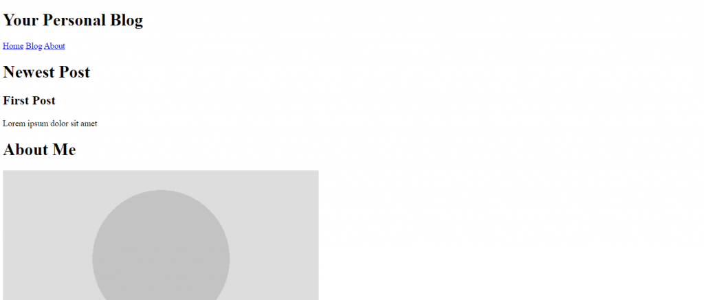
5. Add the HTML Content
After the layout is ready, start filling them with your site’s content, like text, images, hyperlinks, or videos. If the content is not ready, use dummy content as a placeholder and replace it later.
Here are some tags we will use to add the website content:
- <h1> and <p> – contain heading and paragraph text. Use <br> tag to create a line break if the text is too long.
- <nav> and <a> – specify the navigation bar and its anchor element. Use the href attribute to specify the anchor’s linked URL.
- <img> – container for the image element. It contains the img src attribute, specifying the link or name of the image file.
Pro Tip
The tag also has an optional alt attribute. It describes the image in case the file doesn’t load.
Here’s what the code looks like:
After adding the code, your HTML website will have an appearance. Here’s how it looks:
6. Include Layout CSS
Since HTML only lets you create the website’s structure and add basic content, use Cascading Style Sheets (CSS) to change its layout. CSS is a language that defines the style of your HTML document.
To do this, create a style.css file and link the stylesheet to the HTML document by adding the following code between the <head> opening and closing tags of index.html:
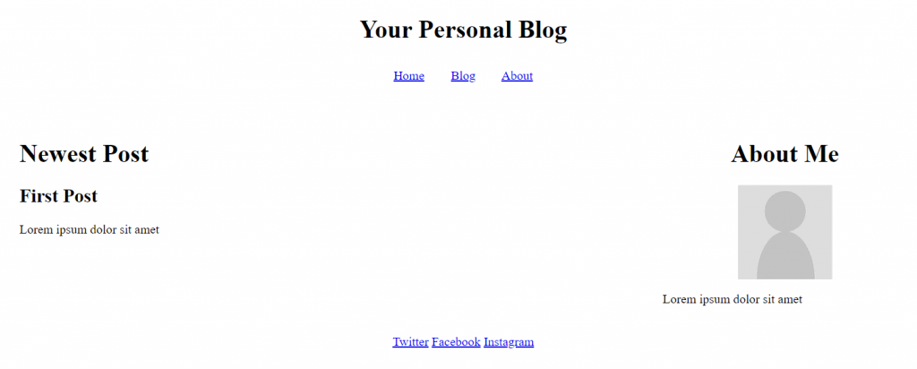
To make the two-column website layout, we will use the flex property. It arranges HTML elements using flexible containers, allowing them to adjust according to users’ screen size.
Here is what the complete code looks like:
After you add the code snippet to your CSS file, here’s how the website will look:
Suggested Reading
7. Customize Your Site
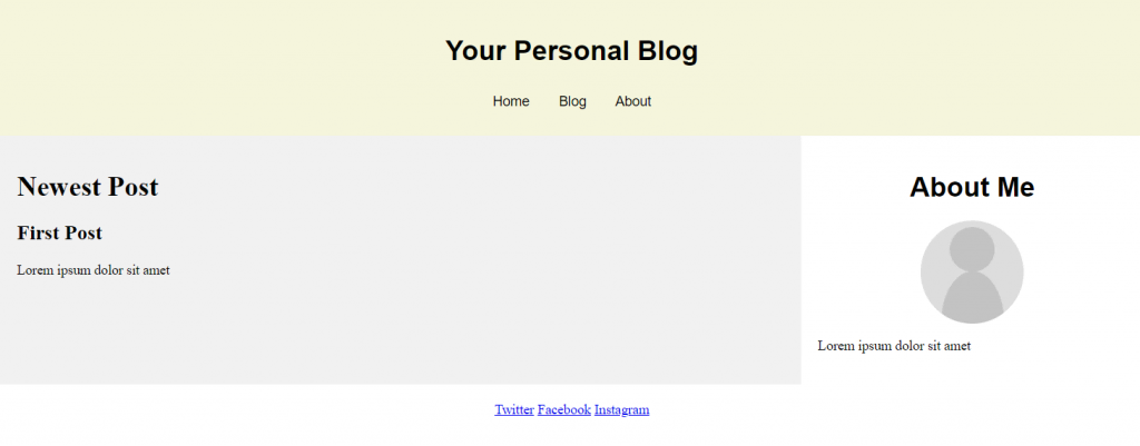
In addition to changing the layout, use CSS to customize other visual aspects of your website. For example, you can change the font family and background image.
To change your website’s appearance, add the CSS properties in the element you want to customize. For instance, here is the code to style the background color and text elements of the navigation menu bar:
After adding CSS styling for every element, here is how the website looks:
Steps to Take After Creating an HTML Website
This section will explain the steps to take after creating a website using HTML and CSS. These steps will make your website accessible and more functional.
Host the Site on the Right Platform
To make your website accessible via the internet, use a web hosting service. Many hosting providers have different plans that cater to various user needs.
Since HTML web pages are lightweight and require few resources to load, a basic shared hosting plan is sufficient.
Alternatively, use a free static site hosting platform like GitHub Pages. However, avoid free static hosting platforms if you plan to add more code or make your site dynamic. Aside from potential compatibility issues, their limited server resources can slow down your website.
Add a Dropdown Bar for Better Navigation
Complex websites with multiple pages have many navigation buttons, links, and texts. You can create a simple dropdown menu using CSS to group these elements.
Users can expand the navigation bar to access the elements. It helps reduce clutter and improves the website’s usability for users with smaller screens.
Improve the Site Design With Advanced CSS
CSS lets you do advanced customization to enhance your site’s design for a better user experience. For example, enable scroll snapping, text animation, zoom on hover animation, and gradients.
In addition, you can build a responsive website with media queries, CSS rules, and flexboxes. The flexbox layout automatically adapts your site to the client’s screen size.
Make the Site More Interactive With JavaScript
JavaScript is a scripting language that lets you create interactive and dynamic website content. For example, enable animation, add countdowns, and include buttons, forms, or menus.
These features make your website more interesting and immersive, improving user experience. The steps to add JavaScript to your HTML website is similar to CSS. You can use a separate file or write it directly into the current code.
Do I Need to Learn HTML to Build a Website?
Users may not have the time or commitment to learn HTML for web development. Fortunately, some platforms let them create a functional website without writing code.
A website builder like Hostinger is an excellent option for beginners. It has a visual user interface and drag-and-drop editor, which makes customization easy.
Suggested Reading
To help you decide which method suits you better, read our tutorial to learn more about the benefits and downsides of using a website builder vs coding.
Maintaining a builder-based website is also simpler and less prone to error as you don’t need to manually update its source code. Simply select the elements you want to edit and apply the changes directly on one screen.
Since Hostinger Website Builder is included in all our hosting plans, you don’t need to purchase the service separately. It starts from $2.99/month and is upgradeable to higher-performance hosting services.
Conclusion
Instead of using platforms like WordPress or website builders, you can code a website from scratch with HTML. Although more complicated to build, HTML websites are more resource-efficient and flexible as you can edit the source code.
In this article, we have explained how to code a website using HTML and CSS in seven steps:
- Pick an HTML editor – choose the program for writing and editing your website’s code, like VSCode.
- Plan the site layout – make a mockup of the website’s layout using a program like Adobe XD or a pen and paper.
- Write the HTML code – create an index.html file and add HTML document structure tags.
- Create the layout elements – separate your website into multiple sections based on the layout by adding tags to the HTML file.
- Add the HTML content – add the heading title, body text, and images into each section.
- Include layout CSS – create a style.css file and add CSS code to change the column position, text alignment, and elements padding.
- Customize your site – use CSS style attributes to customize the website’s background color, font size, typefaces, and other visual elements.
After creating your HTML web page, you can add advanced CSS and JavaScript to improve navigation, interactivity, and overall design.
Too much to learn? Looking for a no-code builder? Check out Hostinger Website Builder:
Making a Website With HTML FAQ
To help you understand more about building a website with HTML, we will answer some commonly asked questions about it.
Is HTML Enough to Create a Website?
Yes, you can create a functional website with only HTML. However, it only displays static content such as text, links, images, and videos.
Use CSS to style the HTML element, like changing the background color and font size. To create a dynamic and interactive website, you also need PHP.
Is HTML Good for Creating Websites?
Yes, it is good for creating a static website. HTML websites require fewer resources to load and are flexible as you can modify the source code.
However, HTML is only suitable for complex websites if paired with CSS and JavaScript. If you’re only learning HTML, it’s better to use WordPress.
How Long Does It Take to Code an HTML Website?
More complex websites will take longer to build. The number of web developers working on the project, their skills, and resources can also affect the building time. Generally, an experienced developer can code a simple website from scratch in four to six weeks.
Aris is a passionate IT professional and WordPress enthusiast. He loves to share his knowledge and inspire people to start their online journey. When he’s not working or blogging, Aris enjoys watching gadget reviews and scribbling random doodles.
Build A Real-World HTML5 & CSS3 Responsive Website From Scratch
In this tutorial we’ll be building a real-world website with pure HTML 5 and CSS 3 which can be used as a template for a web design agency or any other business website. Let’s take a look at the final result first:
The website template is fully responsible and consists of three pages. The start page looks like the following:
If you’re accessing the web site on a smaller screen size the layout will adapt accordingly as you can see in the following screenshot:
Furthermore the website template consist of an About and a Services page:
Let’s explore the steps needed to implement this website from scratch.
Implementing The Start Page
In the following steps we’ll be using plain HTML 5 and CSS 3 code for implementation. No additional framework is needed. Let’s start by creating a new and empty project folder:
Change into that newly created project folder
and create subfolders with the following commands:
$ mkdir css
$ mkdir img
$ mkdir fonts
Because we want to make use of Font Awesome icons, we need to make sure that the icon library is added to our project. Go to http://fontawesome.io, download the free package, unpack the archive and copy the files from the css and fonts folder to the corresponding subfolders in the project.
Implement Index.html
Let’s start coding by adding a new file index.html to our root project folder and add the following HTML code:
As you can see we’re defining five sections within the body element:
- header: Contains the top level bar of the site with branding and navigation menu.
- showcase section: Contains the main image and the main side headline.
- newsletter section: Contains an email input field and and a submit button, so that the user can subscribe to the newsletter.
- boxes section: Contains three boxes to highlight services.
- footer: Contains the code which is needed to display the footer.
Let’s add the needed HTML code for each section step by step …
Add HTML Code For Header
Within the header section add the following code to display branding and the navigation menu on top:
Add HTML Code For Section Showcase
Next, insert the following code within the showcase section:
Add HTML Code For Section Newsletter
The newsletter subscription form is made up of the following HTML code:
Add HTML Code For Section Boxes
Finally add the following HTML code in boxes section:
Now you should be able to see the following result in the browser if you open index.html directly:
Styling Index.html
In the next step we need to style the content of the website. The file css/style.css has already been included in index.html:
Let's use that file to include the CSS code which is needed to style our web application:
General CSS Code
First insert some general CSS code:
Header CSS Code
The header section is containing the branding of the site and the navigation menu. For styling the following CSS code is needed and also added to file style.css:
Please note, that the menu links should change the appearance when the mouse is moved over the element. Therefore the the selector header a:hover is used and the color and font-weight property values are set.
CSS Code For Section Showcase
For the showcase section the following CSS code is needed:
The background image is set by using the background property of the section element with ID showcase. The image file is stored inside the img folder and the filename is headerbg.jpg. This file is selected by using the CSS function url. This function expects the relative path as the first and only parameter.
To make sure that the image is adapting to various screen sizes correctly it is important to furthermore use the options no-repeat and center. Furthermore you should make sure to set CSS property background-size to value cover.
CSS Code For Section Newsletter
The CSS code for section newsletter is available in the following listing and needs to be inserted into style.css as well:
Footer CSS Code
Next, add the CSS code for the footer area:
Making The Website Responsive By Using Media Queries
Finally, we want to make sure that the web site is responsive and is adapting to changing screen sizes. The way this is achieved is by adding media queries to the CSS code:
By using the @media keyword we’re able to define CSS code which is only activated at a specific screen size. In our example we want to define CSS code which is valid for screen sizes with a maximum width of 768 pixel. There we need to set the max-width attribute to the value 768px:
Implementing The About Page
As the website should consists of two more pages we’re continuing the implementation with the next page: About.
Adding HTML Code in File About.html
Create a new file about.html in the project folder and insert the following HTML code:
The page consists of two columns: a main column containing a title and text and a sidebar with additional text.
Adding CSS Code for About Page
The following CSS code needs to be added to css/style.css:
Furthermore the CSS media query needs to be extended to apply a different styling to article#main-col and aside#sidebar as well:
Implementing The Services Page
Finally, we’re going to implement services.html.
Adding HTML Code In File Services.html
Create a new file services.html and insert the following HTML code:
The services page is made up of two columns. In the main column three offerings are presented. In the sidebar a contact form is embedded with three input elements. In addition a submit button is included.
Adding CSS Code For Services Page
The corresponding CSS code is inserted into file css/style.css once again:
Furthermore the CSS code which is embedded in the media query is extended:
Having added this last piece of code the result in the browser should now correspond to the website template which has been presented at the beginning.
The Web Developer Bootcamp
The only course you need to learn web development — HTML, CSS, JS, Node, and More!
Верстка сайта с нуля. Меню навигации. Часть 1.

Начиная с этого урока, мы будем учиться верстке сайта с нуля в популярном flat стиле. Эта тема очень объемная и мы посвятим ей не один урок. Что означает это на практике?
Представьте себе, что Вы на бирже фриланса получили заказ на верстку одностраничного сайта. Заказчик передал Вам макет в виде файла .psd и попросил сверстать HTML страницу. В работу верстальщика входит еще и нарезка макета на картинки, но мы опустим этот этап, поскольку это вопрос умения пользоваться фотошопом. На данную тему Вы можете самостоятельно поискать обучающие уроки по фотошопу.
Будем исходить из того, что заказчик оказался добрым человеком и предоставил нам вместе с макетом и заранее порезанные картинки. Для создания HTML страницы, нам потребуется: .psd макет, папка с картинками, Photoshop, Notepad++ и браузер.
Мы говорим с вами про макет, но пока это только картинка, из которой нам предстоит сделать полноценную HTML страницу.
Обратите внимание, что наш макет представляет из себя классический пример flat дизайна. Flat дизайн – это значит «плоский», здесь вы не увидите объемных теней, градиентов и других «наворотов».
Открываем макет в фотошопе и берем оттуда всю нужную информацию – цвет, шрифт, размеры и начинаем писать код, первой у нас идет шапка сайта, состоящая из логотипа и меню навигации. Разумеется, что наш сайт будет адаптивным под любые устройства и разрешения экрана, поэтому все размеры указываем в % и em.

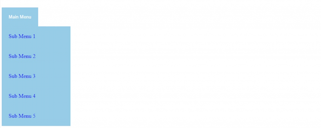
Верстка шапки сайта
Создаем HTML страницу и делаем разметку нашей шапки. Содержимое шапки пишем внутри парного тега header.
Без оформления CSS стилями выглядит шапка совсем не так, как надо. В файле style.css, пропишим селекторам соответствующие свойства, чтобы шапка выглядела согласно макету.
Разберем основные моменты. Логотип и меню навигации должны быть в одной строке. Поэтому в блоке div с логотипом задаем обтекание — float: left; Навигационное меню встанет справа от логотипа. Пункты меню должны быть в одной строке — display:inline-block; Отменить обтекание можно вставкой в код пустого дива — <div ></div>, в стилях соответственно записываем так — .clear